Bloodline by Ernest J. Gaines (Dial Press)
Contributed by Florian Hardwig on Nov 6th, 2019. Artwork published in
.
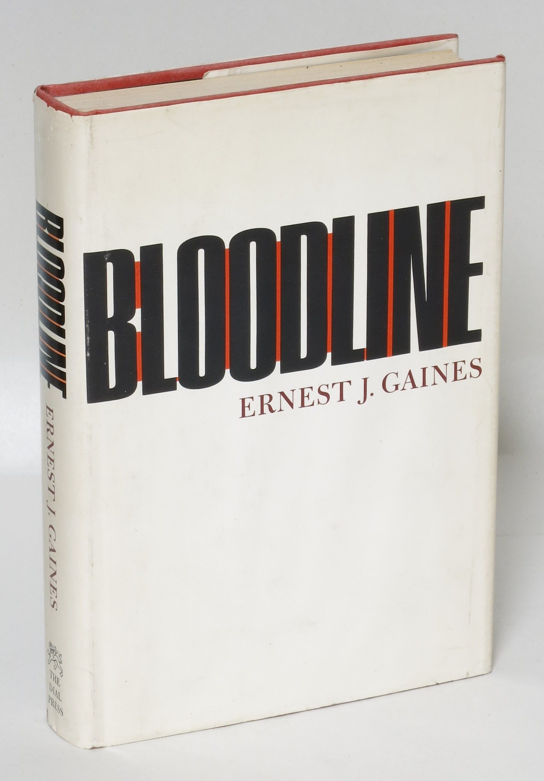
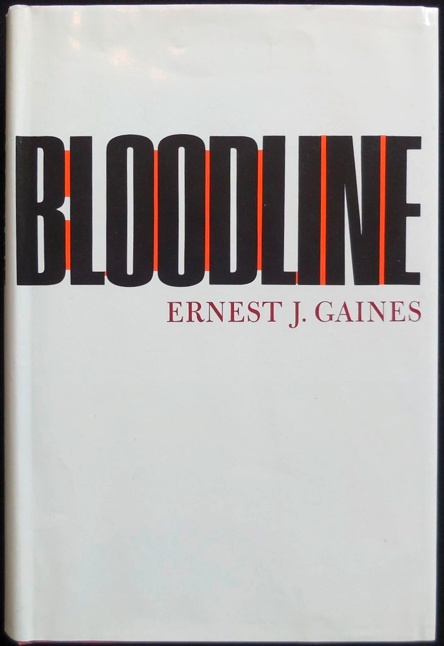
Bloodline is a collection of short stories by Ernest J. Gaines. The first edition published by Dial Press in 1968 features a striking typographic jacket design. The title is rendered in bold condensed caps from Matterhorn or similar. The interletter spaces are partly filled in red, in what looks like a visual echo of the preceding letter’s counter shape, yielding a rhythmic pattern of black and red. The author’s name is set in the dignified caps from Bulmer.

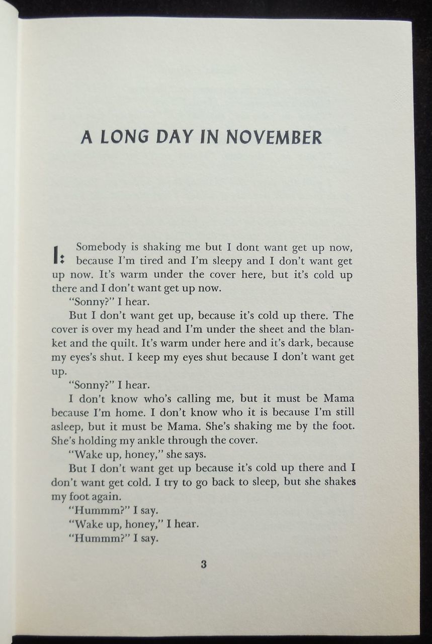
The title page is set in Lydian Bold Condensed and Italic.
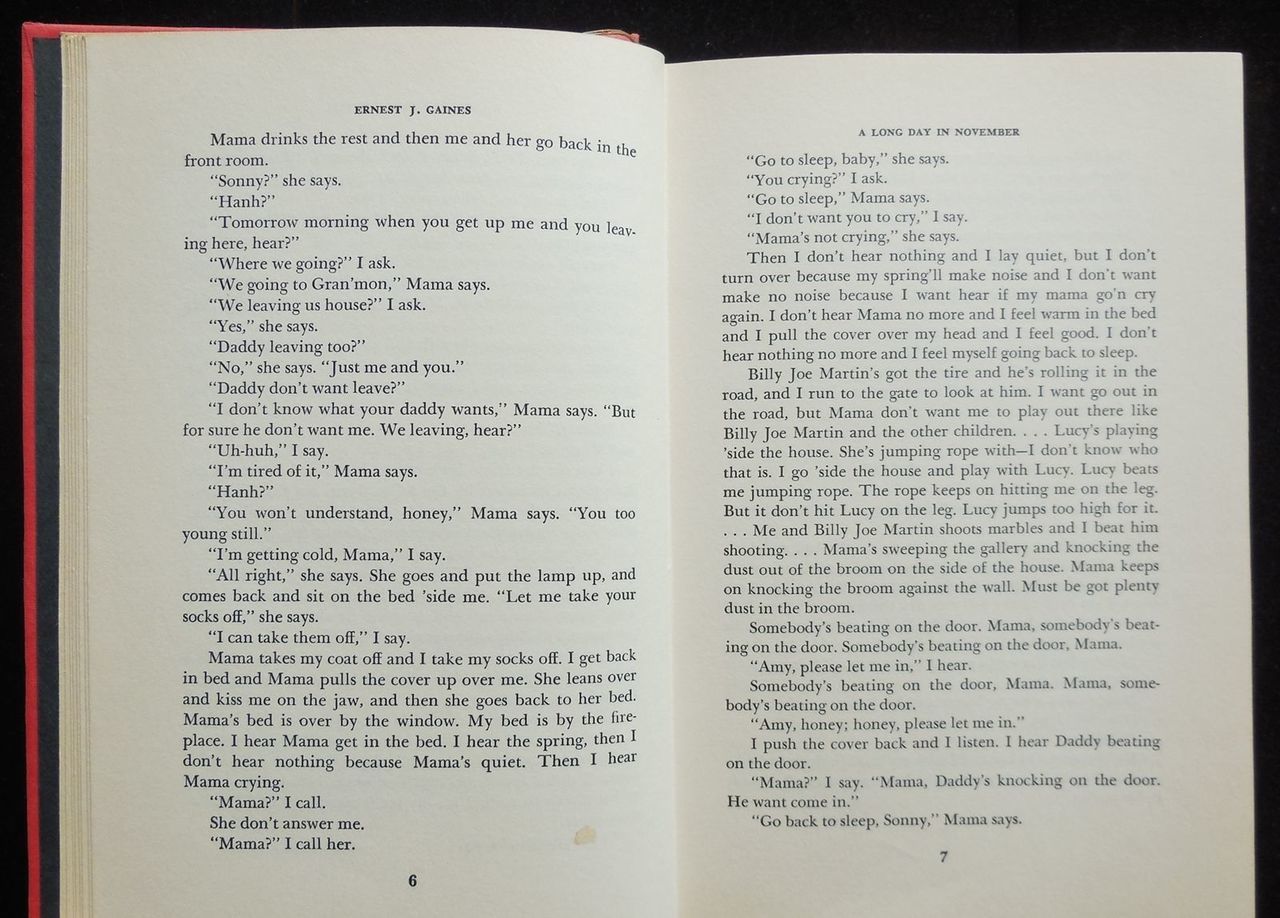
For the book interior, the body copy in Baskerville is paired with headlines and chapter numbers in Lydian.