
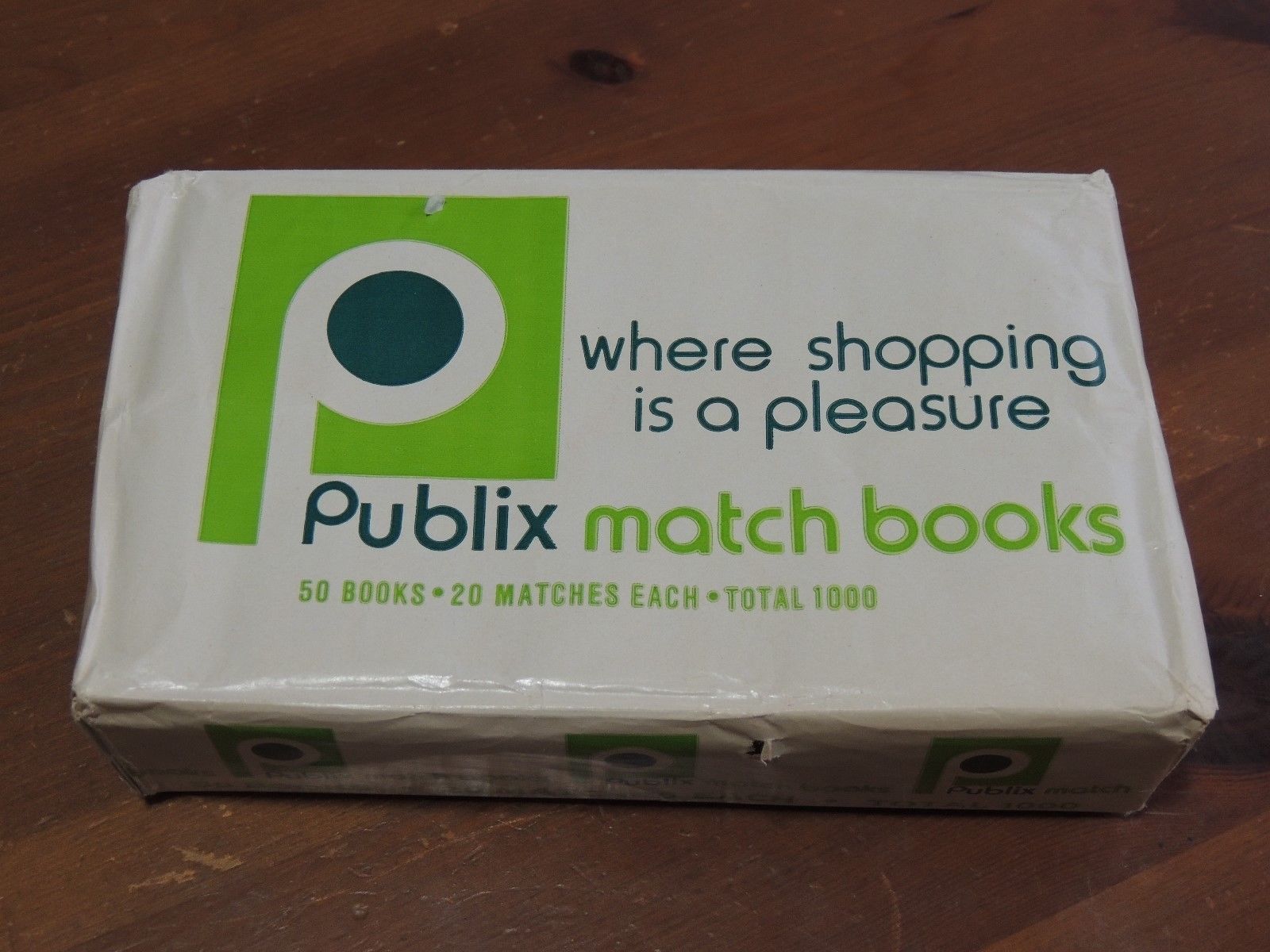
Publix logo (1972)
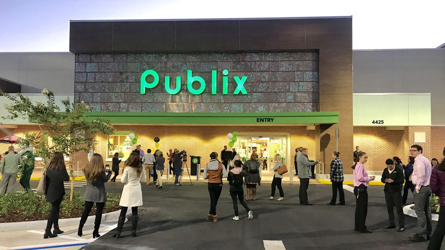
A modern day Publix. The company has started to give the letters in their logo a very wide spacing, which I see as a poor choice.
Sometime in 1972, Florida-based grocery chain rolled out a new branding system. The color green would stay but a new wordmark debuted that’s actually still in use to this day. Six letters of Blippo Bold, the letter p has actually been re-purposed as an uppercase. The spacing started out tight and has loosened over the years. The corporate design department at Publix has been using other Universal-influenced designs to compliment the logo over the years.

Photo of a store opening in the late 1970s.
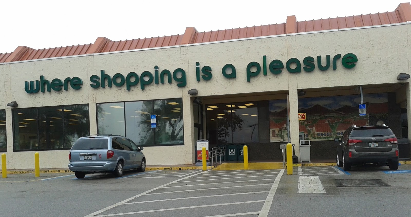
Not too sure of this font (if it is one). The g and i don’t match characters from Blippo Bold. “Where shopping is a pleasure” has been Publix’s slogan off and on for over 60 years. It was coined by Bill Schroter, Director of Advertising, in 1954.
The slogan looks to use a few styles of Harry.
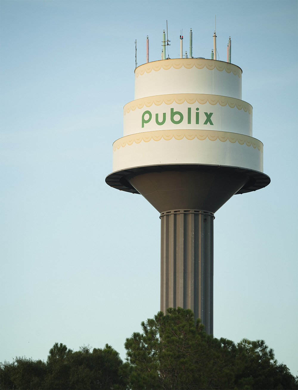
Publix facilities in Lakeland, FL feature a water tower with a birthday cake top. You can see it at 3223 New Tampa Hwy, Lakeland, FL.


")

")


")
")


")


")


")

2 Comments on “Publix logo (1972)”
I was wondering for a long time what typeface was used for the Publix logo. And I’m so glad someone else agrees with me, I really don’t care for the wide spacing either. Blippo Bold is a perfect match, thanks so much for sharing!
This logo was first introduced on November 1, 1972. I’ve yet to find who designed it though.