
Hugh Masekela – Hugh Masekela’s Next Album album art
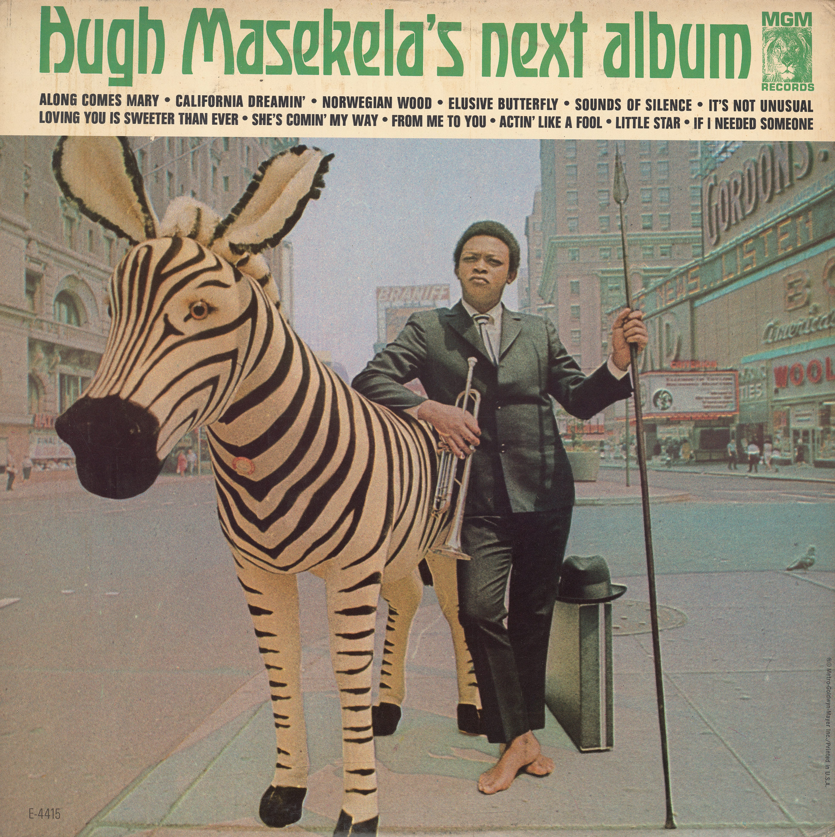
Hugh Masekela’s Next Album is the straightforward – if not to say unimaginative – title of the fourth studio album by South African jazz trumpeter Hugh Masekela (1939–2018) Recorded in New York City, it was released in December 1966 by MGM Records.
The cover photo is my all-time favorite: Masekela in a black suit and a striped tie, standing barefooted on Times Square, his arm resting on a life-sized stuffed zebra, with his trumpet in one hand and a spear in the other. It’s the epitome of cool.

Xenotype 3486 AKA Radium as shown in PLINC’s Alphabet Thesaurus Vol. 2 (1965).
The title typeface is Radium. Photo-Lettering, Inc. presented it in Alphabet Thesaurus Vol. 2 (1965) as Xenotype 3486, without any design credits, and named it Radium in their One Line catalog (1971). As with most of PLINC’s “xenotypes”, it’s not an original design, but a phototype adaptation of a historical alphabet. In the case of Radium, I tracked down the model in Art Alphabets and Lettering (1914), a source book by American calligrapher and engraver John M. Bergling, where it’s shown as an untitled “modern alphabet”. There is no digital version by PLINC. David Nalle’s Beaumains (Scriptorium, 2011) is based on the same historical source.
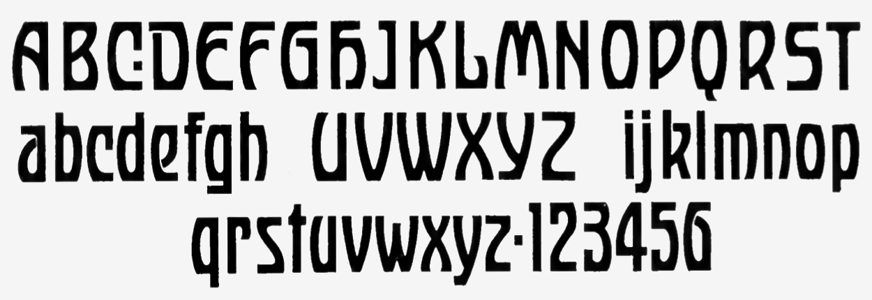
The historical model for PLINC’s Radium: A “modern alphabet” shown by John M. Bergling in his Art Alphabets and Lettering (1914).
Radium preserves the original H with its blackletter/minuscule-like construction. For the cover design, this letter was replaced by a more conventional form. The track list below the green title in Radium is set in caps from Folio schmalfett. I haven’t been able to find a credit for this iconic cover, neither for the photo nor the design. If you know more, please let us know in a comment
")


")


")

1 Comment on “Hugh Masekela – Hugh Masekela’s Next Album album art”
From Ricardo Cueva’s thesis Hugh Masekela: The Long Journey 1959–1968 (pdf):
The typeface choice ties in with this: Radium was probably chosen for its perceived “exotic” look. Of course Radium has nothing to do with South Africa, and is rather a product of the Art Nouveau aesthetic, and especially its German variety of Jugendstil.