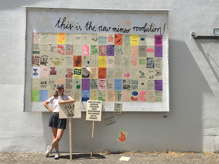
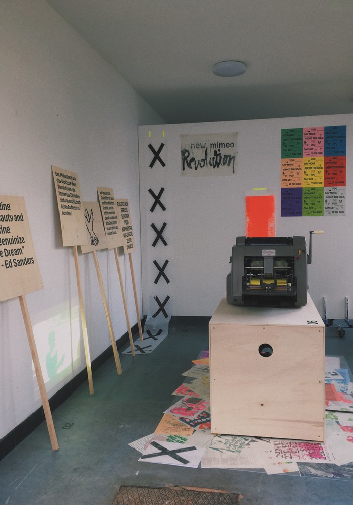
“This is the new mimeo revolution!” — installation with the 100 pamphlets plus protest signs at the HBKsaar.
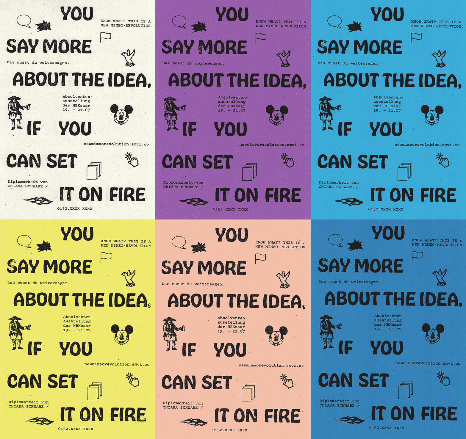
This is my graduation project made at HBKsaar, titled New Mimeo Revolution. In addition to writing a thesis, I printed one hundred pamphlets on the mimeograph and set up an exhibition. For this, I created a visual identity with Hobeaux as display typeface and Pitch for text uses. I combined those with a very direct and emotional language of forms and symbols.
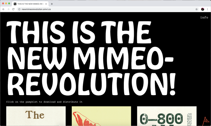
This post shows several images of the project as a whole, followed by a selection of the individual pamphlets. From the project website:
The Mimeo-Revolution was a movement of young American artists during the 50s and 60s, who spread their art and thoughts amongst the people through personal commitment and the use of a stencilprinter, also called a mimeograph.
The mimeograph was invented at the end of the 19th century, when ever-increasing bureaucracy also intensified the demand for copying documents. Shortly after the mimeograph revolutionized office work, the cheap and simple process also conquered the streets: schools, churches, subcultures and parties printed their own documents independently from professional printers or major publishers. This led to the rise of student groups like “Weiße Rose”, which allied itself against the Nazi regime during the Second World War; or students during the ’68 Revolutions, who resisted rigid structures, oppression, the Vietnam War, and conservative sexual morality all over the world.
Nowadays, I choose to print pamphlets with this traditional technique, because I want to continue to build upon what the generations before me have been able to achieve. It’s important for me to engage myself and get my hands dirty during the process of making a difference.
I am currently interested in topics related to environmental protection, democracy, gender equality and human rights. In addition to political topics, I also deal with artists who use words in a particularly eloquent or emotional manner, or who criticize or speak from the heart.
During my final year at the Hochschule der Bildenden Künste Saar, I printed 100 different pamphlets on the previously mentioned and other topics, on a 1967 ideal stencilprinter and a Gestetner printer from the 1950s.
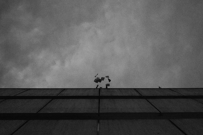
Leaflets are being flung from the top of the building.

“We buy things we don’t need, with money we don’t have, to impress people we don’t like.” The featured quote by Chuck Palahniuk is shown in caps from Obviously, with a psychedelic distortion effect.

Route barée means “road closed” and is the perfect metaphor for the hopelessness of the situation and the French people during the strike of the yellow vest movement. The rotated lines are set in Combat.
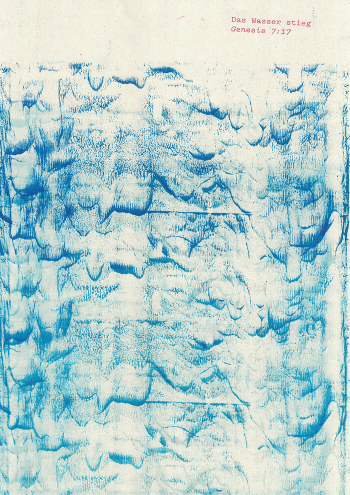
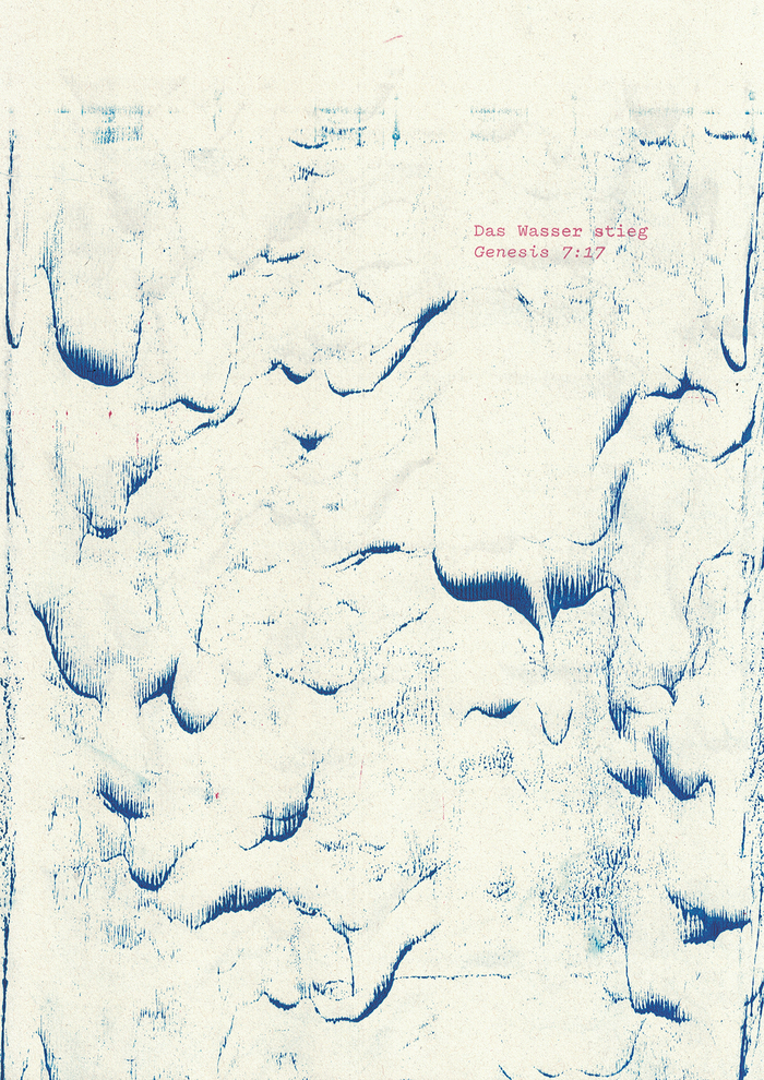
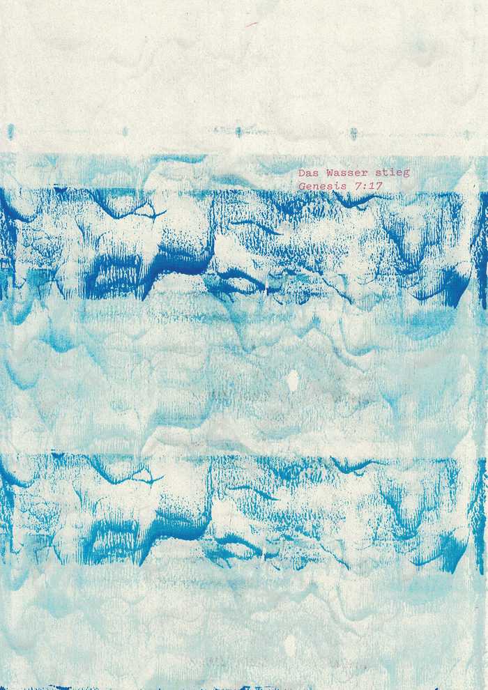
Das Wasser stieg (“The waters increased”) is a quote from Genesis 7:17, here referring to the implications of global warming.
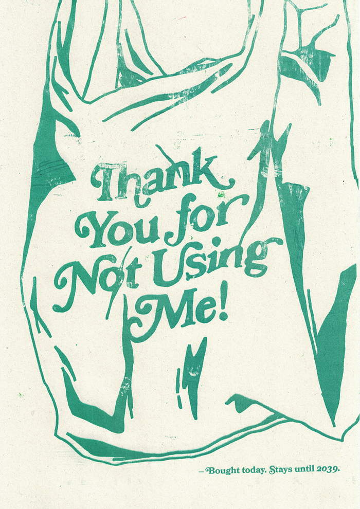
Contrary to what one can usually read on plastic bags, the text (in Bookman) here says “Thank You for NOT Using Me!”. The small text below explains that the bag will stay around in the environment for twenty years.
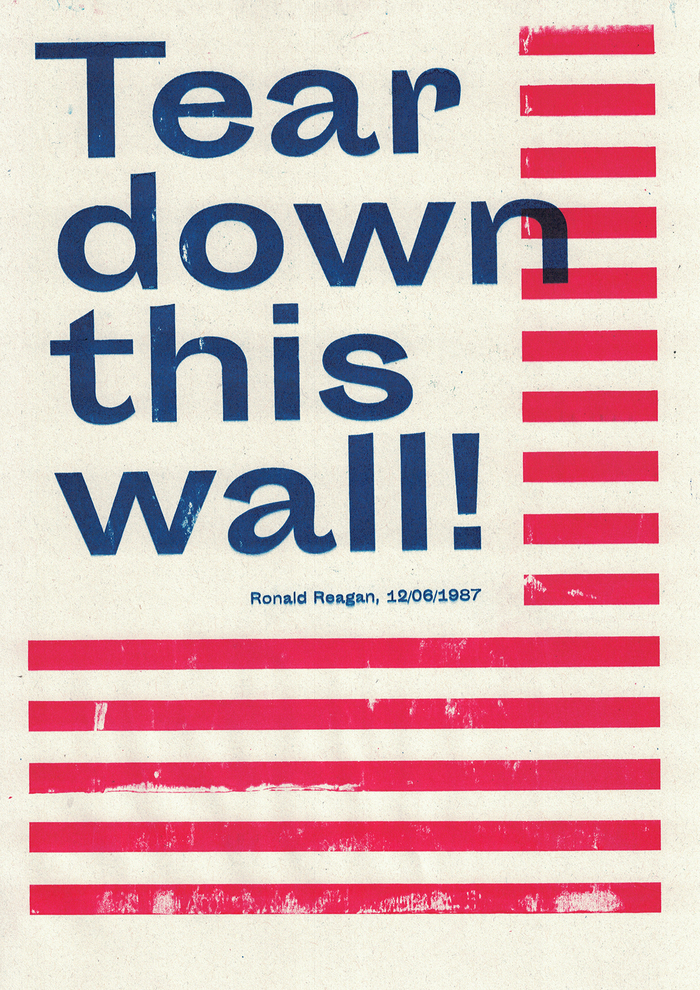
This pamphlet with an excerpt from Ronald Reagan’s famous speech held in Berlin in 1987 is more actual than ever; a response to Trump’s plan to build a wall between the USA and Mexico. The font on this is Sporting Grotesque.
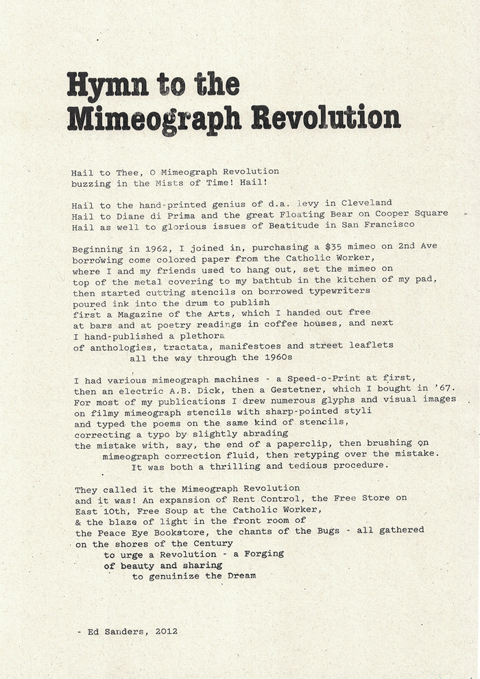
The “Hymn to the Mimeograph Revolution” from Ed Sanders, set in ITC American Typewriter Condensed Bold and Pitch.
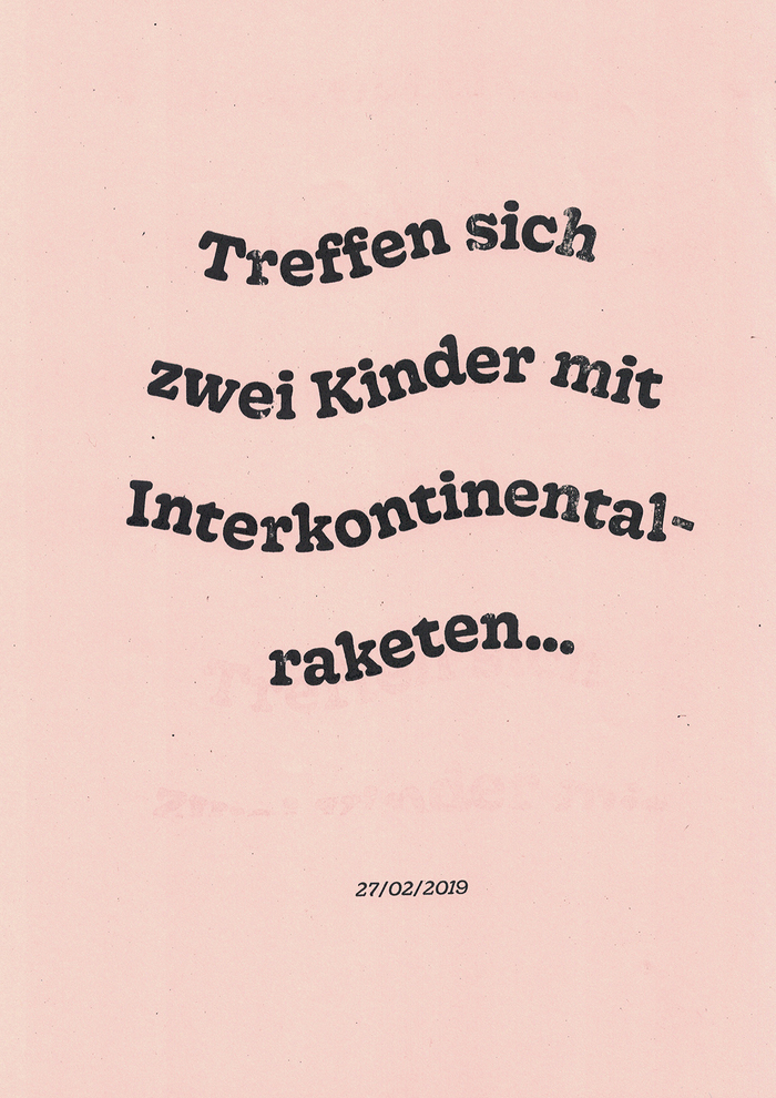
Treffen sich zwei Kinder mit Interkontinentalraketen … (“When two children meet with intercontinental missiles …”) could be the beginning of a good joke, but it was reality. Friendly Gooper, set on a wavy line, on a pink background, underlines the comedy of this meeting between Donald Trump and Kim Jong-Un.
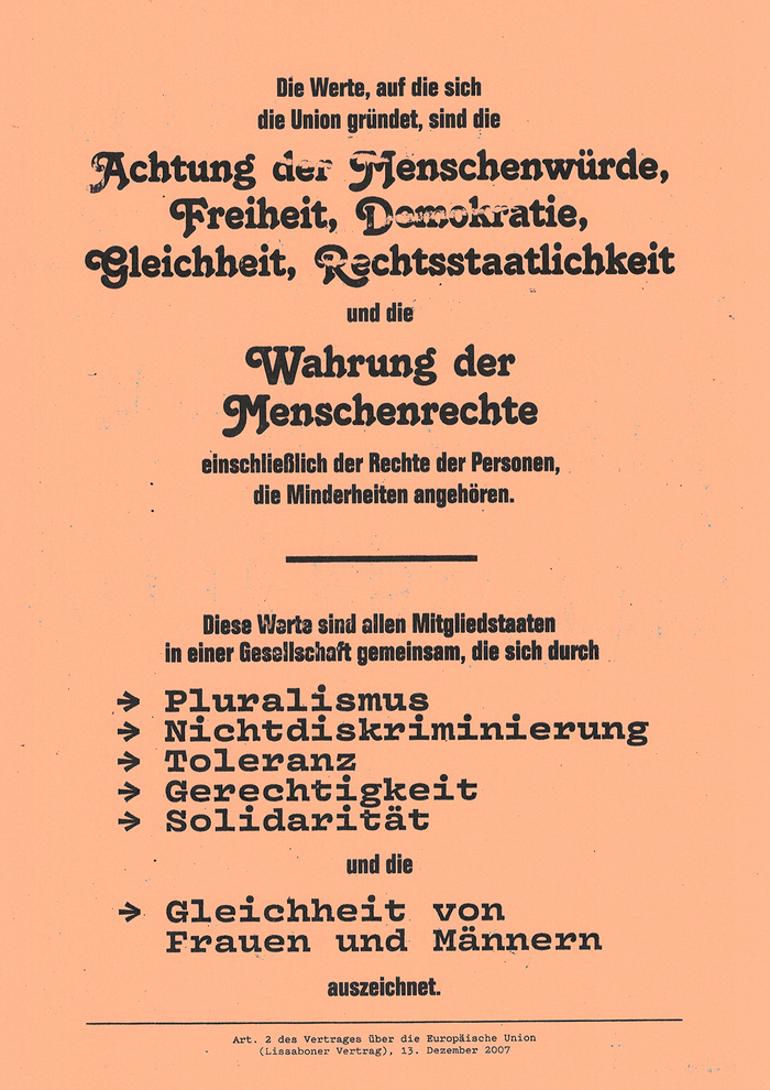
The European Union is tolerant and diverse just as this draft of the Second Article of the Treaties of the European Union. The fonts used (from top to bottom) are: Folio Condensed Bold, Tango, Vulf Mono Bold and Pitch Regular.
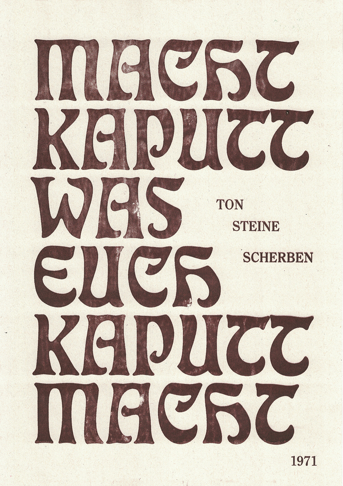
“Macht kaputt, was euch kaputt macht” is a famous song from Ton Steine Scherben and a great reminder to fight all our inner and outer demons! The message is set in historical Eckmann, which fits perfectly with its slighty psychedelic feeling.

I always loved the Refugees Welcome illustration of the running family with its roots in 1990. But the font could use a makeover: How about Cooper Black? Maybe it is that simple.
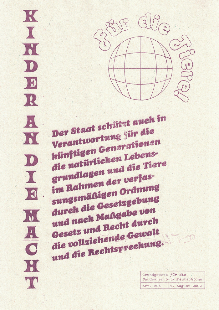
Grundgesetz für die Bundesrepublik Deutschland Art. 20a set in Ouroboros, Octopuss Outline, Cooper Black Italic and Pitch Regular.

Good use of VTF’s Résistance for Article 5 of the German Grundgesetz: “There will be no censorship”.

Rhetoric of the evil: Hate (Old English), Sex (Cooper Black), Fear (Combat).

My grandpa says “In the past there was meat only once a week”. Meanwhile he eats it every day. The font used is Plaktur (a modern and groovy interpretation of a fraktur font, still in progress, by Max Holl).
![This is the 100th pamphlet of the series which draws the conclusion from the project. It is made with Letraset in Bookman. “Jan Norling” is added from Italic [thanks, Jay].](https://assets.fontsinuse.com/static/use-media-items/108/107879/upto-700xauto/5e760e90/100scan.jpeg)
This is the 100th pamphlet of the series which draws the conclusion from the project. It is made with Letraset in Bookman. “Jan Norling” is added from ITC Bookman Italic [thanks, Jay].
Formats
- Web (3284)
- Branding/Identity (4746)
- Posters/Flyers (3489)
- Exhibition/Installation (645)
Topics
- Graphic Design (2167)
- Activism (644)
- Art (2750)
- Politics (508)
Designers/Agencies
- Chiara Schwarz (7)
Tagged with
- student exhibitions (82)
- thesis / graduation projects (106)
- mimeography (3)
- about printing (52)
- political posters (1)
- poster series (360)
- HBKsaar (18)
- protest (81)
- environmentalism (62)
- democracy (8)
- gender issues (43)
- equality (11)
- human rights (20)
- student works (463)
- series (671)
- typographic eclecticism (172)
- flyers (90)
- distortion (191)
- rotated type (1296)
- Chuck Palahniuk (1)
- revolution (12)
- eroded/weathered type (125)
- floods (2)
- multilingual (1162)
- German (language) (1312)
- English (language) (1065)
- French (language) (1247)
- typewriters (69)
- recycling (30)
- swashes (428)
- Ronald Reagan (3)
- type on a curve (602)
- refugees (17)
- stacked glyphs (305)
- outlined type (837)
- italic/script on an angle (211)
- censored (15)
- all caps blackletter (23)
- blackletter (180)
- starbursts (90)
- speech balloons (104)
- type size gradients (27)
- tickets (66)
- meat (26)
- reversed type (1940)
- dry transfer lettering (116)
- asterisks (99)
Artwork location
- Germany (2543)
- Saarbrücken (47)
In Sets
- More is more (Matthijs Sluiter) (83)
- Designs by Women (Fonts In Use Staff) (1469)
- 2+ typefaces by 1 designer (Florian Hardwig) (536)
- Future Fonts (James Edmondson (OH no Type Co.)) (234)
- Colossal Combinations (Jay Mellor) (1864)
- Serif Goodness (Jay Mellor) (153)
- Grotesk or Grotesque (Jay Mellor) (70)
- VG (Jen Dodaro) (22)
- Rising Climate Justice (Jake Pilgrim) (259)




















3 Comments on “New Mimeo Revolution”
The typeface named Résistance was made by a collective of nine at ÉNSAD Paris (Pauline Cormault, Esther Michaud, Claire Mucchieli, Merlin Andreae, Raphaël Maman, Pedro Gomes-Cardoso, Juliette Nier, Gabrielle Meistretty, Damien Bauza) using Glyphr Studio with the help of the French foundry Velvetyne and released on December 9th, 2015.
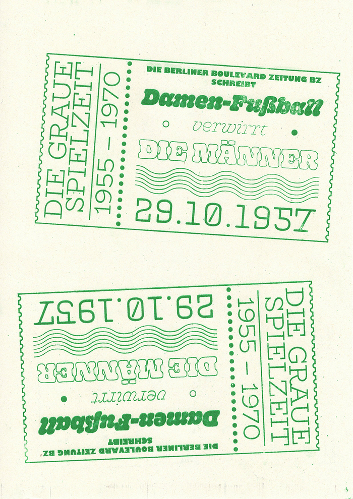
The text Die Berliner Boulevard zeitung BZ schreibt is set in Gill Kayo, not Gill Sans Ultrabold, and the small text –Jane Norling should be in ITC Bookman Italic.
What a wonderful project, Chiara! Congrats, and thanks for sharing!
Jay, thanks for your keen eye. The info about Résistance had been added to our typeface page just before you made your comment. “Gill Sans UltraBold” is another name for Gill Kayo, and the one used in Monotype’s official digital version. You’re right that we have a dedicated entry for this extreme style, and I’ve assigned it now.