
Ford ads (mid-1960s)
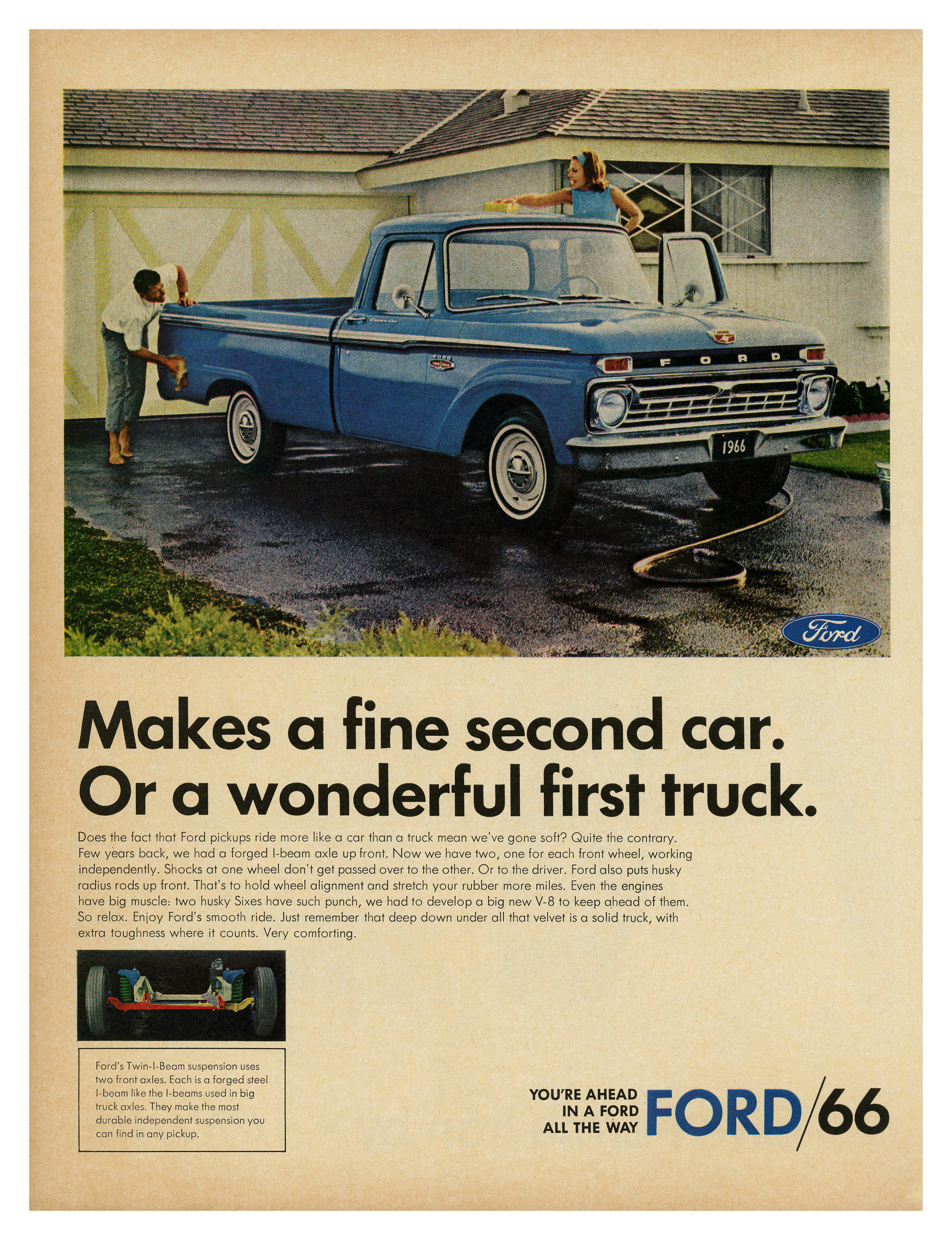
“Makes a fine second car” – ad for Ford pickups (1966) ft. two weights of Futura.
Volkswagen was not the only car manufacturer using Futura for their adverts. A few years after the launch of the famous campaign by Volkswagen of America, competitor Ford relied on Paul Renner’s groundbreaking geometric sans serif, too. Unlike Volkswagen’s, though, their use was hardly consistent. This sample of magazine ads from the mid-1960s shows that Ford had no recognizable visual identity beyond the Blue Oval logo (with script lettering credited to Childe Harold Wills). Almost every model was advertised in a different, at times seemingly random typeface.

“Announcing: Mercury Discovery Special!” – ad for Ford Mercury (1966), also set in Futura, here in three of its weights.
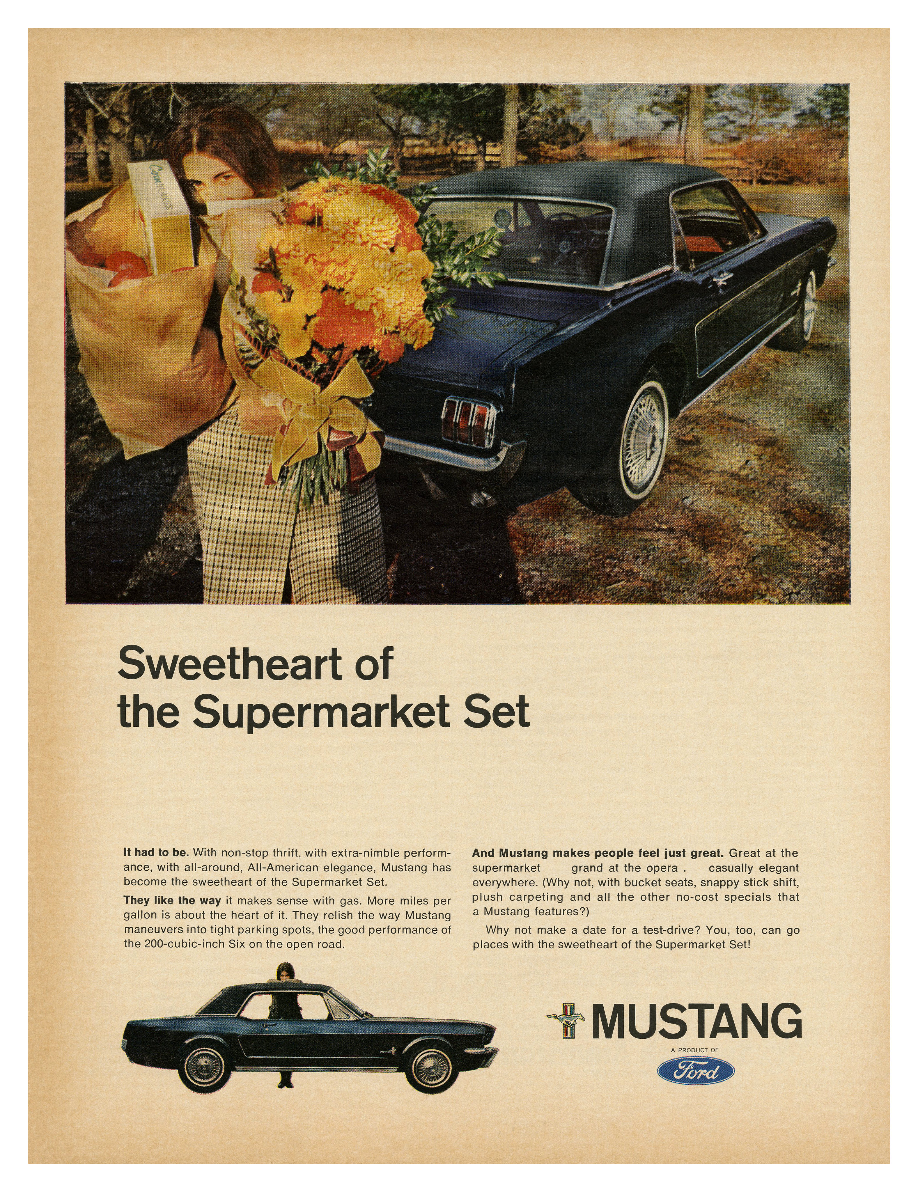
“Sweetheart of the Supermarket Set” – ad for the Ford Mustang (1966), with Akzidenz-Grotesk AKA Standard for display type and the similar Helvetica for the copy.
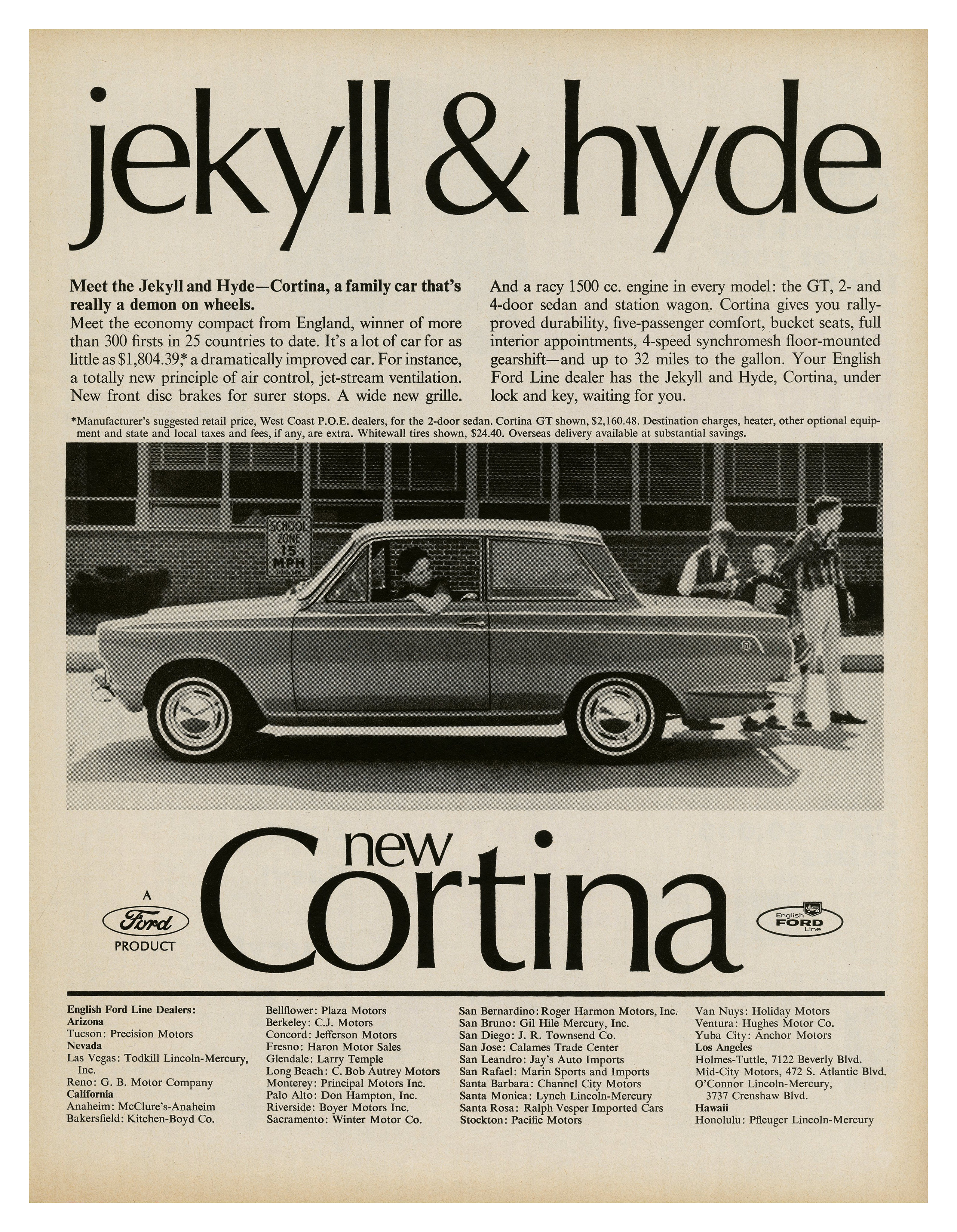
“Jekyll & Hyde” – ad for Ford Cortina from the English Ford Line (1965), combining big Optima with text in Times New Roman.

“My Daddy gets a big charge out of our Fairlane” – ad for the Ford Fairlane (1964) in Baskerville Old Face, striking a macho and anthophobic tone.


")


")


: “Welcome to someday.”")


")
3 Comments on “Ford ads (mid-1960s)”
Around the same time, in 1966, Ford hired Paul Rand to redesign the logo. According to Safet Satara of AutoWise, “the proposed solution was too radical for Henry Ford II, so the more conventional emblem prevailed.”
Rand’s mark looks great, but it’s kind of cool it wasn’t accepted. Like Coca-Cola, Ford one of the few companies with a 100+-year-old signature logo that has stood the test of time.
Also, thank you for teaching me the word “anthophobic”. Haha!