Exercices de style, Gallimard (1963)
Raymond Queneau’s Exercices de style was first published in 1947. In 1963, Gallimard issued a deluxe hardcover edition. The 99 variations of the same story were typographically interpreted by Robert Massin (professionally known just as Massin), who had started working at Gallimard in 1958, serving as art director since 1960. Additionally included are 33 parallel exercises in style; drawn, painted, and carved by illustrator Jacques Carelman. This magnificient book deserves a post that also shows some of the interior pages and an analysis of the many typefaces in use. For the moment, a look at the cover and the title page will have to do.
The title is presented in four big lines, stacked and justified, with a different typeface for each line. “Exercices” is wrapped in two lines, in capitals from Comstock, a contoured grotesque first cast by the Inland Type Foundry in 1902 and also known under several other names including Astoria; and Didot. The specific version may be Initiales Firmin Didot, a caps-only cut offered by Deberny & Peignot in sizes up to 60pt. The dimensional seriffed letters depicted from an extreme perspective are probably from a 19th-century (wood?) typeface. All attention is ultimately directed to the word “style”. It’s presented in a range of bright colors in what otherwise is a monochrome cover. The bombastic letterforms are taken from a decorated capital alphabet originally shown in Jean Midolle’s lettering sampler Spécimen des écritures modernes (1834–1835) as Romaine (genre arabesque). Later on, after this book was designed, this face was adopted for dry-transfer lettering and inevitably made into a digital font, too.
These four lines are representative for Massin’s predilection for vintage and often expressive typefaces. The three small lines at the bottom are set in a more restrained and also much younger design: Folio was released by the Bauer foundry just a few years earlier, in 1957. The neo-grotesk was sold in France under the name Caravelle.
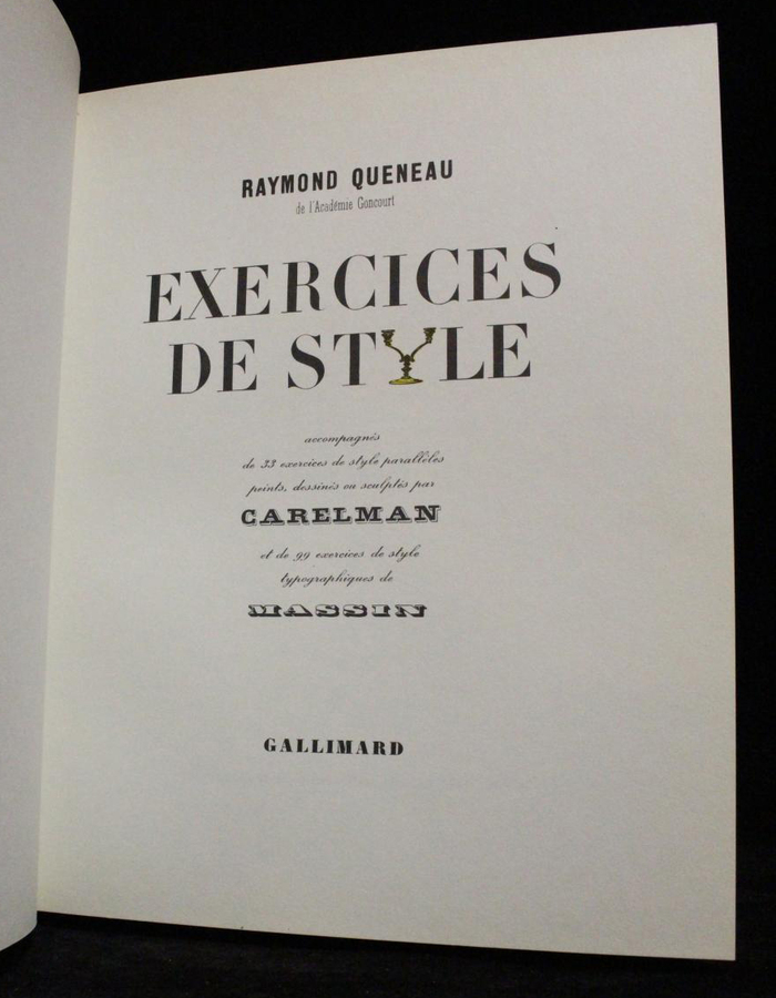
The title page combines a multitude of typefaces, center-aligned, in a neo-Victorian fashion. The title is set in Didot caps, with a candlestick standing in for Y. The formal script appears to be Calligraphiques noires, issued by Deberny & Peignot in 1928. The shaded slab for “Carelman” is Initiales Compactes Éclairées, Deberny & Peignot’s name for a design that originated at the Bruce Type Foundry in 1865 and is better known as Gold Rush. The other typefaces are unidentified. If you have any insights, let us know in a comment.
In an article for Eye magazine no. 16 vol. 4 (1995), Richard Hollis regards the illustrated edition of Excercices de style as Massin’s “first important single piece of design at Gallimard”:
In attempting ‘a literal expression of the text (mainly limited to the titles),’ Massin displayed his skill with eccentric type forms, supplying each variation of the tale with a heading which suggests the narrative form that follows. Derived from the content, the type style becomes part of the expression of the text’s meaning. The letters are not decoration, but unified text and illustration. Massin’s Exercices de style was a further demonstration of Faucheux’s idea of ‘making connections between the text and its graphic expression.’ Since Faucheux had himself produced a book club version of Exercises de style in 1956, there was, for Massin, an element of rivalry as well as homage in the project.
On PaperPosts, Murray Grigo-McMahon shares several images of the interior pages, taken from a later edition issued by Gallimard in the late 1970s, with a different cover.
In 2007, Phaidon published a monograph of Massin’s work, edited by Laetitia Wolff. For more information about Massin and his œuvre, see also the features on Design Culture, Elisava, and Index Grafik as well as Jan Middendorp’s article for Eye about Massin and the Book.
Massin died February 8, 2020 at the age of 94.
Typefaces
Formats
- Books (4010)
Topics
- Literature (1919)
Designers/Agencies
- Robert Massin (2)
Tagged with
- Raymond Queneau (2)
- Gallimard (13)
- book covers (3499)
- hardcovers (591)
- big type (1093)
- stacked and justified (453)
- alternating line styles (55)
- mid-word linebreaks (423)
- chromatic (472)
- title pages (525)
- Victorian style (42)
- 1960s (500)
- French (language) (1255)
- glyphs substituted by images (56)
- Oulipo (3)
- contoured type (172)
- shadow effects (707)
- typographic eclecticism (174)
- contrasting typefaces (288)
- contrasting sizes (357)


