
Linewaiters’ Gazette, Vol. B, Issue 16
“Linewaiters’ Gazette, the official bi-weekly newspaper of what is likely the world’s most famous grocery store, the Park Slope Food Coop. The Coop was established as a members-only, collectively-run buying club in 1973. More than just an in-house newsletter intended to while away the time spent waiting in a checkout line (hence the title), the Linewaiters’ Gazette documents the then-burgeoning and now-established movement to look at food as not just nourishment, but as the product of ethical and political forces.” — Brooklyn Public Library
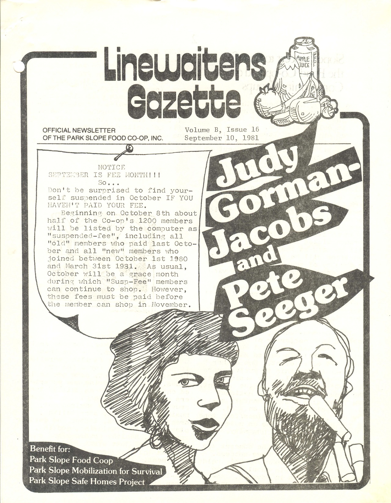
The design changed many times over the newsletter’s life. This issue uses 1970s-era fonts, possibly in Letraset rub-down lettering format, which were quite popular for home-made zines at the time. Everything about this page is so typical of 1970s–80s DIY newsletter design, down to the typewritten text.


")


