
Manifestoes of Surrealism by André Breton, first English edition

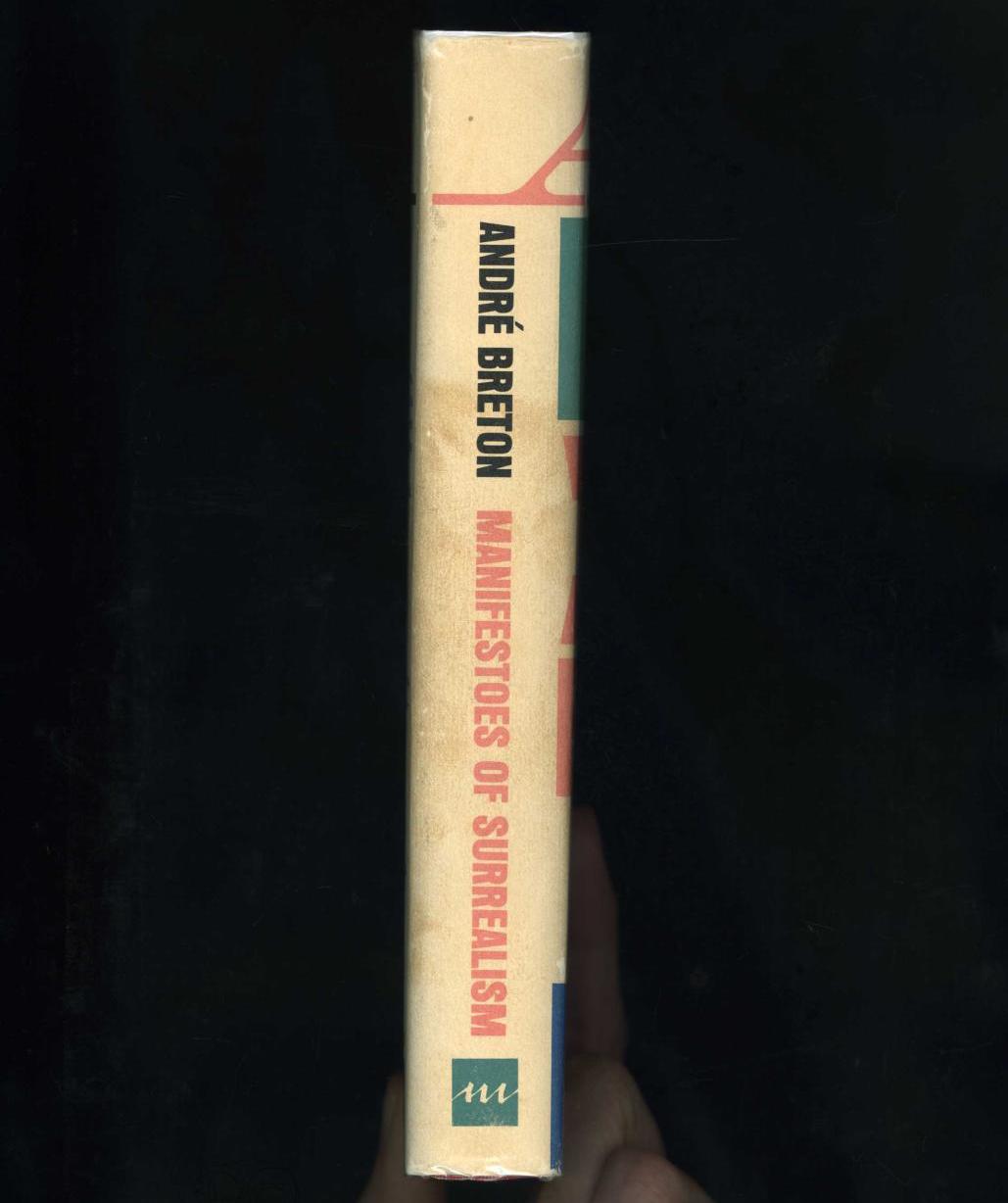
The first English edition of French writer André Breton’s Manifestoes of Surrealism, discussing the ideas behind the Surrealist movement in art and culture. The book’s cover, designed by Quentin Fiore includes a mish-mash of poster types, with a majority set in Anzeigen-Grotesk (a typeface used for other designs by and for Fiore). Note the unusual solution for compacting the accent in “ANDRÉ” by slicing the top crossbar of the “E”.
The “A” in “ANDRÉ” is some version of Roman Extended, perhaps a phototype adaptation (it wouldn’t be surprising if the entire composition was set with phototype). The righter-most serif has been snipped short for tighter spacing.
The “B” in “BRETON” is some form of bold gothic, similar to Bartuska Grotesque, but hard to identify definitively on its own. It’s very possible it’s an adaptation of an older wood type face like some of the other types in the design. For example, Gothic (Nesbitt) has a similar weight but different details.
The “M” in “MANIFESTOES” is Page No. 120 – again, perhaps a phototype adaptation.
The decorative dingbat likely comes from a pre-existing set of dingbats, yet to be identified.
The “SUR” in “SURREALISM” has similarities with Schadow, but no exact matches have been found yet.
The smaller text on the back cover is set in Melior.
Many of the unknown elements of the book’s type could probably be clarified if the specific shop that handled the type was known. Even uncovering the specifics of the dingbat or the “SUR” typeface would probably reveal which adaptations of the other typefaces were being used, since there’s a good chance they all have a common source.


")

")


")


1 Comment on “Manifestoes of Surrealism by André Breton, first English edition”
It looks like the designer was influenced by a layout you see on some posters from the wood-type period where a 'capital letter’ at the start of an all-caps word is indicated with a wider or bolder font. Besides the “mid-word style change” tag I don’t know of a specific name for this. Here it is on another digital-period homage to wood type. (Obviously this is particularly easy to do with wood type sans- and slab-serifs which expanded and condensed nicely and were sold both by size and by width so you could “stat to width”. I don’t think I’ve seen it on posters done, as here, with a totally different font style for the capital letter, but I’m sure there were precedents.)