
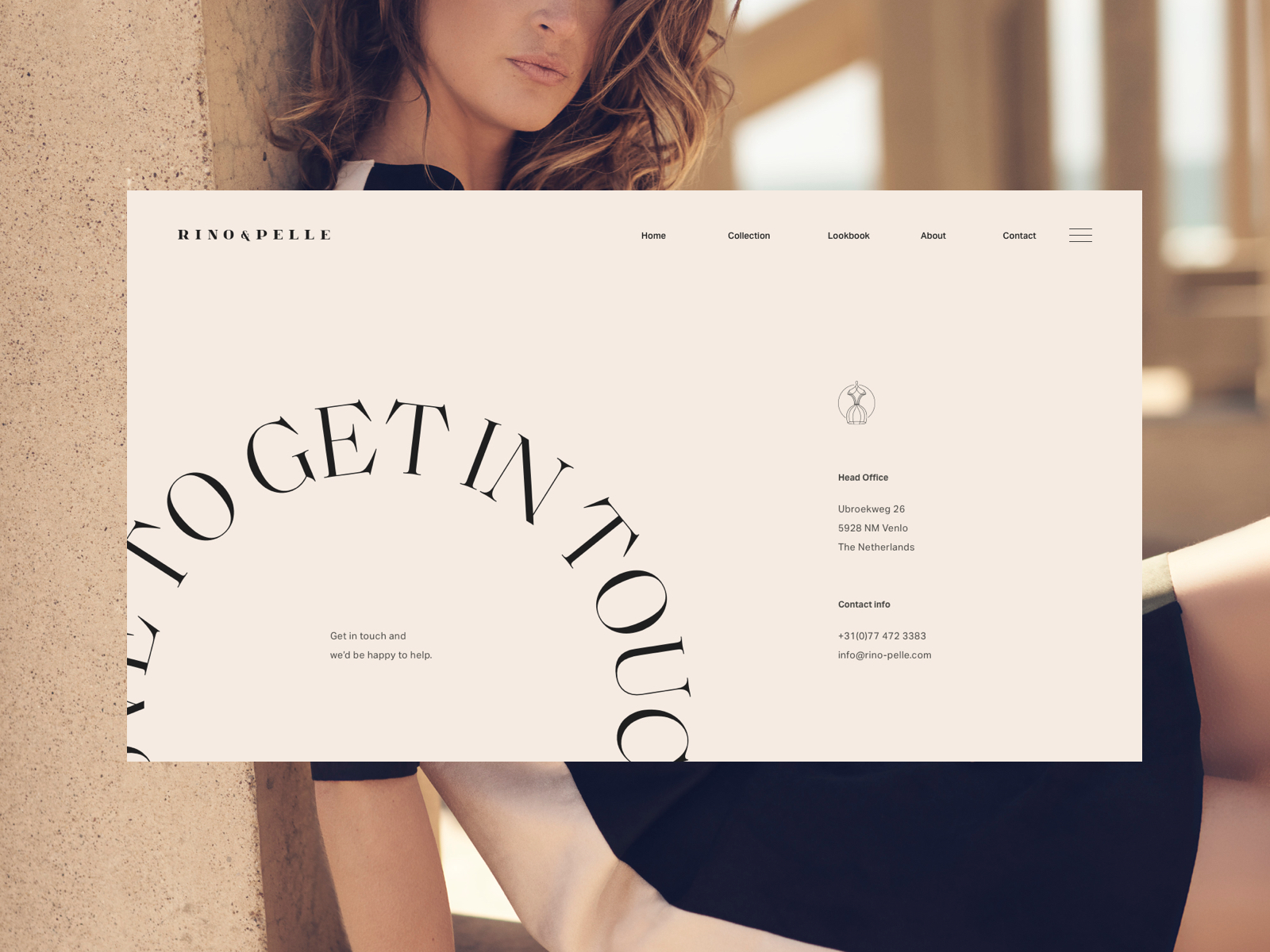
Rino & Pelle identity and website
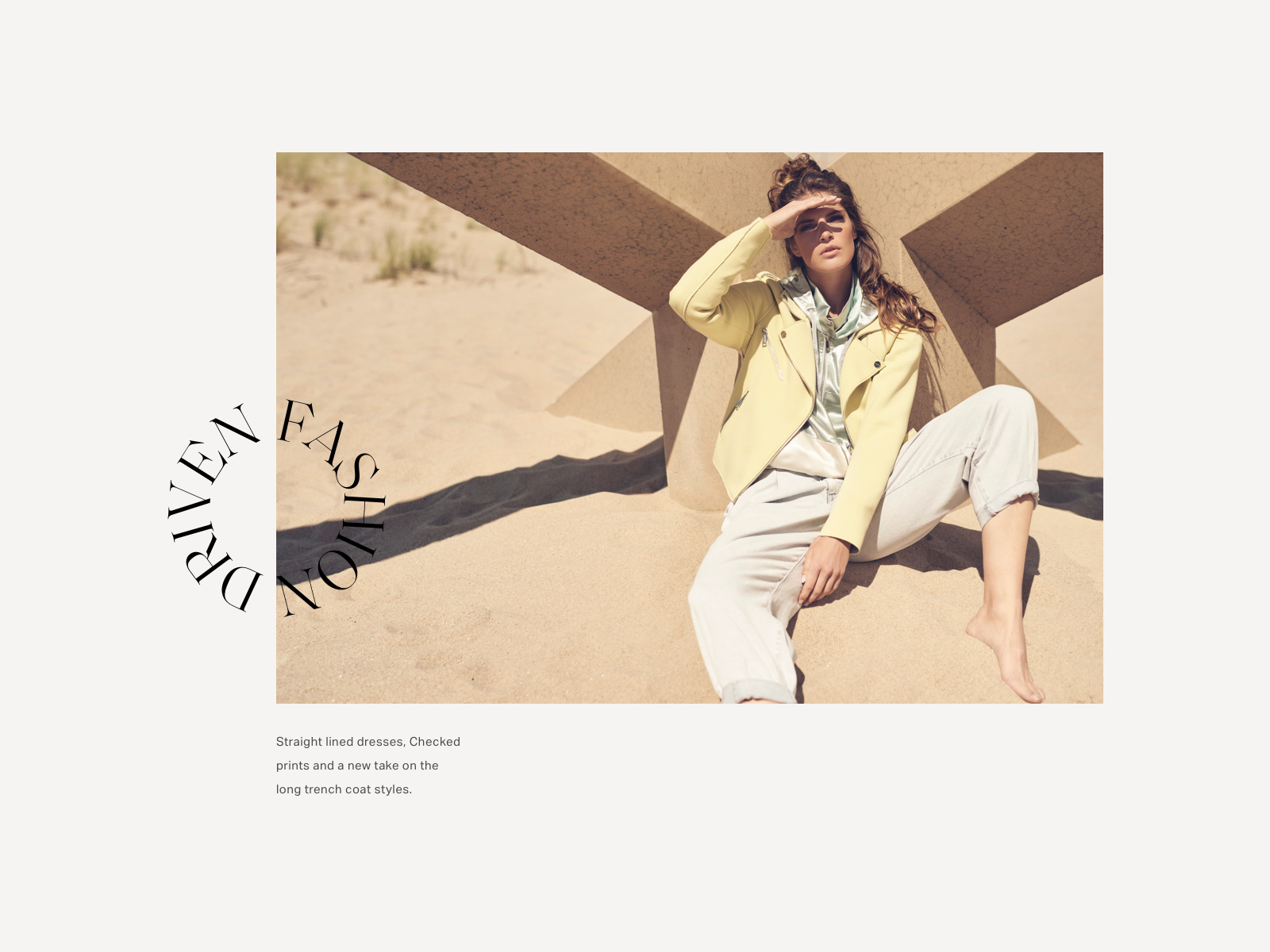
A strong ethos in durable pieces that eventually become wardrobe favourites, have shaped the Rino & Pelle brand into what it is today. Clothes that we love to live in, become an extension of our emotions which makes them part of our precious memories in life.
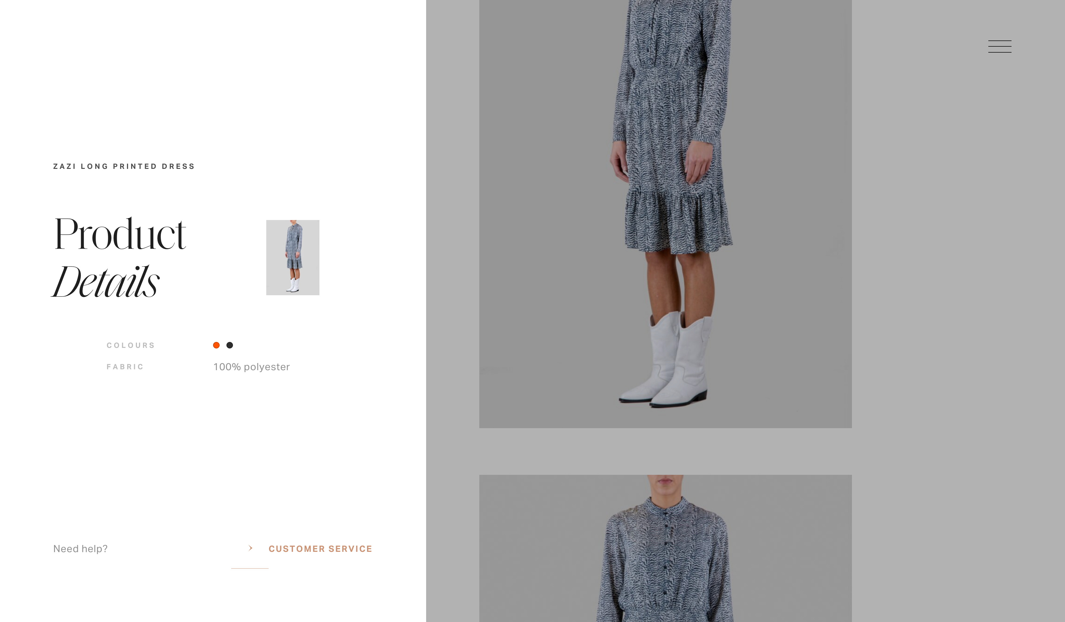
Craftsmanship and eye-for-detail play an important role in our work at Exo Ape, just as much as in Rino & Pelle’s work. We have echoed these brand values through profound design aesthetics and branded user interactions that emotionally connect visitors to the brand.
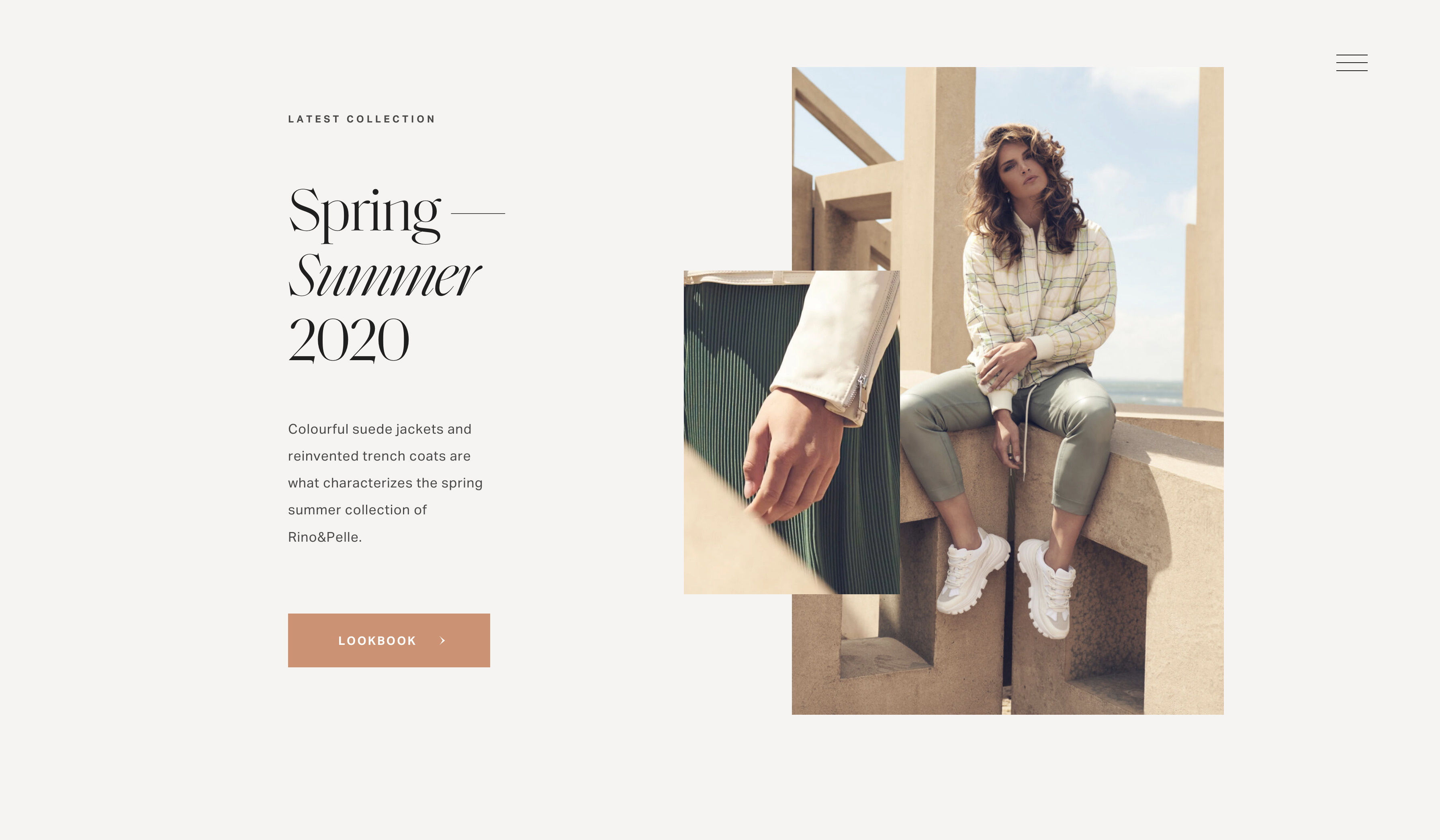
For all titles on the Rino & Pelle website, we consciously used Saol Display, and combined its sharp capitals with the noticeably narrower italics in order to radiate the brand’s daring, yet elegant style. To complement the flamboyant Saol Display we selected Aktiv Grotesk, which has a very neutral yet contemporary feel, for body text.


")

