
The Young Rascals – Groovin’ album art
Contributed by Florian Hardwig on Nov 1st, 2020. Artwork published in
July 1967
.
Probably the most prominent application of Halloween? The bold all-caps typeface featuring cookie-cutter counters with accentuating contour lines was used for the cover of Groovin’. The third album by rock band The Young Rascals was released in July 1967 and peaked at #5 on the Billboard Top LPs charts. For their next album, the band was renamed to The Rascals. The album cover was designed by Loring Eutemey, following an idea by the band’s drummer Dino Danelli, and featuring an illustration by Lynn Rubin.
Two years earlier, Halloween had already be used on the cover of the debut album by The Lovin’ Spoonful.
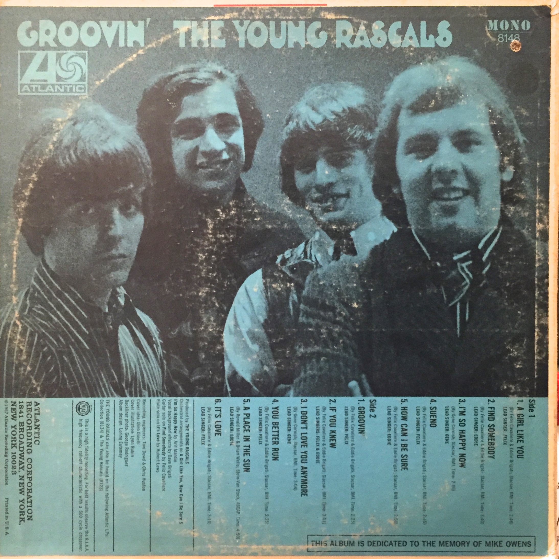

Stereo release with a sticker pointing out the inclusion of the hit “How Can I Be Sure”.


")


2 Comments on “The Young Rascals – Groovin’ album art”
This typeface came from its origins: I guess A. Bardi’s La Boule (1931).
Excellent find, Jay, thanks a bunch! No doubt – this is the source of Halloween. I’ve updated the typeface bio.
This alphabet by lettering artist A. Bardi was reproduced as La Boule in Publicité Vignettes Lettres Chiffres Monogrammes et Rehauts Modernes. This portfolio with 52 sheets (+ 1 index sheet) printed in different colors was published by Les Editions Guérinet, Paris, 1931. It was reprinted as Authentic Art Deco Alphabets by Dover Publications, 1986. The image you show above is probably from the Dover reprint, and is also included in Sander de Voogt’s selection of handlettered Art Deco alphabets. Luc Devroye also has a picture of the original showing of La Boule on his page about publisher R. Panzani, which includes the credits.
La Boule is not the only alphabet from this portfolio that was adopted by Photo-Lettering. Thanks to your pointer and Sander’s specimens, I was able to identify the sources of several other faces shown in the “Pop Type” section of PLINC’s Alphabet Thesaurus, vol. 2 from 1965, with “exotic alphabets of the 1920s”. These include more designs by A. Bardi (La Massive AKA Aztec and L’Ajourée AKA Cabaret) and P. Picaud (La Tiercée AKA Plywood, La Bâton AKA Razzle Dazzle, Le Recto-Verso AKA Eyes Left & Right). Thank you!