
Ads for Pabst Beer
A comical ad for Pabst with a headline set in Condensed Title Gothic No. 11 and body copy in Futura.
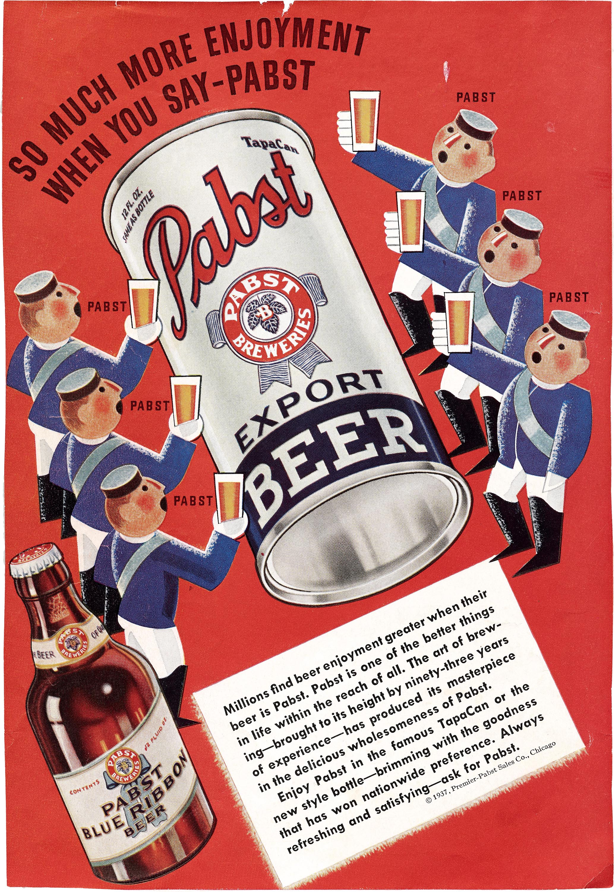
A series of ads designed by Dorothy Shepard in 1937 for Pabst Export Beer, another line from the makers of Pabst Blue Ribbon. The airbrush illustrations are in Shepard’s modern trademark style with streamlined shapes. Headlines and body copy are set on an angle, which was just starting to gain favor in advertising and magazine layouts. The two black-and-white ads include Futura’s distinctive fi and fl ligatures.
These clippings are held in the Dorothy and Otis Shepard Collection at Letterform Archive, some of which and can be seen in the library’s Online Archive.
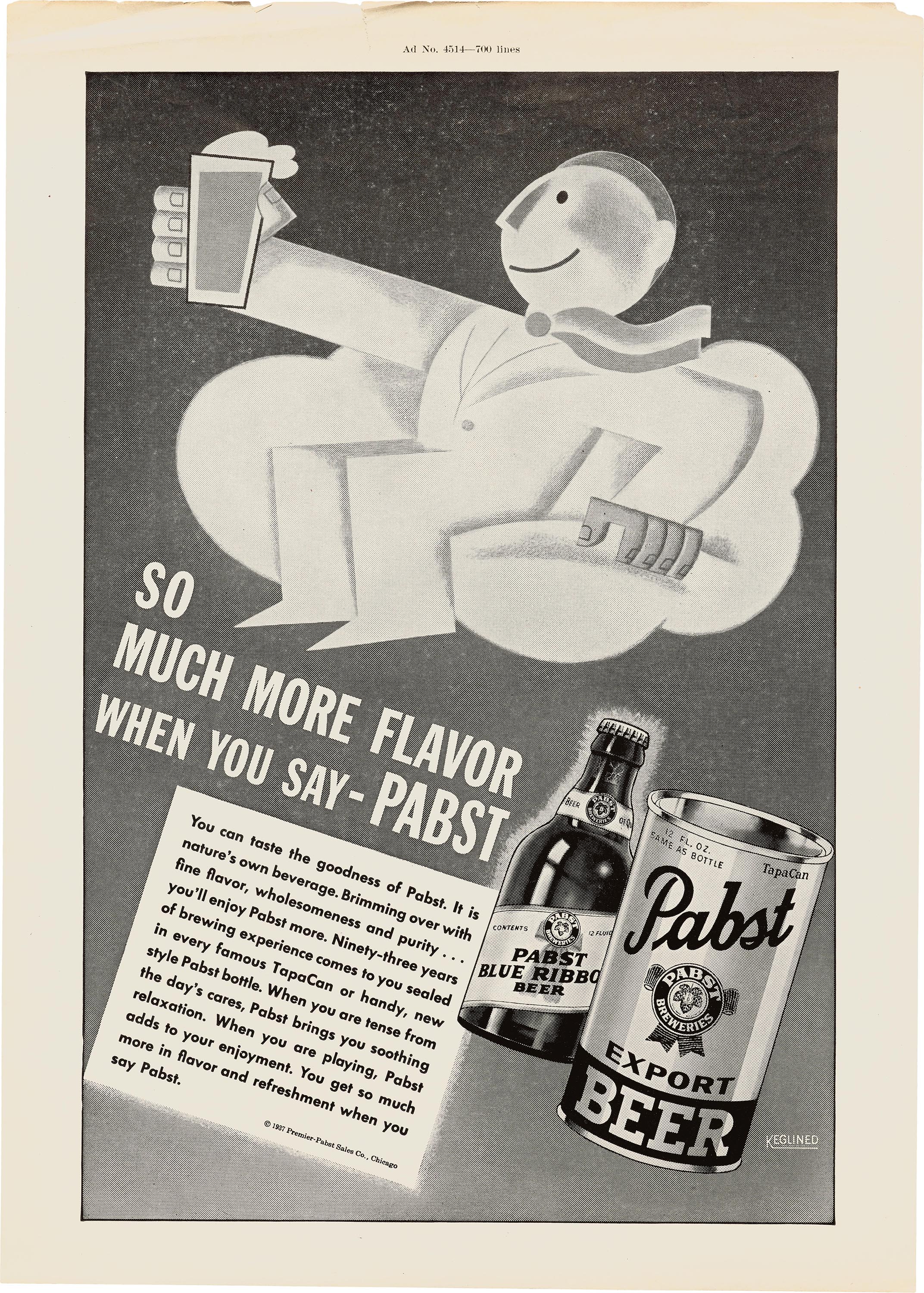
This headline is set in Franklin Gothic Condensed.

This headline is hand lettered in a style possibly derived from Condensed Title Gothic No. 11 used in the color ad above.


")


")


