
Voa Hotels
Contributed by Carlos Mignot on May 21st, 2020. Artwork published in
.
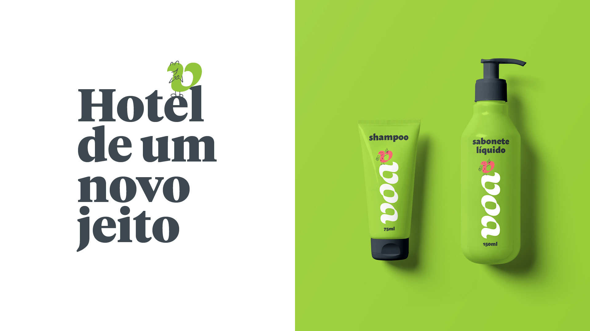
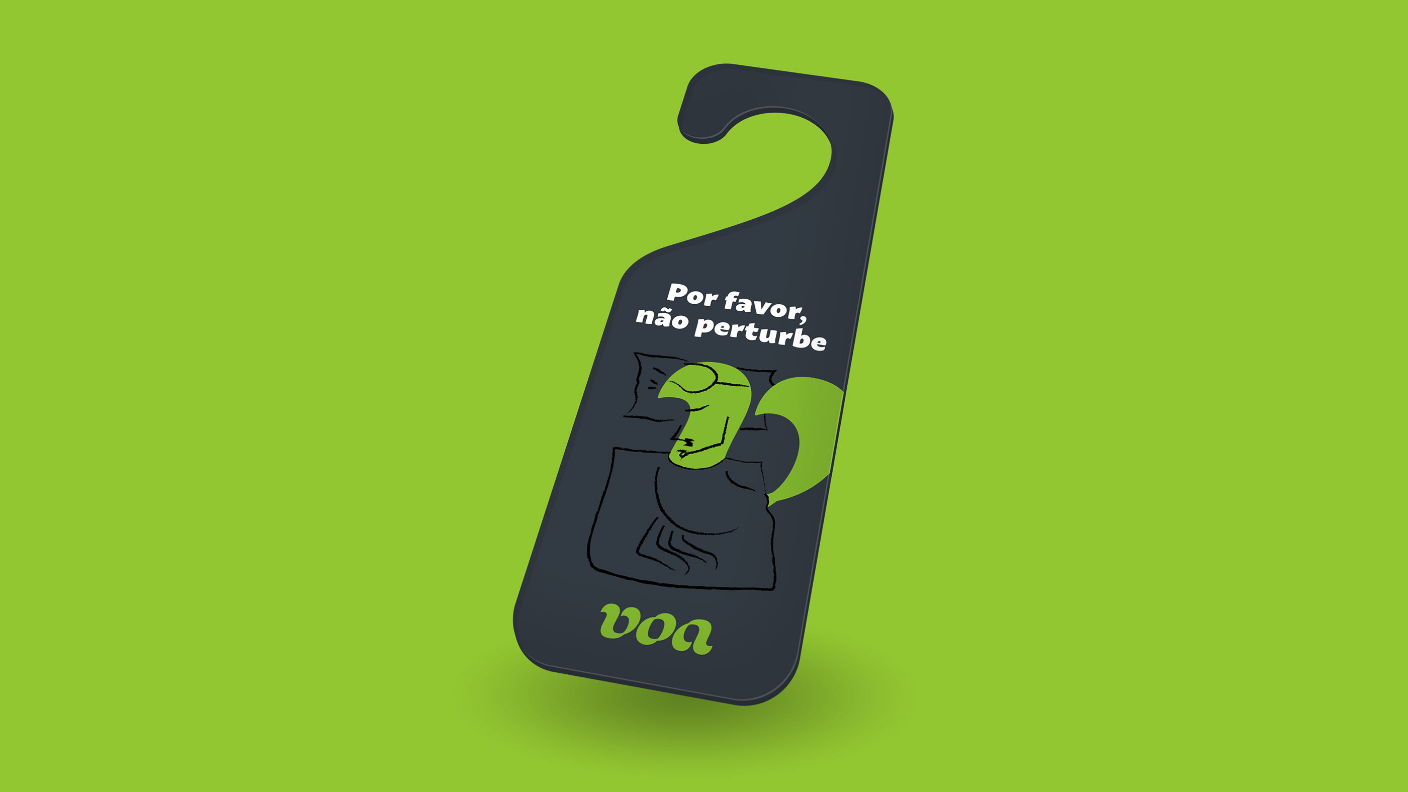
Voa is a Brazilian chain that transforms old hotels into brand new ones with cozy spaces and ready for the digital age. We gave body to their transformation purpose by creating a logotype that can be read from multiple points of view, like magic.
Voa means “to fly” in Portuguese – so we decided to turn the letter v into a cute bird character, sketching all kinds of possibilities for it while staying at one of Voa hotels.
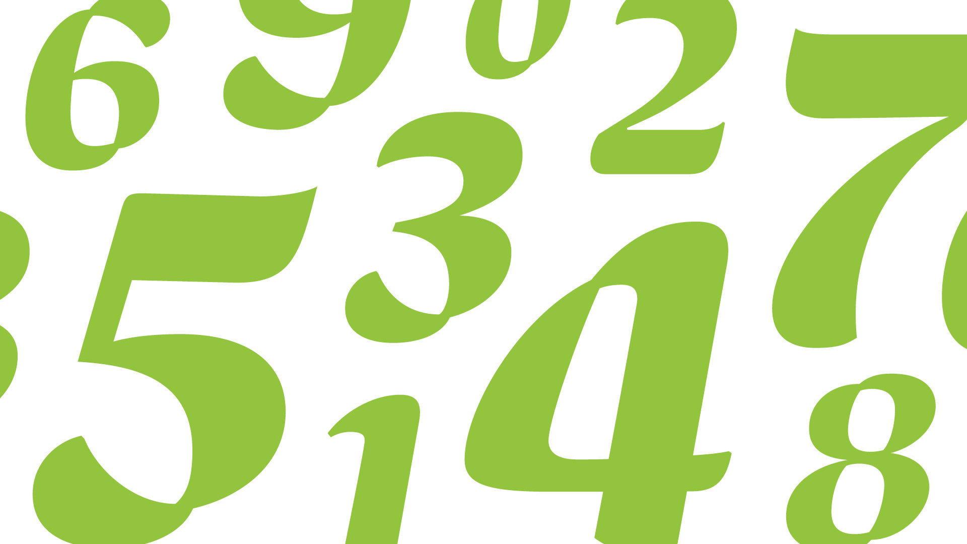
Tiempos Headline Black (Klim Type Foundry) and Macho (Dada Studio) compose the typographical palette. To bring more personality to the set, we created a custom set of numerals based on the logotype.


 TV series titles")


