
Hammer House of Horror (1980) titles
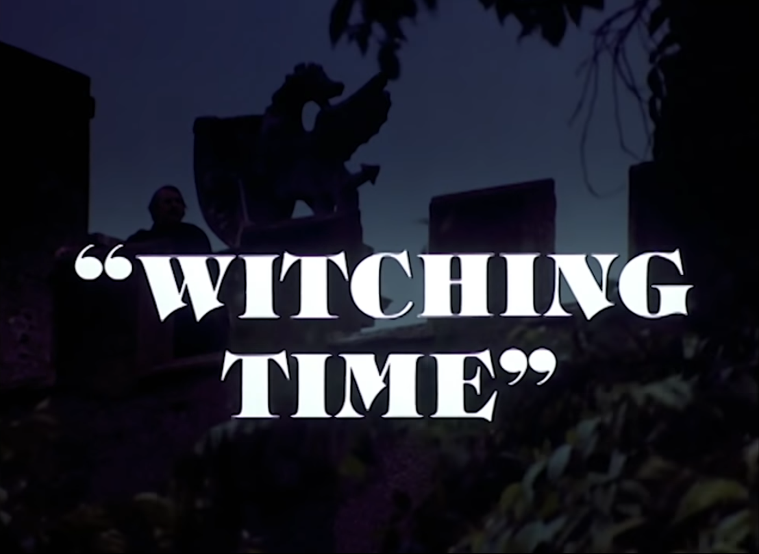
ITC Tiffany is Ed Benguiat’s 1974 revisitation and interpretation of 19th-century faces like West Old Style or Old Style Title. It picks up Victorian details like large angled serifs and sharply terminated diagonals. Especially in the bolder weights, the leg of R resembles a blade that punctures the counter. The M in Tiffany Heavy is one guillotine of a glyph.
No wonder Tiffany was chosen for the titles of Hammer House of Horror. The logo concentrates a double M and four R’s, plus a few more letterforms with diagonals. The spikiness is further increased by the addition of a white outline around the blood-red caps.
“Hammer House of Horror is a British television series made in 1980. An anthology series created by Hammer Films in association with Cinema Arts International and ITC Entertainment [sic], it consists of thirteen hour-long episodes, originally broadcast on ITV.” – Wikipedia
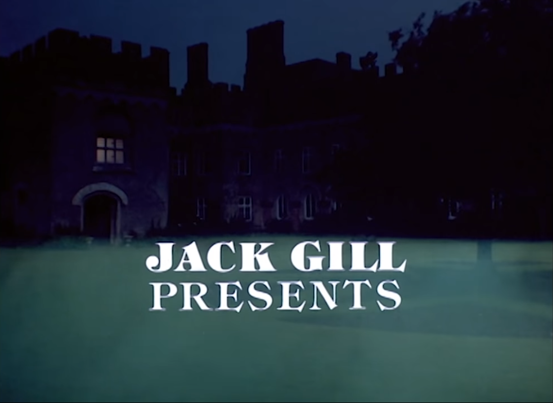
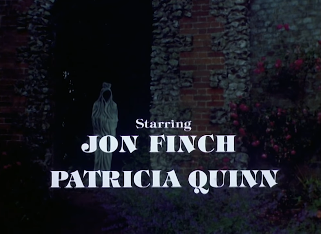
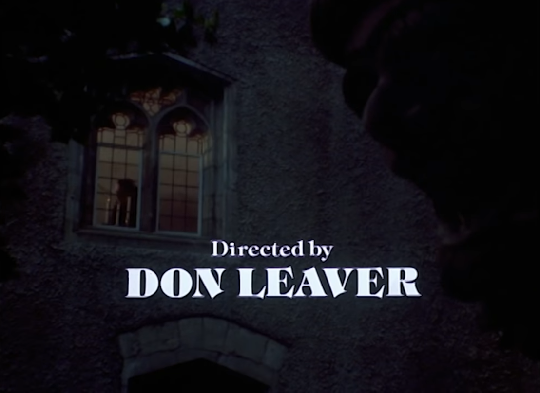
The images show titles from the first episode, “Witching Time”.


 logo")


")


")


2 Comments on “Hammer House of Horror (1980) titles”
My dad really likes this series. There’s a 1991 interview in which Benguiat described Tiffany as “a merge of two typefaces, Caxton and Ronaldson.” But as you say Old Style Title has to have been in the mix.
Thanks for the link, Blythwood! I hadn’t seen that article before. Yes, when I wrote “19th-century faces like West Old Style or Old Style Title”, that was only my guess, and not something Benguiat said himself. Caxton and Ronaldson are also mentioned in U&lc Vol. 8 No. 2 from 1981, when Tiffany’s italics were introduced. From page 31: