Food magazine
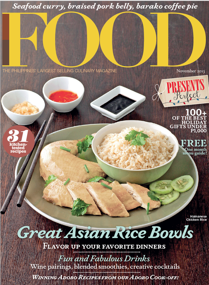
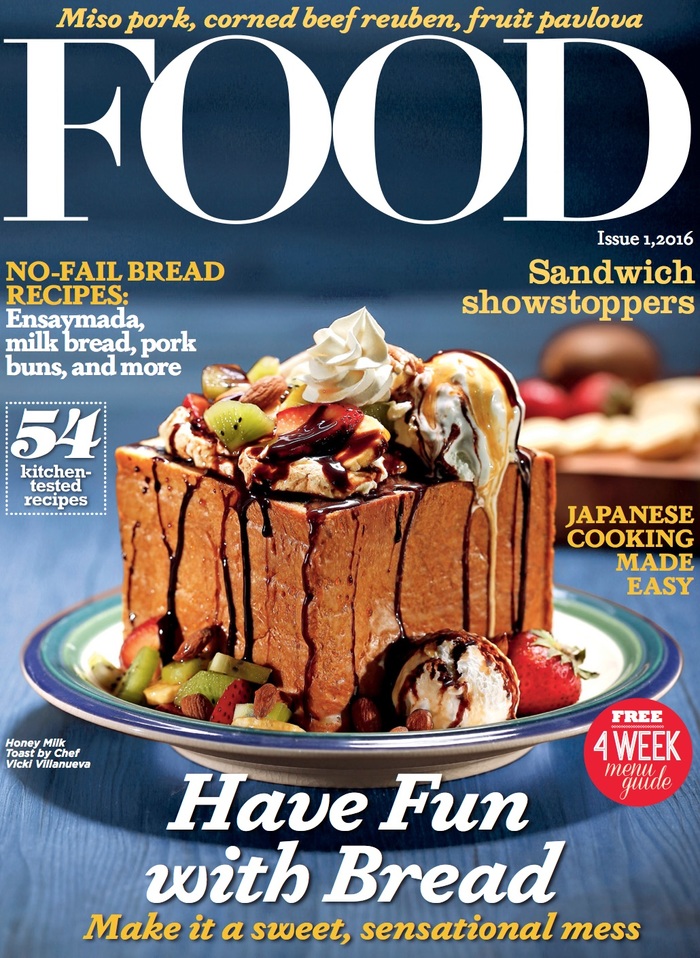
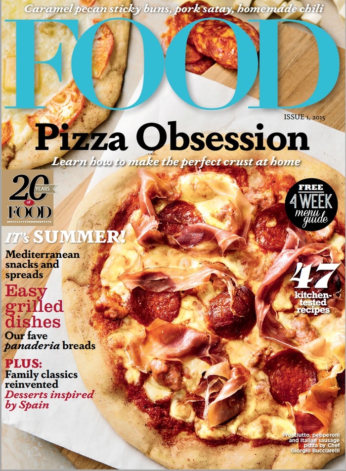
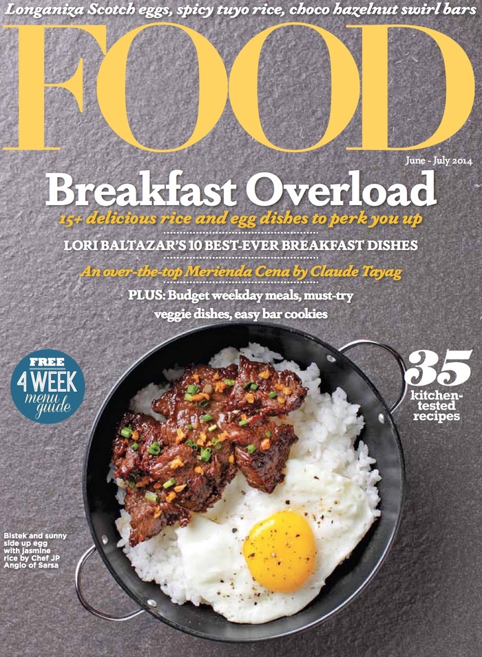
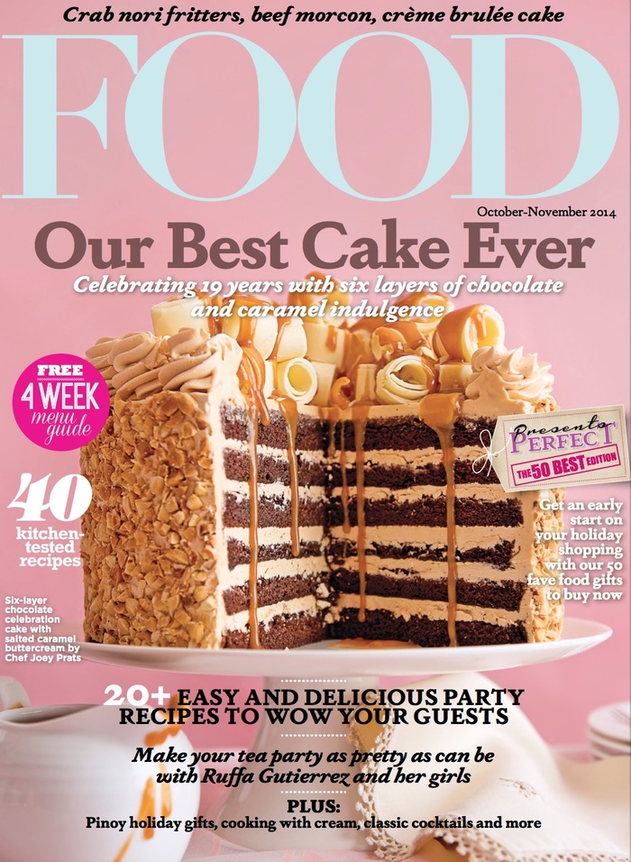
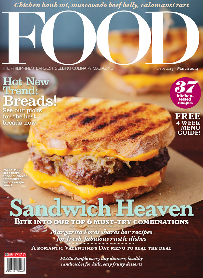
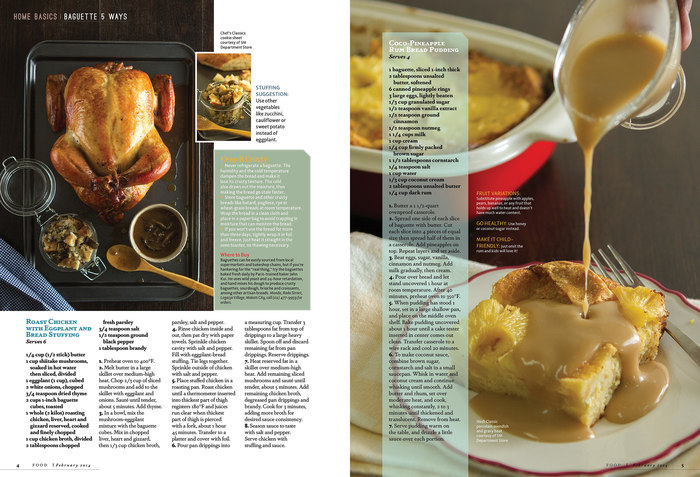
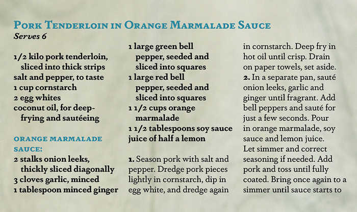
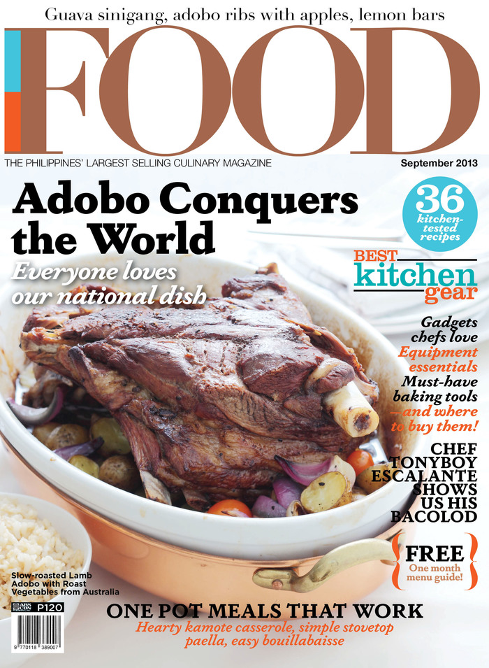
Darden Studio’s Dapifer is the main typeface used by Food, “the Philippines’ largest selling culinary magazine”. The idiosyncratic oldstyle serif appears on the covers as well as on the magazine’s interior pages. Dapifer is employed in a number of roles, from display to running titles and body text, and in sizes ranging from issue titles (>100pt) down to recipes. The Dapifer family spans six weights, from Light to Black. Art director Noel Avendaño uses most, if not all, of them for Food. He frequently applies Dapifer’s lively italics, its small caps, and even the—otherwise rarely seen—italic small caps. Eye catchers like the “Free menu guide” teasers are set in Dapifer Stencil.
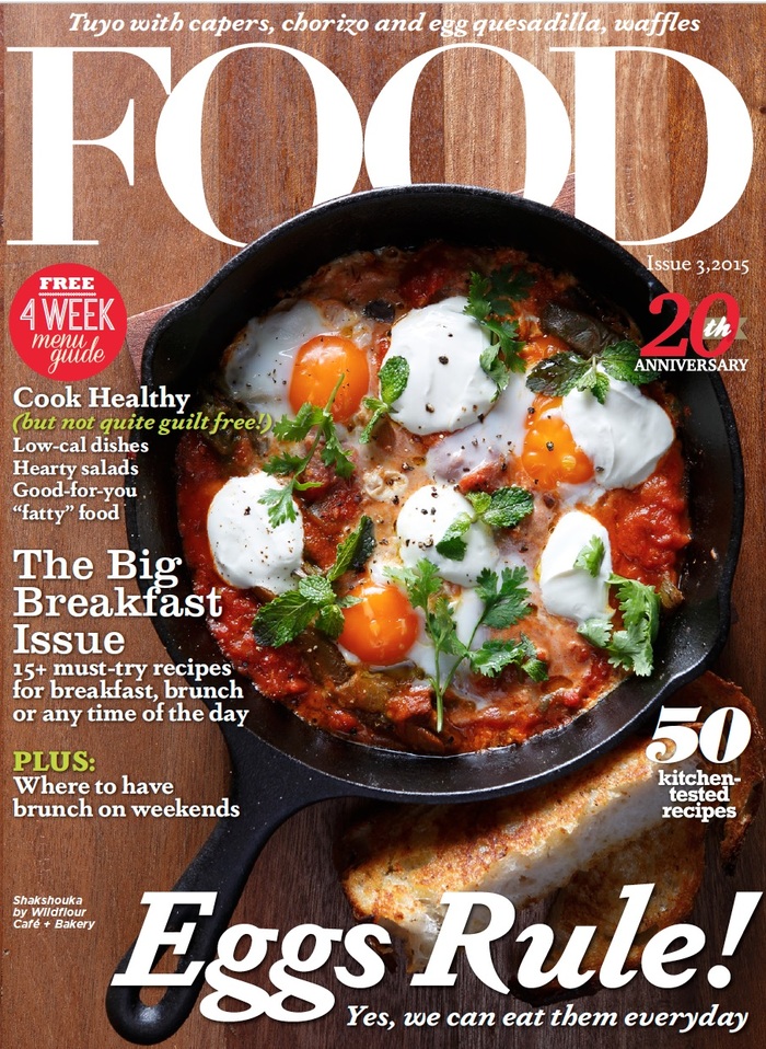
“Eggs Rule!” — the title of the 20th anniversary issue is set in Dapifer Bold Italic.
Formats
- Magazines/Periodicals (1361)
Topics
- Food/Beverage (1949)
Designers/Agencies
Tagged with
- magazine covers (982)
- food magazines (14)
- magazine interiors (783)
- food (154)
- recipes (101)
- typeface combinations (2090)
- small caps (103)
- italics (205)
- center-aligned text (1160)
- sandwiches (12)
- pizza (31)
- meat (26)
- cakes (26)
Artwork location
- Philippines (16)
- Quezon City (1)






















2 Comments on “Food magazine”
What is the font on page 85 of the July 2019 issue that says “HANDBOOK”? Thank you in advance!
Rita, can you upload or link to an image?