Nesthäkchen by Else Ury (Deutscher Bücherbund/Sonocord)
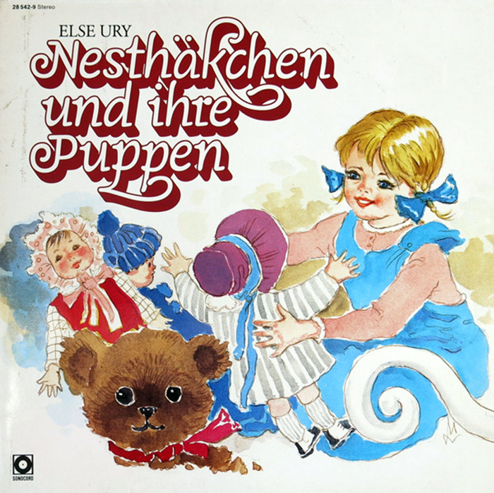
LP front cover.
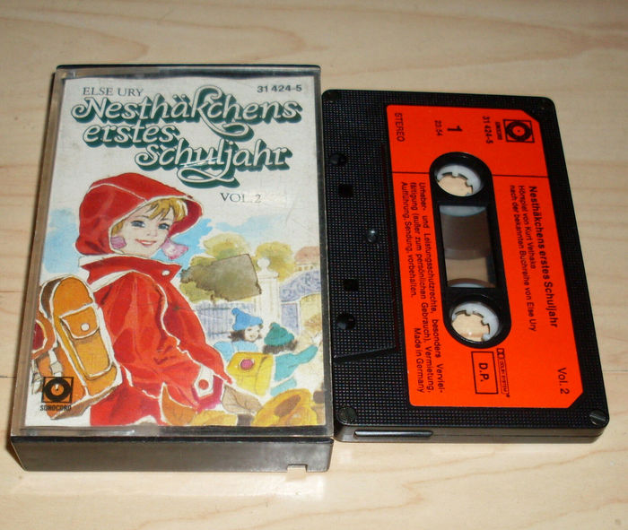
Nesthäkchen is a series of children/teenage girl novels written by Else Ury (1877–1943) in the 1910s and 1920s. In 1984, following the success of a TV adaptation for ZDF’s Christmas series, Deutscher Bücherbund published a new edition in three volumes, each with two Nesthäkchen stories, acccompanied by an audio drama version of the first two novels on the subsidiary record label Sonocord.
The covers of the double LP and two audio cassettes were designed by Fritz Blankenhorn, with illustration by Medard Varsányi. The title typeface is Loreley, which was used for the book covers, too.
Loreley is an unconnected monolinear script with slight slope. It’s one of the more than 40 families (with 200+ styles) that Georg Salden (b. 1930) designed for the GST-Kreis. This collaboration with a group of phototypesetting studios was started in 1972. Every month, Salden came up with a new typeface design that was exclusive to the club members. This arrangement allowed Salden to leave his work as commercial artist behind, start working full time on fonts, and make a living as independent type designer. (In 2017, David Jonathan Ross – unknowingly – revived this idea for the digital age, and launched the Font of the Month Club.)
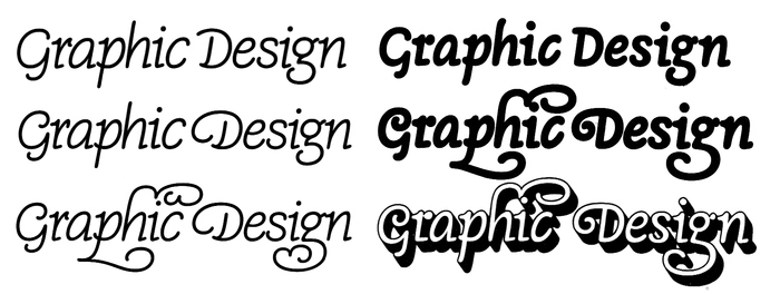
Some of the variants that Loreley and Loretta offered, compiled from samples shown in a 1985 catalog by Stulle, one of the members of the GST-Kreis. Located in Stuttgart, Stulle was probably the typesetting service that Blankenhorn used.
Top: Loretta leicht; Loretta. Middle: Loreley leicht; Loreley with swash alternates. Bottom: Loreley leicht with swash alternates; Loreley Shaded with swash alternates.
The ambitious schedule didn’t allow Salden to come up with completely new and original designs every single month. He was relieved to learn that the members also accepted weight, contour, or shadow variations of existing designs. GST Loreley was drawn in two weights plus outline and shaded styles. The latter is the style used for the Nesthäkchen covers. GST Loretta is a variant with simpler caps. Furthermore, there’s a number of decorative swash alternates that can be used both with Loreley and Loretta, some of which can be seen in this use, too. While several of the Georg Salden Types made between the 1970s and 1990s have since been made available for contemporary use from Salden’s TypeManufactur, Loreley and Loretta are still waiting to be digitized.
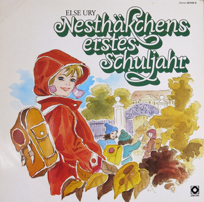
LP back cover.

The gatefold has an outlined version of the cover illustration, allowing the listeners to color it in themselves – an opportunity that the owner of this copy happily seized (at least for the right half).
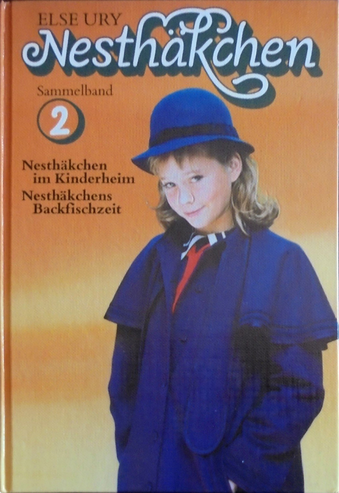
The book covers replace Varsányi’s illustration with photographs. In addition to the descending swash k, this setting also makes use of Loreley’s decorative alternate for h. The secondary text is set in a phototype version of Bembo.
Topics
- Literature (1943)
- Kids (514)
Designers/Agencies
- Fritz Blankenhorn (2)
- Medard Varsányi (1)
Tagged with
- Else Ury (1)
- children’s books (137)
- kids (177)
- girls (11)
- 1980s (438)
- LP (1585)
- radioplays / audio drama (4)
- vinyl records (2247)
- gatefold (53)
- compact cassettes (102)
- Deutscher Bücherbund (2)
- book series (355)
- hardcovers (609)
- book covers (3538)
- Sonocord (2)
- shadow effects (717)
- long shade (59)
- swashes (438)
- alternate glyphs (764)
- German (language) (1336)
- glyph in a circle (115)
- typeface profile (71)
- phototype (49)
- West Germany (129)
- vinyl records (2247)

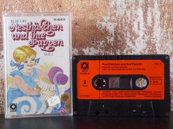






















A glyph set of Loreley can be found here. LudwigType says in the comments that Loreley and Magnet will be soon available in digital form.