The Prodigy band logo (1996–1998)
A look back at the covers from the Fat of the Land period. In memory of Keith “The Firestarter” Flint, 1969–2019
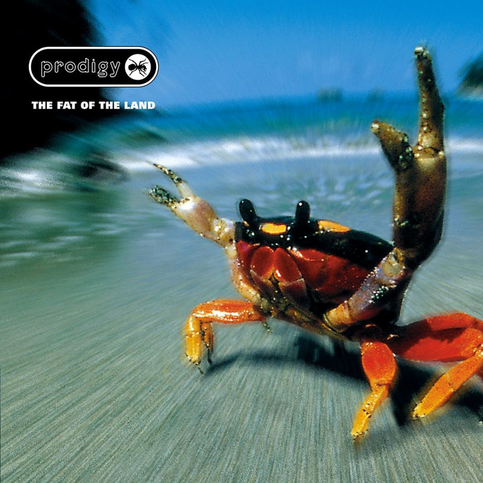
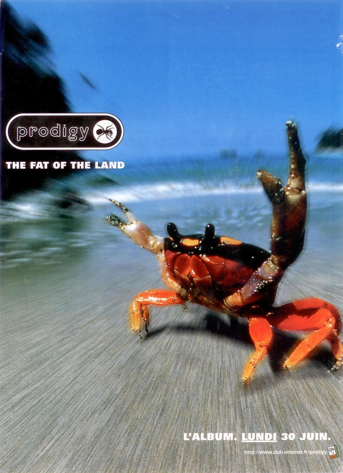
Cover design by Alex Jenkins, with art direction by Liam Howlett. Photography by Konrad Wothe, Silvestris.
In 1996, The Prodigy introduced a new band logo. The first logo from 1991 was loosely based on Peignot, redrawn and with a heavy outline added. It appeared flat on the debut album Experience (1992), and, from 1993 on, in a distorted variant that was also featured on the cover of the second album Music For The Jilted Generation (1994).

In the new logo, the article was dropped from the name. Enclosed in a cartouche and supplemented by a stylized ant, “Prodigy” was now rendered white on black, in outlined lowercase letters from Keedy Sans. This quintessential 1990s typeface with highly idiosyncratic forms was designed by Jeffery Keedy and released by Emigre in 1991. The logo was used for their third studio album from 1997 as well as the preceding single releases.
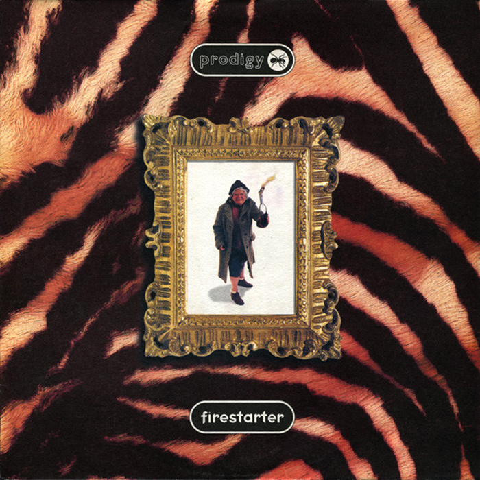
“Firestarter” was released on 18 March 1996. It became the group’s first number-one single on the UK Singles Chart. Photography by Colin Hawkins. Keedy Sans is also used for the title, again in all lowercase letters in a cartouche.
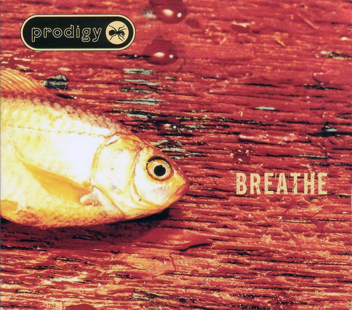
“Breathe” followed in November 1996 as the second single. Photography by Mary Farbrother. The title is in an eroded version of Alternate Gothic No. 2.
The Fat of the Land came out on 30 June 1997 by XL Recordings in the UK and on 1 July by Maverick Records in the US. It reached number 1 in 22 countries in the first week. In 1999, the album entered the Guinness World Records as the fastest-selling UK dance album. As of 2019, it has sold over 10 million copies worldwide.
In 1996, I travelled to Belgium for Rock Werchter. I came to see Beck and the Smashing Pumpkins, but stayed for the Prodigy. I hadn’t been much into electronic music before, but their performance (and also the ones by the Chemical Brothers and Daft Punk) changed that for good. A year later, I had the chance to see them again at V97 in Leeds. This was just mind-blowing. I can’t claim I became a real Prodigy fan – listening to the records wasn’t quite the same, and ultimately not my cup of tea – but that live show was unforgettable. From mea95dad’s report:
It was a highly impressive bill of bands that came together in the grounds of Temple Newsam stately home on August 16th as one half of the V97 festival. […] It’s been known for a long time that the Prodigy are the most vigorous and electrifying live act around today, but even by their standards tonight’s show was an absolute blinder. […] The greatest thing was the sheer volume of the effect. Instead of the usual pocket of fans going mental in front of the stage the feeling this time spread out, making people about 100 yards back from the stage move and dance along, whether they knew it or not. An incredible experience, and strangely tranquil, in spite of the volume. Keith and Maxim were giving it the usual manic display while blondie Liam went quietly bonkers inside his 3 or 4 walls of technology.
Here’s some video from the gig at the twin festival in Chelmsford the day after. Breathe the pressure / Come play my game I’ll test ya / Psychosomatic addict insane. In my memory, it was a lot louder.
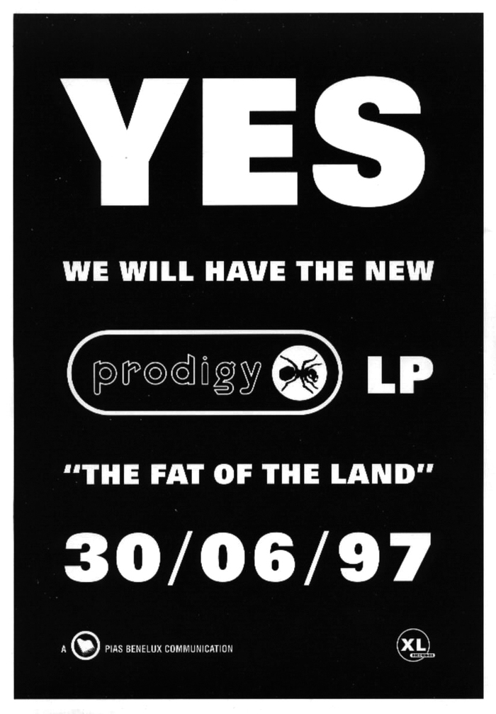
Announcement by Belgian record company PIAS. The heavy sans serif caps that also appeared on the album cover are from the fattest member of Univers, the 85 Extra Black.
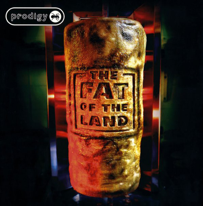
“Originally, the cover was going to be a doner kebab being roasted on a stick and branded with the name of the album. XL designer Alex Jenkins shot the image, then Howlett changed his mind at the last moment, forcing Jenkins to source the dancing crab photo, which he faxed to Howlett to approve. The claw was increased in size, making it look like the crab is sticking two fingers up to the world.” — theprodigy.info
Typefaces
Formats
- Advertising (1402)
- Branding/Identity (4749)
- Album Art (2599)
Topics
- Music (3881)
Designers/Agencies
- Alex Jenkins (1)
- Liam Howlett (1)
Tagged with
- The Prodigy (1)
- album records (1556)
- XL Recordings (1)
- Maverick Records (2)
- single records (656)
- 1990s (218)
- big beat (2)
- breakbeat (2)
- electronic music (328)
- crabs (6)
- fish (67)
- ants (2)
- outlined type (837)
- type in a cartouche (79)
- band/artist logos (133)
- high profile (511)
Artwork location
- United Kingdom (2130)
- London (1196)
- Essex (3)









1 Comment on “The Prodigy band logo (1996–1998)”
Keith and the prodigy were true pioneers