Jean Derome – Le Magasin de Tissu album art
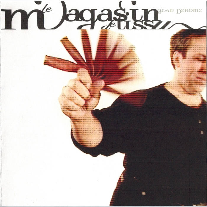
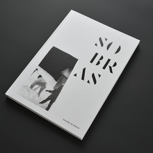
Front cover
The late Frank Heine’s Dalliance is rarely chosen as a body text typeface. Jean Derome’s Le Magasin de Tissu features the most extensive printed use of the upright Dalliance I’ve seen that isn’t promotional material for Dalliance itself. The album sounds as crazy as any Jean-Pierre Jeunet film looks, and it carries some interesting typographic context.
In the mid-1980s, the musician and designer Hans Reichel invented the daxophone, beginning as a piezoelectrically amplified thin strip of wood G-clamped to a table, played with a variety of implements including a cello bow, which in combination with the crucial finely articulated glissandos from its rocking curved wooden “dax,” could eerily and accurately emulate human or animal vocal sounds, beginning with the European badger (der Dachs) after which Reichel named the instrument. He refined the sound body into a portable tripod design, using various woods, from cocobolo to purpleheart to lignum vitae, with which he was already well familiar from his previous unorthodox guitar builds. Reichel toured far and wide playing improvised music on several continents, and he released a number of albums, starting in the 1970s on Berlin’s genre-defining FMP label. At the same time he designed a number of typefaces, beginning with Barmeno for the original Berthold foundry, then later FF Dax, FF Schmalhans, FF Sari and a few others for FontFont. In 2007 Reichel gave a daxophone performance at TYPO Berlin.
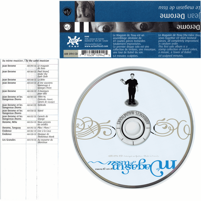
CD tray insert with type in Dalliance, Dalliance Script and FF Sari
Meanwhile in early 1980s Quebec, progressive rock guitarist René Lussier and his partners Jean Derome, Robert Marcel Lepage and André Duchesne founded the record label Ambiances Magnetiques, to spread their uniquely Quebecois form of free improvisation music across the globe. They named this style Musique Actuelle. One hesitates to subsume it under the umbrella of “free jazz,” with all of its inaccurate connotations of tiresome American-idiomatic scoobadabeebaboo schmazz. You could just as easily say that about much of the free improvisation sound coming out of the German FMP label at the time, home to Hans Reichel’s recordings—this is also decidedly not schmazz. This music has deeper roots in European folk songs, marches and languages. Indeed Lussier’s own masterwork Le trésor de la langue structures the timing, articulation and pitch of its playing around the cadence of spoken Quebec French recordings.
At some point in or before 1989, Hans Reichel and René Lussier met at or around the Festival International de Musique Actuelle de Victoriaville (FIMAV), a more or less annual festival for this sort of music since 1983, and Lussier became sufficiently enamored of the daxophone to get or build one himself. Eventually he performed on his daxophone alongside Reichel on at least two separate occasions, sadly for none of which I can find recordings. After Reichel giving birth to the daxophone in Europe, Lussier has become the most prolific daxophone player in North America, rivaled arguably only by Kazuhisa Uchihashi in the opposite hemisphere. Lussier first featured it on his 1990 album Le Corps de L’Ouvrage. To this day, Lussier features daxophone prominently on most of his new albums.
Not surprisingly, Reichel’s fonts FF Dax and FF Sari started showing up in the label’s album art as well. FF Dax became the default body text font at least for the spines, promo inserts and spine blurbs, on those occasions when it didn’t show up in the album notes themselves.
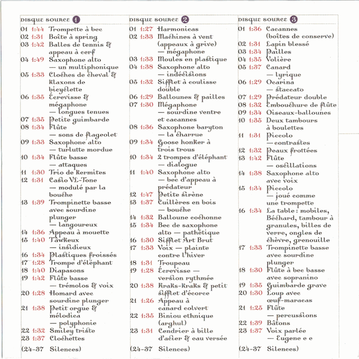
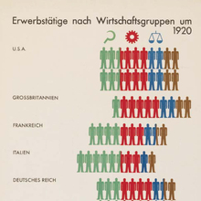
Table of contents of the three CDs with source recordings.
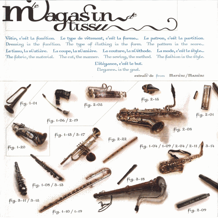
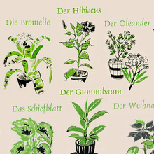
Overview of the instruments used in the recording.
The whimsical barnyard allure of the daxophone fits perfectly within the Musique Actuelle sound. When it all started, Lussier and Duchesne were the two guitar players on the label, and Derome and Lepage were the two reed players. (All are composers and multi-instrumentalists, of course.) Much of their recorded music began as commissioned accompaniment for dance and theatre pieces.
In the course of making those, Jean Derome accumulated a large suitcase full of various noisemakers, from animal calls to novelty toys to completely unrelated objects that just happen to make silly sounds, which served well as dramatic punctuation in such pieces. Over the years he systematically recorded and catalogued these noisemakers, culminating in this 2001 CD, Le Magasin de Tissu.
Even though Lussier is thanked in the liner notes, there appear to be neither daxophones nor guitars on this CD. All of that detail was context and prelude. The zoo of noisemakers on this CD is entirely Derome’s own.
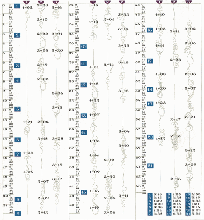
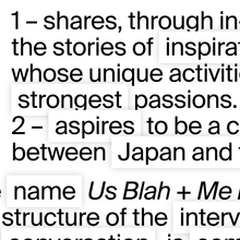
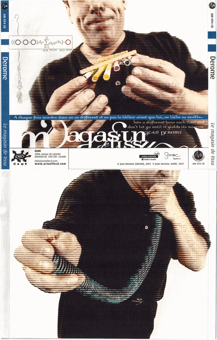
“Railway timetable” using Dalliance flourishes to locate each instrument’s entrance into the recording
Using some numerological constraints, Derome set up three CDs worth of source recordings and 13-second silence snippets so the exhibition could be played back in a random order, yielding a different output in each performance. The album itself is one of these performances, not to be confused with his private three CDs of source material. The liner notes, designed by Luc Beauchemin, showcase Heine’s font Dalliance, which had been newly released by Emigre at the time. Dalliance’s Script counterpart shows up sparingly in the liner notes, and FF Sari shows up on the back of the CD. Beauchemin makes a point of using lots of Dalliance’s flourishes and alternates, including a few instances of final forms in the middle of words. My favorite detail is his schematic for which noisemakers show up at which points on the CD, like some sort of filigreed railroad timetable. It tells us, for example, that the strange helium babbling beginning sixteen seconds into track 9, opposite the vrrp-vrrp-vrrping firetruck whistle, is something Derome himself must have named the tâwkeux-insidieux, which is sadly ungooglable. We’re left with only a tiny picture of something resembling some kind of animal call. I would love to meet such an animal.
Derome and Lussier have collaborated extensively, and they have a series of duet albums under the group name Les Granules. They’re magnificently goofy.
Compared to Reichel, Lussier and Derome, I’m far less familiar with Dalliance’s designer Frank Heine, other than the fact that like Reichel, he died before his time. Like many designers in the 1990s, Heine began in what became slurred as the “postmodern” or “grunge” type genres, but his final types like Dalliance and Tribute stand up well and are genuine treasures. Dalliance masters the same tension between structure and silliness as Derome’s music, and could not be a more perfect body text choice for the liner notes. Luc Beauchemin must have fallen in love with Dalliance the moment he saw it, which could be the only reason he so meticulously used as many of its alternates, ornaments and features as he could manage to fit into the project. The upright Dalliance, which was a more fanciful outgrowth of the original Dalliance Script based on a historical model, also happens to mesh well with the whole upright French script idiom which lends itself well to the hyperfrancophony of Quebec.
Hunt down and own this CD. Aside from being Worth Owning For The Type Alone, it’s also one excellent musical gateway from type design into the delirious world of musical free improvisation. This record was released on CD only, as far as I can tell, but I hope one day it might be reissued in vinyl format to better show off both its sound and its look.
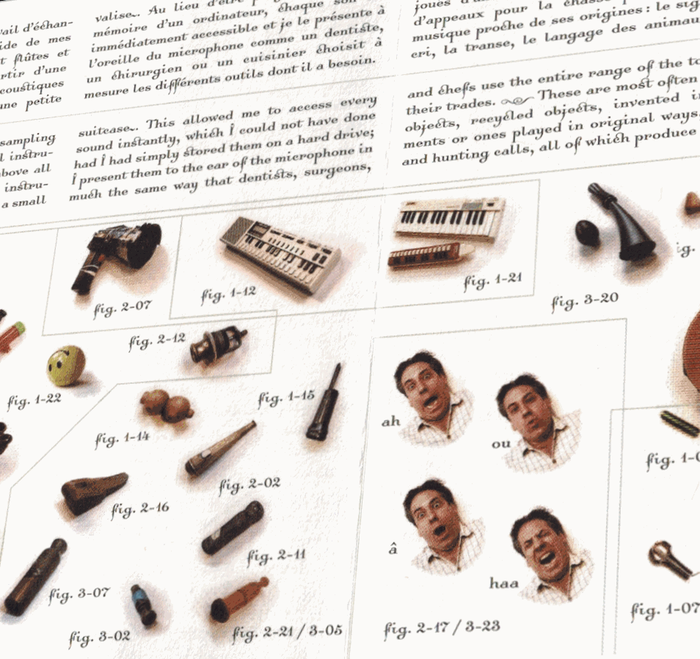
Liner notes detail in Dalliance
Typefaces
Formats
- Infographics/Maps (386)
- Album Art (2641)
Topics
- Music (3947)
- Performing Arts (589)
Designers/Agencies
- Luc Beauchemin (1)
Tagged with
- free jazz (7)
- sound effects (1)
- Jean Derome (1)
- Ambiances Magnétiques (1)
- album records (1854)
- compact discs (CDs) (222)
- 2000s (54)
- alternate glyphs (764)
- swashes (438)
- type series (626)
- terminal forms (23)
- mid-word style change (137)
- tight letterspacing (538)
- tight linespacing (205)
- tables of contents (629)
- track listings (557)
- multilingual (1191)
- French (language) (1270)
- English (language) (1091)
- discretionary ligatures (232)
- musical instruments (46)
- saxophones (26)
- trumpets (33)
- clarinets (4)
- harmonicas (2)
- flutes (5)
- liner notes (63)
- back covers (977)
- flourishes (12)
- early uses (1290)


