

Mugison Mugiboogie tour poster
Contributed by Florian Hardwig on Apr 3rd, 2013. Artwork published in
.
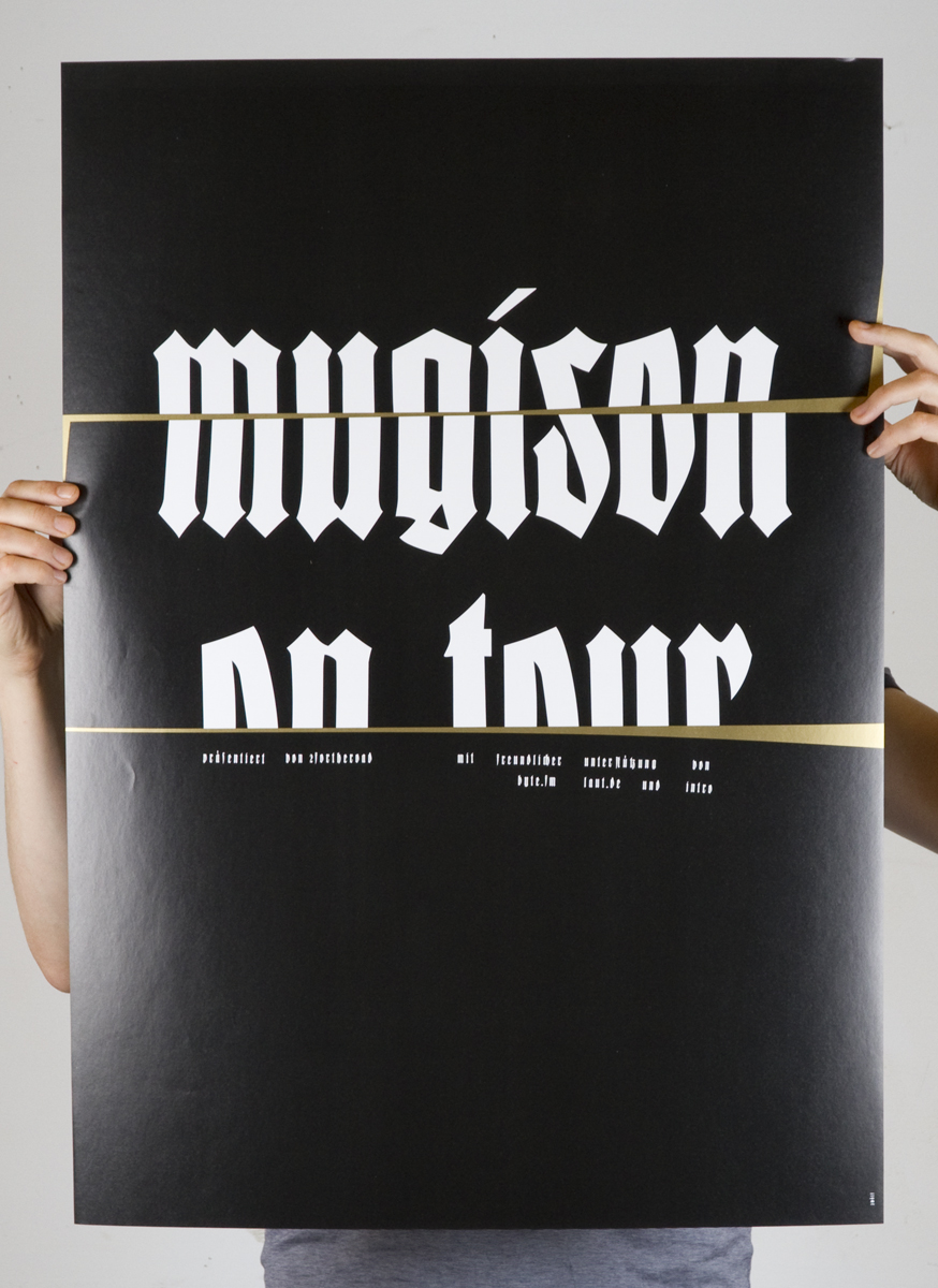
Poster for selected shows of the manic Icelander in Germany. Client: 2fortheroad Booking Agency.
The type looks like Rudolf Koch’s Deutsche Anzeigenschrift, originally published by D. Stempel AG. The “Schmal” (Narrow or Condensed) has been revived by Dieter Steffmann and Ralph M. Unger. Delbanco has the “Breit” (Wide), while Gerhard Helzel offers two weights, Breit and Schmal. Very likely, none of those digitizations were employed in the making of this poster. The letters used here are probably derived directly from a historic source and could be based on the “Eng” (Compressed). The ‘s’ is clearly different, though. It probably was customized because the original form doesn’t lend itself to being cut in half horizontally.


")


")


1 Comment on “Mugison Mugiboogie tour poster”
Wittenbach (Scriptorium, 1993) appears to be an interpretation of Koch’s Enge Deutsche Anzeigenschrift (Stempel, 1923).