An independent archive of typography.
to participate.
Topics
Formats
Typefaces

Maison Dentaire, No32

Contributed by Studio July on Nov 6th, 2020. Artwork published in
October 2020
.
    Maison Dentaire, No32 1
    Source: studiojuly.co License: All Rights Reserved.

    Global brand strategy and identity development for Maison Dentaire No32 – a multigenerational dental clinic blending heritage and youth to form an old school reminiscing celebration. July’s creative vision was to infuse a feeling of establishment, confidence and experience with a young attitude – through a gritty tone of voice and a crisp yet daring typographic treatment.

    Walking into Maison Dentaire, you immediately feel it is not your typical dental clinic. The familiar and laid back atmosphere makes you feel that you’re in good hands – it’s comparable to walking in your neighbourhood’s barbershop, where you will sip a whiskey while waiting for your ‘man’ to groom you. That same person who was taking care of your ‘pa and Grandpa, making sure they always looked fresh and on point. “It’s not a men’s cave, it’s just about the global spirit.” Patients actually enjoy going to the dentist, it becomes their good moment in a bad day, even with a bad tooth.

    You know these old type specimen books? We never start a new project without taking time to flip through their pages – although amazing typefaces are being designed today, sometimes the older, poorly digitized typefaces can bring something special to the equation.

    Looking at the dental world from a very elementary stand point: teeth, roots, bones, strings, pointy tools etc., we come up with qualitatives that illustrate these aspects and translate them typographically – fragility, growth, morphology, transformation, intricacy, detail and craft. We settled on Gascogne by Frederic Goudy, for its effortless attitude – we immediately found it could feel young and gritty, while conveying a sense of confidence and establishment. The pointy yet rounded letter ends felt dental, the wide nature of the letters also felt dental, as in when you’re asked to “open wide” etc. It’s always a good challenge to design a logotype that can “feel” like a certain field, without necessarily having to use recognizable graphic references. The S was completely customized to bring a visual “vibration” to ‘Maison’, boosting the logotypes’ personality, and smooth ligatures were carefully integrated throughout the logotype as a nod to bones growing, fusing together, and morphology – just like the NT ligature, that was also used as a stand-alone typographic element in the ‘No32’ symbol. Yeah, we didn’t just type a classy serif…

    Maison Dentaire, No32 2
    Source: studiojuly.co License: All Rights Reserved.
    Maison Dentaire, No32 3
    Source: studiojuly.co License: All Rights Reserved.
    Maison Dentaire, No32 4
    Source: studiojuly.co License: All Rights Reserved.
    Maison Dentaire, No32 5
    Source: studiojuly.co License: All Rights Reserved.
    Maison Dentaire, No32 6
    Source: studiojuly.co License: All Rights Reserved.
    Maison Dentaire, No32 7
    Source: studiojuly.co License: All Rights Reserved.
    Maison Dentaire, No32 8
    Source: studiojuly.co License: All Rights Reserved.
    Maison Dentaire, No32 9
    Source: studiojuly.co License: All Rights Reserved.
    Maison Dentaire, No32 10
    Source: studiojuly.co License: All Rights Reserved.
    Maison Dentaire, No32 11
    Source: studiojuly.co License: All Rights Reserved.
    Maison Dentaire, No32 12
    Source: studiojuly.co License: All Rights Reserved.
    Maison Dentaire, No32 13
    Source: studiojuly.co License: All Rights Reserved.
    Maison Dentaire, No32 14
    Source: studiojuly.co License: All Rights Reserved.
    Maison Dentaire, No32 15
    Source: studiojuly.co License: All Rights Reserved.
    Maison Dentaire, No32 16
    Source: studiojuly.co License: All Rights Reserved.
    Maison Dentaire, No32 17
    Source: studiojuly.co License: All Rights Reserved.
    Maison Dentaire, No32 18
    Source: studiojuly.co License: All Rights Reserved.
    Maison Dentaire, No32 19
    Source: studiojuly.co License: All Rights Reserved.
    Maison Dentaire, No32 20
    Source: studiojuly.co License: All Rights Reserved.
    Maison Dentaire, No32 21
    Source: studiojuly.co License: All Rights Reserved.
    Maison Dentaire, No32 22
    Source: studiojuly.co License: All Rights Reserved.
    Maison Dentaire, No32 23
    Source: studiojuly.co License: All Rights Reserved.
    Maison Dentaire, No32 24
    Source: studiojuly.co License: All Rights Reserved.
    Maison Dentaire, No32 25
    Source: studiojuly.co License: All Rights Reserved.
    Maison Dentaire, No32 26
    Source: studiojuly.co License: All Rights Reserved.

    Typefaces

    • Gascogne
    • Swiss 721

    Formats

    Topics

    Designers/Agencies

    Artwork location

    3 Comments on “Maison Dentaire, No32”

    1. Even though Frederic Goudy was a prolific type designer (with multiple typefaces named after him), Gascogne is not one of his own. It was designed by Walter Florenz Brendel, based on Goudy Light Old Style.

    2. Here is a sample of Goudy’s original from D.J.R. Bruckner’s book about Goudy’s work (Abrams, 1990): Monotype 38-E Roman. Gascogne shares most of the original lettershapes, albeit less irregular. In contrast to Gascogne, 38-E had oldstyle numerals, and ligatures.
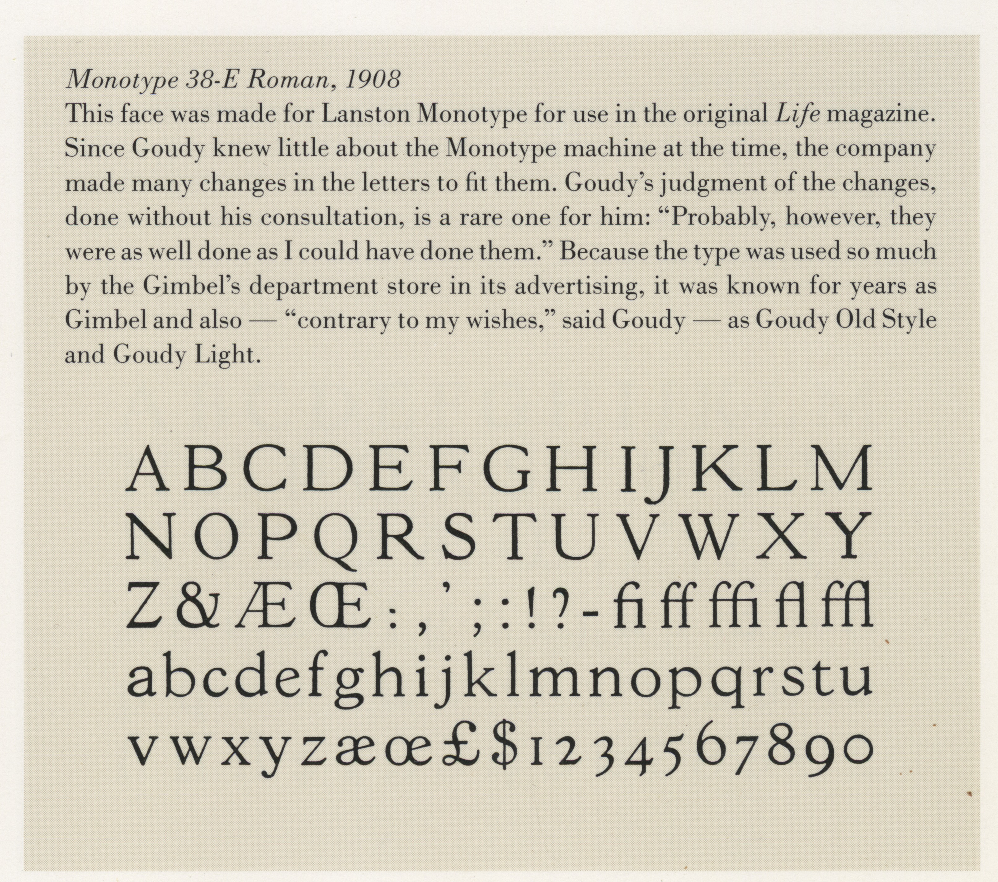
    3. Thanks for clarifying this, and for sharing a specimen of Goudy’s 38, Matthijs!

      I don’t know if Walter Florenz Brendel (1930–1992) personally designed Gascogne, but it’s correct that this typeface originated at his Brendel Type Studio. The idea was to take existing designs and make them more usable for contemporary use by expanding them to a range of weights, often including outline and shadow variants, and typically raising the x-height. In this regard, the approach was not unlike ITC’s (see e.g. their text=Cheltenham, Souvenir or Korinna). What’s different between ITC’s adaptations and Brendel’s is, as far as I understand it, that the latter weren’t always authorized or licensed, and didn’t keep the original names. In some cases, Brendel copied and expanded relatively new designs from contemporary type designers, with minute changes. In the 1980s, Brendel’s “Serial” typefaces were available from Typeshop, a chain of phototypesetting studios with offices in several European countries.

    Post a comment