
Carhartt “Work In Progress” Retail Stores
Contributed by Stephen Coles on Apr 7th, 2013. Artwork published in
circa 2013
.
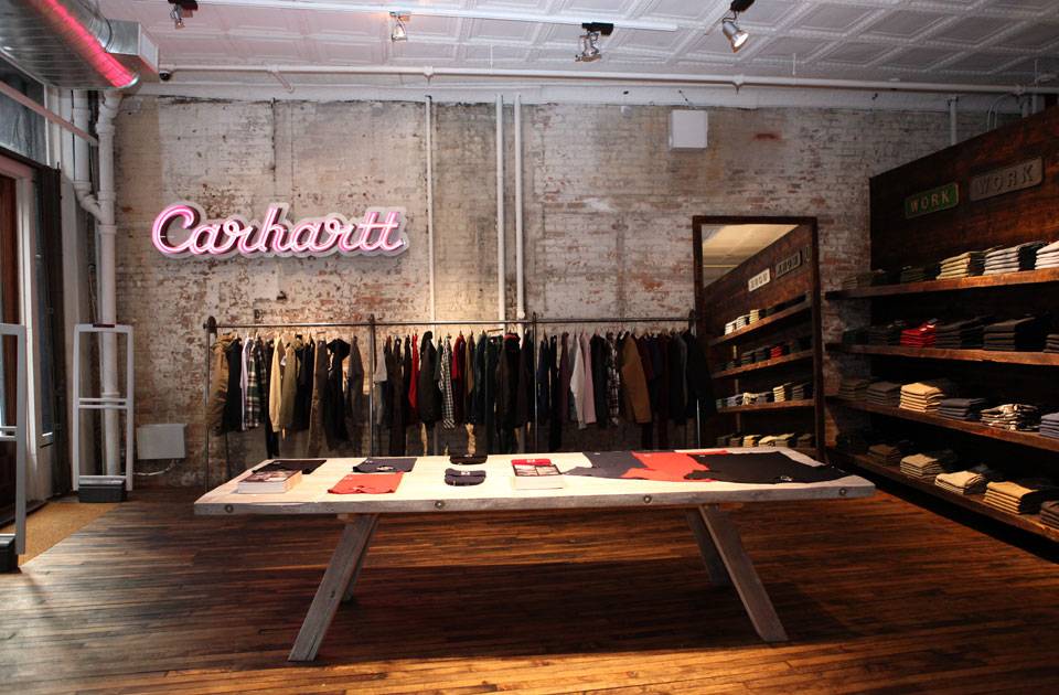
New York City
Above: Magnus Rakeng spots his own typeface in the Carhartt WIP store in Soho.
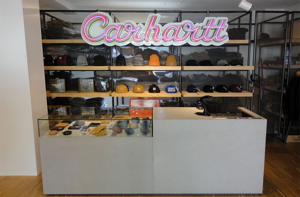
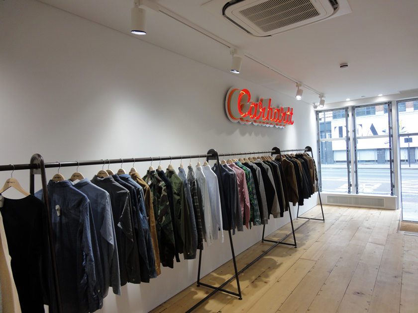
The gentle curves and mostly monolinear structure of Radio are well suited for neon, and these signs are a standard part of Carhartt’s in-store decor in locations throughout the globe.
Source: plus.google.com License: All Rights Reserved.
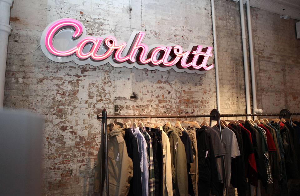
New York City
Source: plus.google.com License: All Rights Reserved.
New York City
Source: www.carhartt-wip.com License: All Rights Reserved.
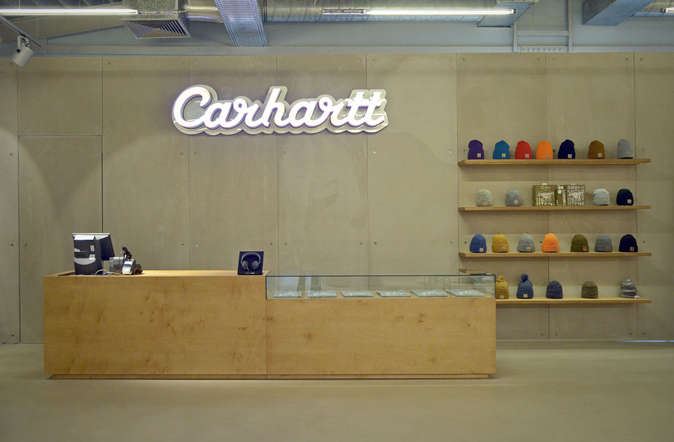
Düsseldorf
Source: www.carhartt-wip.com License: All Rights Reserved.
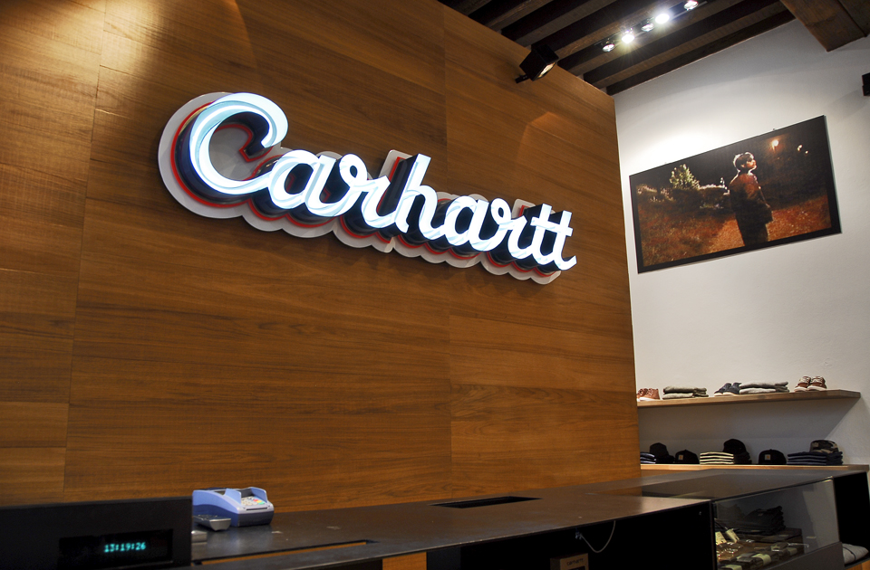
Verona

Source: www.carhartt-wip.com License: All Rights Reserved.
Moscow
Source: www.carhartt-wip.com License: All Rights Reserved.
Zürich
Source: www.carhartt-wip.com License: All Rights Reserved.
London


")


")


</span>")


2 Comments on “Carhartt “Work In Progress” Retail Stores”
The signage looks great—I’ve always loved Radio. But I’m amusing myself thinking what the machinists I used to work with in Alaska would make of this place. Give it up for Carhartt—they’re a savvy company. But I wonder what the meetings among its division heads are like.
From what I gather, Works In Progress is a completely separate label from the original Carhartt which still sells gear for heavy labor. But, yeah, it’s interesting that they chose to keep the Carhartt name for this city slicker offshoot.