Fantasy Island Adult Book Store
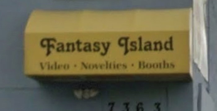
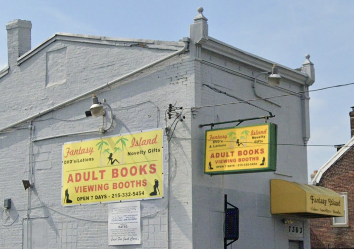
Fantasy Island is a shop featuring adult books, novelties, videos, and viewing booths. (It is located in Philadelphia, a few yards down the street from Four Seasons Total Landscaping, which was made famous by Donald Trump’s legal team who held a press conference there on November 7, 2020.) The shop’s awning sign uses a typeface commonly found on 1980s storefronts, Tango. In its current state (November 2020), the sign is suffering from the weathered peeling characteristic of vinyl, but Tango’s descending swash caps reveal its identity. On Google Maps, you can see the sign in a less corroded state, and witness its steady deterioration with each capture over the last 13 years.
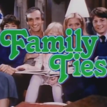
Tango, a popular Letraset style by Colin Brignall released in 1974, was probably inspired by Joe Caroff’s stacked and interlocked lettering for the steamy 1972 film, The Last Tango in Paris. Perhaps, the signmaker for this adult bookstore was inspired by Tango’s erotic pedigree and used it as a winking reference, but I think pure luck is more likely.
As is common with small, indie shops without the means or interest in a consistent visual identity, Fantasy Island’s other signs employ a different swashy casual font: Freehand 521 (Bitstream’s version of the 1934 Mandate). The sans is Arial Black.
Formats
- Signs (1383)
Topics
- Retail/Shopping (672)
Designers/Agencies
- unknown (2140)
Tagged with
- erotica (27)
- bookstores (19)
- yellow (310)
- yellow and black (305)
- red and yellow (110)
- palm trees (31)
- vinyl (material) (15)
- eroded/weathered type (125)
- uncertain typeface ID (160)
Artwork location
- United States (6350)
- Philadelphia (46)























8 Comments on “Fantasy Island Adult Book Store”
Coincidentally:
Top-notch documentation, Stephen! From looking at the weathered state, I had assumed we’re dealing with our friend Black Chancery here. That freebie would have been an apt choice, too.
Thanks for the detective work on finding the font—I am in the process of making a replica of this building for our cat.
The “Video – Novelties – Booths” text on the awning appears to be Century Schoolbook.
My pleasure, Xydexx. I only ask that you post an image of said cat building upon completion.
The small awning text seems too high contrast (difference between thick and thin strokes) to be Century Schoolbook. You’d get closer with ITC Zapf Book Demi.
Ah! Many thanks! ITC Zapf Book Demi is definitely a closer match. I’d already manufactured the pieces for it before I saw your message, but I may be able to swap it out fairly easily.
The good news is I may be able to use this site as a resource for tracking down typefaces when I work on other buildings in the future. I’ll post pictures once finished; there is still a little more work to do.
Hello! Just a quick follow up, I have completed the Fantasy Island Book Store for our cat. I ended up swapping out the font on the awning with ITC Zapf Book Demi (thanks again, Stephen Coles!) with little trouble.
Here’s a few photos! Be good, stay safe!
The building itself.
Signage details.
The building in relation to others.
Amazing. Ten years ago, would I never have guessed this project would be used for such a holy purpose.