

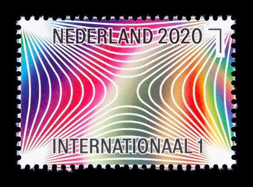
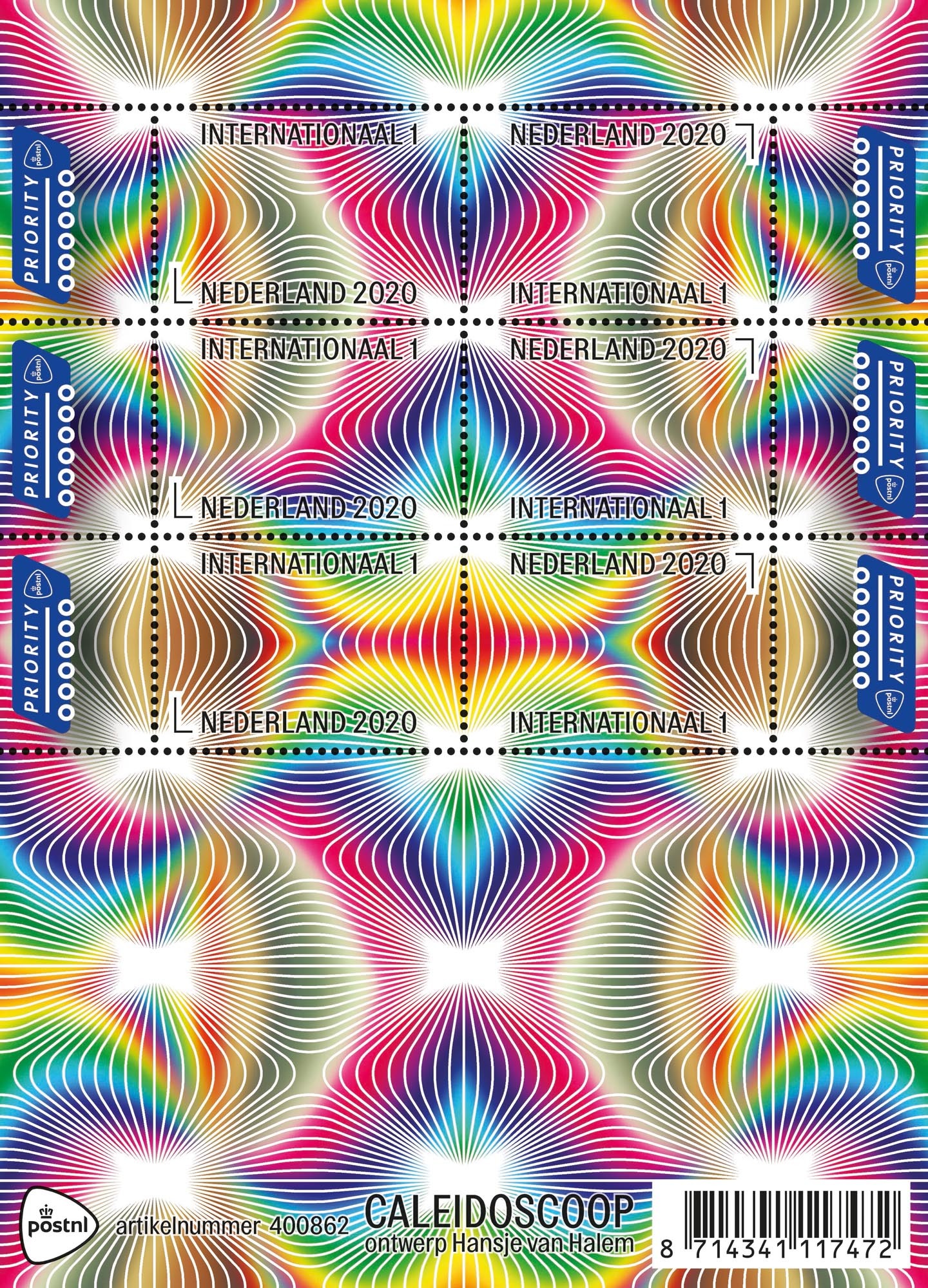
Caleidoscoop postage stamps
Contributed by Matthijs Sluiter on Jan 8th, 2021. Artwork published in
.
Source: www.instagram.com License: All Rights Reserved.
From Instagram account Post__fris, a showcase for the postage stamp collection of Jelle Koper:
This colorful stamp with optical illusions is part of a new series in which PostNL assigns designers to design stamps without a concrete subject. They’re allowed to be guided by their own interests, by what fascinates and moves them. In this case, these are the recognizable kaleidoscopic effects that were also visible in Van Halem’s earlier projects, for example in the identity she developed for Lowlands.
Designer Hansje van Halem picked Topol, available from Heavyweight, set in all caps and contoured with a stroke that is coloured slightly darker than the white lines of the pattern.
Source: shop.postnl.nl License: All Rights Reserved.

")


")


")


