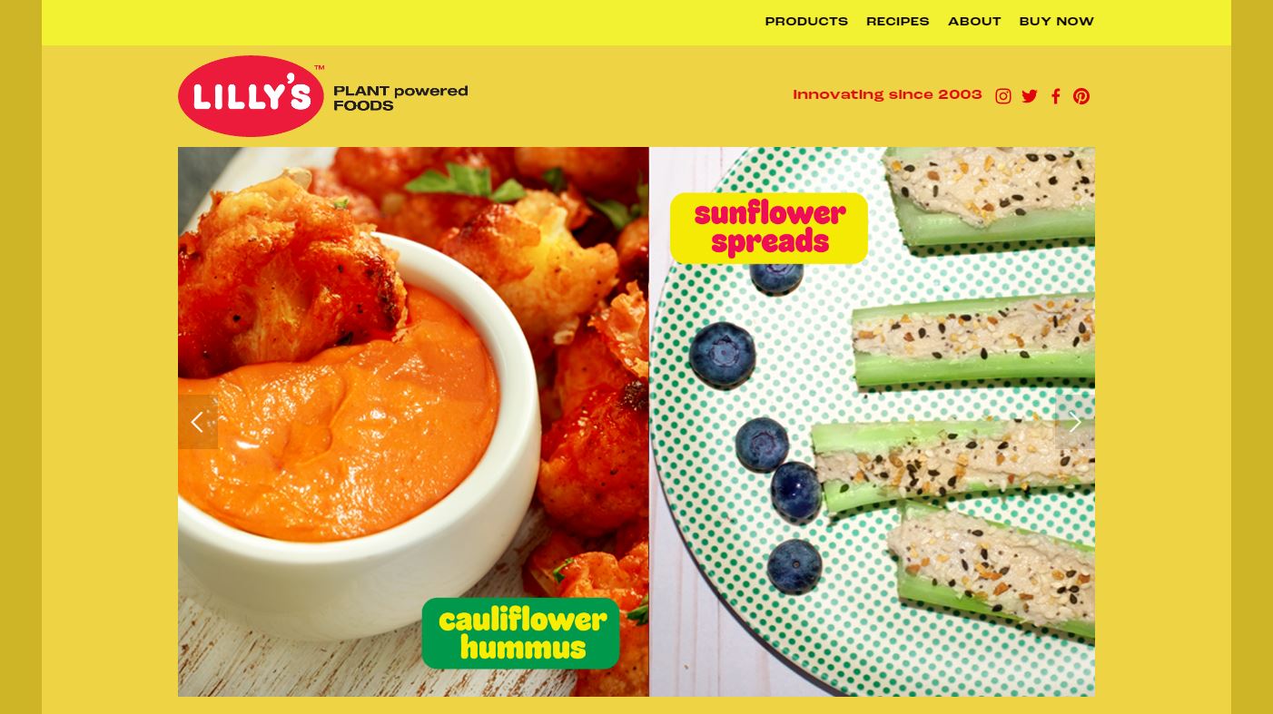
An independent archive of typography.
to participate.
Topics
Formats
Typefaces

Lilly’s

Contributed by Dave Rowland on Jan 22nd, 2021. Artwork published in .
    Homepage.
    Source: lillysfoods.com License: All Rights Reserved.

    Homepage.

    Lilly’s use of Sausage for a plant-based food maker must be the opposite of an LTypI. The highly saturated colours are a break from the norm in this market place, but really work, complementing the vibrant hues of the food photography.

    In addition to Sausage, the website uses a range of other fonts, including Roc Grotesk (body copy, plus a Wide weight for the top menu) and Cooper Black (footer menu, among other places).

    The Lilly’s logo is based on the caps of Sausage, with increased letterspacing and a raised apostrophe.
    Source: lillysfoods.com License: All Rights Reserved.

    The Lilly’s logo is based on the caps of Sausage, with increased letterspacing and a raised apostrophe.

    Lilly’s 3
    Source: lillysfoods.com License: All Rights Reserved.
    Lilly’s 4
    Source: lillysfoods.com License: All Rights Reserved.
    Lilly’s 5
    Source: lillysfoods.com License: All Rights Reserved.
    Lilly’s 6
    Source: lillysfoods.com License: All Rights Reserved.
    The newsletter overlay combines “subscribe” in Sausage with a second call to action in . The text here is rendered in , with UI elements labeled in . In the background, all-caps Cooper Black for the footer menu.
    Source: lillysfoods.com License: All Rights Reserved.

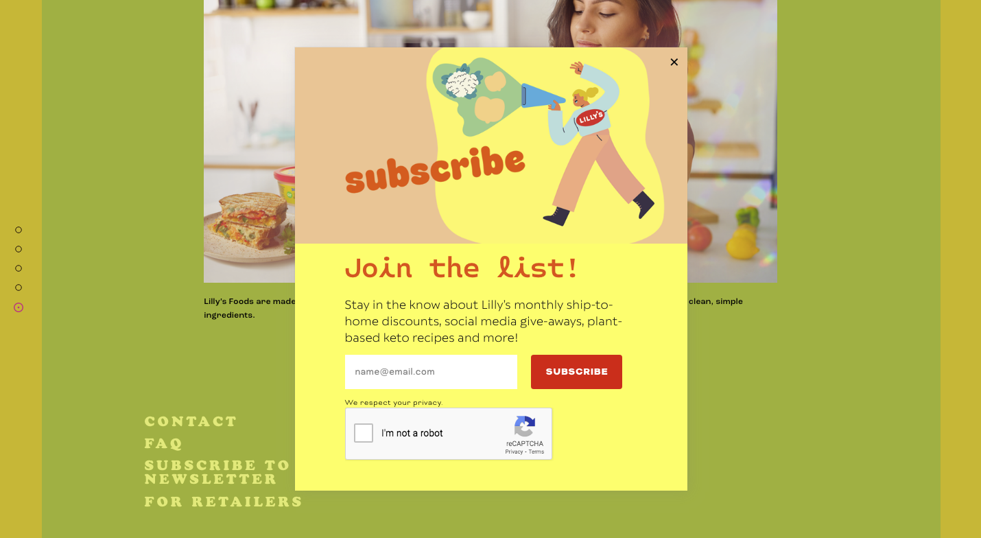
    The newsletter overlay combines “subscribe” in Sausage with a second call to action in Monotalic. The text here is rendered in Catalpa, with UI elements labeled in Bicyclette. In the background, all-caps Cooper Black for the footer menu.

    Typefaces

    • Sausage
    • Roc Grotesk
    • Cooper Black
    • Catalpa
    • Monotalic
    • Bicyclette

    Formats

    Topics

    Designers/Agencies

    Artwork location

    Post a comment