
The Queen’s Gambit (2020) poster, titles, promotional materials

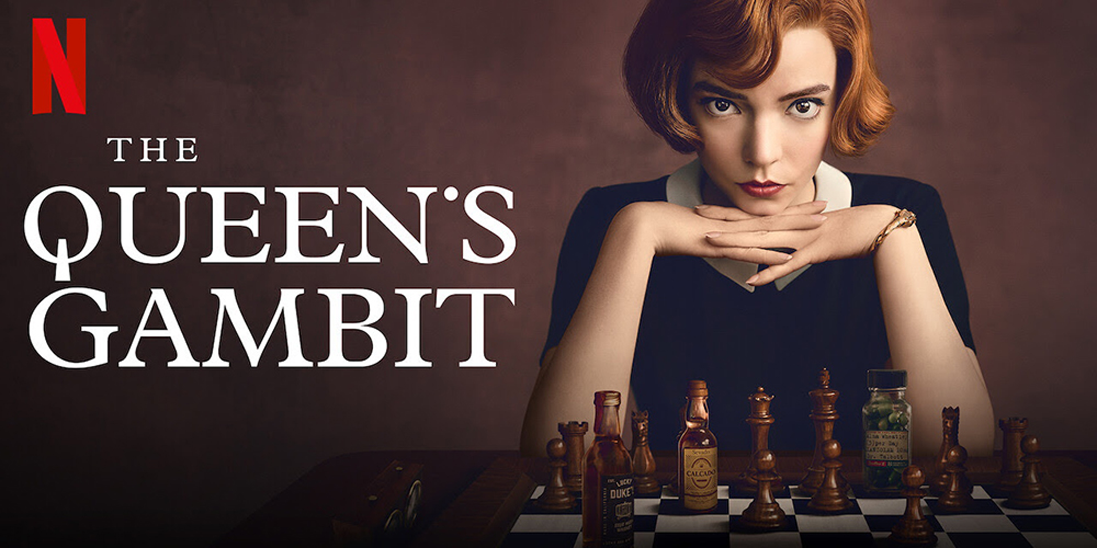
The Queen’s Gambit is a limited series from Netflix, based on the novel by Walter Tevis from 1983, and directed by Scott Frank, 2020.
The title treatment used to promote the show is set in all-caps Plantin (Monotype). It has some customization to the Q: It’s likely an uppercase O with a custom, vertical tail appended. The apostrophe has also been replaced with a superscript dot/period glyph. Additionally, the supplementary text, “A Netflix Limited Series,” is set in Bookman (Bitstream), widely tracked out and in all-caps.
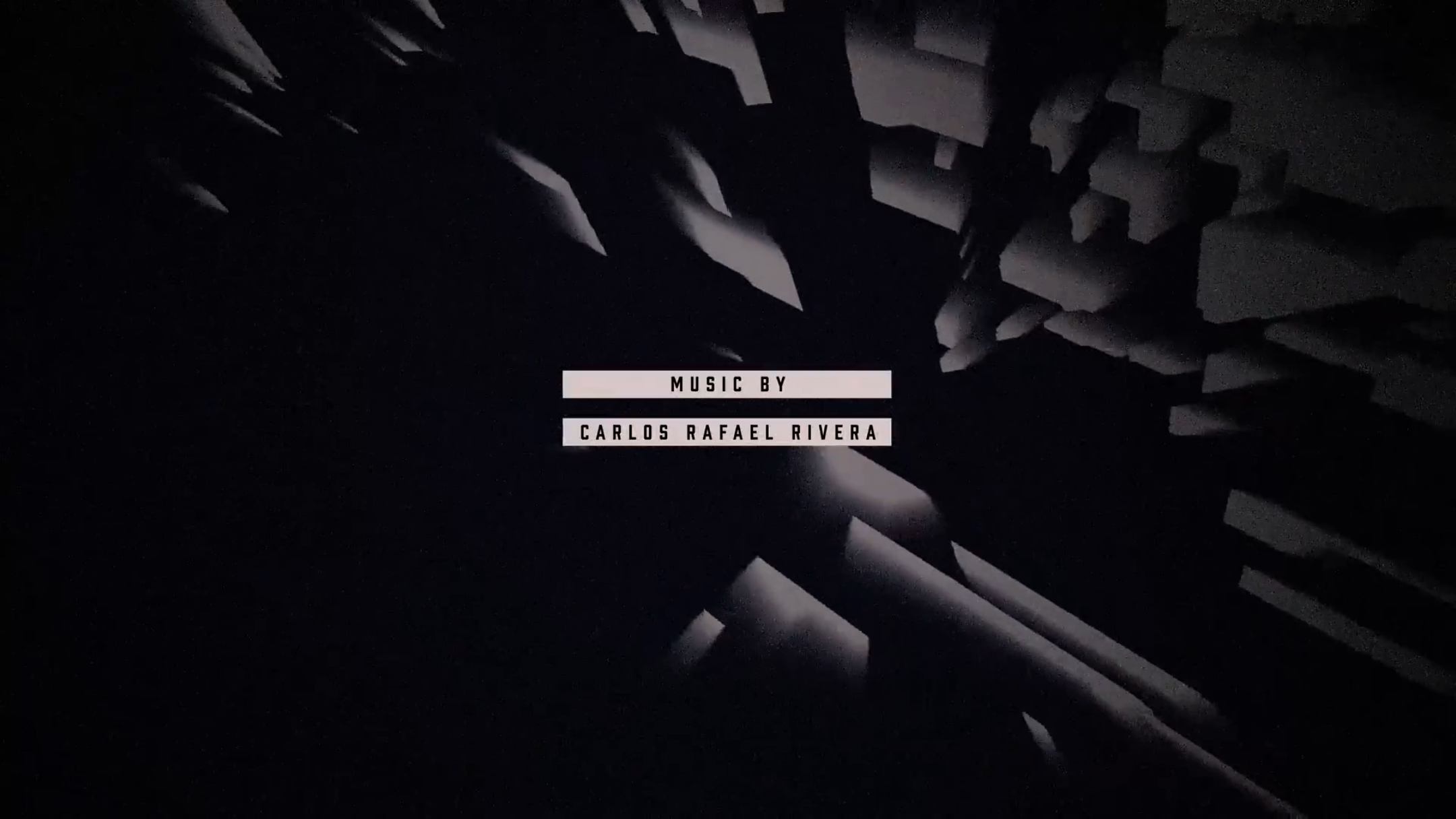
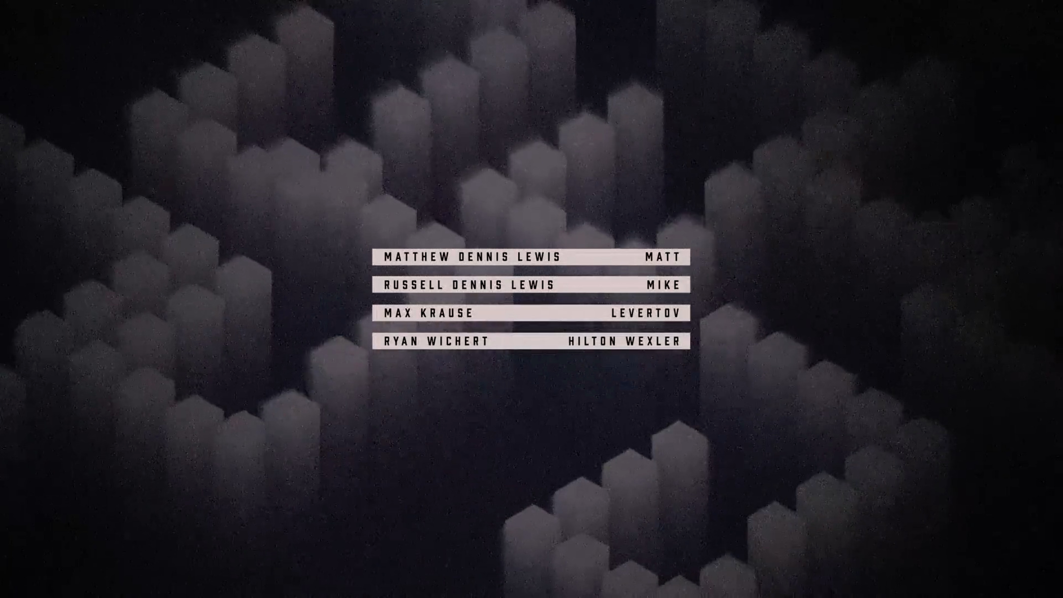
The main titles featured in the show are set in Prohibition by Fort Foundry. The various credits throughout the title sequence use Prohibition placed in black or white bars for contrast against undulating, geometric patterns.
Netflix style frame.

Customization of the promotional title treatment.

Main titles.

Main titles.
Main titles.
Main titles.


")


 Trailer")


4 Comments on “The Queen’s Gambit (2020) poster, titles, promotional materials”
Does anyone have any idea if the tail of the Q and the period instead of an apostrophe have any special significance, possibly in relation to chess?
Just a guess, but making the Q tail vertical brings the glyph a little closer to the female sign (♀︎), hinting at the protagonist’s role as a woman in a world dominated by men. For the dot-shaped apostrophe: Chess pieces typically are round when seen from above (or from below, as shown in the sequences where Beth visualizes chess games on the ceiling).
Another possibility for the dot (and maybe the vertical tail) is that it resembles the shape of the queen chess piece. The classic shape of that piece includes a rounded ball atop its crown. The vertical tail could also resemble a pawn piece or even the queen piece itself (neck/head).
Additionally, you can watch the title sequence and read an interview with the title designer, Saskia Marka, at Art of the Title. It’s a great read!