An independent archive of typography.
to participate.
Topics
Formats
Typefaces

Future Exhibitions Nº 1

Our Swedish outpost explores a smorgasbord of modular miniatures created with the online font editor FontStruct.

Contributed by Patch Hofweber on Nov 25th, 2014. Artwork published in
March 2009
.
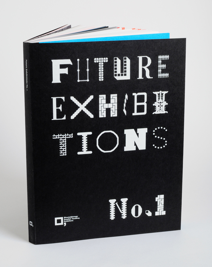
    Future Exhibitions Nº 1 1
    Source: konstochteknik.se © Konst & Teknik 2009. License: All Rights Reserved.

    The art world and the type world have a lot in common. As we move into the future some of the traditional methods and models of creation, participation, and control have grown stale.

    In 2008 FontShop and Rob Meek lowered the barrier to entry with a site called FontStruct. Enthusiasts could try their hand at type design with a limited set of tiles instead of the traditional corner and curve of a font editor. These limitations proved to be a good starting point to either explore fundamentals or force users to think outside the box. Without proper kerning and other essential controls, most FontStructions remain amateur and not commercially viable. However, thousands are available under a Creative Commons licence, and certainly have their uses.

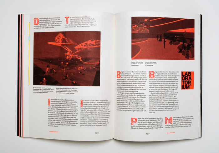
    Konst & Teknik, a firm in Stockholm who specializes in unconventional publications, are just the people to pull off a project with these fonts. In Future Exhibitions № 1, Riksutställningar (Swedish Travelling Exhibitions) departs from traditional exhibition methods and explores “visionary visions” of how viewer participation, Creative Commons, and open source will grow in the art world. Konst & Teknik saw an opportunity for collaboration, and marks each article with a different decorative FontStruction.

    These choices aren’t random, in fact it’s cheeky how literal some are:

    Ball and Chain, a connect-the-dots face by the prolific Wilson Thomas a.k.a. funk_king, paired with an article on the networked age and engaging the audience.

    Wee the People, also by Thomas, a typeface constructed of human icons on the topic of a human-centric exhibit.

    • Jade Gordon’s Bolts, a nuts-and-bolts collection in a chapter about technology.

    • The dotted Pullchain by David Sudweeks, in reference to a world without borders.

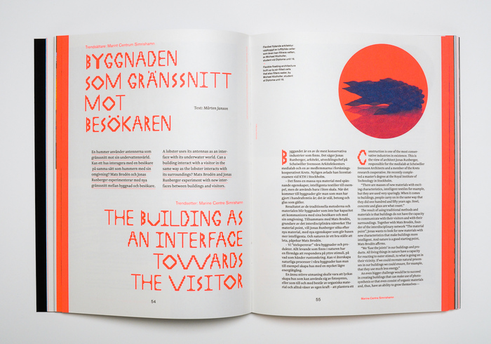
    font4 by webviking6, a FontStruction made from shaded bricks in an interview with a modular architect.

    • The shaded squares Last Brick from Alex Fulton where artists discuss “deserting the white cube.”

    • Avantesk, a reconstruction of Avant Garde by Tiago Balas a.k.a. eskema paired with illustrations depicting Edvard Munch works.

    • The Tetris-inspired Tetrisyde by Gene Buban on the topic of blurred borders.

    Having installed all these fonts in preparing this article, I can attest to their low quality. Luckily, InDesign offers enough control for a skilled typographer to set it right. An economic solution to dynamic drop caps and punchy pull-quotes. However, Konst & Teknik don’t rely on questionable free fonts to do the heavy lifting. The form is built on Riksutställningar’s very strong graphic identity, with bright palette and Akzidenz-Grotesk (in captions and pull-quotes) as a guiding force. To accompany Akizdenz, all body copy is gracefully set in Newzald, using two grades to demarcate Swedish and English text.


    Patch Hofweber is a physical and digital product designer based in Lund, Sweden. Together with Göran Söderström, he designed the typeface Trim Poster. Patch was among our Contributors of the Year 2013. This is his second appearance on the Fonts In Use Blog.

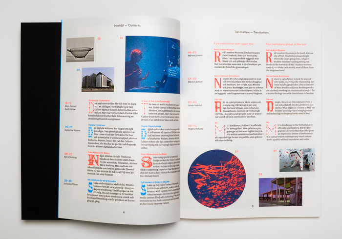
    Table of contents.
    Source: konstochteknik.se © Konst & Teknik 2009. License: All Rights Reserved.

    Table of contents.

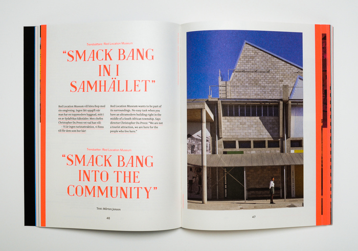
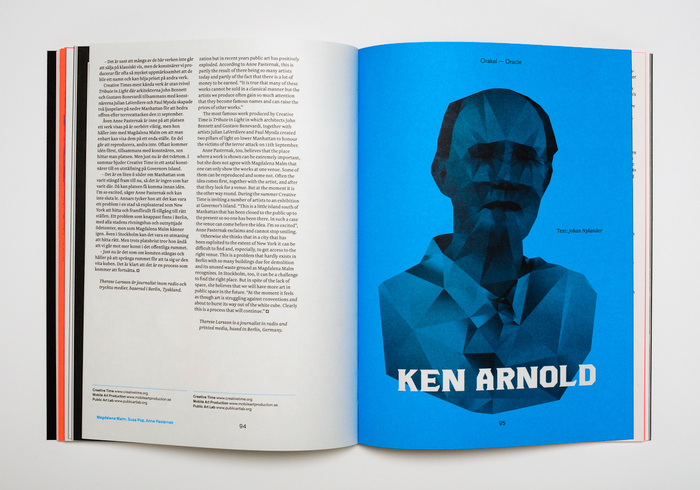
    The large quotes are in Temptation by Karolina Lach a.k.a. sliveress.
    Source: konstochteknik.se © Konst & Teknik 2009. License: All Rights Reserved.

    The large quotes are in Temptation by Karolina Lach a.k.a. sliveress.

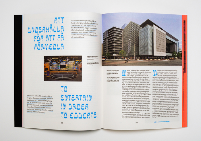
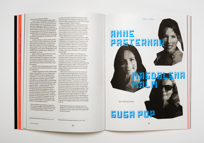
    The electric bottom-heavy caps are from Fairy Feller’s Master Stroke, a design by Wilson Thomas.
    Source: konstochteknik.se © Konst & Teknik 2009. License: All Rights Reserved.

    The electric bottom-heavy caps are from Fairy Feller’s Master Stroke, a design by Wilson Thomas.

    Round Pixel is the debut of FontStruct user sora005.
    Source: konstochteknik.se © Konst & Teknik 2009. License: All Rights Reserved.

    Round Pixel is the debut of FontStruct user sora005.

    The dotted Pullchain by David Sudweeks, in reference to a world without borders.
    Source: konstochteknik.se © Konst & Teknik 2009. License: All Rights Reserved.

    The dotted Pullchain by David Sudweeks, in reference to a world without borders.

    The shaded squares of Last Brick from Alex Fulton where artists discuss “deserting the white cube.”
    Source: konstochteknik.se © Konst & Teknik 2009. License: All Rights Reserved.

    The shaded squares of Last Brick from Alex Fulton where artists discuss “deserting the white cube.”

    Anchorage by Ben Hamm, a FontStruction inspired by the signage of a fish house in Alaska.
    Source: konstochteknik.se © Konst & Teknik 2009. License: All Rights Reserved.

    Anchorage by Ben Hamm, a FontStruction inspired by the signage of a fish house in Alaska.

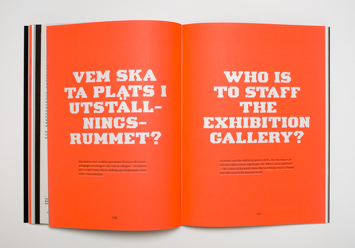
    Reversed caps from Blackwolf by Axel Leyer.
    Source: konstochteknik.se © Konst & Teknik 2009. License: All Rights Reserved.

    Reversed caps from Blackwolf by Axel Leyer.

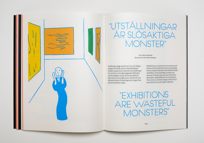
    Avantesk by Tiago Balas, a reconstruction of Avant Garde paired with illustrations depicting Edvard Munch works.
    Source: konstochteknik.se © Konst & Teknik 2009. License: All Rights Reserved.

    Avantesk by Tiago Balas, a reconstruction of Avant Garde paired with illustrations depicting Edvard Munch works.

    The Tetris-inspired Tetrisyde by Gene Buban on the topic of blurred borders.
    Source: konstochteknik.se © Konst & Teknik 2009. License: All Rights Reserved.

    The Tetris-inspired Tetrisyde by Gene Buban on the topic of blurred borders.

    Typefaces

    • Anchorage
    • Avantesk
    • Ball and Chain
    • Blackwolf
    • Bolts
    • Chinese Chairs
    • Fairy Feller’s Master Stroke
    • font4
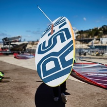
    • INSLAB II
    • Last Brick
    • Leaves (FontStruction)
    • Pullchain
    • ROUND Pixel
    • Temptation
    • Tetrisyde
    • Wee the People
    • Akzidenz-Grotesk
    • Newzald

    Formats

    Topics

    Designers/Agencies

    Artwork location

    4 Comments on “Future Exhibitions Nº 1

    1. Great post. Thank you for this.

      The quality of the average FontStruction has gone up since 2009 although there is still no kerning support. 

      I love the way the designers of Future Exhibitions were prepared to choose some very raw, naive FontStructions e.g. ROUND pixel. There was prettier and more coherent stuff to choose from, even then.


    2. It should also be noted that FontStruct introduced the option to export a Glyphs file a while ago, so that font projects that started out in this deliberately limited editor can be further honed, for example by adding kerning or OpenType layout features.

      Gallery Top Picks is a good place to see what can be accomplished with FontStruct. In addition to that, check out the pages with the results of the regularly held competitions on one theme or genre, like connected scriptsinline styles, or stencil fonts.

    3. Glad to hear from you, Rob. Thanks so much for the joy that is FontStruct. I hope I didn’t come across as badmouthing the platform.

      K&T did pick some of the more unpolished faces, and in doing so perhaps opened up the reader’s mind to ideas that were raw and unpolished, as new technology often comes.

    4. Fontstruct continues to be an amazing font laboratory. Missing in the mix above is IronManiac, an superhero Industrialist’s dream of a font. Not perfect, but clever. Of the two qualities my heart’s with the latter.

    Post a comment