

Penninghen school
Penninghen is a private school of art direction and interior design located in the center of Paris. The school is situated in the former building of the Académie Julian, created in 1868, where famous artists such as Félix Vallotton, Henri Matisse, or Marcel Duchamp studied painting. Interested by this legacy, Jacques d’Andon and Penninghen created a new school in this location in 1958. This, through different names changes, led to the current Penninghen school – which makes it one of the oldest private schools still in operation.
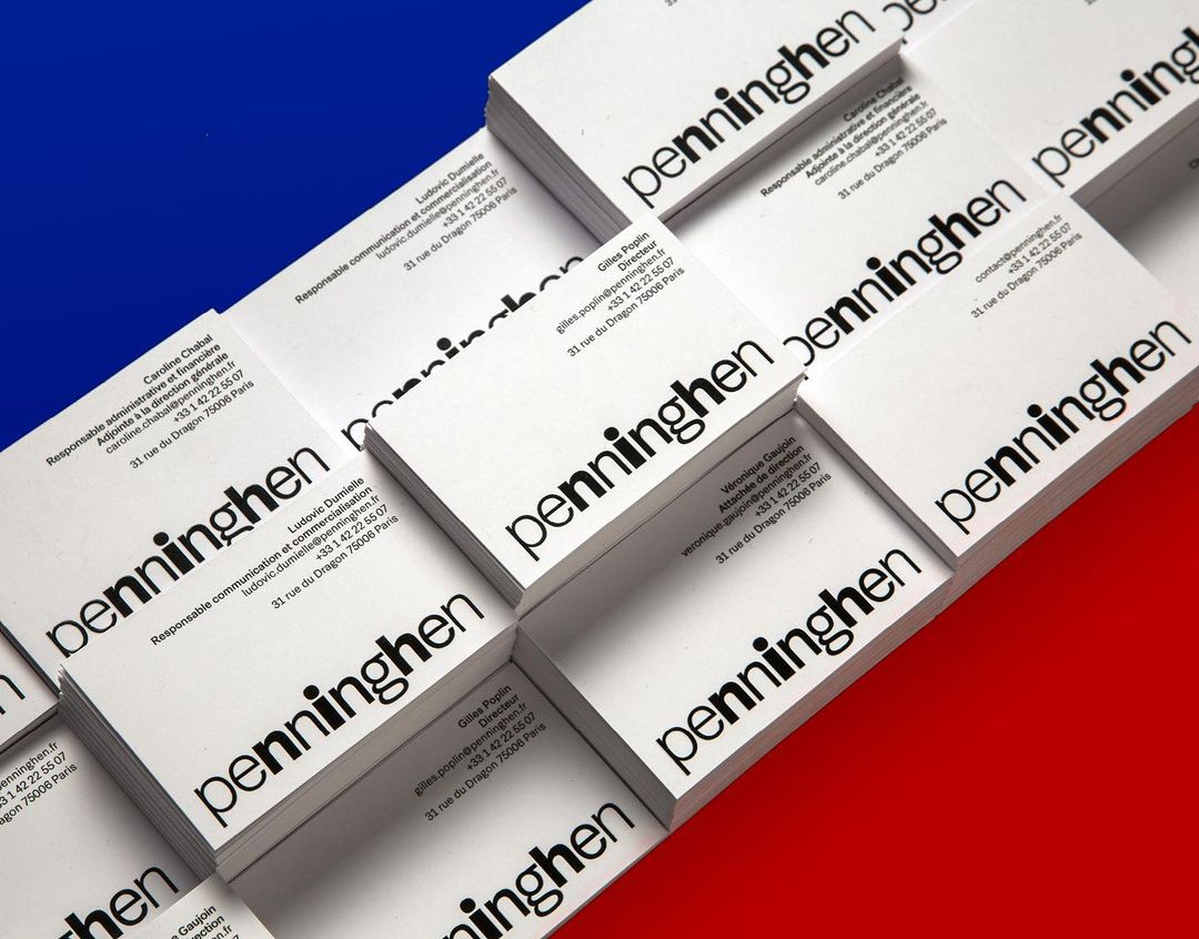
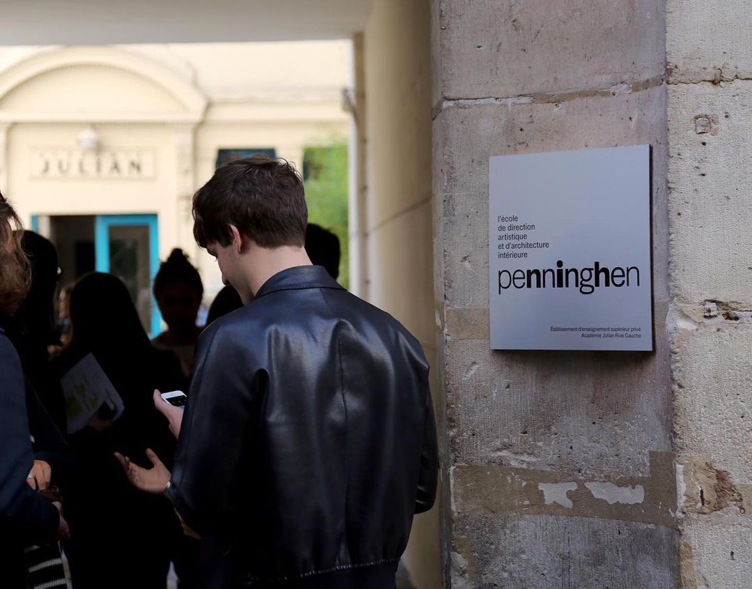
The last name change to Penninghen, without any addition like “school” or an acronym, was accompanied by a change in identity conceived by Etienne Robial and developed by Jules Banide. The identity is built around a logotype by Robial set in Synthese from Production Type, designed by Gilles Poplin and Jean-Baptiste Levée. The different weights of Synthèse are combined in the same word in order to give an idea of motion, as if the letters were flashing, and as if the actual logotype was only a snapshot or a still image in this dynamic. This evokes the energy of an art school and the processes of creation at work: a continuous experimentation that takes inspiration from different places, to finally create a whole. Jules Banide elaborates on the concept:
Using a different weight for each letter depicts diversity and multidisciplinary teaching. Furthermore, the nine lowercase letters embody the school’s teachers and all their different courses and fields of expertise. They are placed around the bold central letter i, representing the student and the organisation around each.
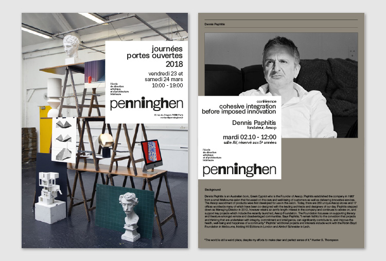
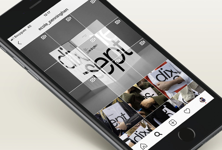
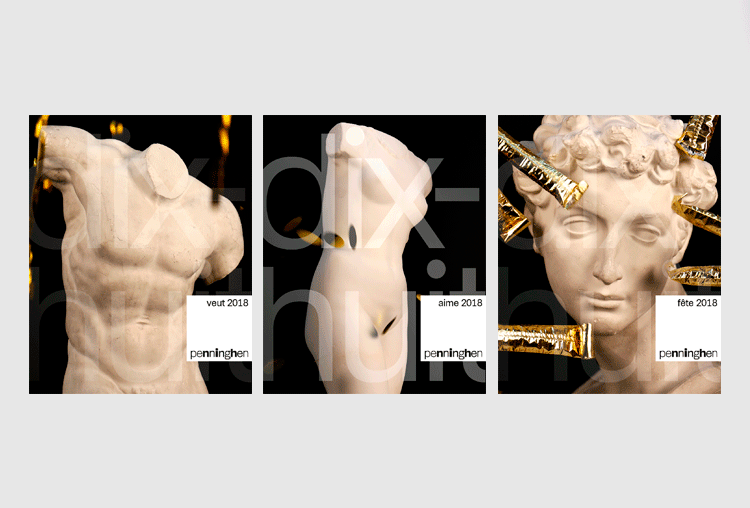
The mobility expressed by the logotype is also made visible through the conception of animated posters for web and social media: this gives life to printed matter and adapts the contents smartly to the possibilities of screen. As most of the research and documentation process about schools are made through the internet, it is therefore relevant to question such traditionally printed objects and make them sensually accessible as much on screen as on paper.
Synthese has also the quality of being a versatile font with the rigor of emblematic sans-serif typefaces such as Univers, with a relative “neutrality”. This makes it ideal for signs inside the school, as much as for publications and text on screen: optimized for digital display, the typeface reveals all its facets in this identity.
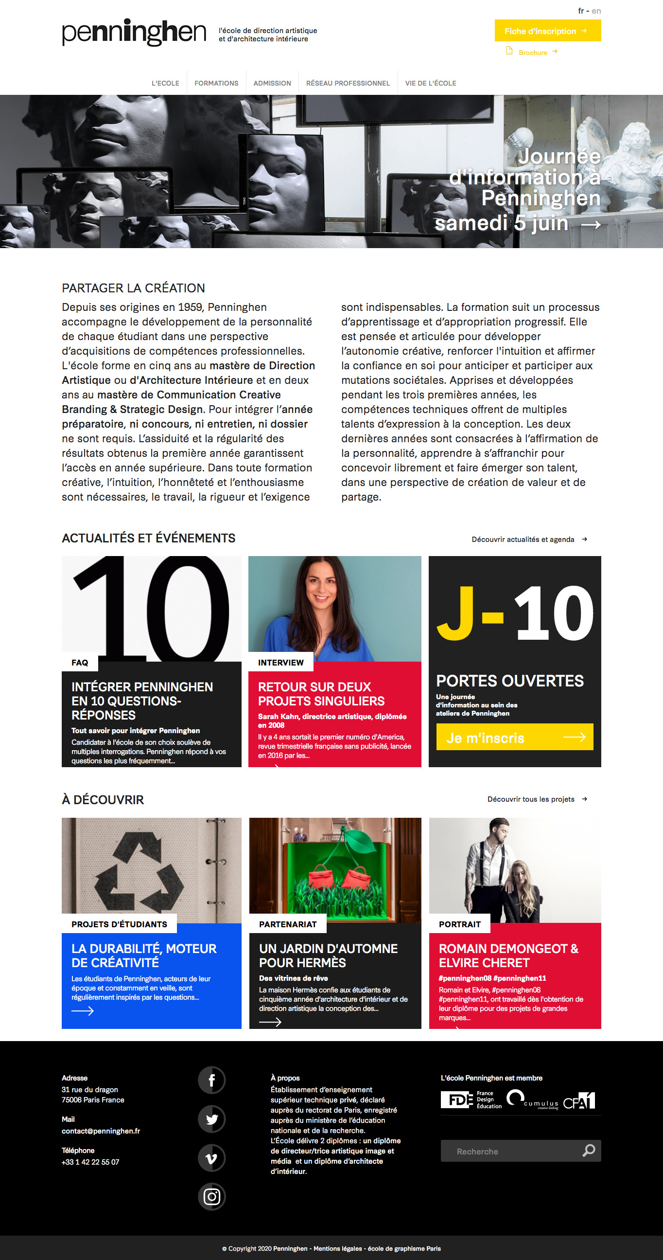
Website homepage (2021).


")


