
Christus-Kirche lottery ad
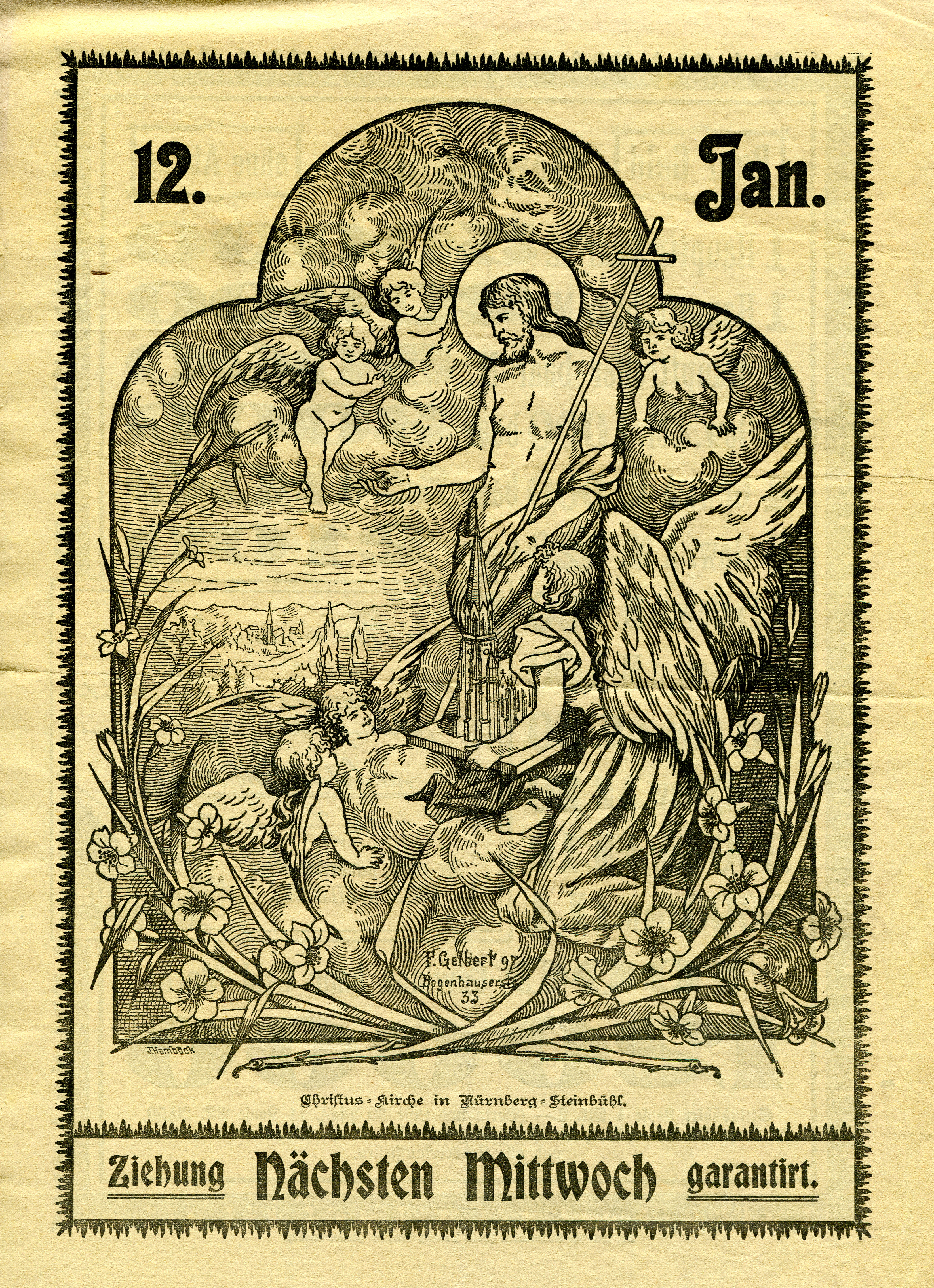
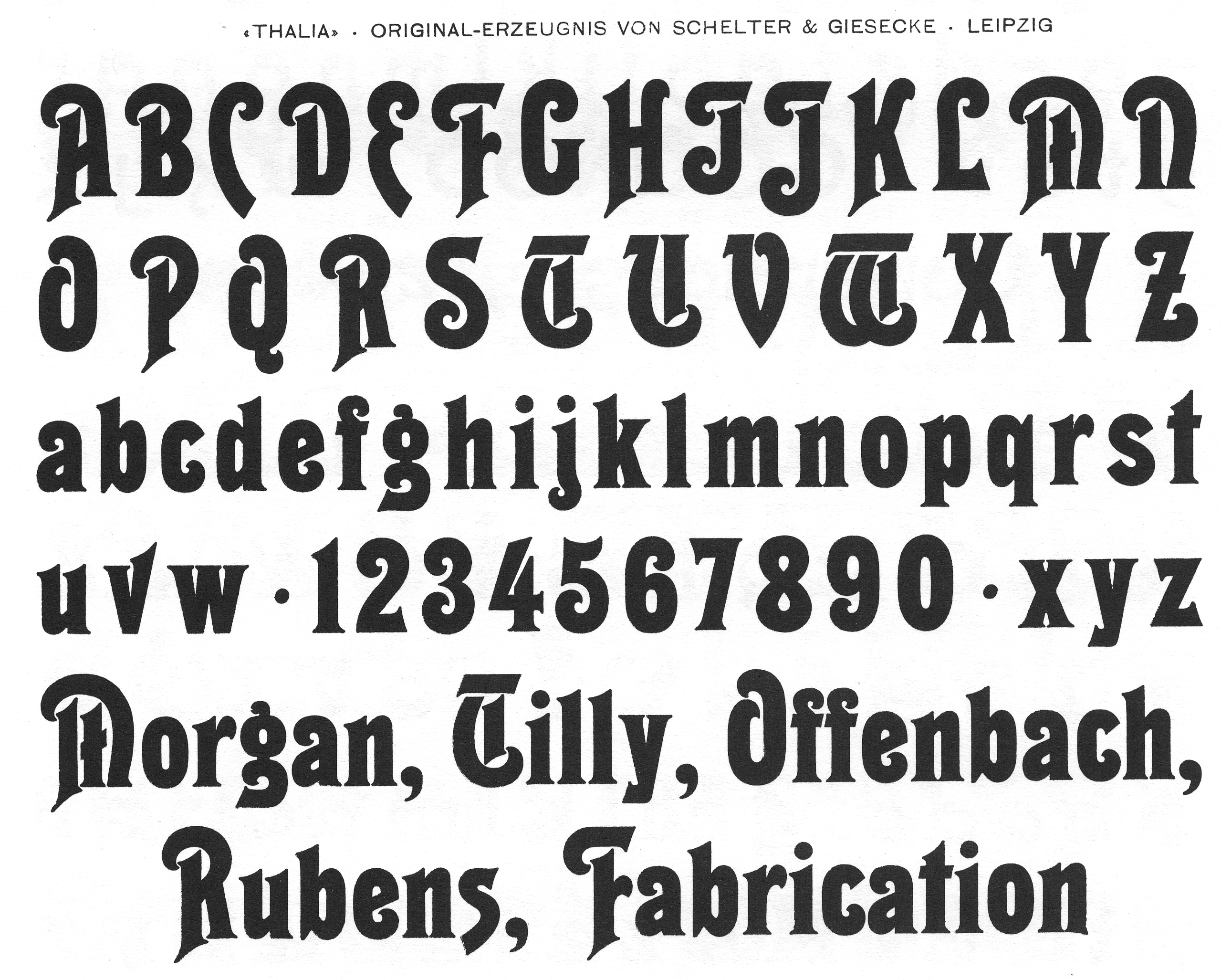
The typography of this lottery ad from 1898 features two typefaces that were quite new then: Thalia and Bradley, both issued in 1894. The latter originated in the United States, but made its way over the pond very quickly. The small type is in (a) Breite Kanzlei, which emerged around 1830 and had become a standard face by the 1890s. Together, the triple provides a good sample of German type preferences at the end of the century: There’s traditional blackletter (Kanzlei), “fairytale blackletter” (DJR on Bradley) with simpler letterforms much closer to roman type (see e.g the Z in “Ziehung” or the w in “Mittwoch”), and a roman display face with only a few blackletter-infused caps (Thalia, see its M, T or W). Three degrees of blackletter, if you will.
The lottery was organized in favor of the Christus-Kirche in Nuremberg-Steinbühl. The foundation stone of this church was laid in 1891, and built by David Röhm in the style of Burgundian Early Gothic until 1894. The depiction of Jesus Christ with an angel holding a model of the church is signed by “F. Gelbert (18)97 Bogenhauserstr. 33” (the artist) and “J. Hamböck” (= Graphische Kunstanstalt Johann Hamböck, Munich; in backslanted angular letters).


")


")


4 Comments on “Christus-Kirche lottery ad”
That stalactite border made a strong impression when browsing turn-of-the-century type specimens, but I can’t remember where I saw it.
Just stumbled upon Inland Borders Series No. 67, which has a somewhat similar feel.
That was it!
Serendipity! I was looking for the type shown in the center, Saint John, which is Inland’s interpretation of Will Bradley’s lettering.