
Studies In British Transport History 1870–1970 by Derek H. Aldcroft (David & Charles)
Contributed by Florian Hardwig on Oct 10th, 2021. Artwork published in
.
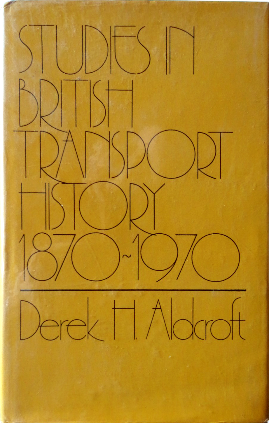
A light face for a heavy subject: Colin Brignall’s Premier Lightline (Letraset, 1969) is the sole ingredient for the book jacket to the first edition of Studies In British Transport History 1870–1970, published by David & Charles in 1974.
Derek H. Aldcroft is an economic historian who worked at the University of Leicester. He also lectured at the University of Glasgow, and later served as a professor and chair at the University of Sydney. From 1994 until his retirement, Aldcroft was a research professor at Manchester Metropolitan University.

")


” / “What A Wonderful Thing Love Is” – Al Green")
")


")


")
")


")


4 Comments on “Studies In British Transport History 1870–1970 by Derek H. Aldcroft (David & Charles)”
The designer did that thing that so many Letraset users used to do: Using a tilde as a hyphen. To me, that was always a sure sign that it was Letraset (aside from the font, which weren’t always exclusives).
Right! Well spotted, Mark.
Shown below are two Letraset sheets with Premier Lightline, uppercase with numerals and lowercase, in 120pt. Both have a pile of diacritics in the bottom right corner.
When the Letragraphica range was introduced in 1970, Premier Lightline was included in the first quarterly issue. The numbers for the 120pt size, LG 101 and 102, are the lowest ones. Premier Lightline is also the face used for the Letragraphica logo.
I am wondering if the font on these two designs is the same. And what is it / are they?
en.wikipedia.org/wiki/5_(gu…
en.wikipedia.org/wiki/File:…
Thanks, Fonts In Use. Fascinating project.
Hey Jeff, good thinking! Premier Lightline is a 1970 design referencing a style that was popular in the Art Deco period of the 1930s. The numerals in 5 Gum and To the Power of Three are related to a typeface design that originated in that period: Cassandre’s Peignot from 1937/1938. The 5 is only similar, but might still be inspired by Peignot. The 3 is more directly derived from Peignot Bold.