World Wide Web logotype
The original World Wide Web logotype (and slogan) was designed by Robert Cailliau, using Optima.
Cailliau comments on the naming and design in an article on Psychology Today:
[…] Tim [Berners-Lee] came up with “World-Wide Web”. I would have preferred something shorter, but to find a catching name is not easy. I agreed to use WWW for the new document that was to go to management and “find a better name later”. WWW stayed: it summarized well what it was.
Because I’m a synesthete I see characters in colors and I perceive a W as green. I liked that. So it remained WWW. And there was indeed a logo that we used a lot in the beginning. It was made from three Ws: white, light green and darker green.

Logotype of the First International Conference on the World-Wide Web in 1994.
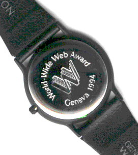
The logo used in a special edition watch awarded to the “Hall of Fame Inductees” of the WWW94 Awards.
Typefaces
Formats
- Branding/Identity (4841)
Topics
- Institutional (796)
- Technology (906)
Designers/Agencies
- Robert Cailliau (1)
Tagged with
- World Wide Web (1)
- logos (2740)
- abbreviations (30)
- repetition (526)
- green (500)
- single glyphs (251)
- type on a curve (617)
- outlined type (854)
- watches (31)
- 1990s (223)
- slogans/claims (66)
- CERN (3)
Artwork location
- Switzerland (682)
- Genève (52)


