
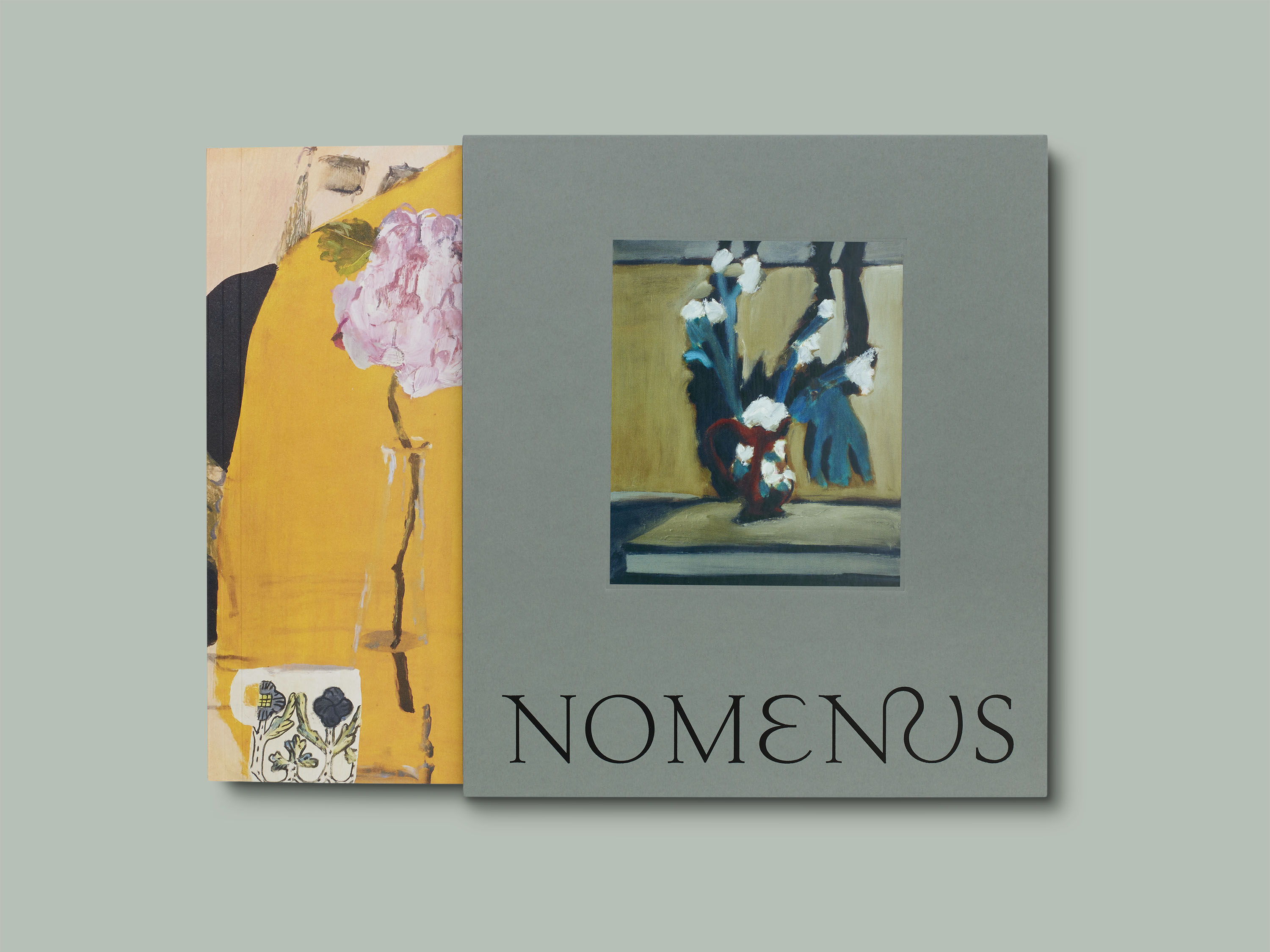
Nomenus issue 2, “The Language of Flowers”

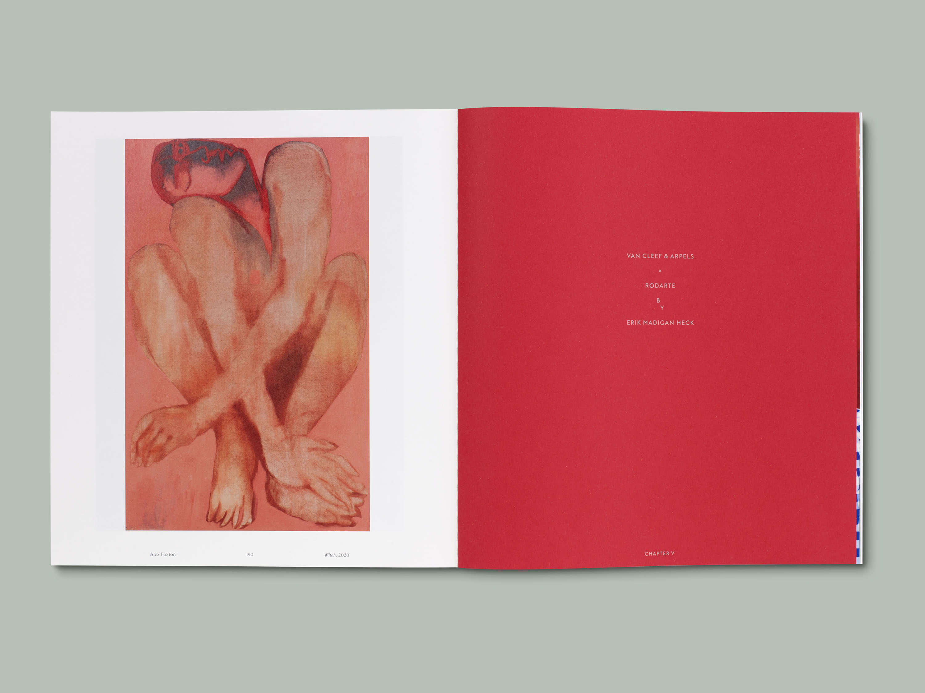
Nomenus is a limited edition arts journal edited and conceived by the photographer Erik Madigan Heck in 2007. Its second issue entitled “The Language of Flowers” deals with the romantic theme of nature and flowers, and offers a selection of unseen figurative and non-figurative works of art by painters and photographers such as Helen Frankenthaler, Rita Ackermann, Anselm Kiefer, Gabriel Orozco, and more. Generously supported by Van Cleef & Arpels who prepared an exhibition titled Florae that will be shown in Paris in autumn 2021, the book displays a wide range of papers and printing techniques, and is as much a good showcase of artworks as of publishing possibilities.
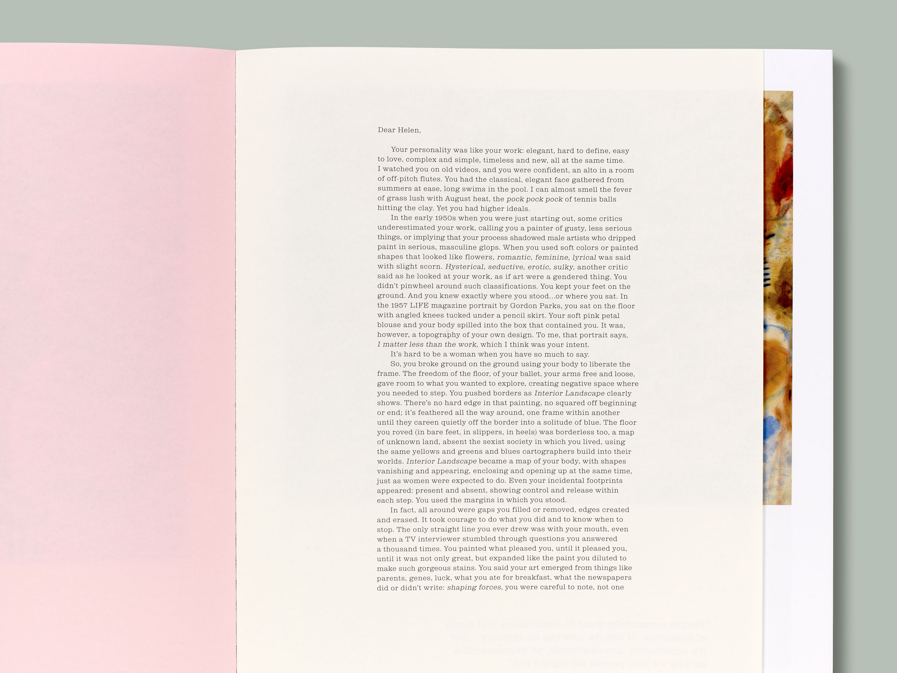
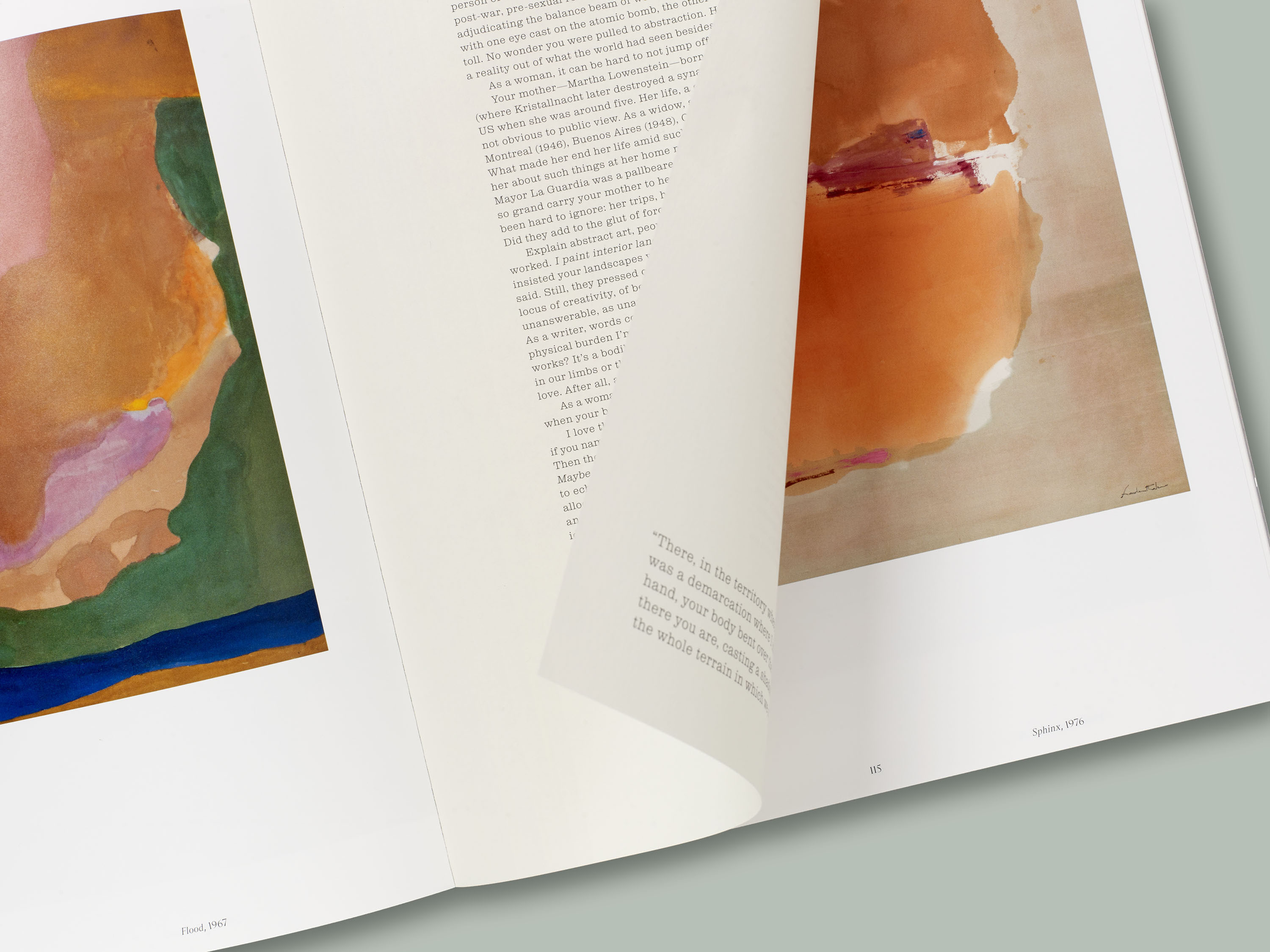
British studio A Practice for Everyday Life (APFEL) designed an object that looks more like a proper exhibition catalog than an arts journal (except maybe for the OTA binding and the paper cover). The paper-wrapped slipcase is what makes this book a hybrid: it is foil-printed with a customized version of Kessler from Production Type, made more organic with ornamental ligatures and a new curvy E. The slipcase protects the fragile softcover while giving it a precious aspect. The designers used no less than 15 different paper stocks to create a rhythm between the various contributors: from thick glossy paper for the works of art to semi-transparent tip-in pages marked with a famous quote.
In addition to Kessler for the cover, the publication is set in the geometric sans Marquis, designed by APFEL studio itself, and Sainte Colombe from Production Type, for the text blocks and notes. Inspiration for the book design was found in early 20th-century artist monographs, with a classical approach to typography and large plates. We find this historical influence also in the typographic choices: Sainte Colombe reminds us in its contrasts of Didot-like typeface that were used in this context, paired (sometimes clumsily!) with sans-serif fonts. In the end, the journal is a subtle remix of late romanticist approach to design, in the great tradition of William Morris.


")


")


")


 movie poster")


