
Death certificates, Salerno, Italy (1889–1917)

1889. “Registro” uses a typeface related to French Oldstyle, while “Atti di Morte” is in Novel Open (AKA Bruce Mikita), which was sold by Italian foundry Societa Urania as Pekino. “Parte I” is (similar to) Lining Gothic or Interchangeable Gothic.
These are cover pages from the Salerno, Italy death certificates, “Atti di Morte,” from between 1889 and 1901. I found these during research into my Italian heritage, and they were too cool to not share.

1892. “Registro” uses Mortised, patented by Hermann Ihlenburg for MacKellar, Smiths & Jordan in 1884. The bifurcated Tuscan caps with outlined shade used for “Atti di Morte” go back to Henry Brehmer’s Ornamented No. 1540 for Bruce (1876). “Anno” is set in a style like Old Style Bold. “Degli” and the body copy might be Mediaeval-Egyptienne (similar, but without beard on G: Old Style Antique).
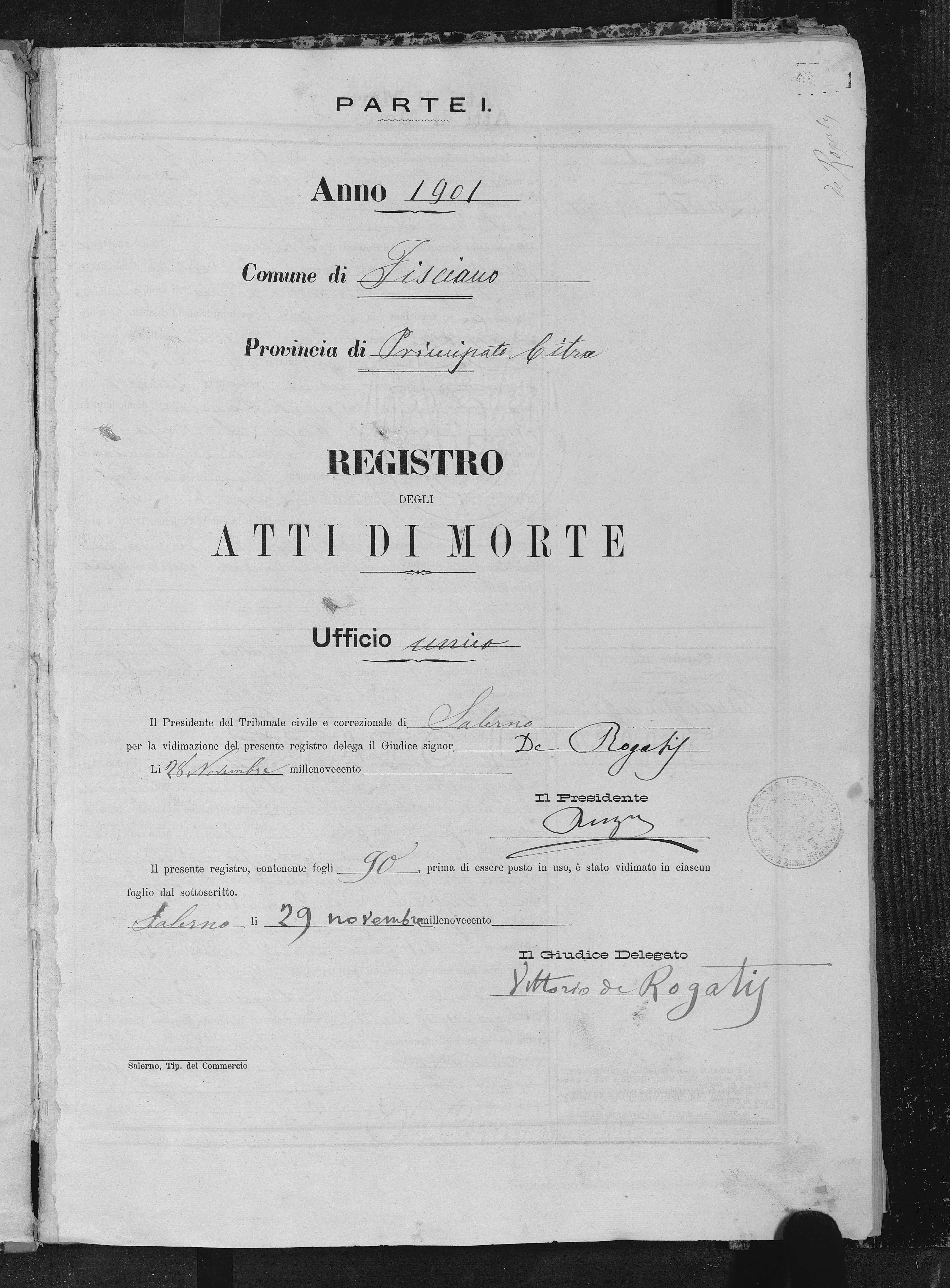
1901. “Il Presidente” and “Il Giudice Delegato” use a style known in the U.S. as French Antique/Clarendon Extended.
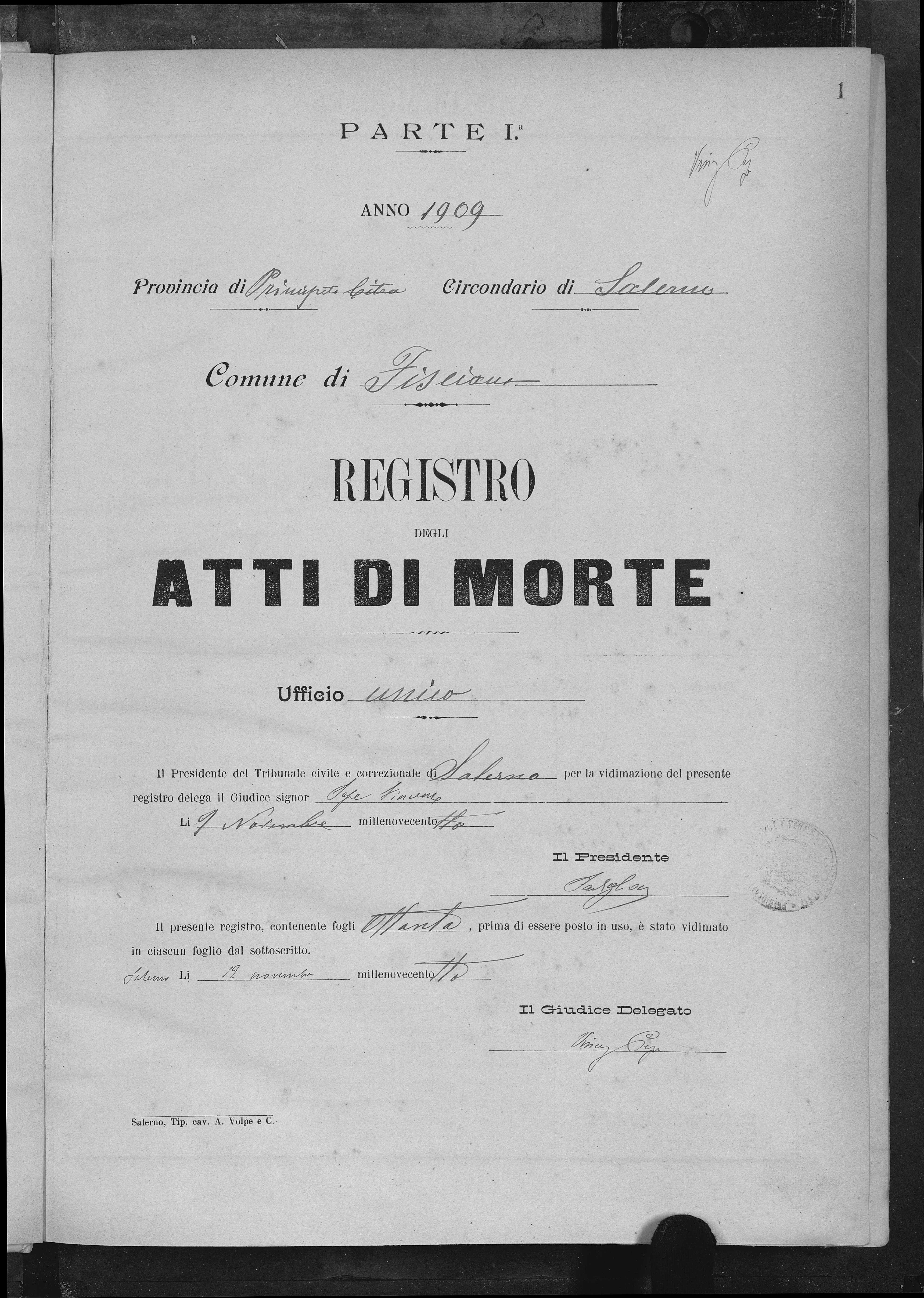
1909. “Atti di Morte” is a version of Zeitungs-Grotesque, which was sold in Italy by Reggiani (as Turandot) and by Nebiolo (as Etrusco nerissima). “Ufficio” is in Washington.
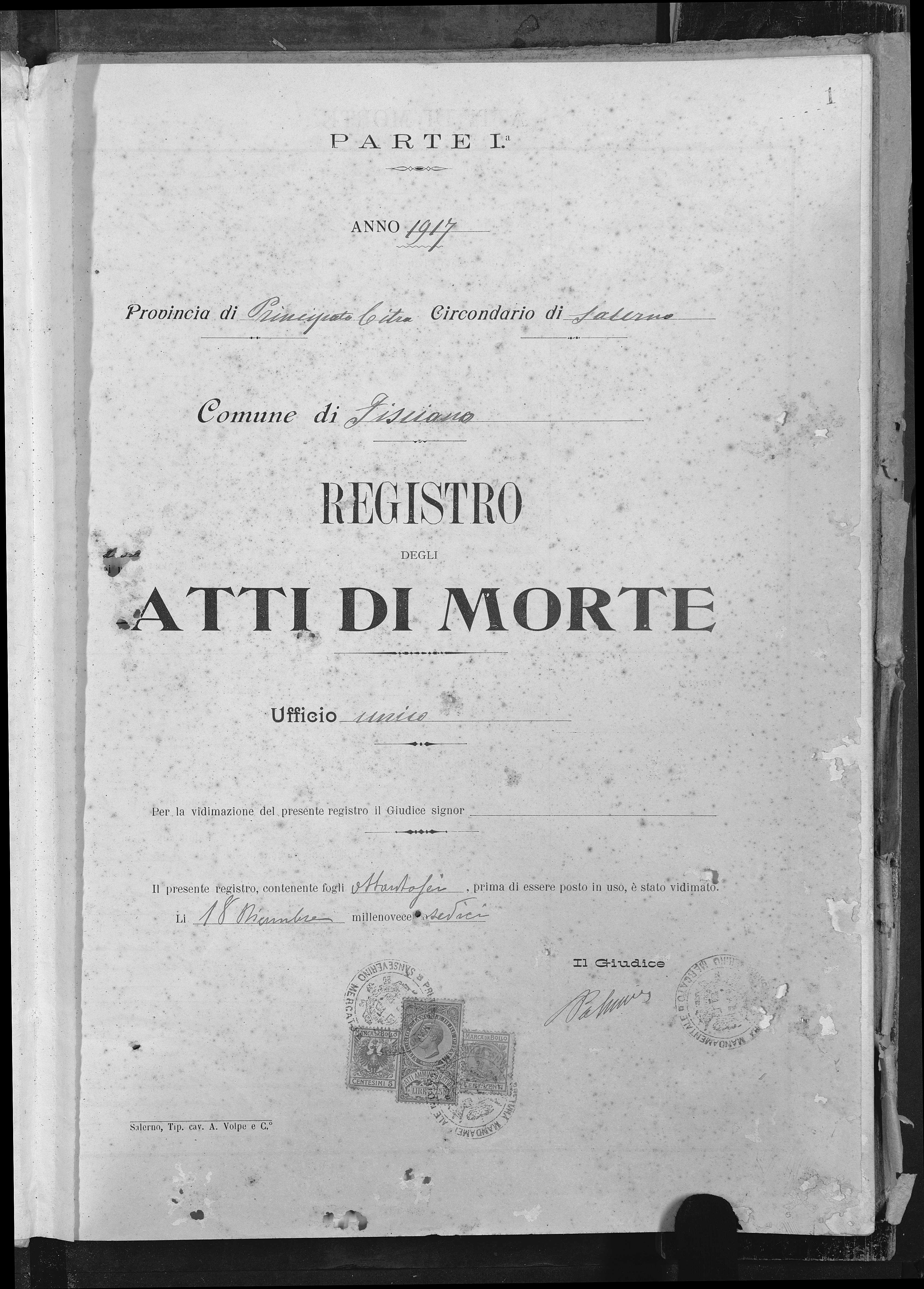
1917. “Atti di Morte” is set in De Vinne Bold (cf. this specimen by Barnhart Brothers & Spindler)


")


")


")


")


2 Comments on “Death certificates, Salerno, Italy (1889–1917)”
Thank you for sharing these fascinating documents, MacNeill!
Most of the tagged typefaces were tracked down by my colleague Matthijs (thanks, Matthijs – great job!). Unfortunately, we don’t have easy access to period specimens from Italy. Some IDs are to be understood as approximations, and virtually all of the typefaces probably went under different names in Italy. Also, several styles are still unidentified. Maybe our readers can help and fill some gaps.
I’m in awe of what you did find out, brilliant work Matthijs and Florian!