
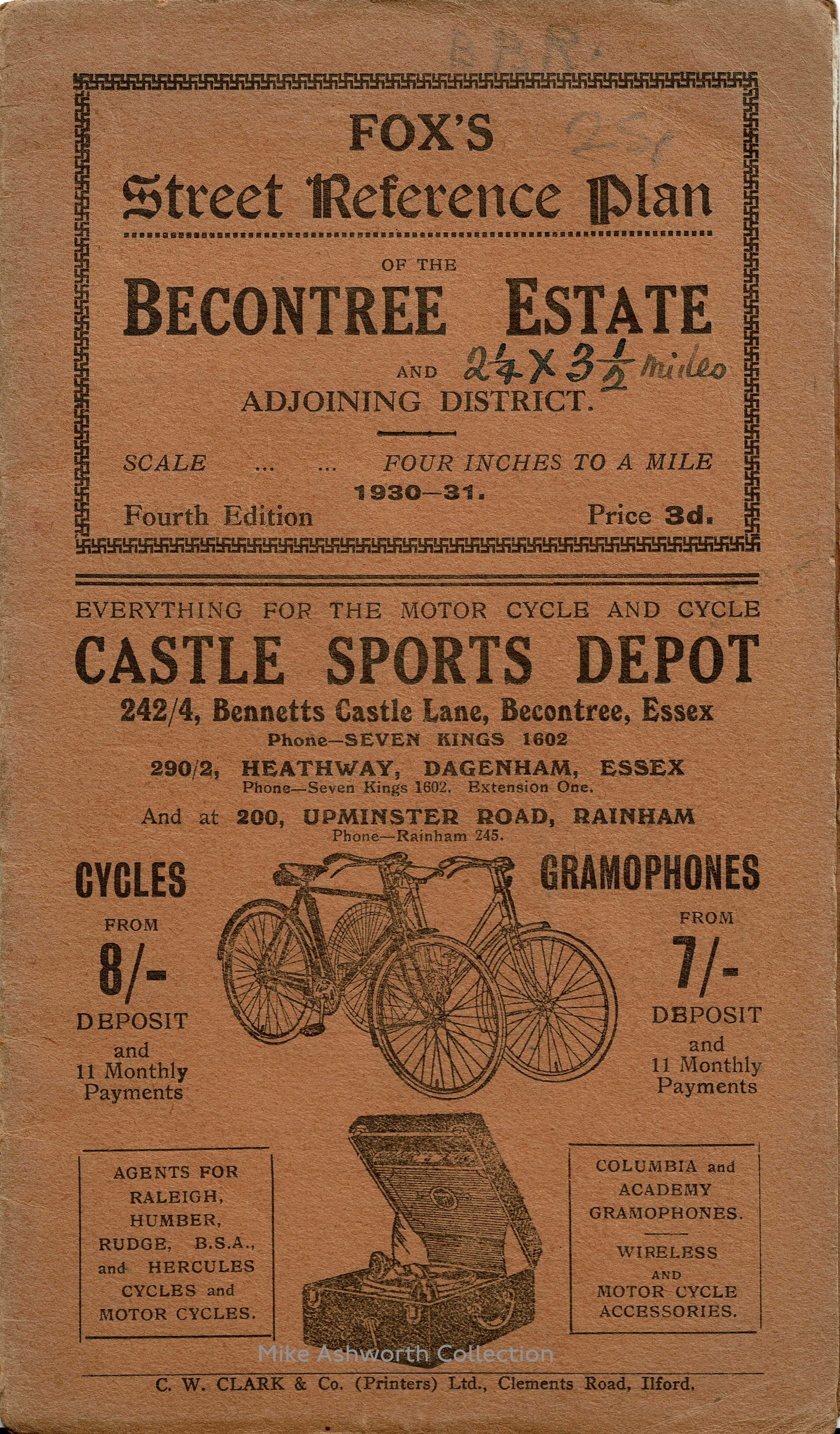
Fox’s Street Reference Plan of the Becontree Estate, Fourth Edition, 1930–31
An odd little commercial street plan of the London County Council’s vast housing estate at Becontree in Essex. Given the pace of construction and development at the time, 1930, there would have been a requirement to keep up to date with the extensions to housing areas, new streets and infrastructure and that could account for this being the ‘fourth edition’.
As is the case with these small plans, retailing at 3d., production costs would have been kept down by the sale of advertising on the map and cover. The front cover is for the Castle Sports Depot that dealt with two stalwards of 1930s consumerism – cycling and gramophones! The map itself has been annotated with what looks like church sites and what are possibly some sort of areas or zones of interest to the map’s owner – possibly areas for canvassing or leafleting?
Becontree was the largest of the LCC’s massive housing drive in post-WW1 years that was driven by slum clearances of inner-city slums, the need to lower densities and also to provide for a growing population. From the start of works in 1921 until formal ‘completion’ in 1935 around 26,000 homes were completed to home around 100,000 people. Attached administratively, mostly, to Dagenham, it caused this previously small Essex village to expand massively and this was helped along by construction of more local sources of employment such as Ford Motors massive plants and May & Baker chemicals. The estate, like many others, was seen as rather sterile in that amenities such as shops and pubs were seen as being sparse and late to be developed and the major issue, that of distance from the traditional East End where many had links back to, made travel by public transport slow and expensive. This was despite the development of the District line services, over existing LMSR lines, to serve the area as seen on the map.
“Street Reference Plan” is in Tudor Black. The largest lines appear to be set in caps from a bold condensed style of some Cheltenham, possibly Stevens’s Sandringham, or maybe Winchester. There’s also Condensed Sans Serif No. 7 or similar (“Cycles”, “Gramophones”) and Grotesque No. 8 (year and price), two widths of Windsor, as well as two or more unidentified oldstyle romans. Note the use of swastika ornaments for the border, something that would have been unthinkable to see in British printing just a few years later.


")


1 Comment on “Fox’s Street Reference Plan of the Becontree Estate, Fourth Edition, 1930–31”
Great addition! It’s a good example of the more “cosy” styles of British trade printing of the interwar period before the influence of people like Morison, Curwen and Gill. The first edition of the A-Z maps of London six years later makes for a real contrast, using hand-drawn lettering, Gill Sans and Kabel.