
Bell & Howell – Short Form Catalog cover (1973)
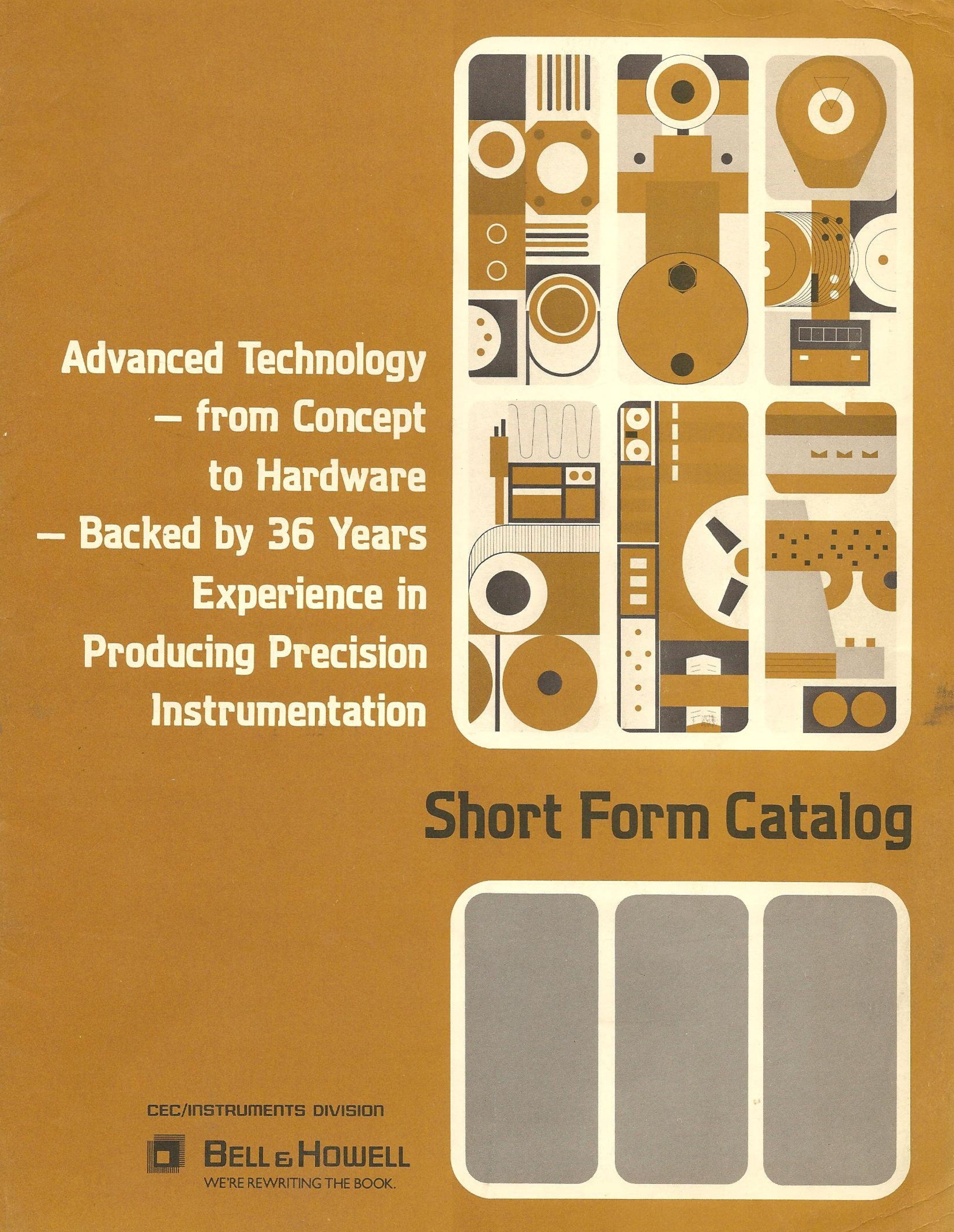
1973, deep in the Era of Brown. This typeface is Aquarius, designed by Ronald Arnholm and released by VGC shortly before, in 1972. The logos of Bell & Howell and CEC/Instruments Division are probably custom drawn. The slogan “We’re rewriting the book” is set in tightly spaced caps from Gill Sans.
Bell & Howell is a former manufacturer of cameras, lenses, and motion picture machinery, founded in 1907 in Wheeling, Illinois. CEC was a chemical instrument manufacturer founded in 1937 by Herbert Hoover, Jr. in Pasadena, California, and merged with Bell & Howell in 1960.
Digitizations of the complete catalog are hosted by Bitsavers as well as by John T. Jackson, Jr, who comments:
Bell&Howell Datatape, located in Pasadena, California during the 70s and 80s designed and manufactured state of the art magnetic tape recorders which were typically used for telemetry by military and aerospace facilities and laboratories. NASA used them to record the Apollo missions video which became the “Lost Apollo Tapes”. The early ballistic missile launches at Vandanburg Air Force Base were recorded on the one inch wide tape. Other laboratories such as Los Alamos and Sandia had many of them. The US Naval recorded sonar for spectral analysis.


")


")


 by Anthony Burgess (Aleph, 2019)")


")


