An independent archive of typography.
to participate.
Topics
Formats
Typefaces

MLS visual identity

Contributed by Sandro Weber on Dec 1st, 2021. Artwork published in .
    MLS visual identity 1
    Source: maeve.ch Atelier Maève. License: All Rights Reserved.

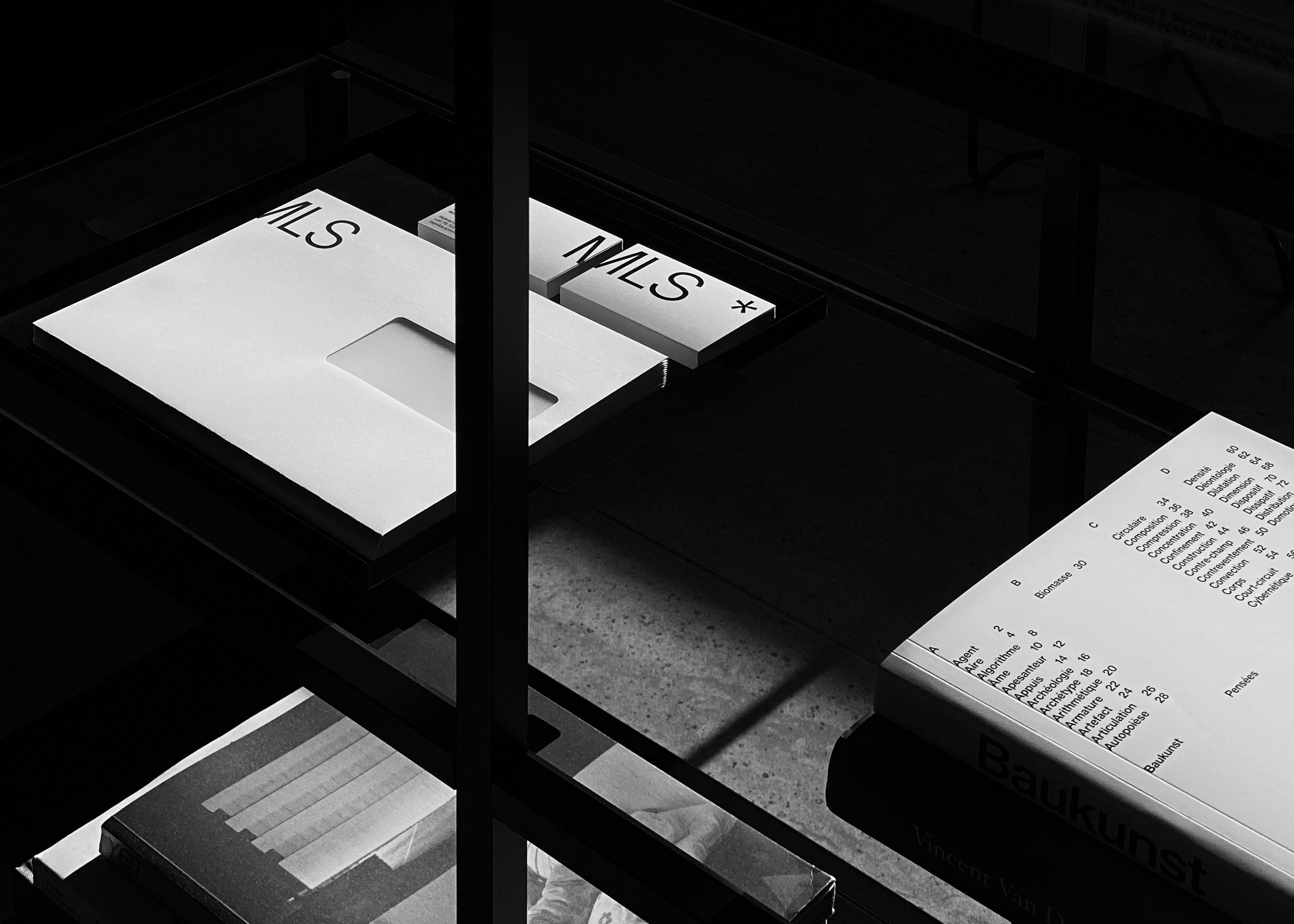
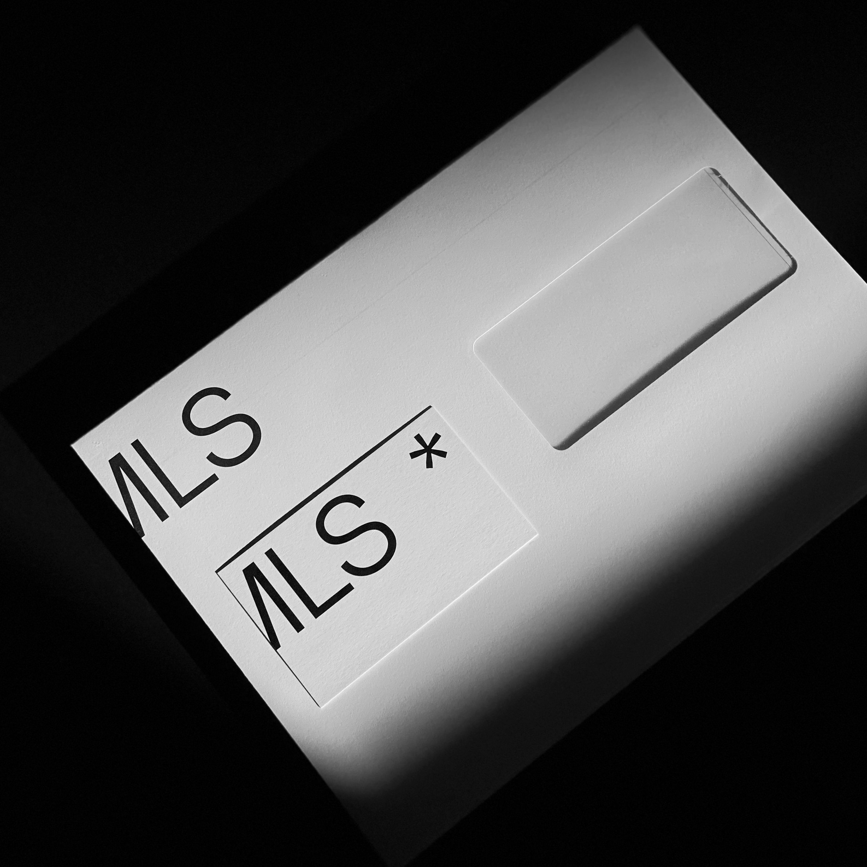
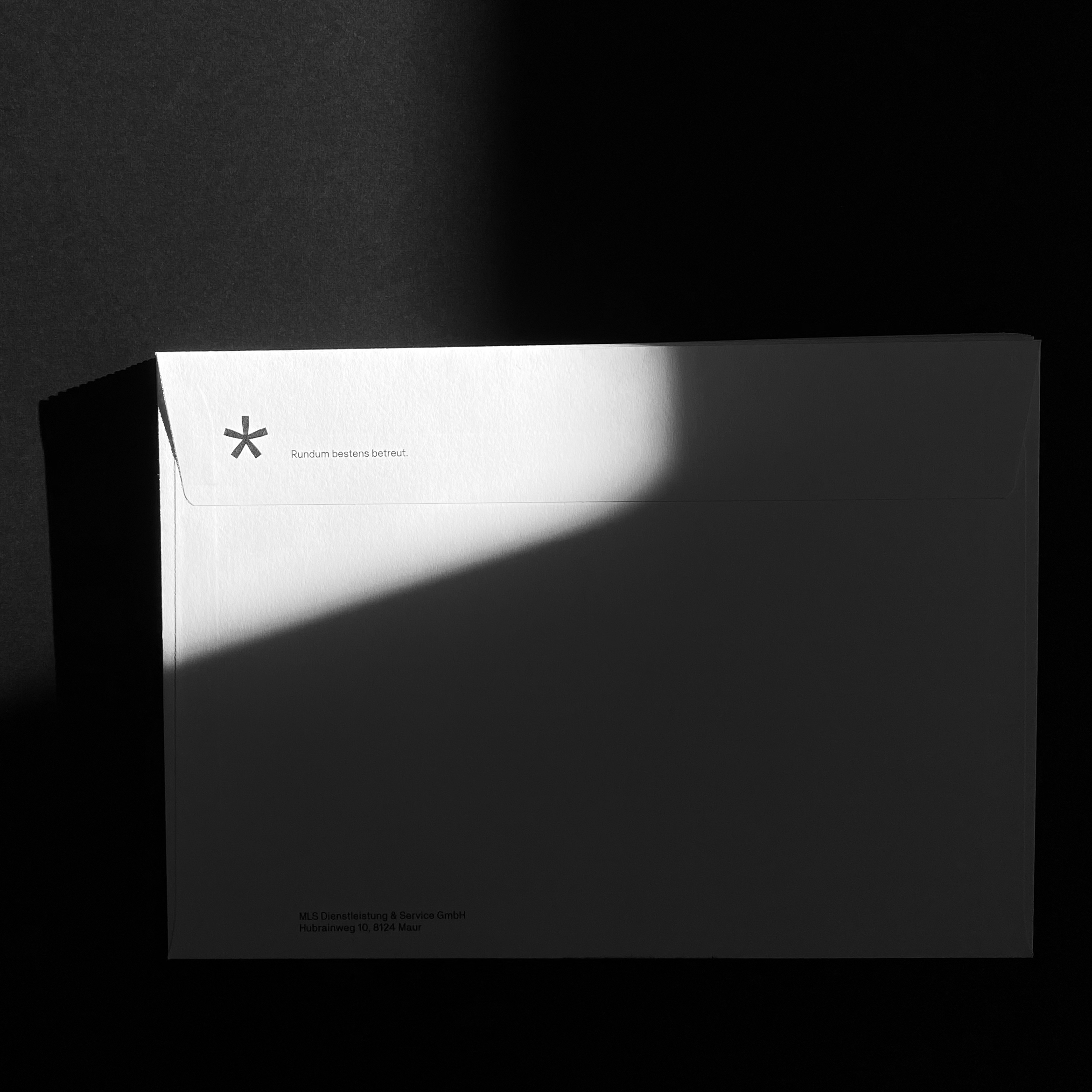
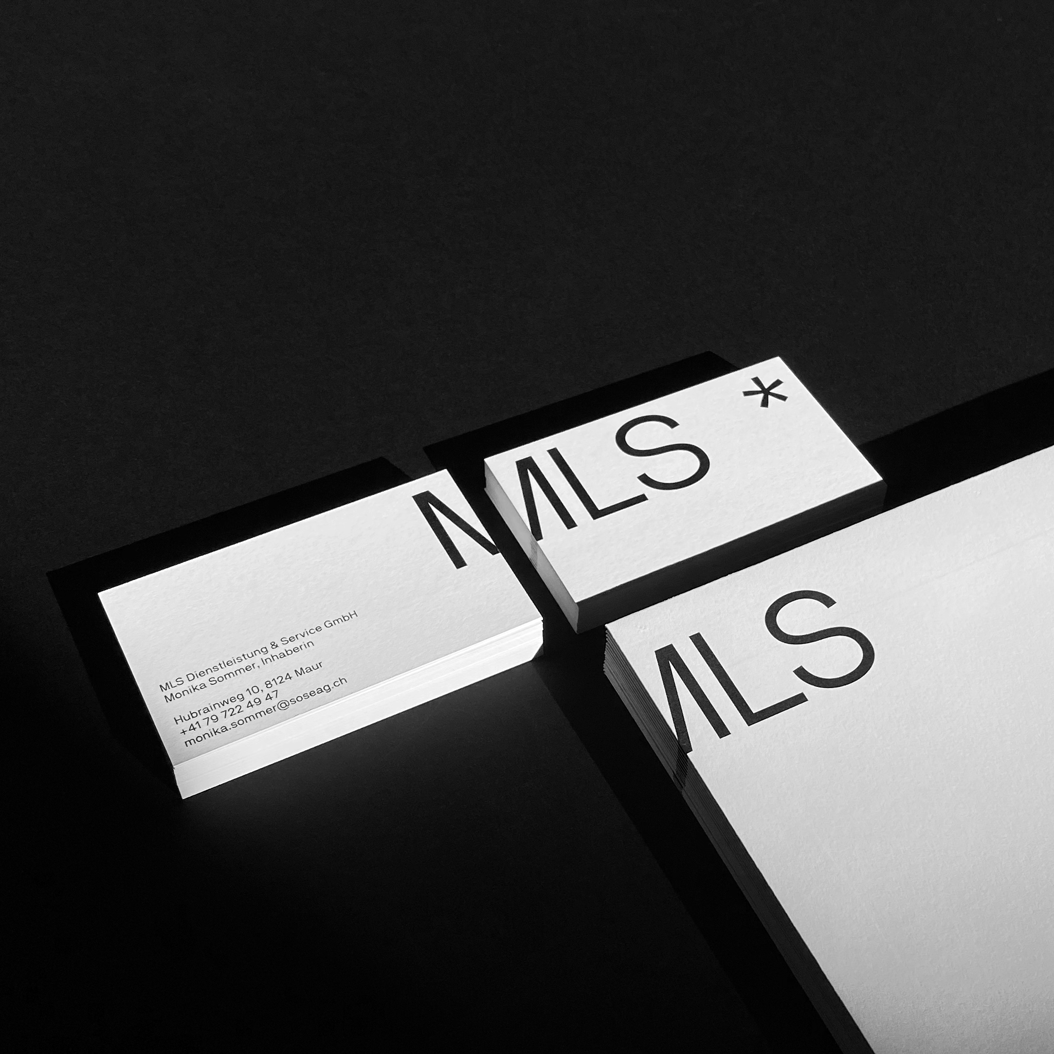
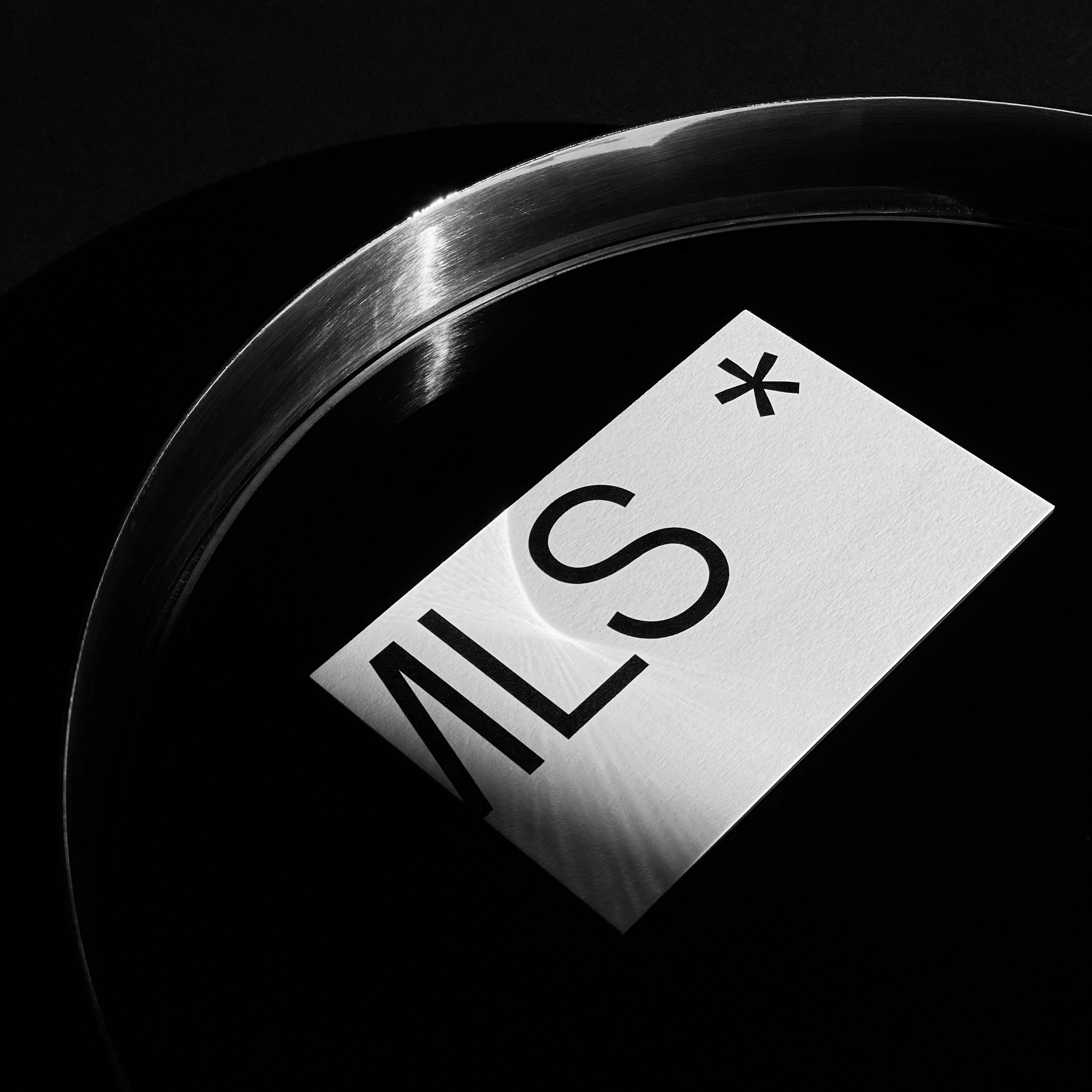
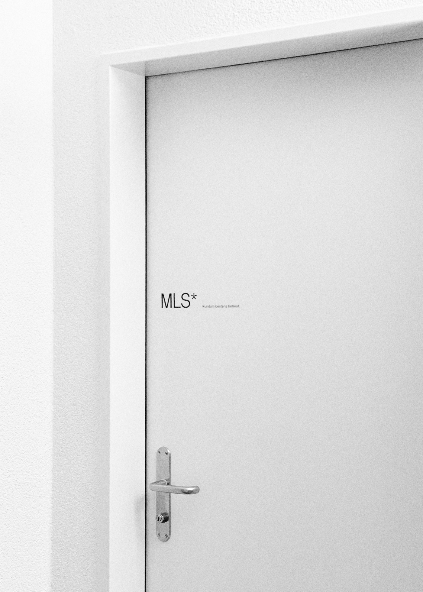
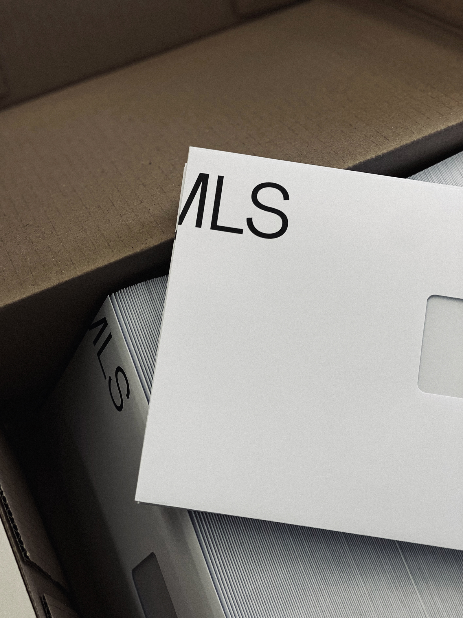
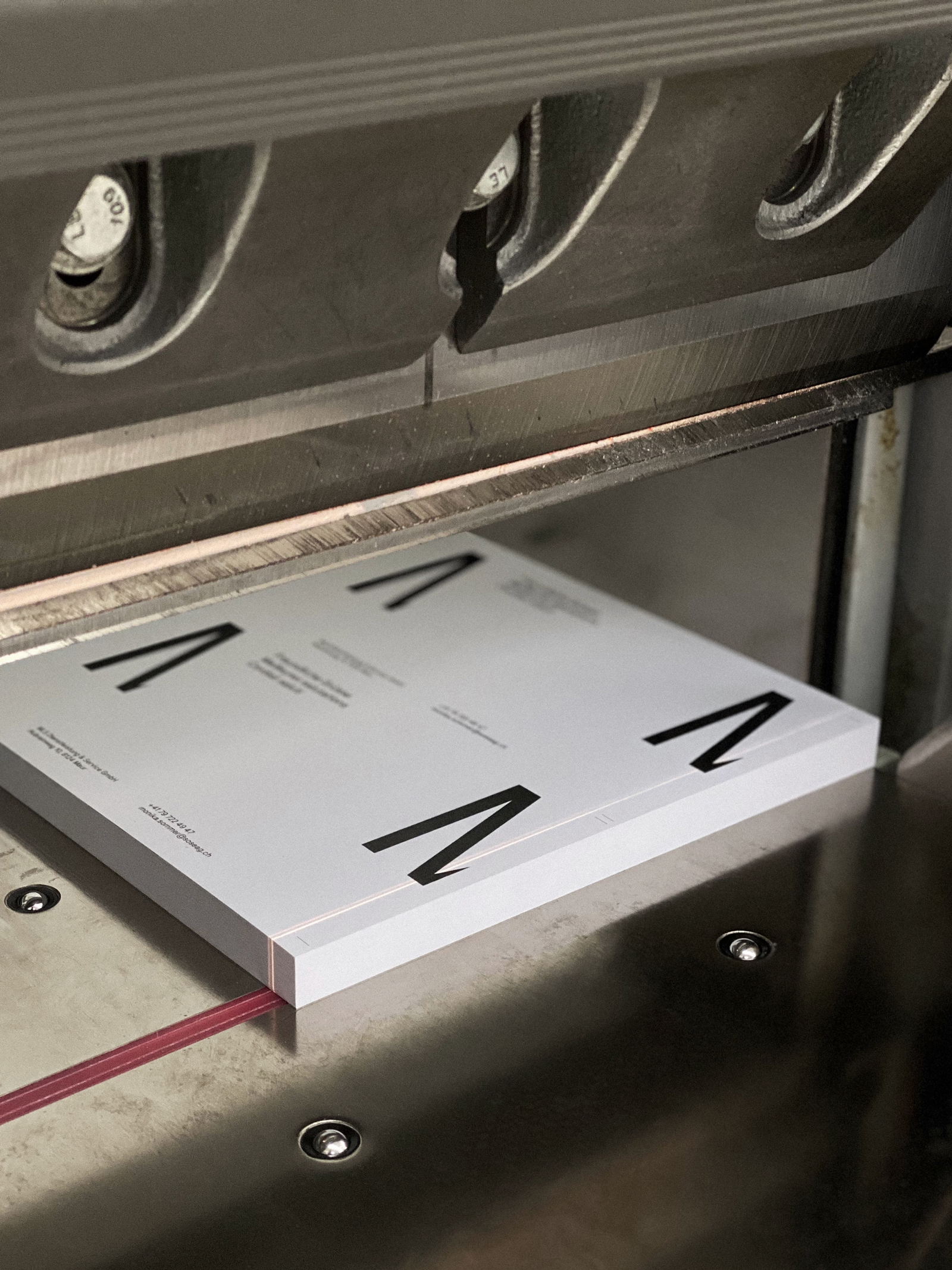
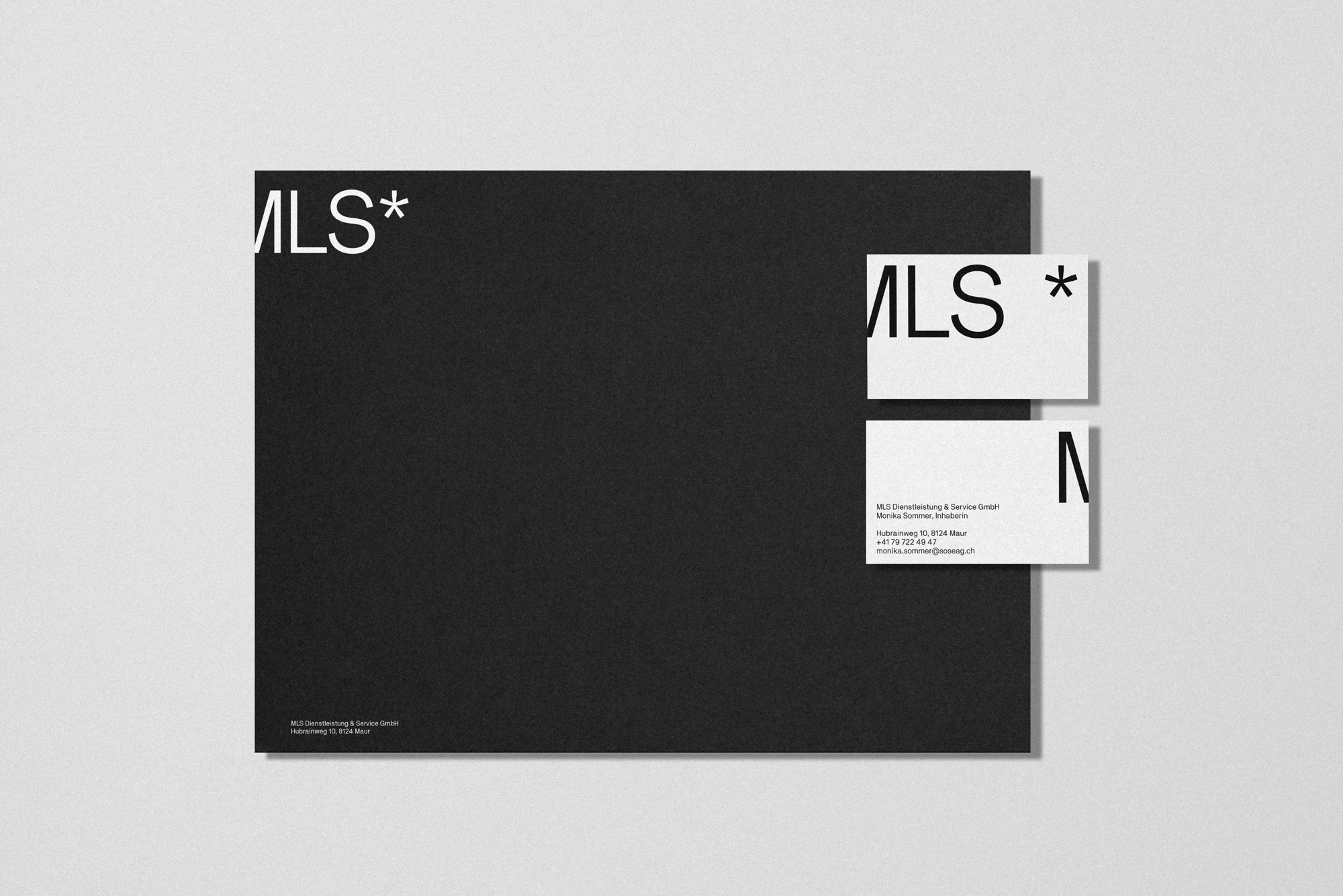
    Visual identity and stationery design for MLS Dienstleistung & Service GmbH in Maur, Switzerland.

    The minimalist visual identity relies on the intensity of the NB Akademie typeface by Neubau Berlin – with a precisely cut M around the edges of printed matter. While the symbol stands for the five core tasks and services of MLS, the split wordmark around the corners mirrors the claim “Rundum bestens betreut” (“Best care all around”).

    The chosen paper stocks are Z-Offset RAW by Fischer Papier and Sirio Ultra Black by Fedrigoni. Printed by GH Druck Volketswil, Switzerland. Client: Monika Sommer.

    MLS visual identity 2
    Source: maeve.ch Atelier Maève. License: All Rights Reserved.
    MLS visual identity 3
    Source: maeve.ch Atelier Maève. License: All Rights Reserved.
    MLS visual identity 4
    Source: maeve.ch Atelier Maève. License: All Rights Reserved.
    MLS visual identity 5
    Source: maeve.ch Atelier Maève. License: All Rights Reserved.
    MLS visual identity 6
    Source: maeve.ch Atelier Maève. License: All Rights Reserved.
    MLS visual identity 7
    Source: maeve.ch Atelier Maève. License: All Rights Reserved.
    MLS visual identity 8
    Source: maeve.ch Atelier Maève. License: All Rights Reserved.
    MLS visual identity 9
    Source: maeve.ch Atelier Maève. License: All Rights Reserved.

    Typefaces

    • NB Akademie

    Formats

    Topics

    Designers/Agencies

    Artwork location

    Post a comment