
Barry White – I’ve Got So Much To Give album art
Source: www.flickr.com Uploaded to Flickr by Bart Solenthaler and tagged with “laramie”. License: All Rights Reserved.
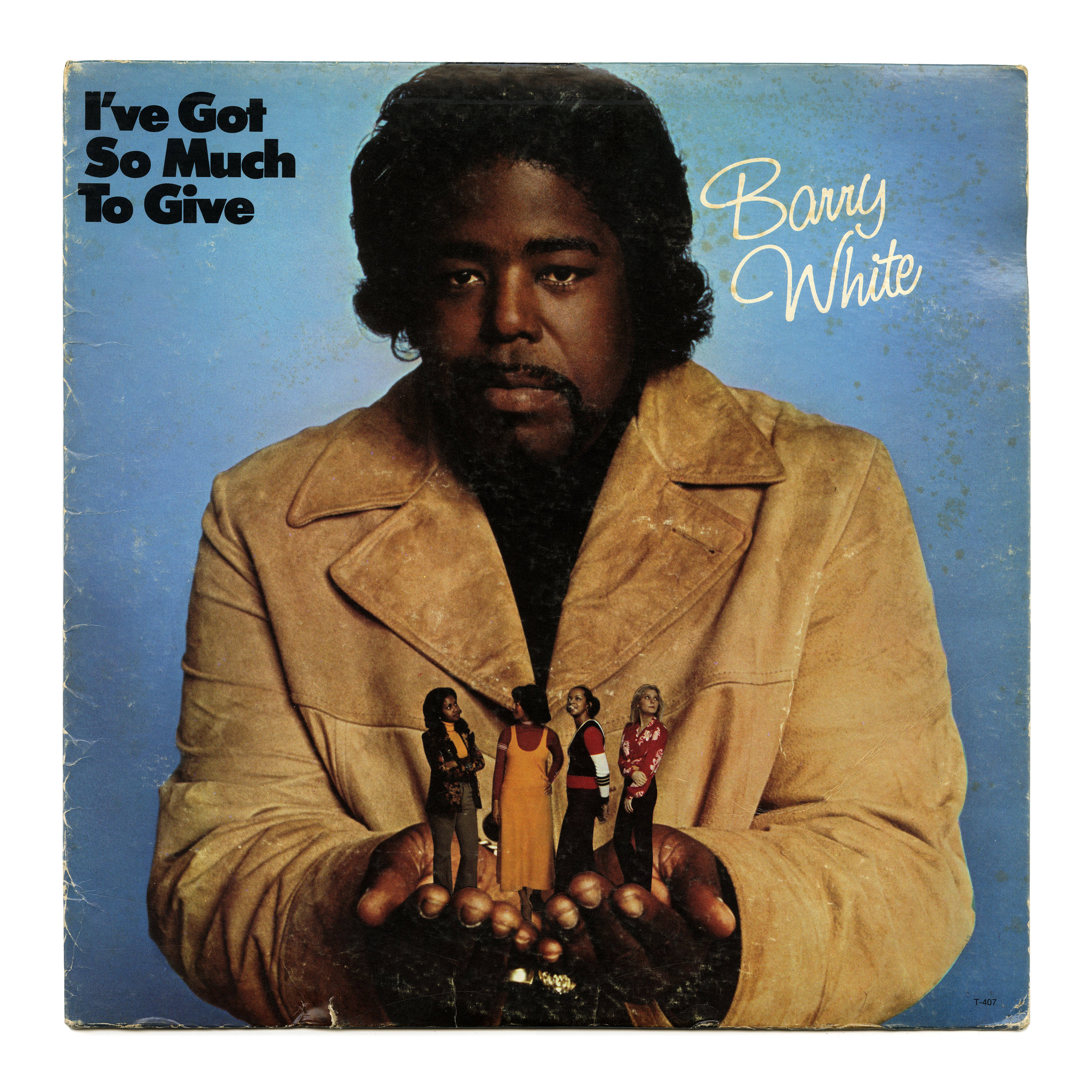
I’ve Got So Much to Give is the debut studio album by Barry White, released on March 27, 1973, on the 20th Century label. Design concept by Barry White, with photography by Ken Veeder. The back cover credits a spiritual adviser (Larry Nunes), but no typographer.


")


")


1 Comment on “Barry White – I’ve Got So Much To Give album art”
Honey, I shrunk the ladies!
The title is set in Tempo’s Black weight. This weight was added to Ludlow’s geometric sans series in 1942, ten years before Intertype made the similar Futura Extra Bold. See it also in use on the cover of Schriftindex Adolph Fürst & Sohn from 1969.
The script is a typeface with an interesting and convoluted history.
According to Joe Treacy of Treacyfaces, it was designed by Robert Evans around 1960, originally in a single light weight named Laramie, with two related styles named Sherbrooke and Cranbrooke, which were later folded into the Laramie family. All were outgrowths of ‘ruling pen script’ headlines Evans and other Headliners studio artists had created for ad agencies mostly located in New York City. By the early 1970s, there were three weights, now named neo-Laramie. Around 1992, Evans himself renamed it to Saginaw for the digital release. When Treacyfaces took over Headliners in 1995, they continued and expanded it as TFSaginaw. The digital family currently comprises nine weights plus three outlined/shaded styles.
A Headliners catalog from 1962 doesn’t show a face named Laramie, but has Sherbrooke, Cranbrooke, and Cranbrooke Bold; all three in upright and italic styles.
ITC Studio Script is basically the same design as Laramie. According to the announcement in the Spring 1991 issue of U&lc, it was “first designed by Pat Hickson of Manchester, England, as a ‘house’ face for one of her many clients.”
The comparison below shows neo-Laramie as depicted in an undated (ca. late 1970s/1980s) phototype catalog by Headliners (top), and the digital ITC Studio Script (bottom). I used the pre-OpenType version of ITC Studio Script. It comes with several alternates that are not all shown here, for example a non-cursive A with splayed legs. The OpenType version of ITC Studio Script has even more alternates, including a script s like the one included in the pre-digital Laramie. It is quite possible that the original Laramie had more alternates, too.
Bottom: ITC Studio Script (pre-OpenType version, showing only some of the available alternates)
You can see how closely ITC Studio Script follows Laramie. I don’t know what happened here – maybe Hickson/ITC struck a deal with Bob Evans in the early 1990s, when Headliners only started to make the transition to digital, and before Treacyfaces acquired their assets. In any case, the article in U&lc doesn’t tell the full story. Some font retailers credit Evans for the design of ITC Studio Script, and not Hickson.
There is also a digital font family named Laramie (Pro). It was “designed” by Profonts Studio in 2005, in four weights. Profonts was a foundry founded in 2005 by Peter Rosenfeld and Dr. Jürgen Willrodt of URW++. I assume it was acquired by Monotype together with the URW Type Foundry in 2020. Their presentation of Laramie makes no mention of Robert Evans or Headliners.