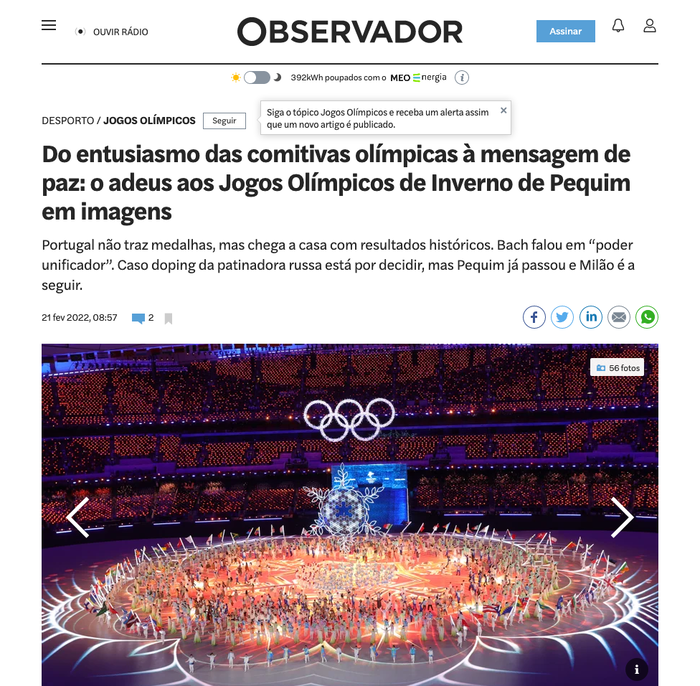
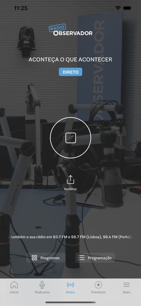
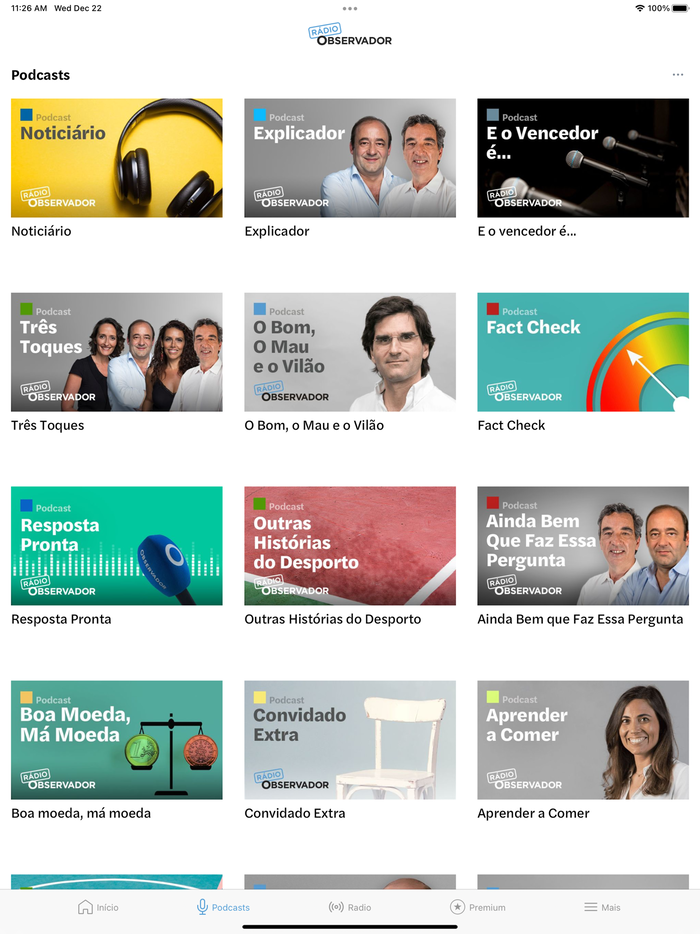
Observador website and app
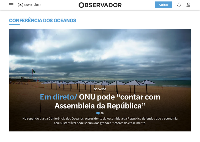
Homepage (detail)
Halyard Text is the primary typeface used by Observador. Launched in 2014, the Portuguese newspaper was rather unique at the time in that it was published exclusively in digital from, with no printed edition. In 2021, Observador revised its typography and chose new fonts that better represent the newspaper’s identity and brand.
The main typeface used both on the website and the mobile apps now is Halyard Text by Darden Studio, replacing the old Roboto in headlines, decks and highlights, but also in navigational elements and auxiliary texts. Halyard Text can prove itself as an on-screen workhorse sans that’s clear and pleasantly readable across a range of sizes and weights, without compromising on character and distinctiveness.
For the process of selecting the new typefaces, Observador’s in-house design team consulted with art director Ana Freitas. “After we reached a small group of finalists, Halyard Text was the one that stood out for being the most functional, expressive, dynamic and recognizable”, explains design manager Alex Santos. Freitas characterizes Halyard Text as “a flexible, contemporary and very consistent typeface.” The newspaper acknowledges that typography is a crucial element in brand communication: the style guide prescribes Halyard Text for all communication elements, to be used whenever possible.
Halyard Text is paired with Noto Serif for body text. The latter was chosen as it better harmonizes with Halyard Text than the previously used Georgia.
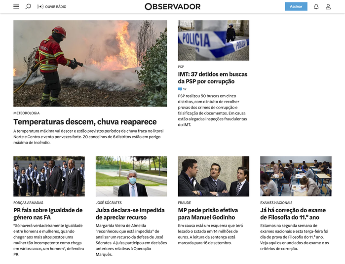
Homepage detail with article teasers
Topics
- News (456)
Designers/Agencies
- Observador (1)
- Ana Freitas (1)
- Alex Santos (1)
Tagged with
- Portuguese (language) (297)
- news websites (8)
- newspaper websites (26)
- apps (110)
- iOS apps (47)
- typeface combinations (2267)
- multiple weights (262)
- headlines (144)
- reversed type on an image (780)
- user interfaces (UI design) (166)
- buttons (UI) (77)
- podcasting (42)


