
L’Amour du Pain
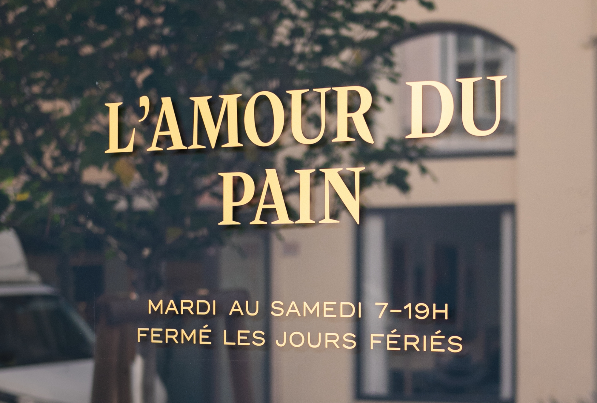
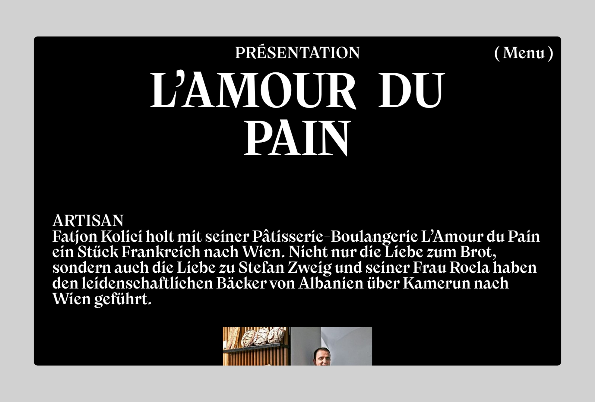
Since late summer 2021 the creative consultancy and design studio Cin Cin has been developing an extensive identity for the French café/pâtisserie L’Amour du Pain in Vienna. At the heart of the brand’s design is the typeface Nikolai by Franziska Weitgruber.
Most designs for French cafés outside of France look uniform: too creamy and cute. It’s all about avoiding clichés when it comes to creating a new brand. Cin Cin therefore tried to establish a contemporary look without losing sight of tradition. A fresh typeface was needed, one that is both timeless and strong in character, as it would, in some cases, be the only visible element of the identity.
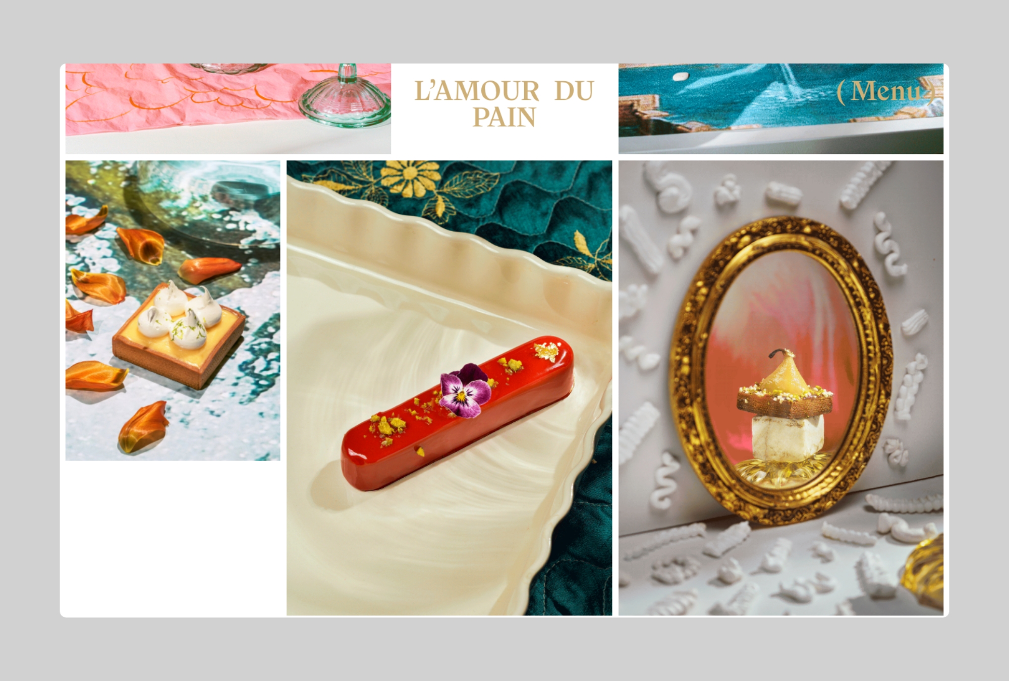
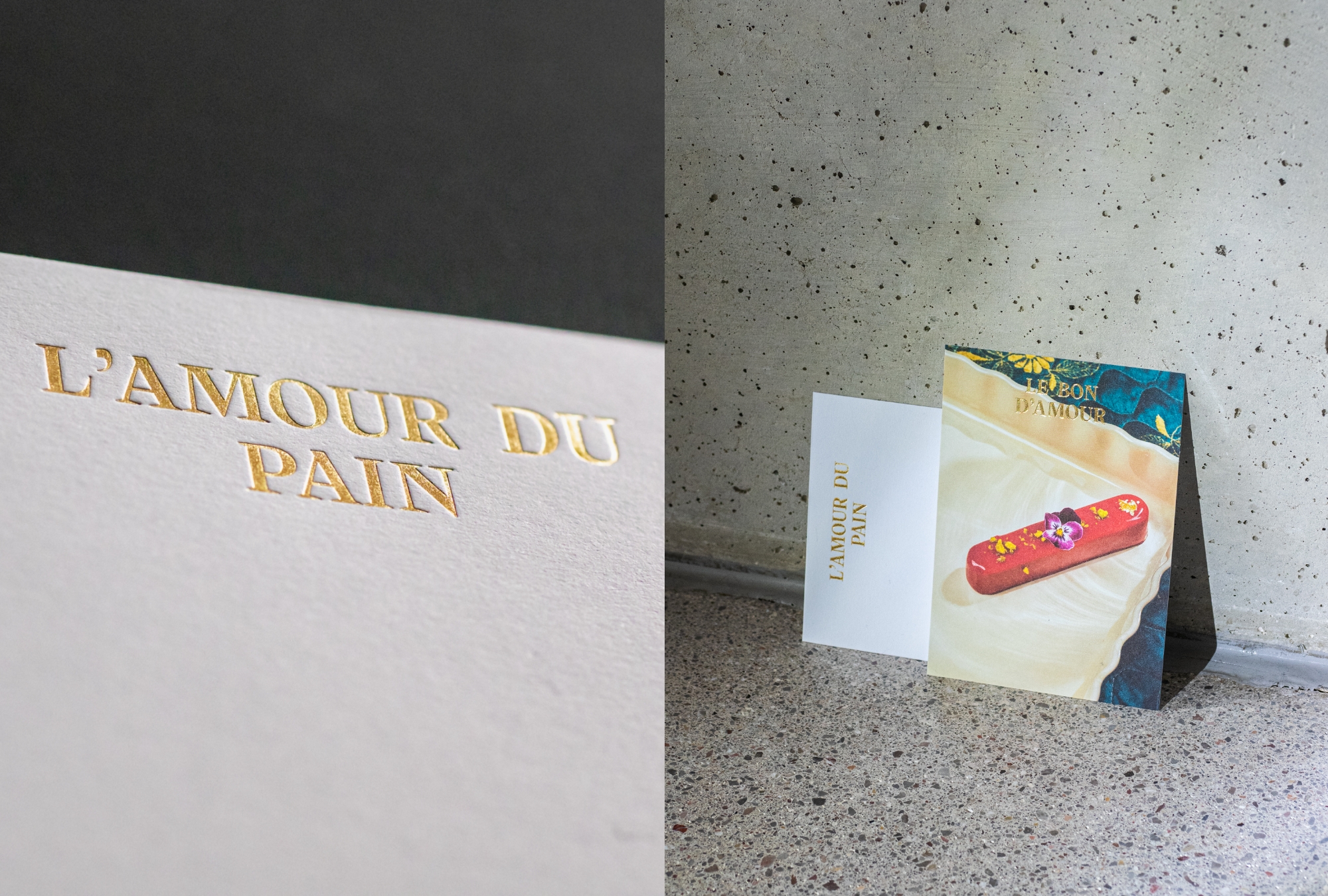
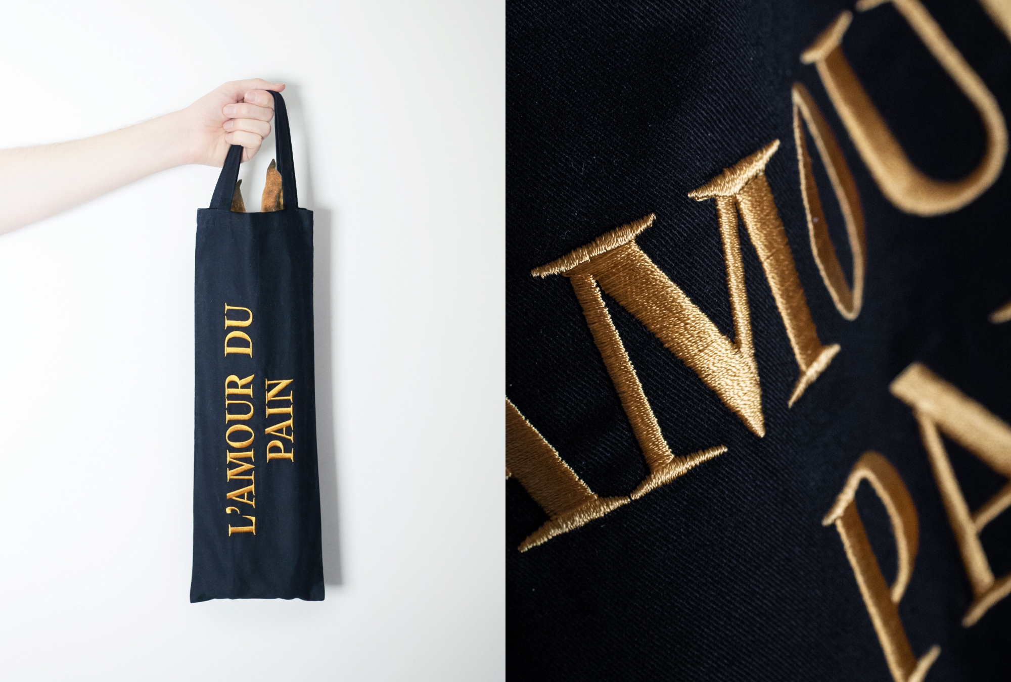
The brand’s lettering – sometimes in combination with artistic food photography by Erli Grünzweil and Susanna Hofer – can be found on many applications: as storefront signs, on the customized modular packaging, on voucher cards (embossed with gold foil) as well as on a small capsule collection consisting of Le Sweater and Le Sac – a specially tailored tote bag for baguettes. Nikolai is paired with Trio Grotesk by Florian Schick.


")


