
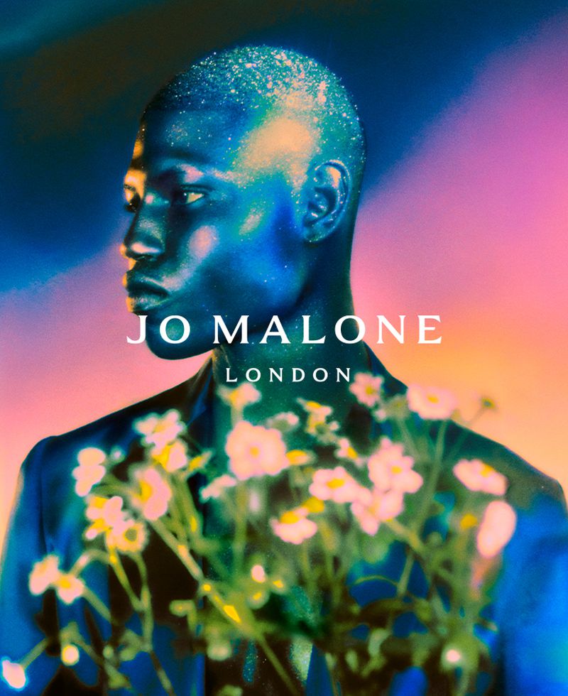
Jo Malone (2019 brand overhaul)
Logotype
Bold-Decisions (Mads Wildgaard) was approached by Pete Howe, Print Director at Jo Malone, in 2018. The brand was about to update its identity, and sought to develop something sturdy to take the weight off the broad shoulders of its existing font choice, whilst being elegant and non-generic. As a surprising and imperative decision, there was no actual brief, but instead, a pleasant trust from the creative team to come up with something new. From our side, it was clear in the cacophony that the Brexit discussions were at the time, that English design history is not detached from the European continent by any means. And so the process began of trying to merge the channel of what this visual history was. The typeface had to levitate while staying firmly grounded and be calm while expressing a lot. Much opposed to how the world seemed at the very moment.
A highlight in the process came one morning on the way to our initial design concept meeting, when it occurred to us that not only did our design come from a certain angle of graphic design history — the subway map font by Johnston itself was this starting point of this history that we now could update and use.
In a handful of revisions, we came to the basic shapes with Pete and his team, and then slowly dressed up the entire typeface in a range of weights from Book to Semi-Bold and OpenType functionalities. The typeface also includes a small caps which are used extensively for titling on the packaging and in-store. It became, to us at least, a very joyful collaboration, that made it clear that not everything today has to end up following a generic recipe.
Besides the overall “leading font”, aptly named Malone Serif, we were also asked to develop the new logotype for the brand, together with Pete Howe. Furthermore, the packaging and identity features Lars in a custom version drawn for Jo Malone London.
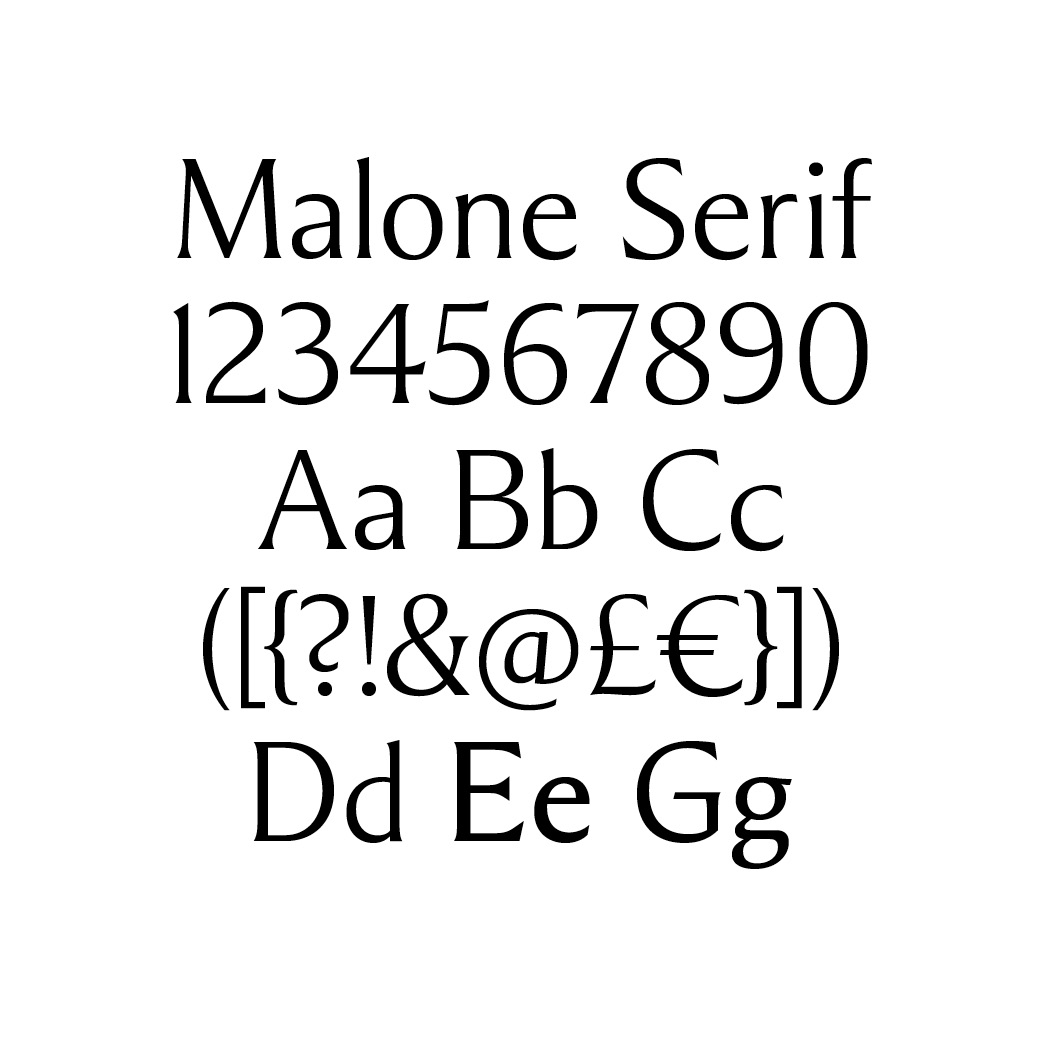
Malone Serif is the custom typeface developed for Jo Malone.
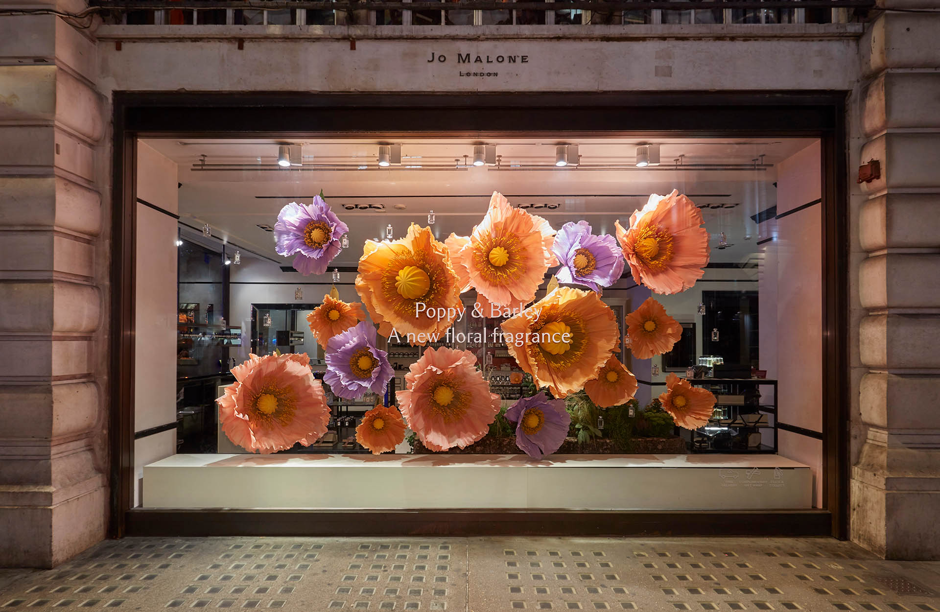
Shop window decoration

Flacon design for Bitter Mandarin Cologne
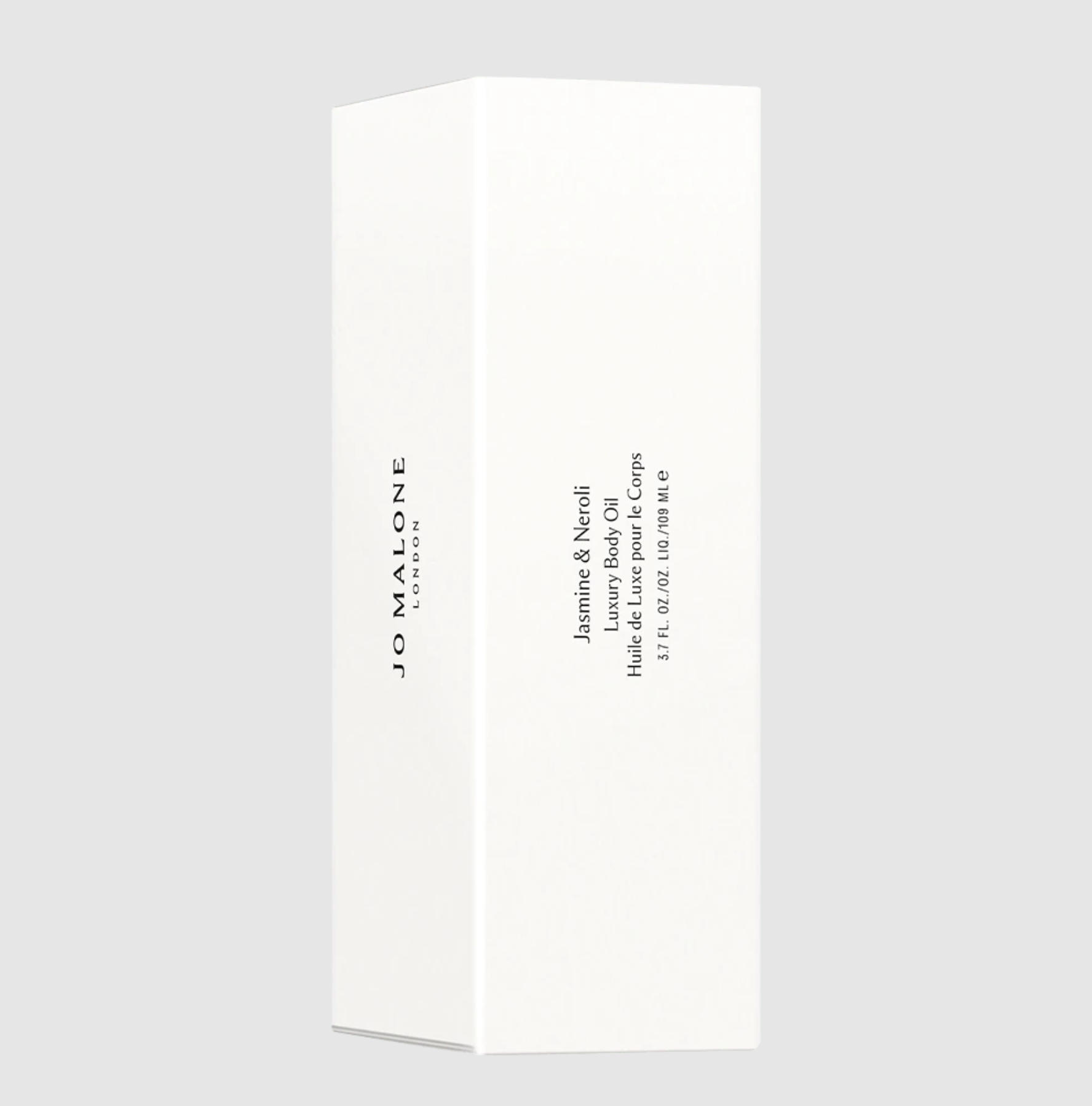
Box design for Jasmine & Neroli Luxury Body Oil
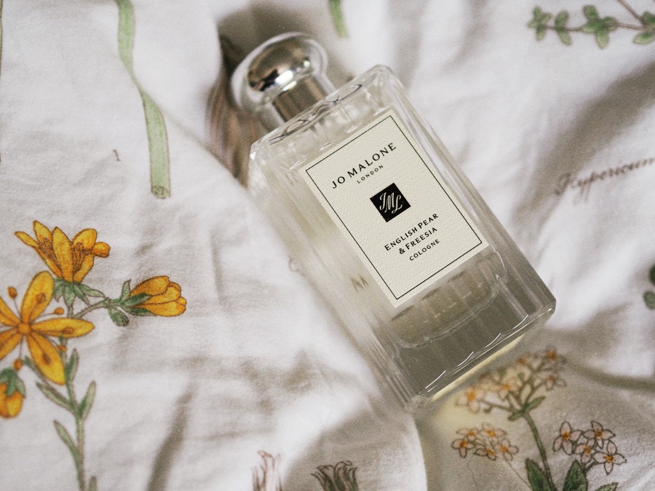
Flacon design for English Pear & Freesia Cologne

Lars Malone is a customization of Lars.
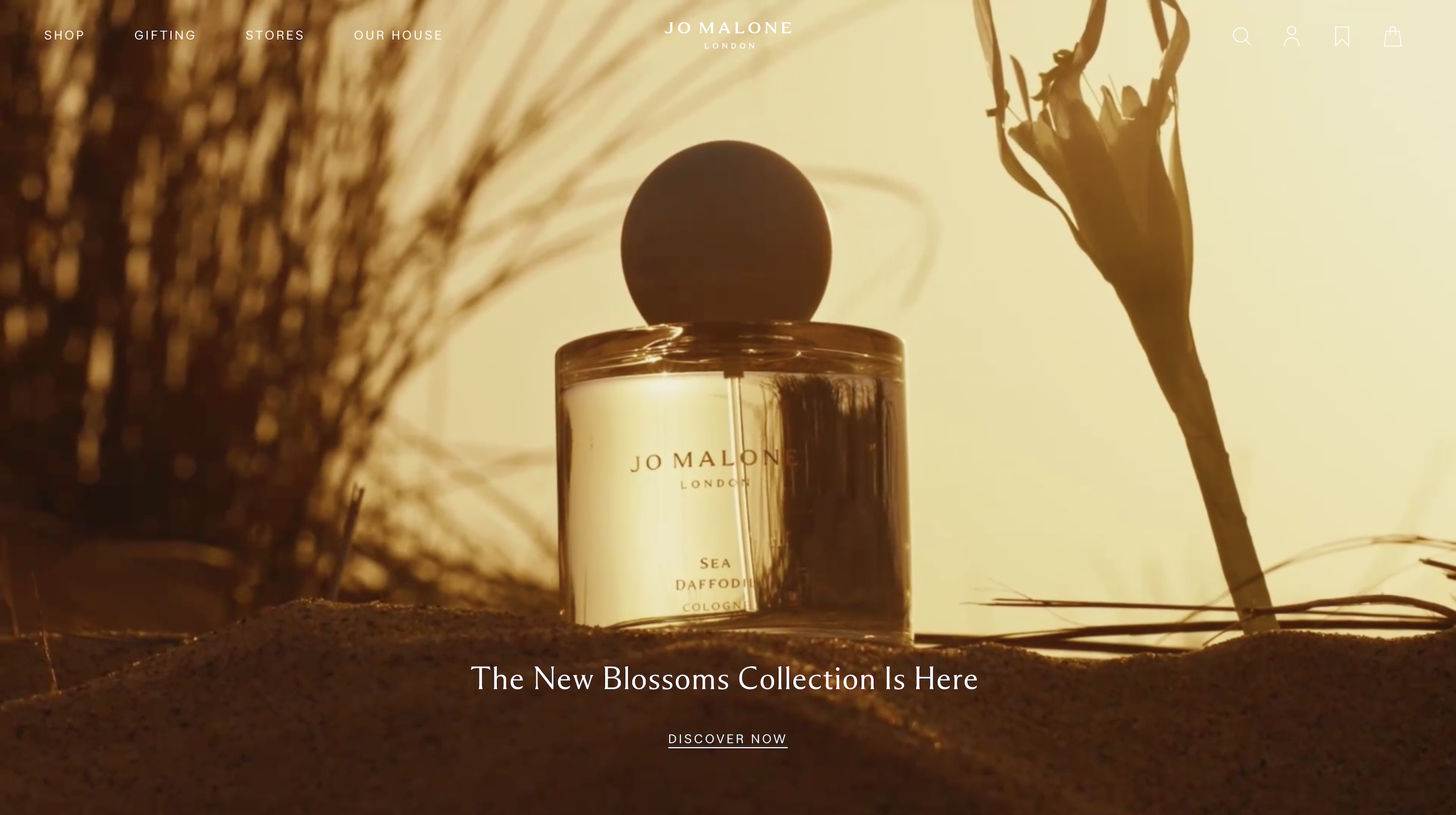
Malone Serif and Lars Malone as used on the Jo Malone website

Malone Serif and Lars Malone as used on the Jo Malone website


")


")
