
Los Prósperos brand identity
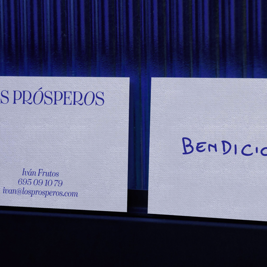
Los Prósperos is a conscious gastronomic consultancy founded by Iván Frutos. Based in Madrid, he helps manage emotions to teams and hotel leaders through coaching.
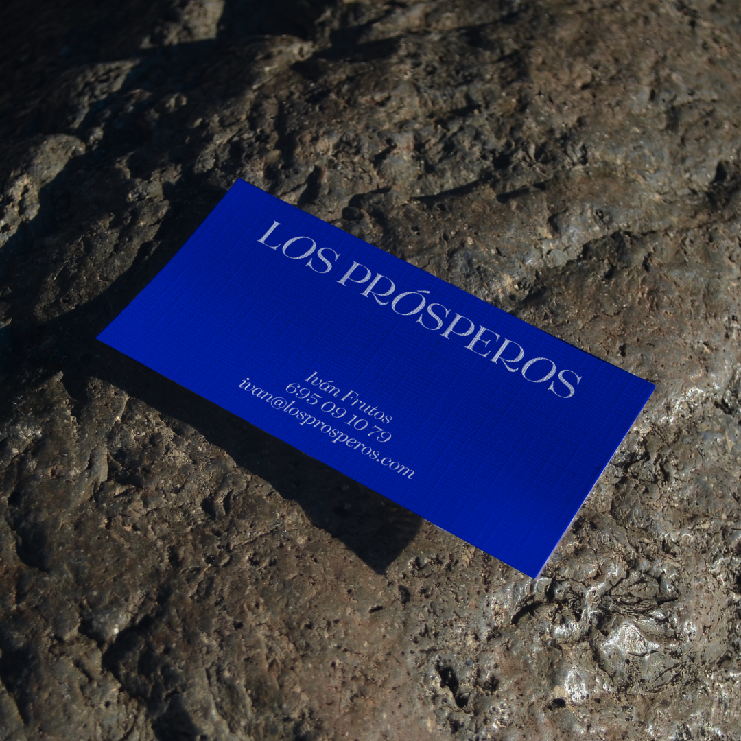
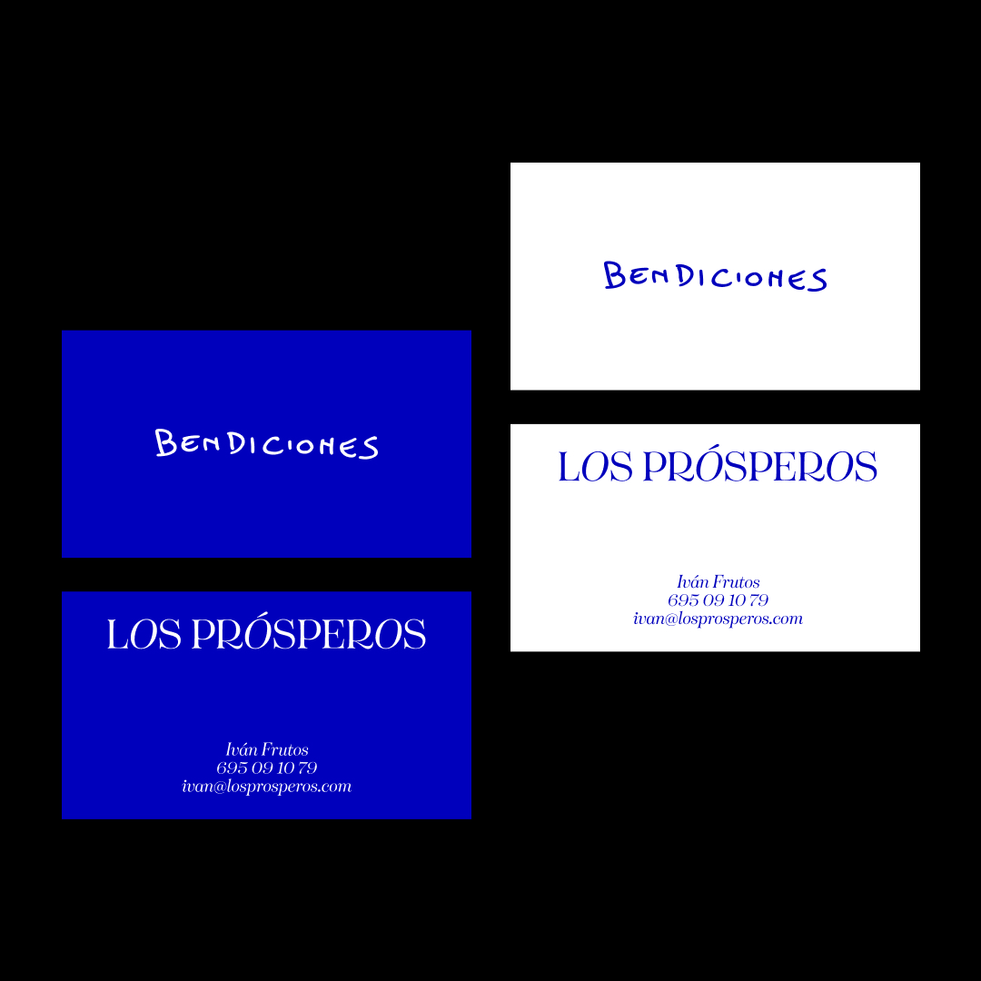
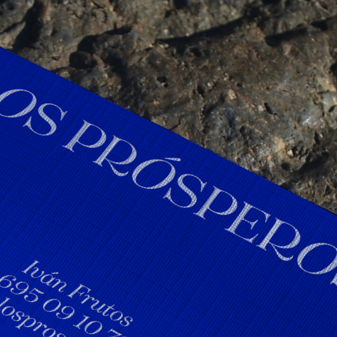
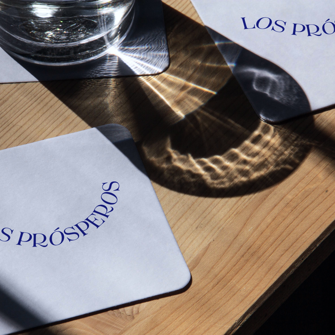
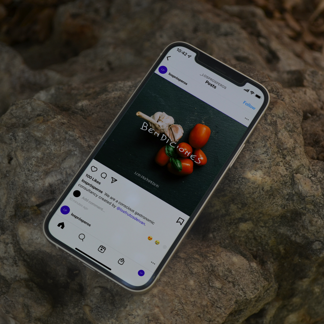
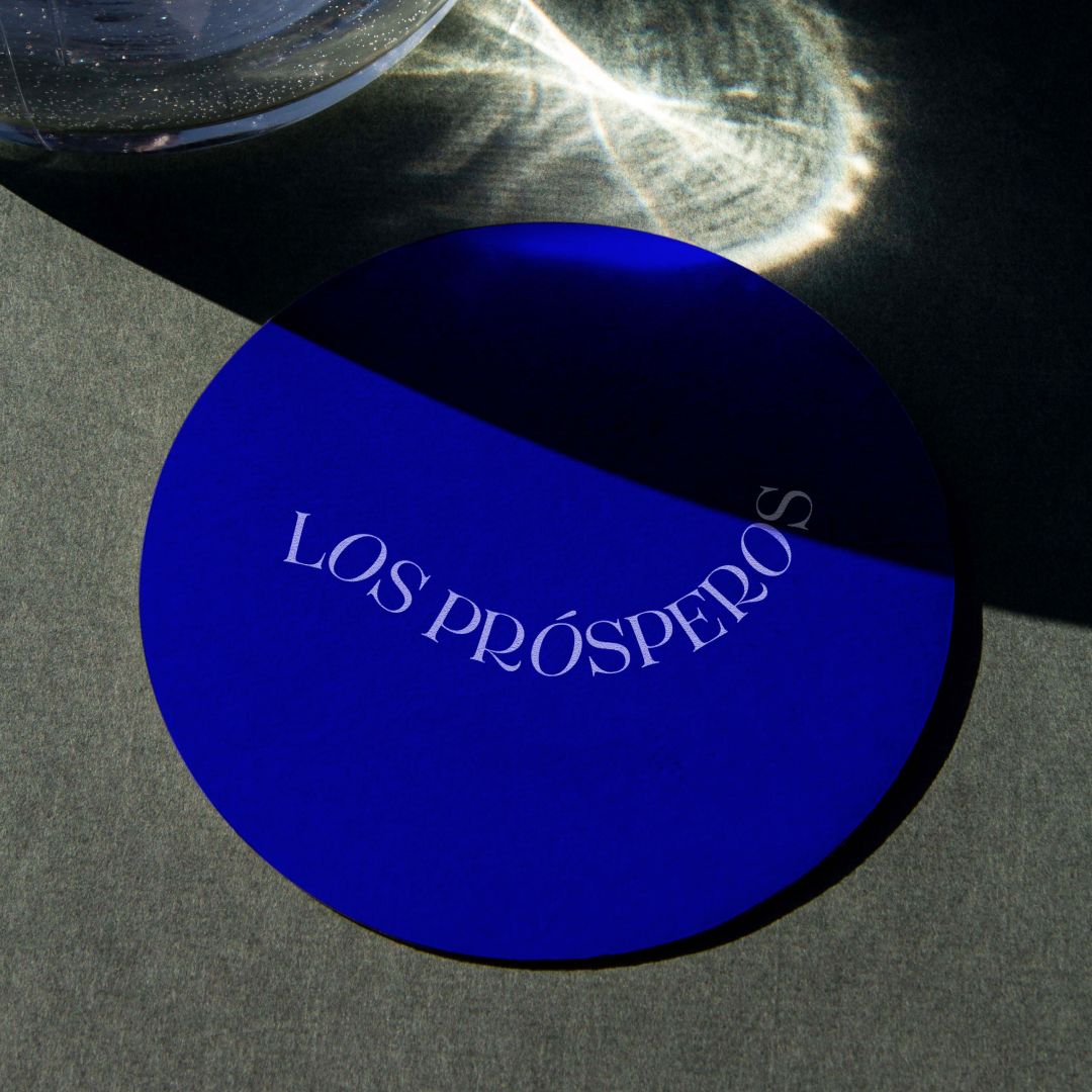
We worked on the creation of the logo and business cards for his brand. We wanted to convey Iván’s creativity and uniqueness, while maintaining an elegant look. We achieved this with Tenez, the typeface we chose for the logo, combining its Regular and Italic styles. For the business cards, we decided to add the word “Bendiciones” (“Blessings” in English) in Ivan’s handwriting. He told us that it is something he says a lot, both personally and for his business, so we thought it was a resource that added to the brand’s character.
Los Prósperos’ color palette pivots between black and white neutrals and an electric blue accent, which goes hand in hand with Ivan’s outgoing personality, as well as creating a focal point of attention in the branding.


")


")