
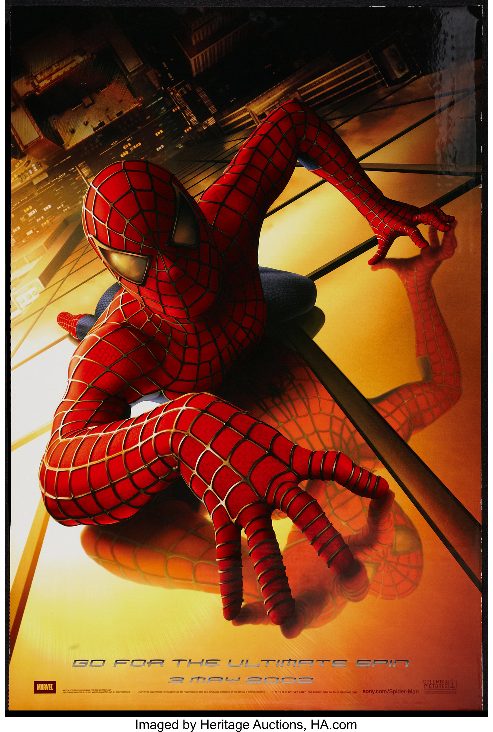
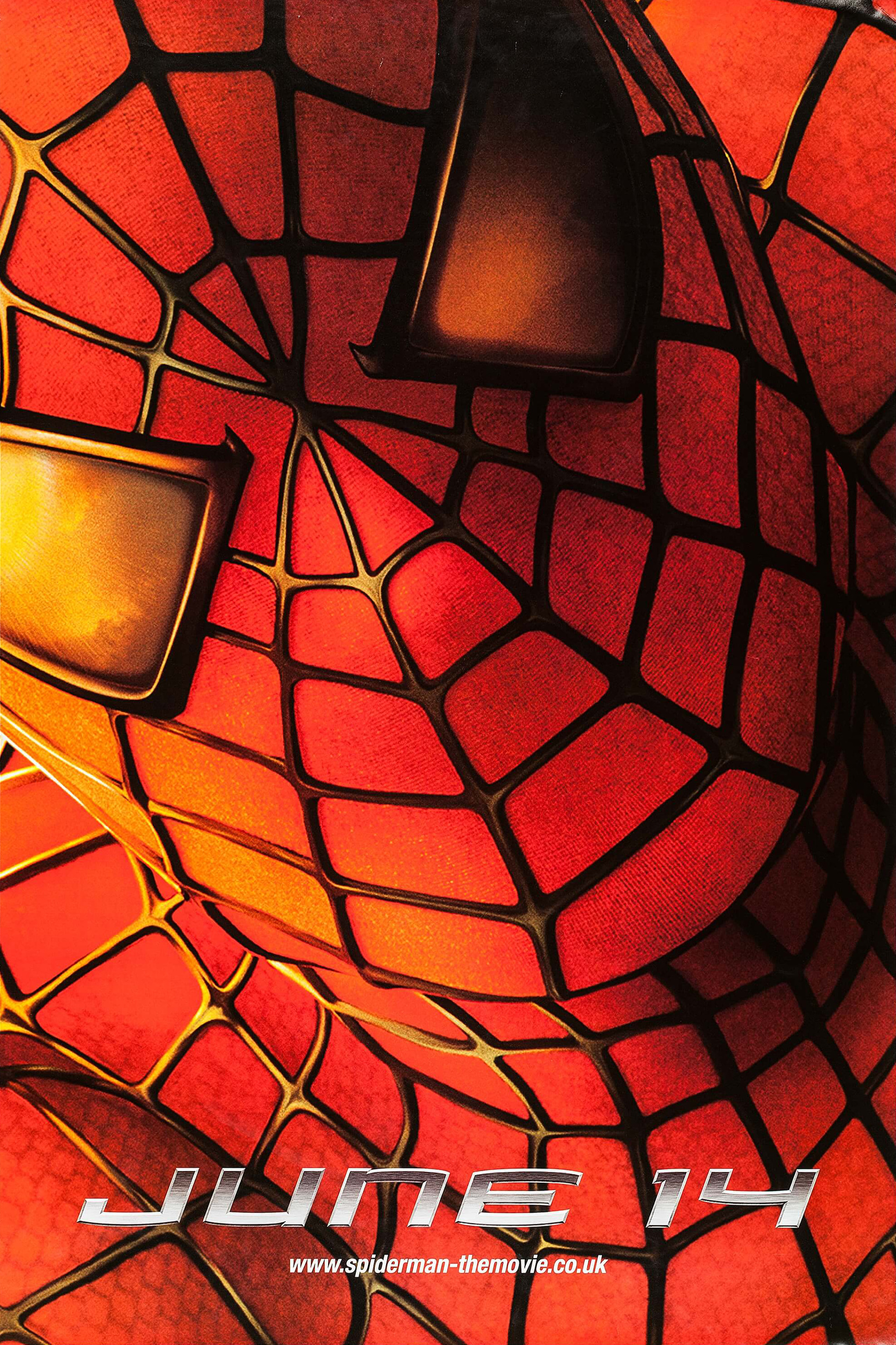
Spider-Man (2002) movie posters
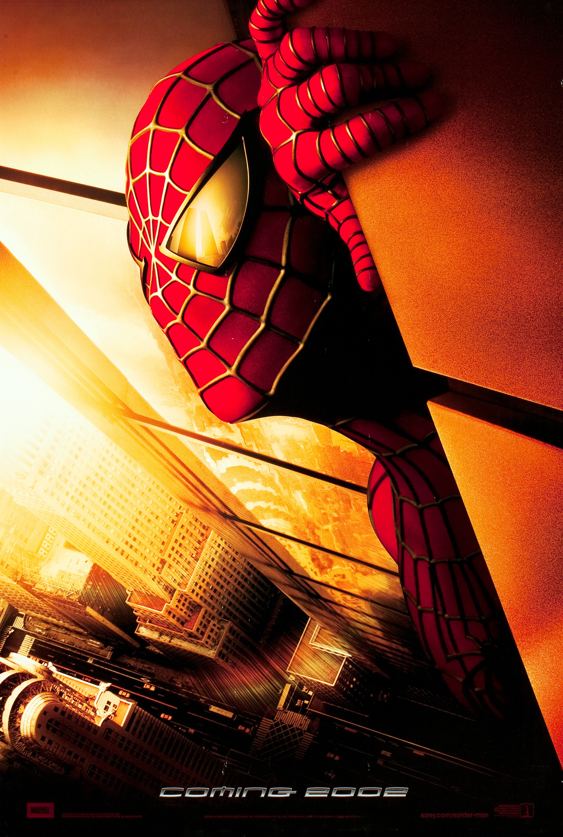
The posters for the Spider-Man trilogy directed by Sam Raimi use a customized Mata. Shown here are various posters made for the first installment in the superhero series from 2002, starring Tobey Maguire, alongside Kirsten Dunst, Willem Dafoe, and James Franco; produced by Columbia Pictures, Marvel Enterprises, and Laura Ziskin Productions; and distributed by Sony Pictures. The poster designs are credited to Vox and Associates as well as Creative Domain, with photography by Peter Tangen.
The letterforms of Greg Samata’s 1993 design were modified to varying degrees. In addition to the obliquing and the chrome effect that is common to all text, R and Y got shorter spurs (see “FOR” and “MAY”), and the 1 (in “JUNE 14”) a shorter nose. The Spider-Man logo was further customized, with spurs on the top of P and N. The same customized Mata was later reused by Sony for the PlayStation 3 logo.
One Sheet poster (27″×40″)

One Sheet poster (27″×40″)


Willem Dafoe as Norman Osborn, a.k.a. the Green Goblin


")


")


")

2 Comments on “Spider-Man (2002) movie posters”
Hi! I find this font Homoarakhn which is quite similar. I think the font in the poster is Mata but this can be in the Related Typeface?
Hi Nathan,
The similarities are not accidental. Here’s what happened: in 1997, someone made a copy of Greg Samata’s Mata (1993) and thought it was a good idea to publish it as an anonymous freebie, with the comment “I made this font so I could have something looked like the Pumpkins 1979 single”. That single used Mata. Everyone who wanted to have something that looked like the Pumpkins 1979 single simply could have licensed Mata.
After the Spider-Man movie used a customized Mata (as shown here), someone released an oblique version that replicated the modifications seen in this use, again anonymously and for free, under the name Homoarakhan, with a note saying “spiderman font, based partiialy on 1979 font”. It’s derivative and unauthorized, and hence ethically problematic (the original Mata was released just a few years earlier). Also in technical regards, it’s a poor font, with a very limited character set (no accents etc.), faulty spacing and no kerning. If we receive a submission featuring Homoarakhan, we’ll probably add it. But since there is nothing recommendable about it, I leave it at this comment for now.