
German alphabet learning cards, 1950s
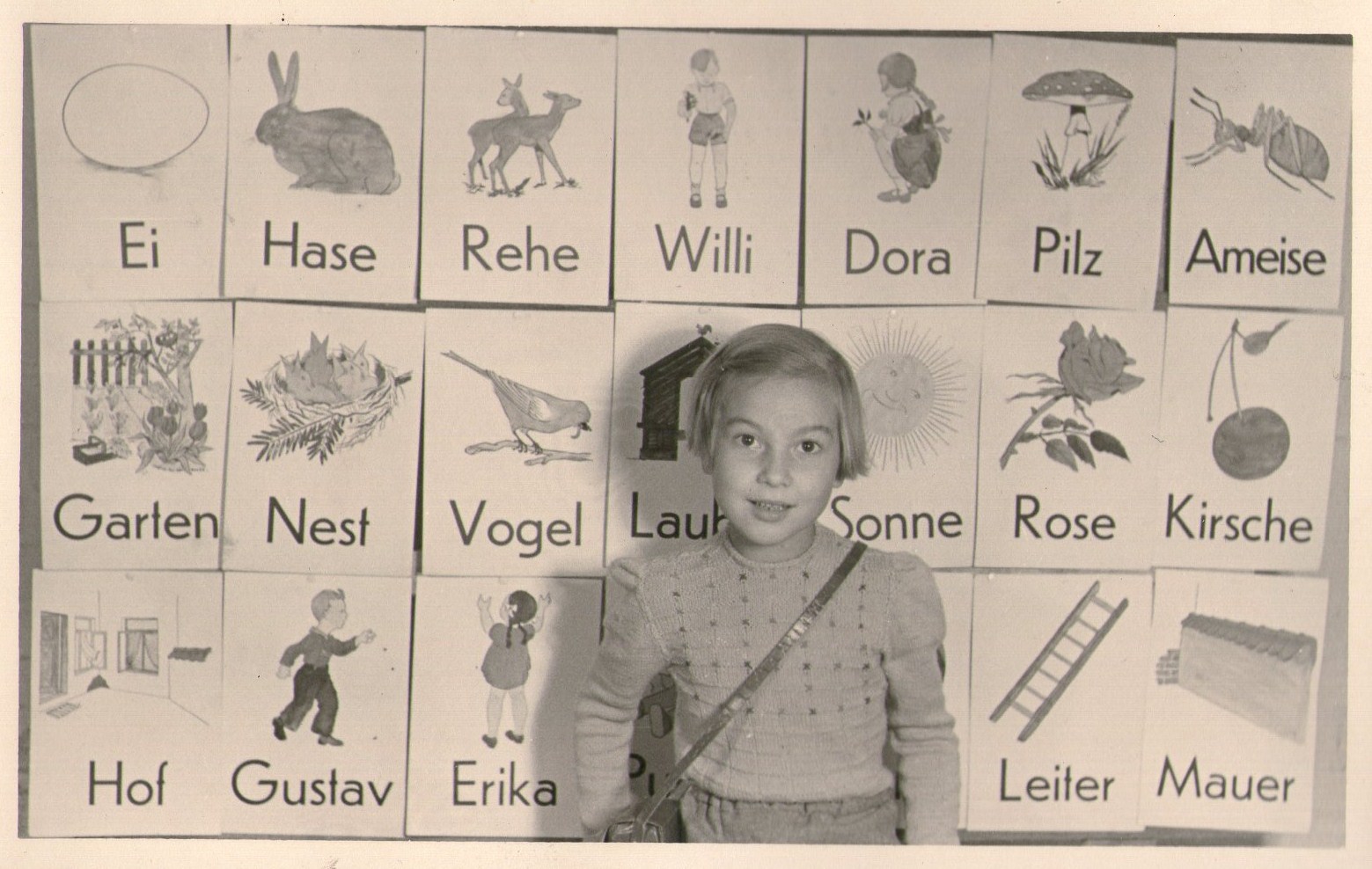
German learning cards from the 1950s, including Ei (egg) and Hase (hare).
The typeface is Erbar-Grotesk (1926) with its two-storey a. Initially the default form, it was later relegated to alternate status, and replaced by a monocular a. This change was very likely motivated to bring Erbar-Grotesk closer in appearance to its more successful competitor Futura. The original two-story form has the benefit of being less ambiguous – it can’t be confused with the letter o –, making it the preferable option for abecedarians.
Geometric sans serifs are often chosen for material in primary education. Their elementary shapes are spuriously equated to easily readable ones. Erbar’s double-storey a may be unambiguous, but other letterforms, like the f and t with their undersized features, don’t perform as well.


")


")
")


")


")

4 Comments on “German alphabet learning cards, 1950s”
While the two-story a is less ambiguous, I am under the impression that many children are taught to write with the single-story a, and thus it might be superior since it more closely parallels their writing. The form is also common in fonts targeted at children, such as Helvetica Textbook and the Sassoon fonts.
Sans-serifs for children makes sense to me based on the same rationale – children don’t draw in the serifs when handwriting, and thus using a font without them while they’re learning may help, lest one of them attempt to do so.
That’s correct. My point was specifically about geometric sans serifs – children don’t use a compass and a ruler when writing either.
More importantly, writing is not the same as reading. The letterforms chosen for teaching these two skills don’t necessarily have to match. I’ll quote myself from an old Typophile thread about the purpose of Schoolbook/Infant typeface variants:
The significance of a single-storey a for children is, at least, debatable. Such a typeface might come in handy for teachers, when it is both used for reading and (as a model for) writing. Apart from that, the benefit of avoiding confusion of a and 𝒶 is soon outweighed by the potential – and likely – confusion of a and o.
Children are not stupid, they can handle more than one representational form per character. Their world doesn’t end at the edges of their primer. They do spot and effortlessly read a lot of different a glyphs every day: caps, italics, serifs, sans serifs, scripts, fat letters, condensed letters, single-storey and double-storey …
Furthermore, here’s what the researchers involved in the Typographic Design for Children Project at the Department of Typography & Graphic Communication (University of Reading, directed by Sue Walker and Linda Reynolds) have found out about infant characters:
“Infant” types are often said to be based on research about what children like best to read, while other types have no such wondrous claims of research; so, if I had ever even considered that children might confuse their as and os, I might have dismissed it with the thought that the researchers had surely considered that. It is a good point, however, especially on those signs, which would probably be seen from far.
I have no experience with children being taught to write roman lowercase; I was taught the capitals and then cursive. So I can only make assumptions about what is best for them, and deferred to the supposed professionals in this case.
It seems clear that a child need not be always taught with writing-model letterforms until he is done learning to write, but I imagined it could help. It clearly does not if it gets confusing for them, however.
Which infant typefaces are we talking about? Not all sans serifs are alike, and not all monocular as are equally problematic.
Confusion is more likely to happen in the disastrous FF Schulbuch Süd (left) than in Sassoon Infant (right). The latter is one outcome of Rosemary Sassoon’s research project which started with asking children “what features of letters and spacing they liked best and what was easiest for them to read.” Its a is distinguished from the o by an exit stroke and a corner at the top right (which also yields a different counter shape).