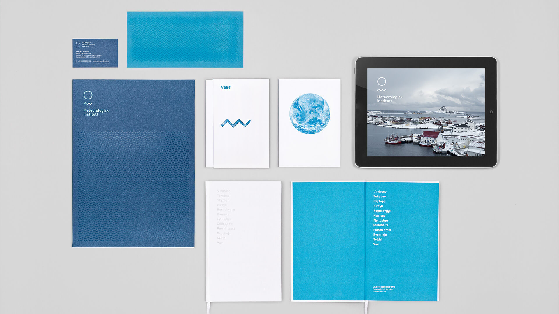
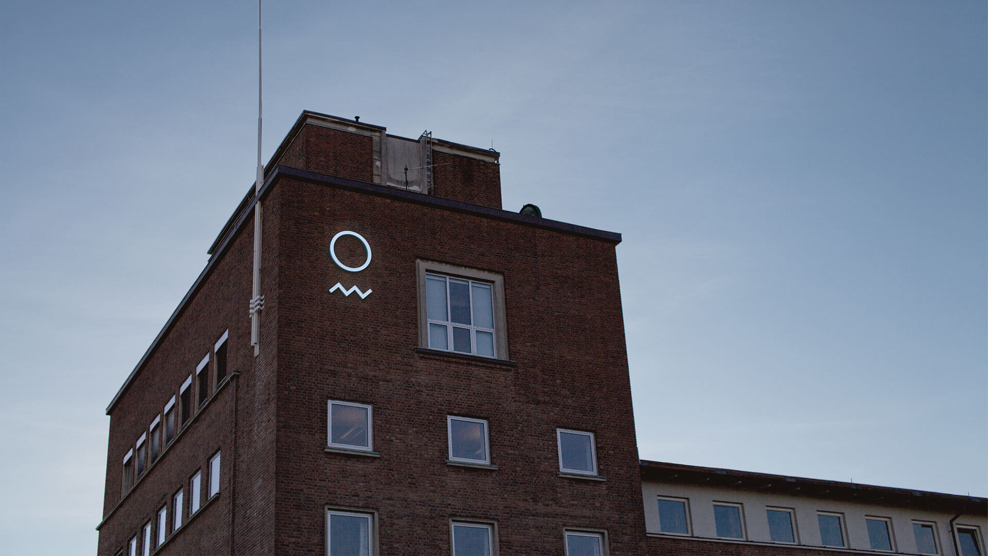
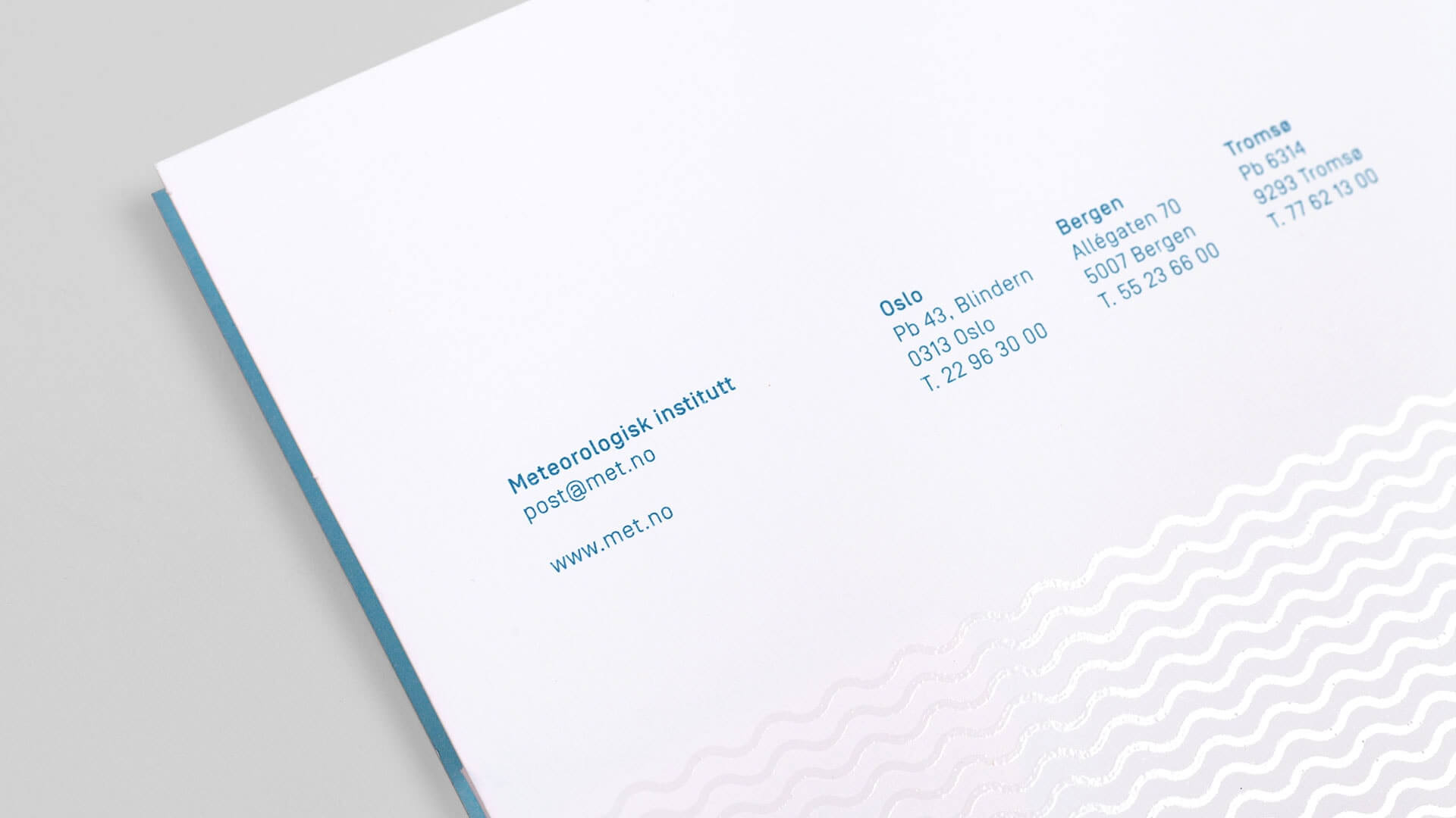
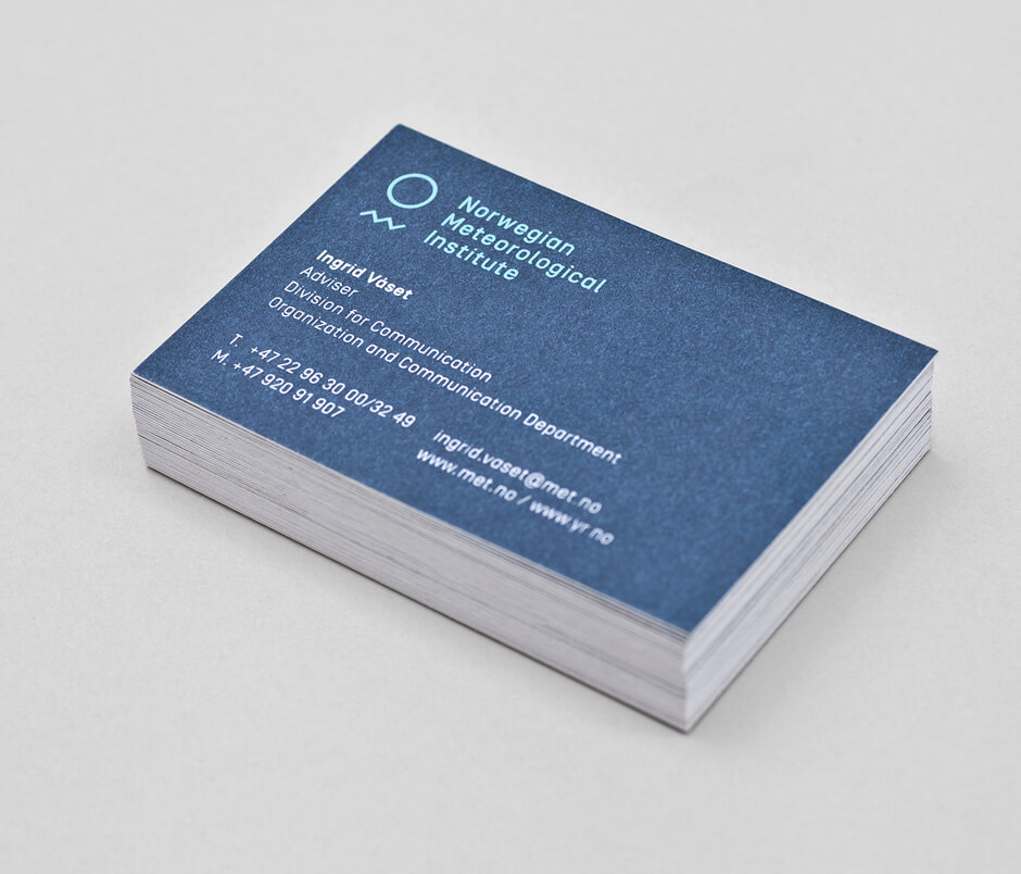
Meteorologisk Institutt
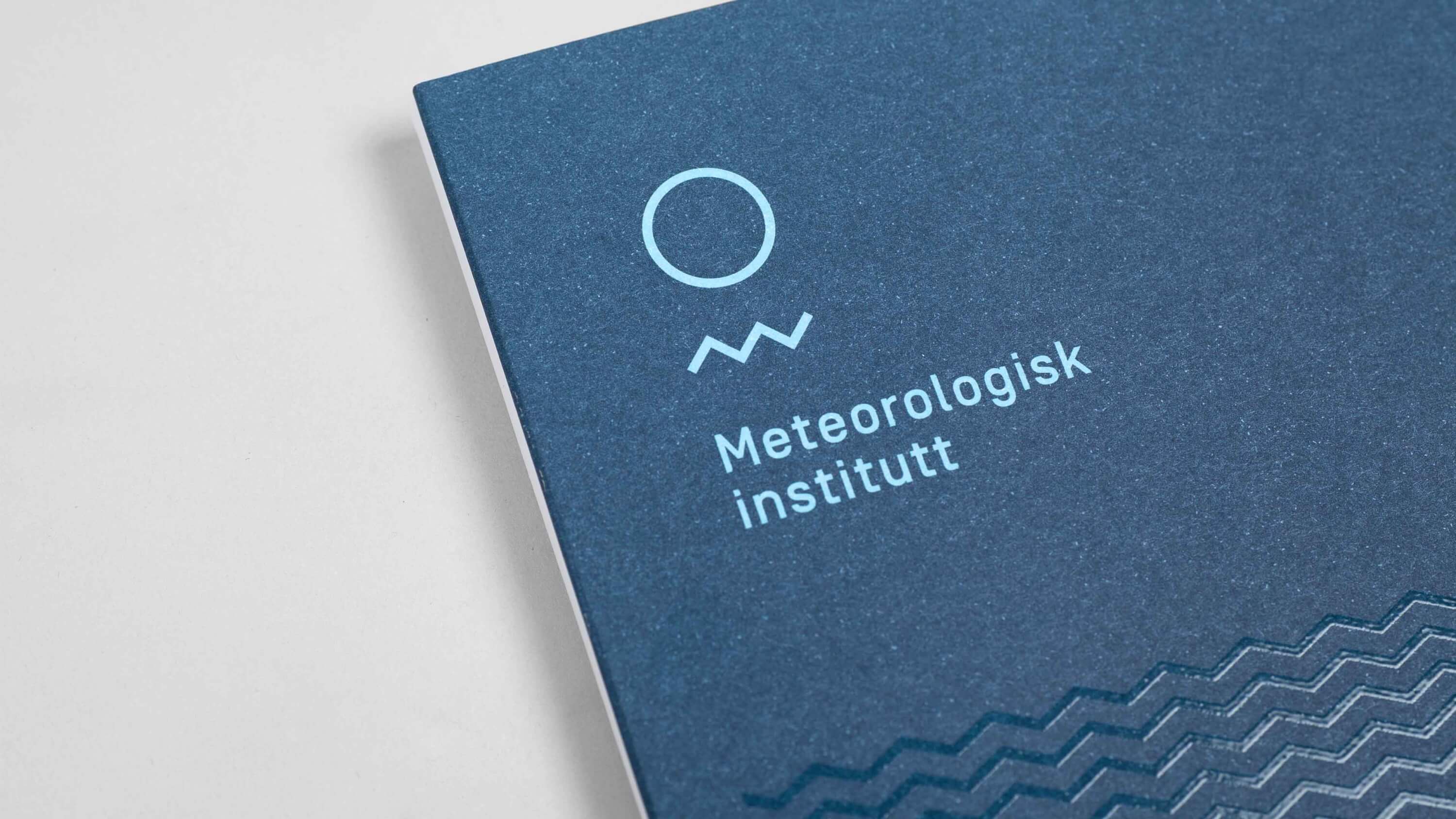
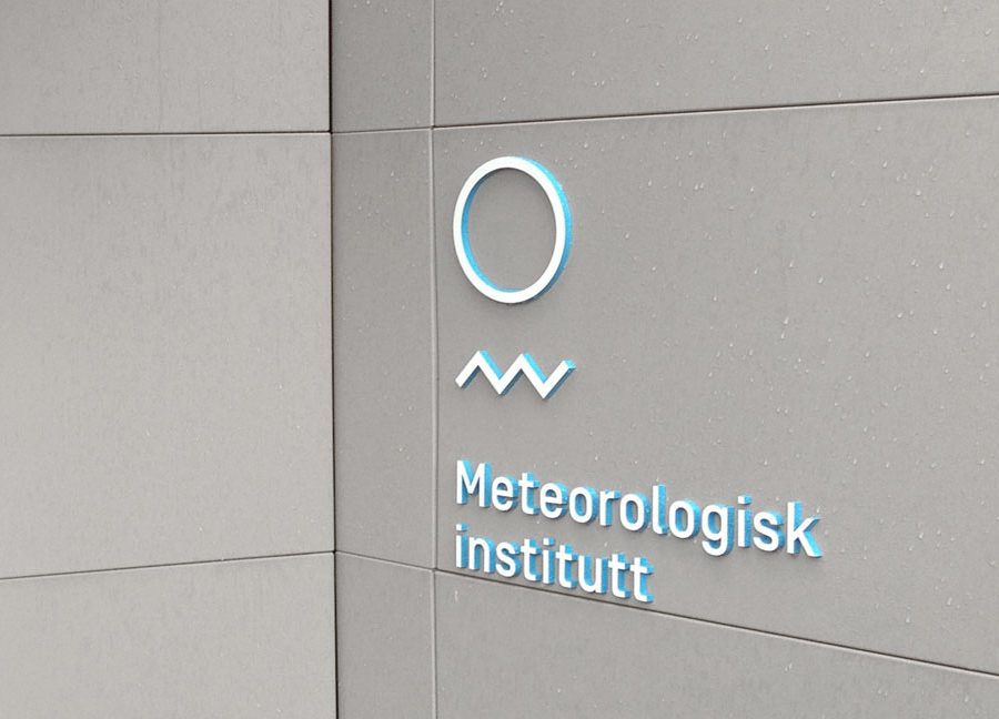
The Norwegian Meteorological Institute (MET) is a reliable platform providing weather forecasts and climatological reports to the public. It has a free and open data policy for the benefit of society and the protection of life and property. Hence, its identity should be instantly recognizable and should be a sign of seriousness and trustworthiness.
Oslo-based studio Neue designed the identity using Simplon Norm supplemented by a logotype made of a circle and a point waveform.
Regarding this logotype, designer Richard Baird wrote on his blog:
Although Neue attribute the sun, moon, sea and mountains to its forms, the two components of their new identity system functions equally well as an elemental distillation of the earth and the free-flowing data that emerges from it. There is a lovely contrast and communicative duality created by the smooth curves of the earth and the sharp peaks of the saw wave that although I might be reaching have a sense of fine and stormy days, low and high data traffic periods. These basic geometric shapes resonate well through the sans-serif characters of the typography with a technological efficiency and a similar cohesive single line weight and solid sense of space.
Simplon Norm is part of the Simplon family, available from Swiss Typefaces.