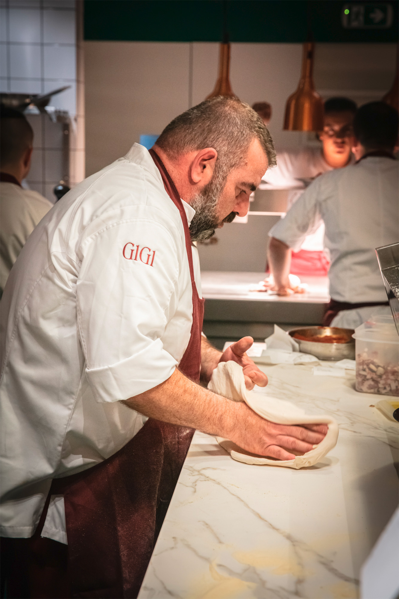
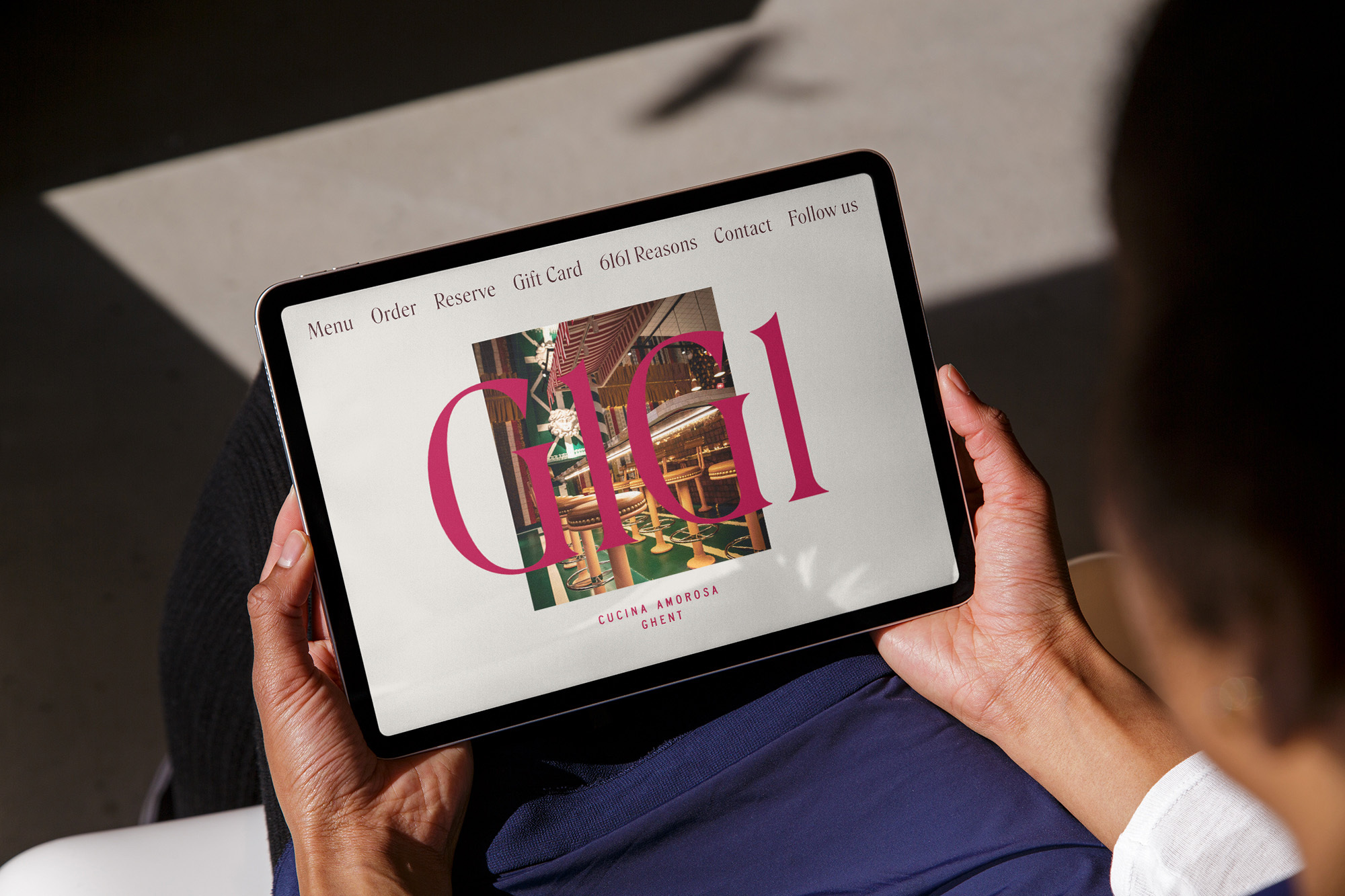
GIGI
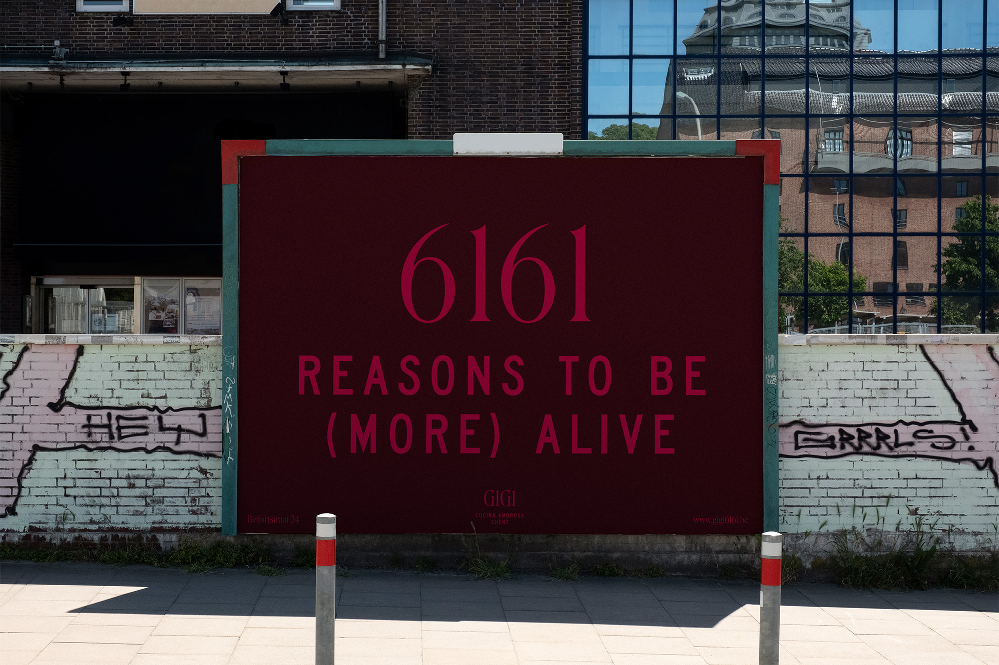
GIGI is an Italian restaurant in Ghent, Belgium that “blurs the lines between nightclub and eatery.” As reported by Harry Bennett for The Brand Identity, founder Filip Janssen explains the choice of typographic palette like this: “We were looking for a strong mix: eclectic, sexy, bold but elegant.”
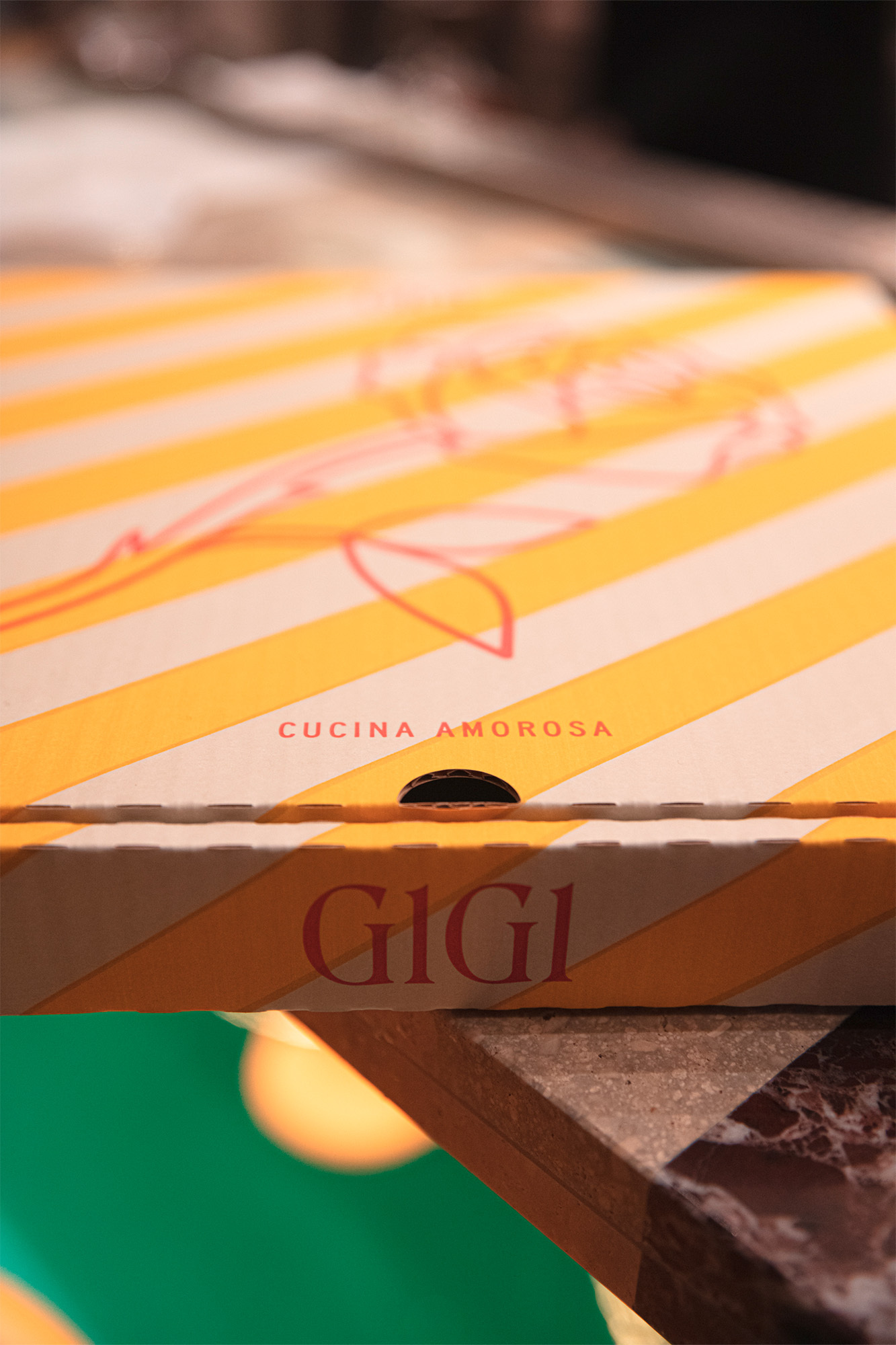
Designed by Zware Jongens, GIGI’s eye-catching identity combines the shimmer of Roslindale Display Condensed Light against the blocky geometry of the C and D widths from URW’s SAA series.
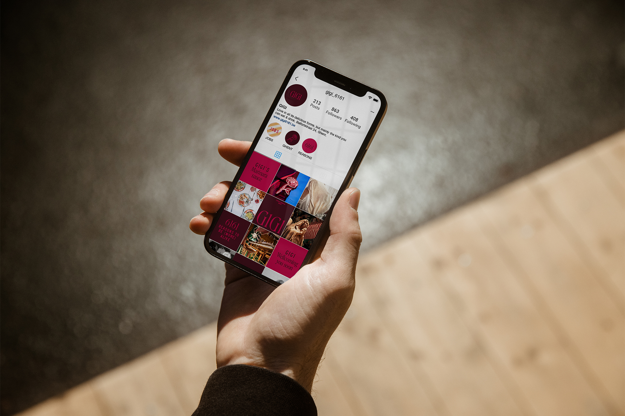
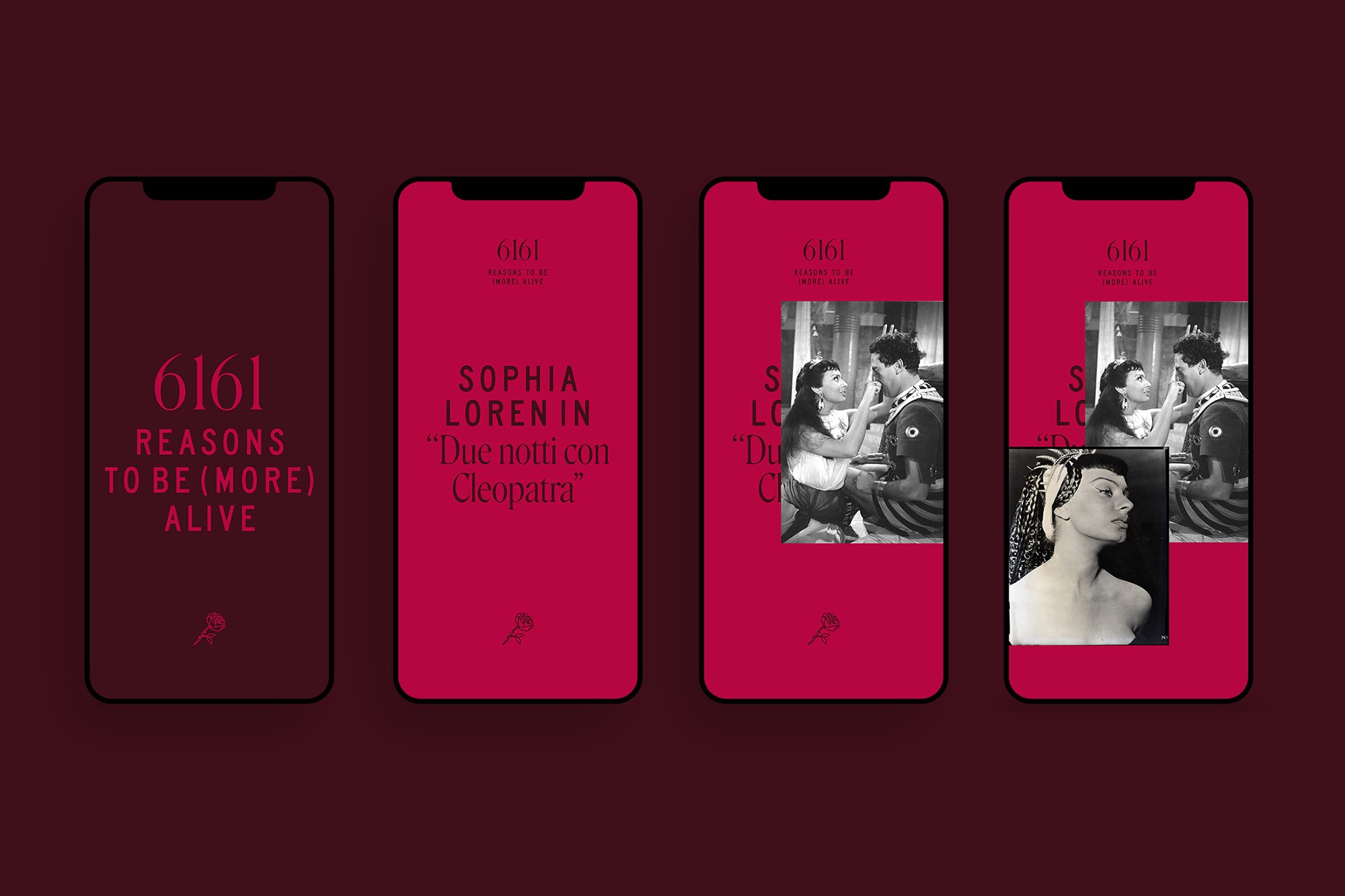
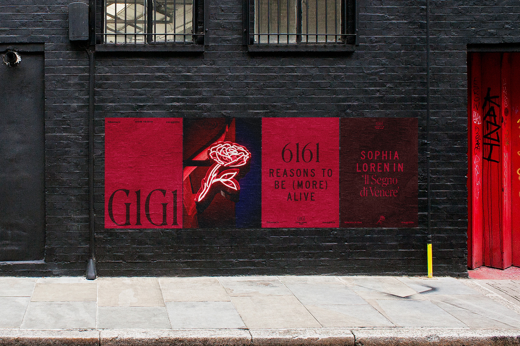
The wordmark, set in Roslindale, replaces the capital I with the numeral 1 and plays with the visual similarity of GIGI and 6161. This visual play is carried through to the tagline, “6161 Reasons To Be (More) Alive.” (See also the recent identity for Pillar, which features a similar replacement.)
The identity is punctuated by an illustration of a rose, which is used as a logomark. Deep reds abound.