Русские Дневники / Russian Diaries
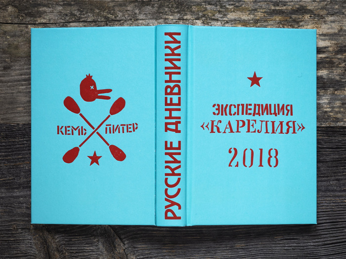
Front cover featuring lettering based on DIN 1451, Bodoni, and Narrow Roman Stencil JNL
Please note!
Given the abhorrent war Russia is engage in in Ukraine this project is of course cast in a different light than when it was first conceived.
Like many neighbouring nations, Finland too has a troubled past with Russia. At the time of our journey our aim was to try to cast aside past wounds and try to get to know the people. But some three years later old fears and prejudices have unfortunately resurfaced and been proven valid.
For this we are truly sorry, as the people we met during our voyage were anything but the rabid warmongers we now encounter in the daily news. But let us be clear, we do, in no uncertain terms, condemn the unlawful and completely senseless occupation of Ukraine that Russia is presently absorbed in.
Despite this less than cheery disclaimer we hope you can appreciate this project for what it is – an attempt to build bridges instead of burning them. Something we feel the world is in dire need of.
*
It was not a very well thought out idea, but very few adventures start with being meticulously planned. At least our adventures. But at least we had a rough outline of what we would attempt to achieve:
Our aim was to paddle from the small town Kem located on the shore of the White Sea all the way to St Petersburg.
These two places are connected by a number of locks, rivers, and lakes to each other, and upon learning that it was at least theoretically possible to kayak from one to the other we decided it was well worth trying. On the 9th of June 2018 we set sail southward.
But enough about the background, you are here to read about fonts. And we’re getting there. Just one quick thing we need to mention first:
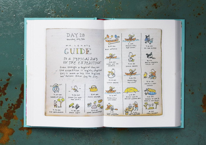
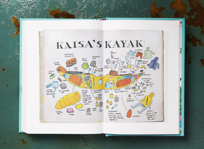
During our voyage Kaisa kept a diary in which she recorded what happened during the trip. When we reached St Petersburg seven weeks later she had filled four small journals with drawings and text.
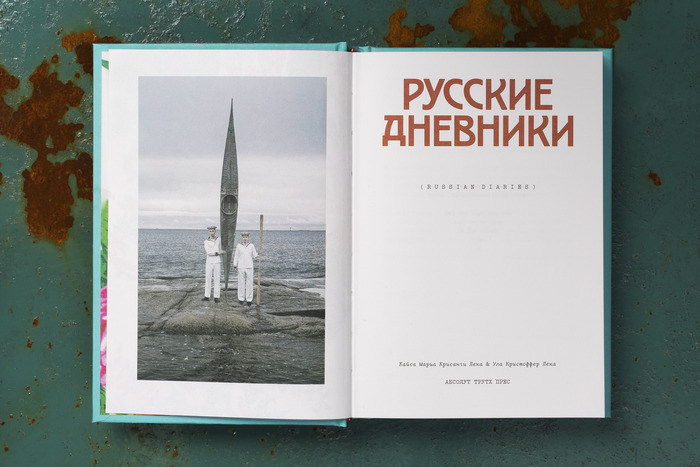
In 2020 we published these diaries in book form under the title Русские Дневники (Russian Diaries).
In 2021 our small book was included in the collection of the most beautiful books of the year in Finland. It also received the Hopeahuippu prize (silver) in the annual Finnish design competition Vuoden Huiput.
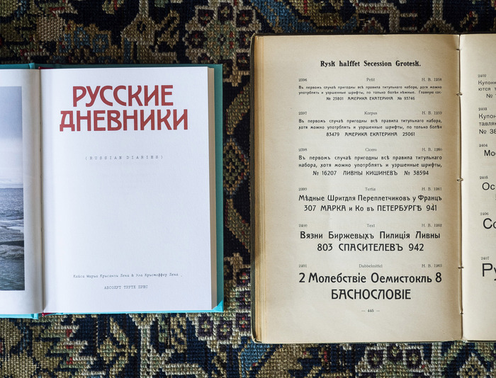
As for the typefaces, we came upon the Cyrillic version of Secession in an old type specimen book in our library and felt it fit our purposes perfectly. The problem was that we couldn’t find a digitised version of it.
Here our friend Teo Tuominen came in the picture. As an accomplished type designer it took him little time to render beautiful versions of the needed letters from a scan we provided him with.
As for the body copy we went with LTC Remington Typewriter, a nice typeface that also came with the much needed Cyrillic characters.
For more information about the project and our journey you can pop over to the project website.
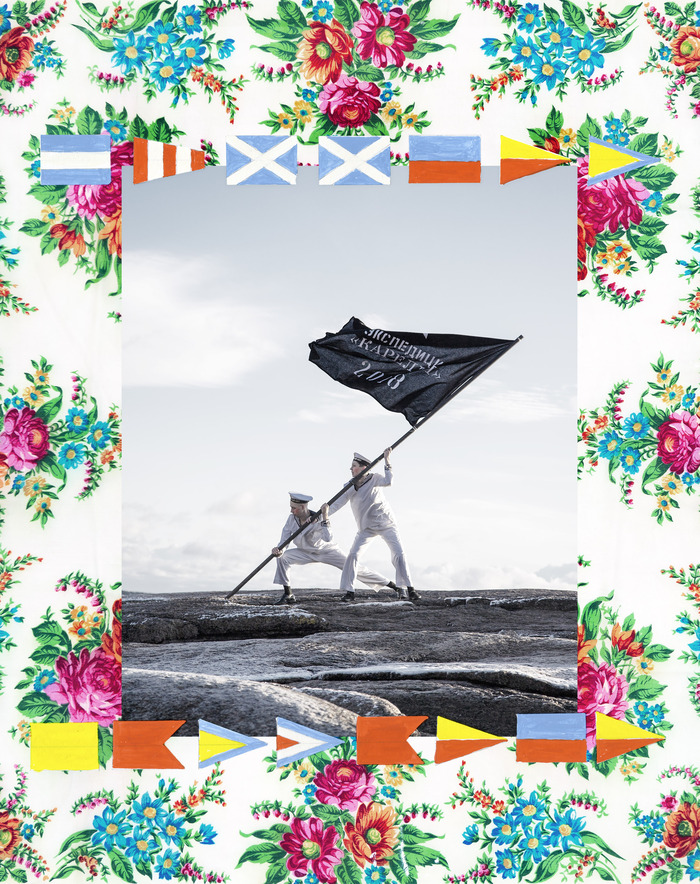
Alongside with the book we also made a poster in which we posed with our expedition flag. It was a horribly cold and miserable photoshoot (you can see the frost on the rocks in the foreground!) but the picture itself turned out really nice. At least we think it did.
(Oh, and for all the real maritime design nerds out there: On the cover of the book, as well as on the poster we spell out “Русские Дневники” in the Soviet Signal Alphabet. Admittedly not a font, but still interesting for letter lovers.)
Typefaces
Formats
- Books (4426)
- Object/Product (771)
- Posters/Flyers (3867)
Designers/Agencies
- Christoffer Leka (4)
- Kaisa Leka (4)
- Teo Tuominen (3)
- Nici Lönnberg (1)
- Ninni West (1)
Tagged with
- diaries (24)
- Russia (21)
- travelogues (13)
- self-initiated projects (285)
- hardcovers (721)
- book covers (3882)
- book spines (869)
- back covers (1146)
- multiscript (517)
- Cyrillic (script) (296)
- Latin (script) (349)
- multilingual (1407)
- Russian (language) (184)
- English (language) (1289)
- custom typeface digitizations (41)
- lettering derived from typeface (526)
- stencil (335)
- book interiors (2207)
- title pages (616)
- typeface combinations (2395)
- typewriters (85)
- kayaks (1)
- flags (124)
- signal alphabets (1)
- stars (203)
- Absolute Truth Press (2)
- self-published (185)
- posters (781)
- guillemets («») (116)

