
Reporters sans frontières, Album Photo #69: Patrick Chauvel

In 2022, studio deValence started a new collaboration with Reporters sans frontières (Reporters Without Borders) for the art direction and design of their Album collection. The first edition of this new collaboration celebrates Patrick Chauvel’s work as a war photographer.
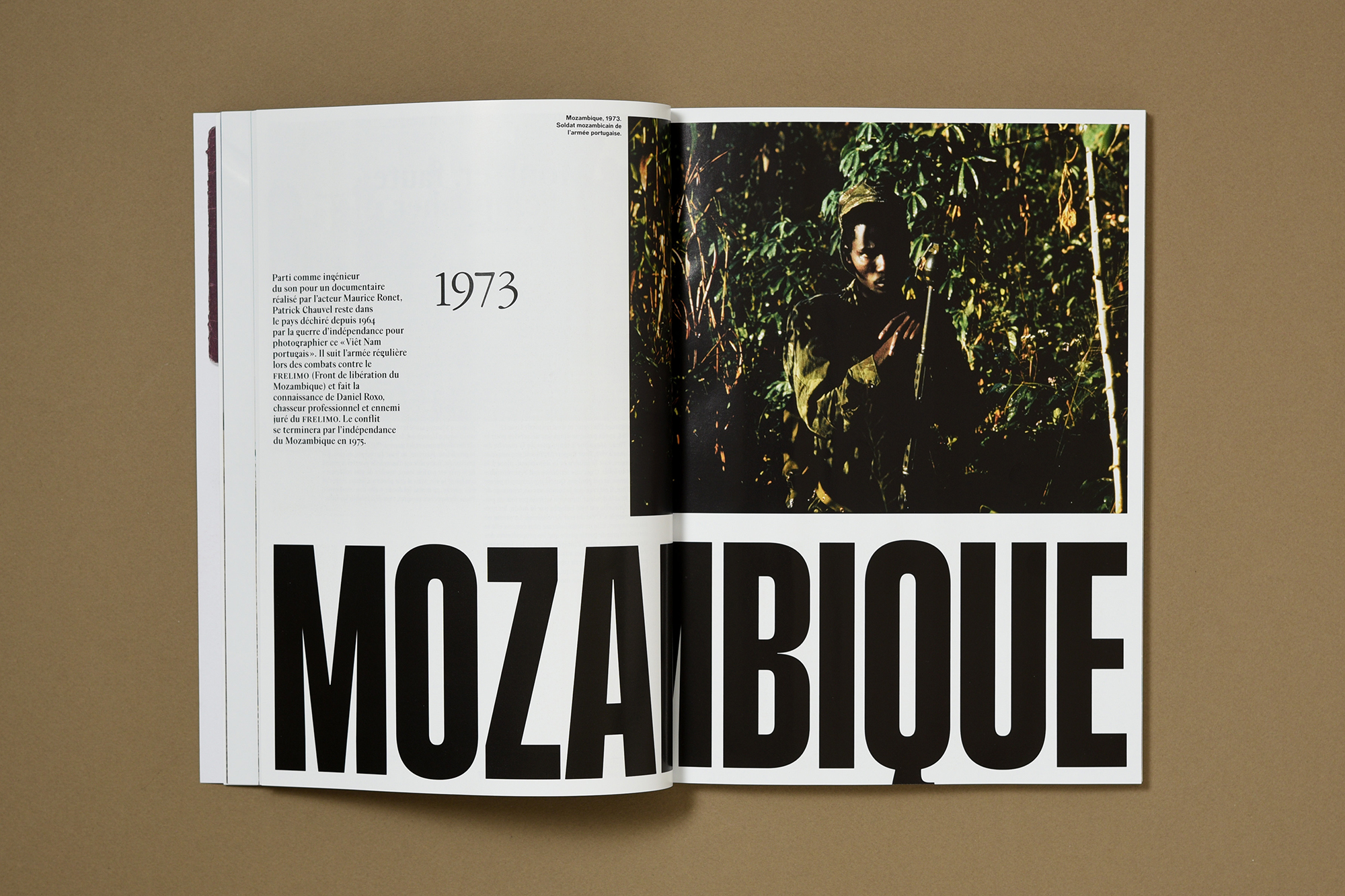
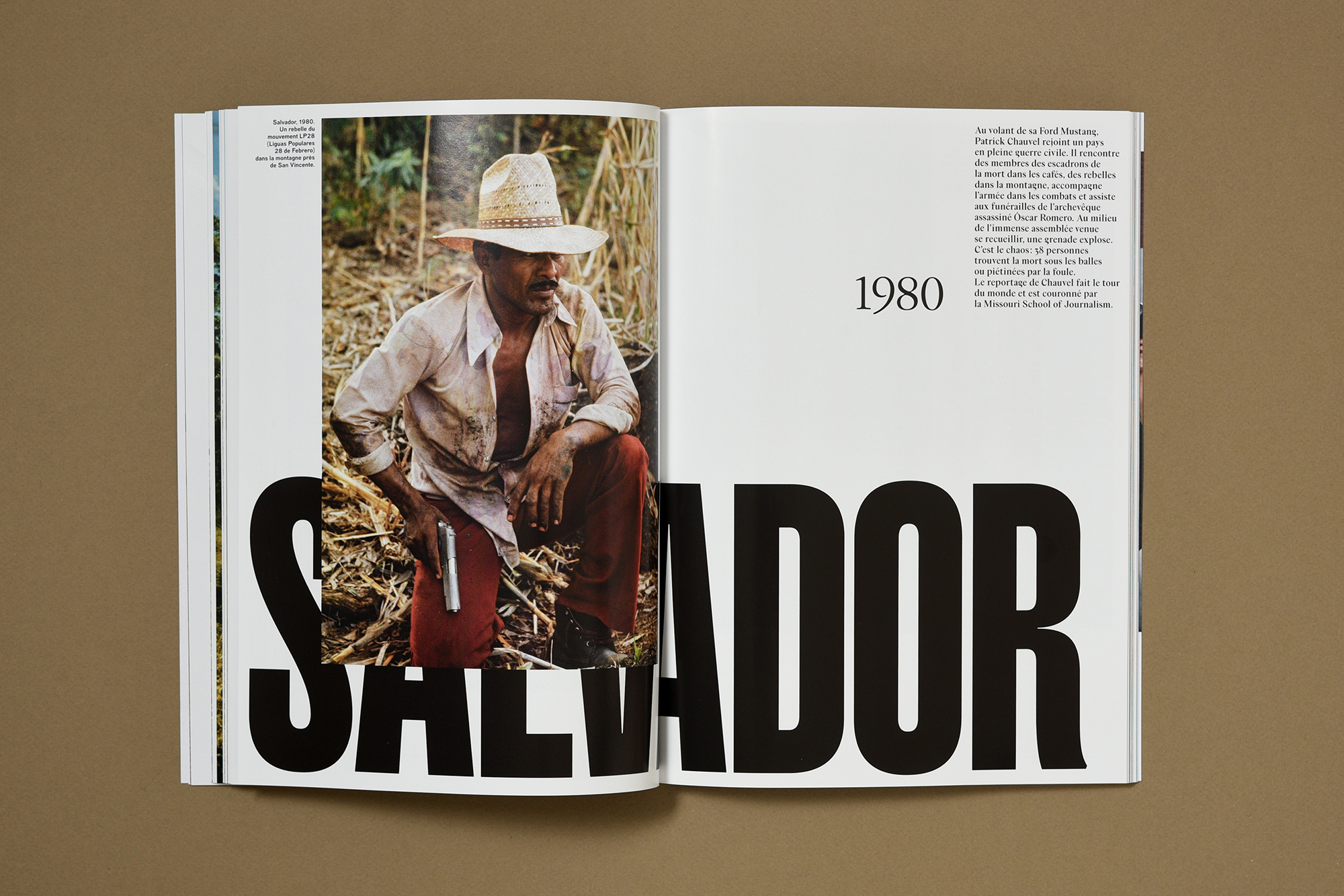
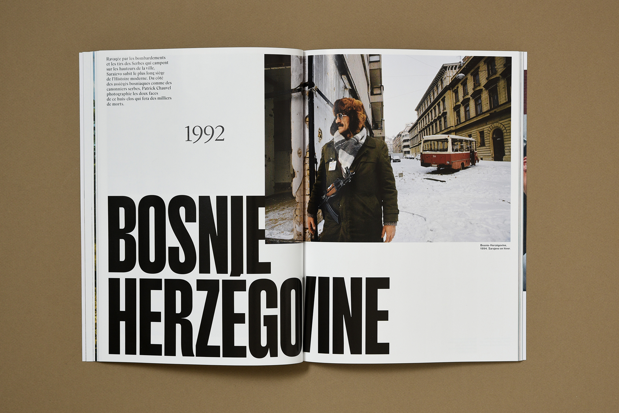
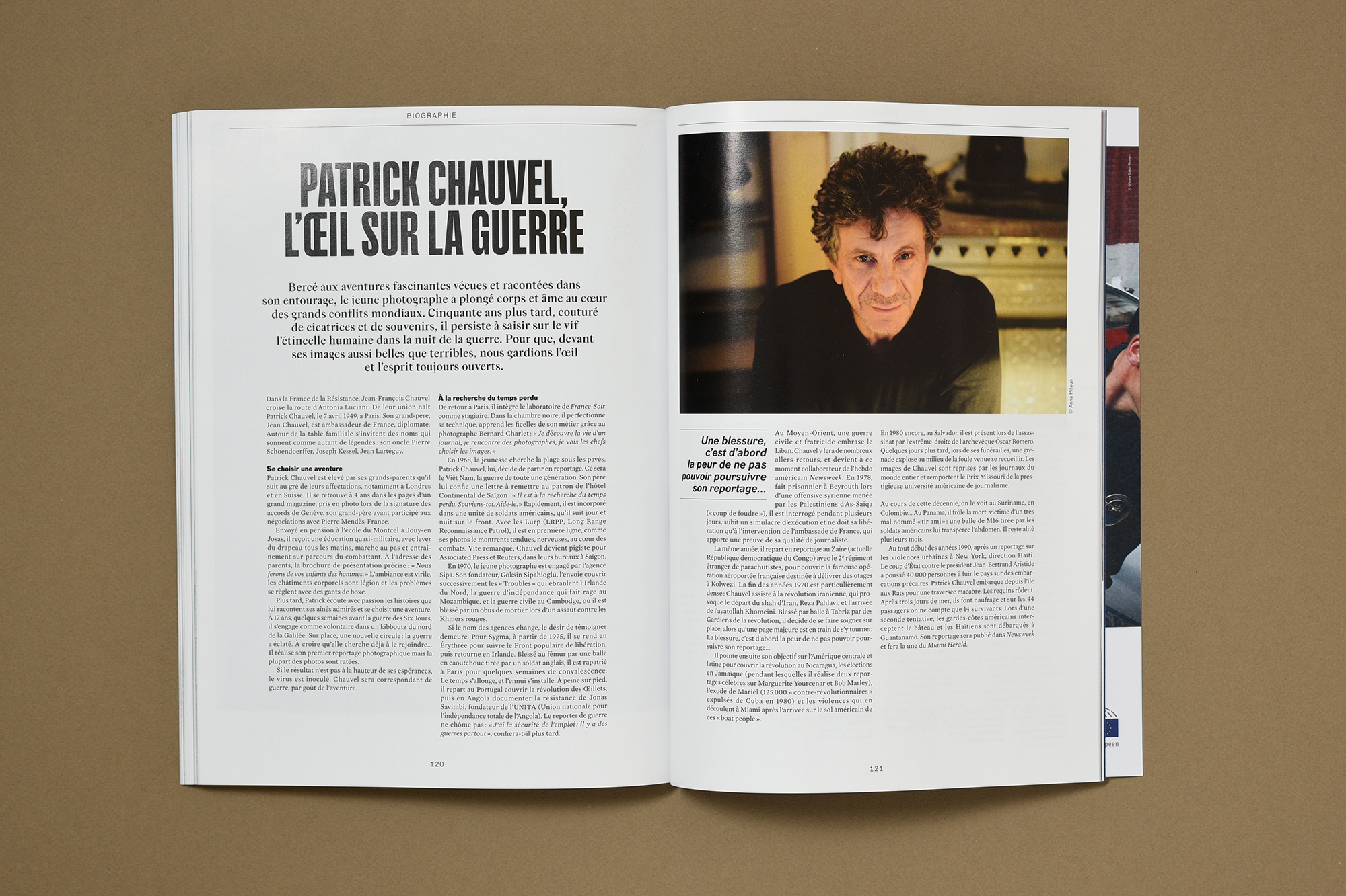
Thirty years ago, Reporters Without Borders published the first issue of its “100 Pictures for Press Freedom” series. The cover featured a young war photographer who had been seriously wounded in Cambodia while reporting on a story. The man with the brown curls in that iconic image was Patrick Chauvel. Thirty years later, RSF has chosen to pay tribute to this legend of the profession.
The typefaces used by deValence are Mercury (by Hoefler & Co.), Almeria, Smithee Extra Condensed (both by Apex Type Foundry), and Dada Grotesk (by Optimo). 144 p., 210×280 mm.


")


4 Comments on “Reporters sans frontières, Album Photo #69: Patrick Chauvel”
The numbers for the dates on the opening spreads (1968, 1972, etc.) look a lot like ITC Garamond to me…
Agreed, and added. Merci!
Funny that this much-maligned 1970s throwback (see here) should make its return today…
As Michael Bierut hints at in that article, much of the rejection was related to its name, which led people to assume it’s just another Garamond, and hence a good choice for setting longform text. In fact, it’s a fine display face, especially in its condensed styles. The fact that it isn’t omnipresent anymore helps.
A new generation of designers don’t associate it with its questionable use for book typography, or with the 1970s, for that matter. It rather makes them think of Apple’s custom (less condensed) version from the 1980s and early 1990s, and the aesthetics of the fledgling digital age, which in many cases is the period of their childhood. As such, it now sees renewed use, sometimes in a positively retro way, but also in applications where the nostalgic angle isn’t that clear, see e.g. the Kensington Healing Verse project, or the posters for Jay Horsth’s Solitude Tour.