
Art – Goût – Beauté magazine No. 100, Christmas 1928

Cover with a hand-lettered nameplate and tagline. The information on the bottom of the page is set in Cheltenham on the left and Nicholas Cochin on the right hand.
This glossy avant-la-lettre is one of the numerous gems in the collection of the Rijksmuseum Amsterdam, accessible through their Rijks Studio: a website where the Rijksmuseum offers high resolution images of their collection, and where most of the images are free for download and (re-)use.
Art – Goût – Beauté, Feuillets de l’élégance féminine (Art – Taste — Beauty, a magazine about feminine elegance) was “A luxurious fashion magazine published in Paris from 1920 to 1933. It is illustrated with hand-colored pochoir images. Text is in French. Binding had gold sash.” (Otis.edu). Pictured here is the Christmas 1928 edition, No. 100.
Like the authors and the subject, the typography shows an international perspective, pairing typefaces from the USA (Cheltenham) and Germany (Block) with classical and more recent French type – Fournier Le Jeune and a trio of Cochins: Nicolas Cochin, Cochin and Moreau-le-jeune a.k.a. Cochin Blanc. In addition to letters, the printer/designer did not hold back when it comes to borders and rules and fleurons. You will find some of them in this Cochin catalogue by Debergny et Peignot from 1932.
For those who eager to pinpoint unidentified typefaces, there is an unknown Copperplate-like typeface on the third picture, and an interesting serif with square tittles and a Venetian e on the last picture.
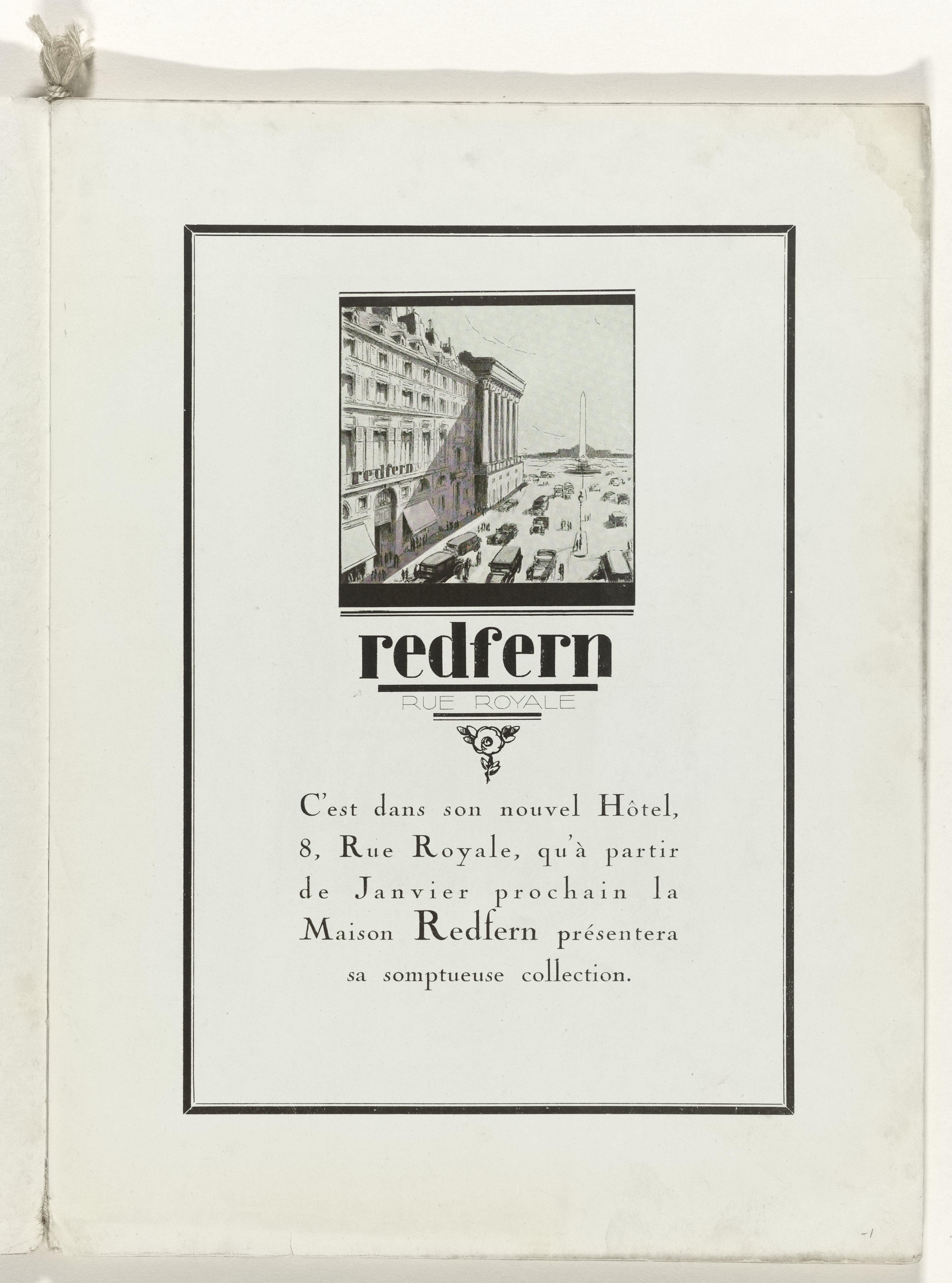
What’s new: an advertisement on page 1. Custom lettering for the client (Redfern; Polyphème from 1910 has a similar lamppost r), with copy set in Nicholas Cochin, the magazine’s default typeface.
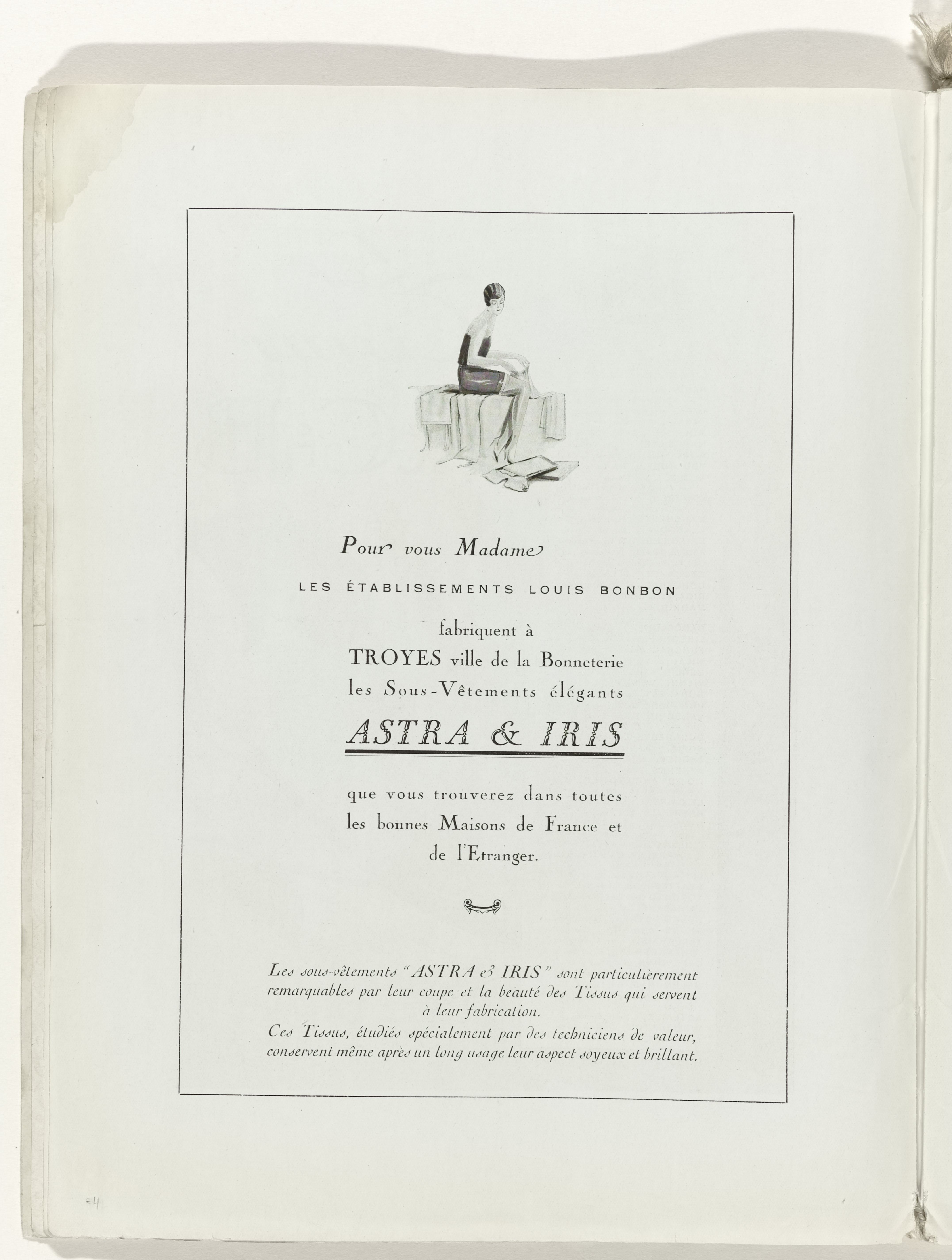
Page 4, more ads. The advertiser’s name is set in Fournier Le Jeune. Note the end swashes on r en e in the opening line in Nicholas Cochin’s italics. The complimentary caps with mini serifs are from a yet unidentified typeface similar to Copperplate Gothic. The text at the bottom is in (non-Nicholas) Cochin Italique with its characteristic cursive d and s.
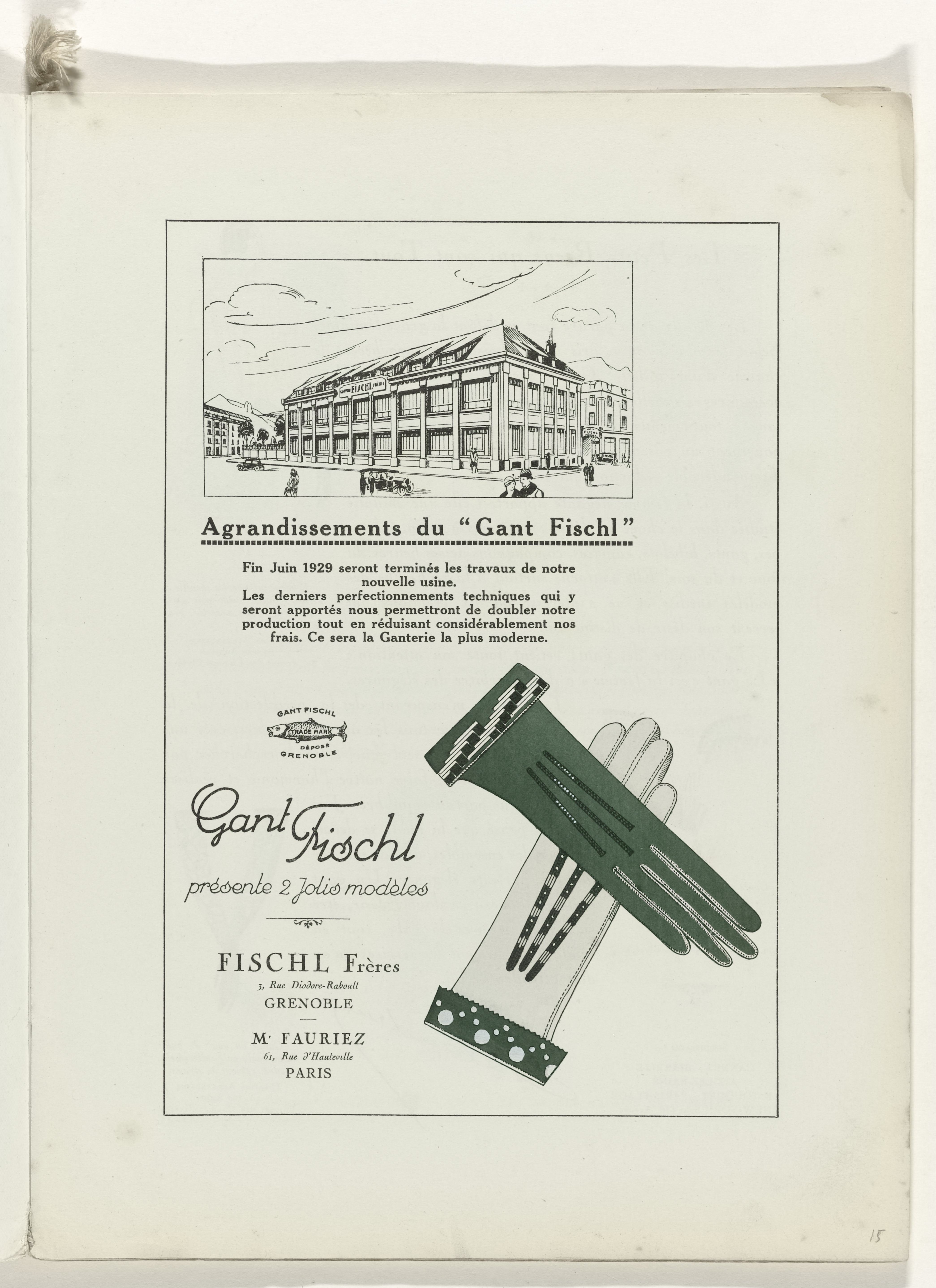
Om page 15, a last advertisement before the articles start. Gant Fischl does not exist anymore, but judging from the depicted brand new factory (see also these photographs) it must have been a very successful brand. Korso, Ella Cursief and Rondka Urtyp are typefaces that have a similar feel as the hand-drawn logo. Text set in Cheltenham.
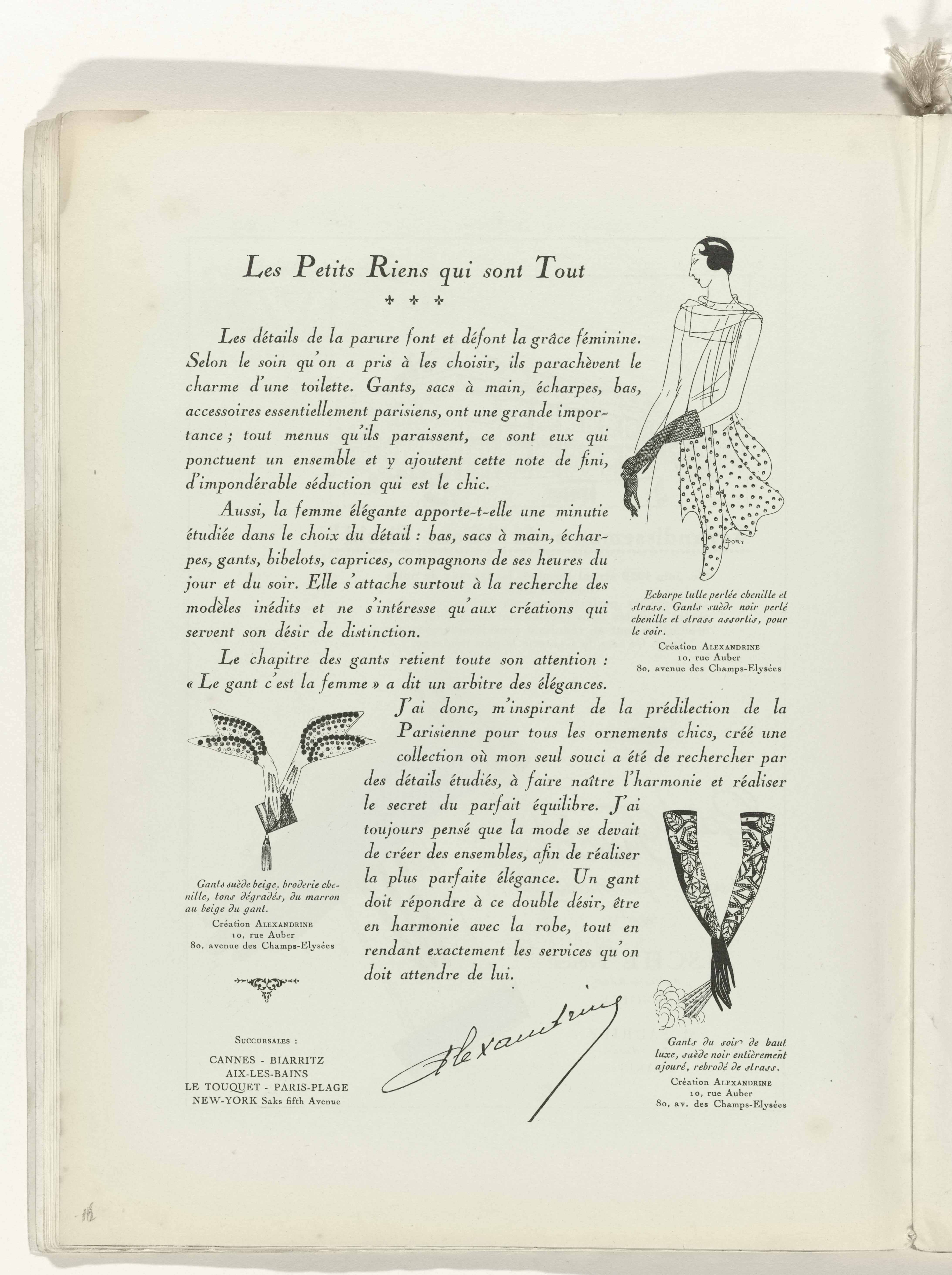
“Les Petits Riens qui sont Tout” (The little nothings who are everything) — must-haves for an elegant winter in Paris. Body copy set in italics from the typeface series that is used throughout the magazine: Cochin & Nicolas Cochin, by Peignot & Fils.

Page 18, corsets.
“Paris est Harmonie!” Opening page for the main part of the magazine: a series of illustrated single page style suggestions.
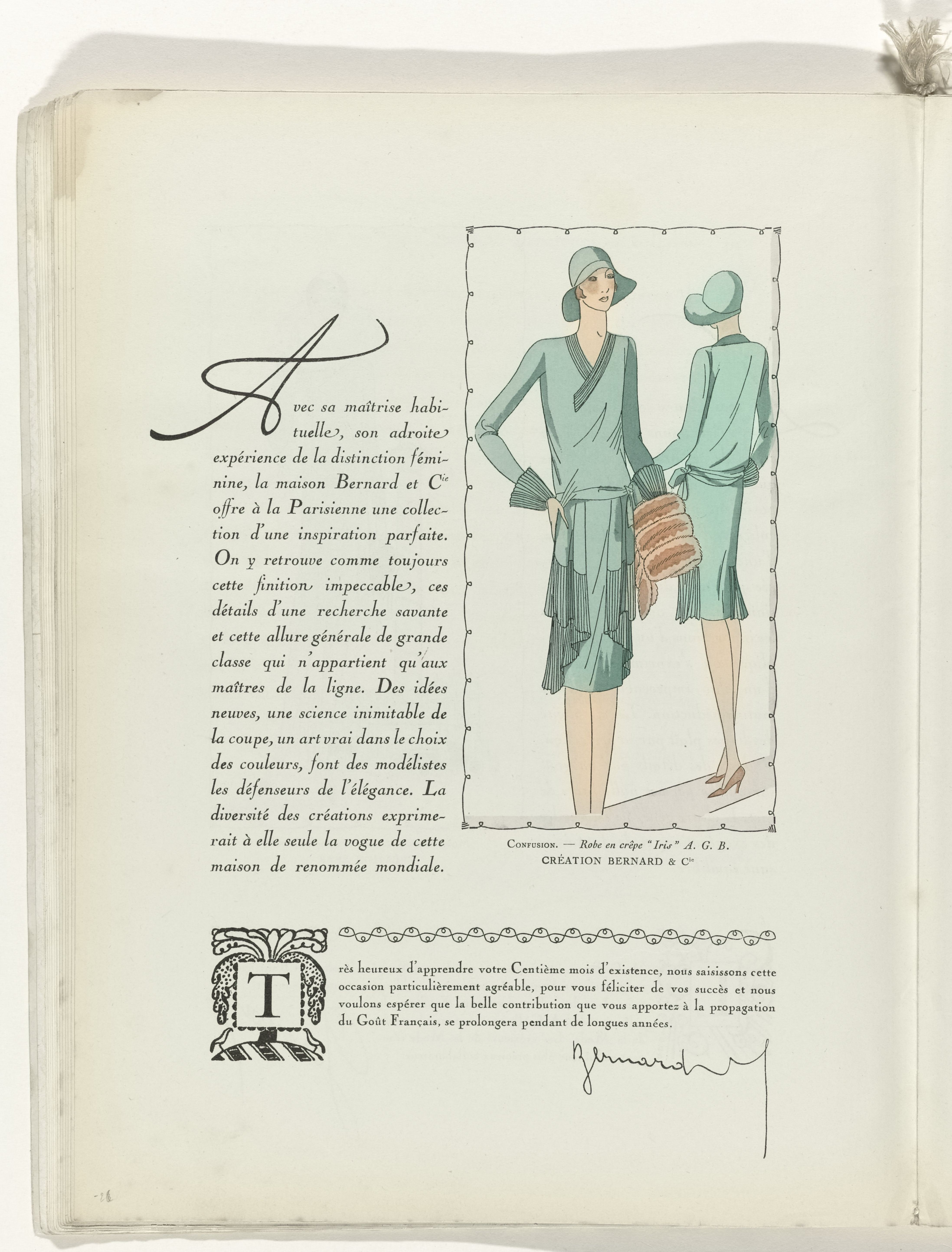
Page 26: an elegant hand-dawn drop cap, and a generous use of end swashes in the body copy.

Page 29. The decorated initial at the bottom appears to be from the Cochin series, too.

Page 41: a royal affair. An article by Princess Eugene Murat about luxury tableware, with a colored lithography of a solid marble and silver centerpiece for a dinner table.
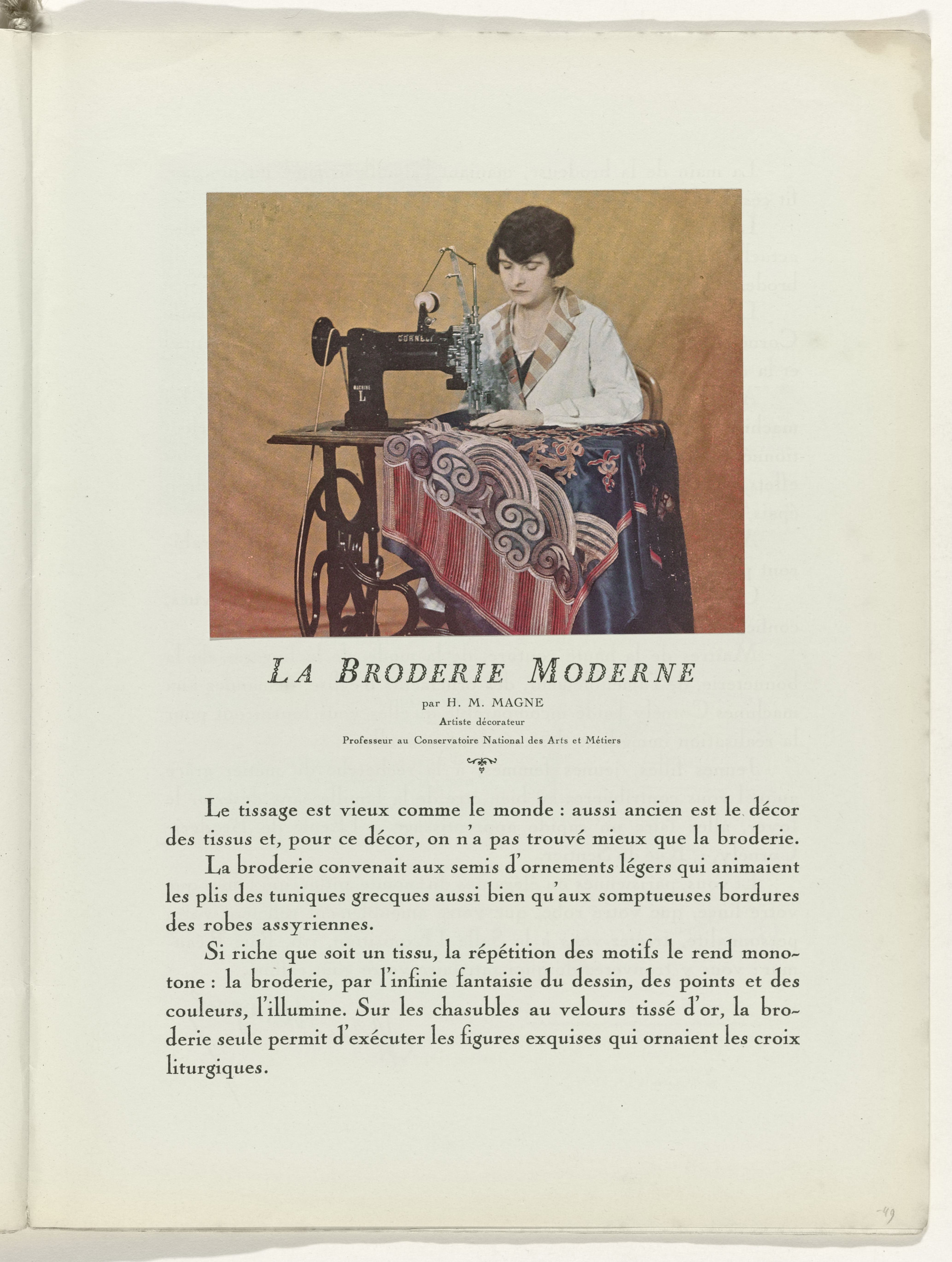
Page 49, modern embroidery. Title set in Founier Le Jeune. Instead of using the swash caps, initial letters are set with the regular weight in a bigger size.

Page 51: Le sac à main et la mode – G. Silberstein discusses handbags. Title set in Moreau-le-jeune, an open style accompanying Cochin and issued by Peignot & Fils in 1913. It was copied by Barnhart Brothers & Spindler as Caslon Open Face.
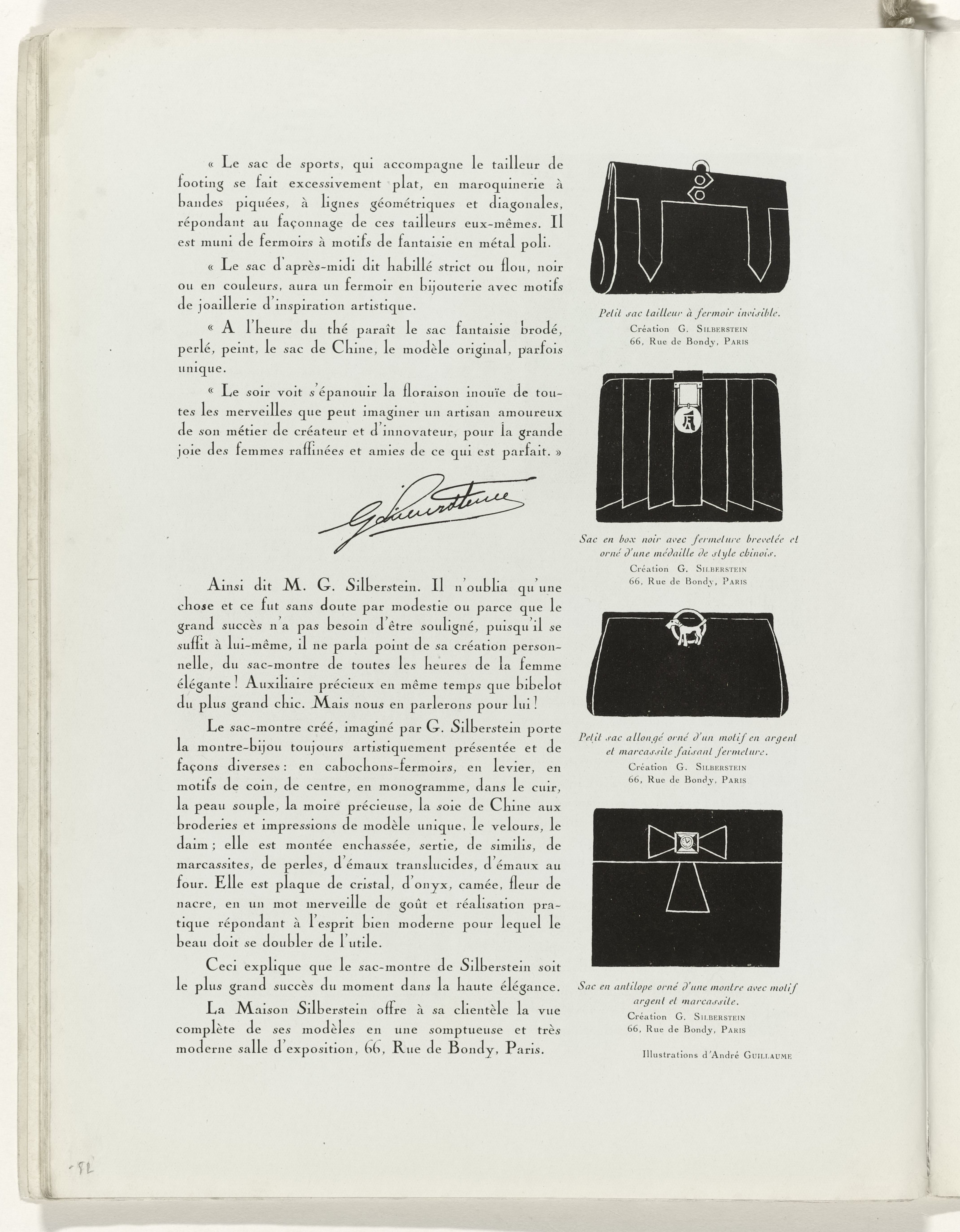
Page 52.

Page 59, two advertisements, The top one mixes Cochin with Cheltenham, the “Darling-Cream” ad uses Block and a yet unidentified serif with Venetian e.


")


")


")


1 Comment on “Art – Goût – Beauté magazine No. 100, Christmas 1928”
The unidentified serif in the last image that sits somewhere between Bookman and Jenson is Old Roman, a design that originated at the Caslon foundry in England and was extended at Barnhart Brothers & Spindler in the USA. It was also available from Flinsch/Bauer in Germany as Universum.