
NewJeans EP cover and logos
![EP cover [More info on Discogs]](https://assets.fontsinuse.com/static/use-media-items/179/178385/full-1280x1280/63962663/newjeans.jpeg)
EP cover [More info on Discogs]
NewJeans is a five-member South Korean girl group, releasing music under the native ADOR record label. Promotions for the group first started on 22 July 2022, with their first music video “Attention” being released on streaming service YouTube. Their eponymous debut EP was released on August 1, 2022.
Under the management of South Korean art director and graphic designer Min Hee-Jin, NewJeans donned on a Y2K-inspired image. It trickles down from fashion to the typography used in their promotional artworks, favouring flourishes and display types prominently used in the late ’90s and early ’00s.
Unlike typical brands, many people were commissioned to create several logos for NewJeans, giving their identity more fluidity within its early millennium look. The wordmarks encompass styles found in the era, from the likes of brands like Bratz, Heelys and The Powerpuff Girls, to name a few.
While custom lettering was used, there are still many fonts being applied on the logos. An anonymous Twitter user named @newjeansfonts has taken the liberty to search and curate all the utilised typefaces on a dedicated website. A Reddit user has also compiled the various logos in its animated form, likely extracted from the artists’ Instagram pages. Their official logo consists of a hybrid of various fonts being used in different glyphs, altogether being faux-condensed.
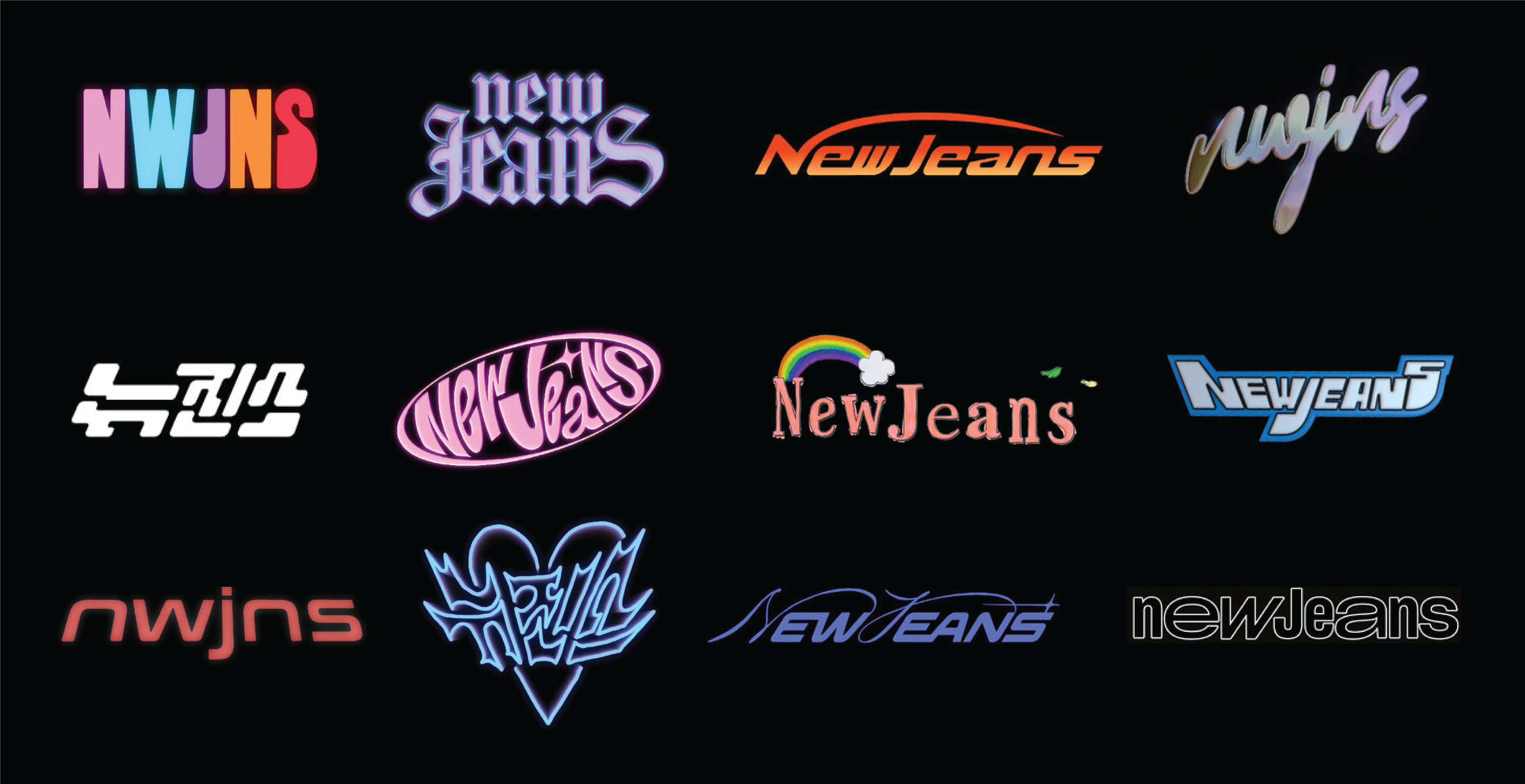
Top row: Village / Amador / not a font / newjeansfonts suggests Dollie Script with modifications, but that’s unlikely
Middle row: not a font / not a font / possibly a mix of Honey Pocaline and Times New Roman / not a font
Bottom row: Conthrax / not a font / newjeansfonts suggests Sloop Script and Elevon with modifications, but at least Sloop seems unlikely / Sharp Grotesk Book 25 and Medium 20, plus the alternate w from ITC Avant Garde Gothic
Additional logo designs shown in their interactive website, newjeans.kr. It is included in its website feature, “My Album,” an online NewJeans album cover maker.

Screenshot of NewJeans’ intro card (with their official logo) for their performance of “Attention” in Music Bank (KBS World). The fonts in use appear to be Genty, Helvetica, Alagard, Brush Script, and Fairfax.

Screenshot of NewJeans’ stage design for their performance of “Cookie” in Inkigayo (SBS). It features one of their logos affixed with neon lights.


")


2 Comments on “NewJeans EP cover and logos”
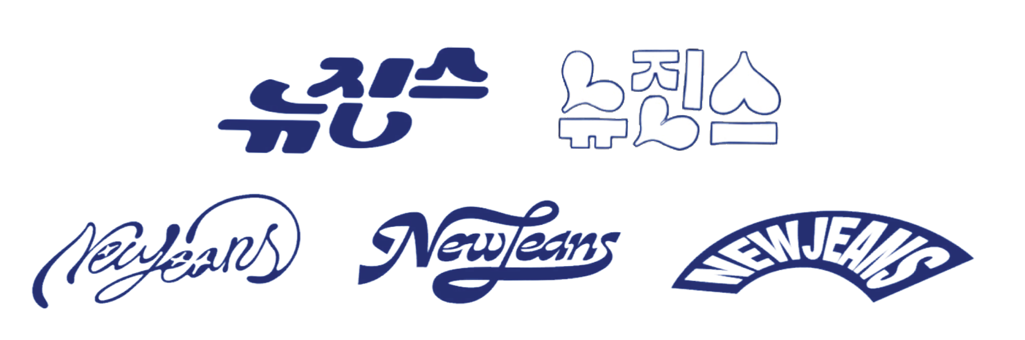
That customization of Rafael Saravia’s Gardez appears to be in the middle centre of the third image. Here’s a comparison that shows the details on the top vs. the unmodified text below.
This sample shows the letters N, J and lowercase s in a loopy swash and ligatures connecting ew and ea (like something that connects in a contemporary script) to my saying. HBU?
Right on, Jay! Added.