Beck! – Odelay album art
Odelay is the follow-up to Beck’s major debut Mellow Gold from 1994. I had it on heavy rotation when it came out in the summer of 1996, and it still ranks high among my personal favorites. A lot has been written about the album. Since this is Fonts In Use, I’ll focus on the typography.
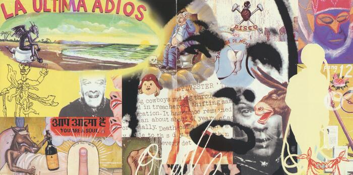
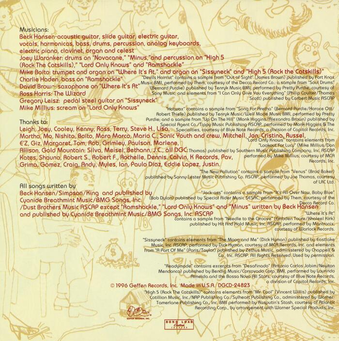
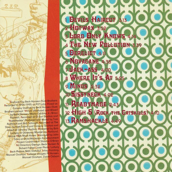
The easier part first: track names on the back as well as the inlay are set in Davida. With its curls and dangling ball terminals, it may look like a display oddity from the 1880s. In fact it was designed much later, by Louis Minott, and issued as a winner of a VGC competition in 1965. Davida here is set with faux small caps, giving away that this album is from the digital era. All smaller text including the track numbers, the run times and the credits uses ITC Bauhaus, another typeface that’s not trivial to date. While it references attempts at a stripped-down geometric sans made by Herbert Bayer at the Bauhaus in the 1920, the typeface is a child of the 1970s: drawn by Ed Benguiat, it was released in 1975.
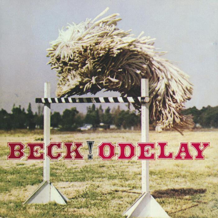
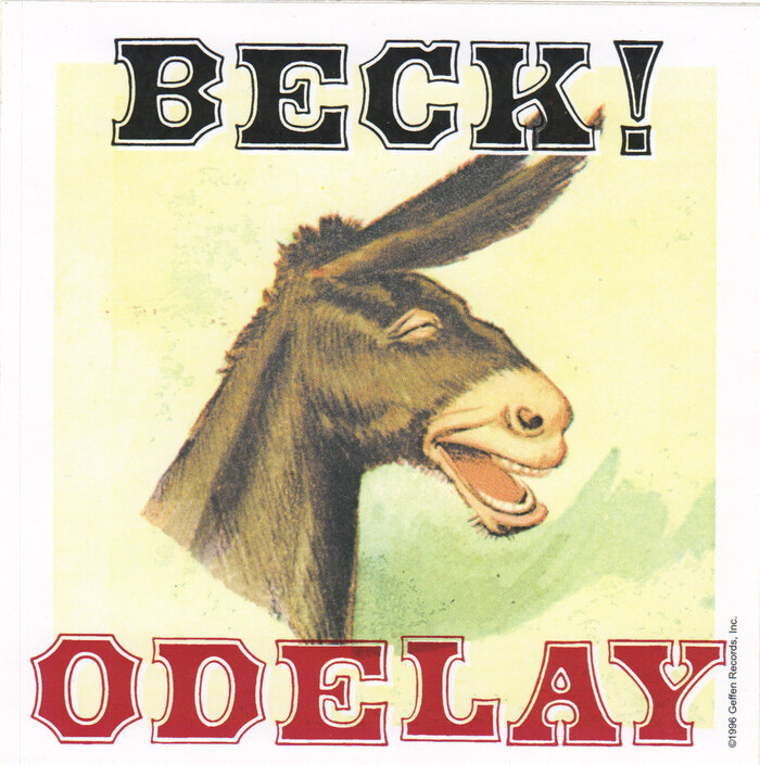
Identifying the font used for the title is trickier. The typeface is Antique Tuscan Open, which is a variant of Antique Tuscan, with contour. According to the RRKWTC, this design was “first shown as wood type by Darius Wells and E.R. Webb in […] W. & H. Hagar’s 1854 Specimen of Printing Types.” William H. Page & Co showed their cut in 1859. In the phototype era, it went under the name Yukon (FotoStar/Facsimile Fonts, before 1973). Solotype carried it as Assay Rimmed (before 1992), but did they have a digital version? What specific font did designer Robert Fisher use?
Alan Jay Prescott made one such digitization as Antique Tuscan Contour Wood in 1996, but I haven’t been able to find out if it was already available when the album art was designed. One source suggests that Tim Ryan of Type Revivals had a digitization, too, but that’s unconfirmed. Dick Pape’s freebie AWT Page Ant(ique) Tuscan Outlined is based on the showing in Rob Roy Kelly’s American Wood Type. However, it was made in 2013, and hence can’t be the font used here. Or maybe the letters aren’t typeset at all, but were sourced directly from an analogue source, like a scan of Kelly’s book or another showing? That would be a fitting visual counterpart to Beck’s sample-heavy music.

A visual comparison of the album title with a resetting in the digital Antique Tuscan Contour Wood (Alan Jay Prescott, 1996) is inconclusive. I was able to come very close, but in addition to adjusting the spacing and shifting the baseline, this required slightly different font sizes for each glyph, plus some squeezing for the K. I’m still seeing minute differences, but I’m not sure if these are caused by the reproduction. One thing’s for sure: Prescott’s digitization stays very close to the showing in American Wood Type, and preserves even small blemishes like the notch at the top right serif of the K’s stem.
Anyway, the Antique Tuscan is a great match for the moments of vintage Americana that are present throughout both the album and its art, and together with the other two fonts, for Odelay’s exuberant eclecticism.
Make sure to read David Shields’ article about Tuscans and Antique Tuscan, in particular, and the important role this genre played in American visual culture in the 19th century.
Typefaces
Formats
- Album Art (2865)
Topics
- Music (4335)
Designers/Agencies
- Robert Fisher (2)
- Beck Hansen (1)
Tagged with
- Beck (4)
- Geffen Records (7)
- album records (1738)
- indie rock (53)
- alternative rock (18)
- 1990s (269)
- compact discs (CDs) (260)
- bouncing baseline (230)
- contoured type (225)
- exclamation mark (!) (214)
- dogs (71)
- CD booklets (34)
- collage (169)
- track listings (660)
- faux small caps (38)
- credits (122)
- back covers (1169)
- stickers (249)
- donkeys (9)
- left-and-right-aligned text (167)
Artwork location
- United States (7071)
- Los Angeles (399)

















2 Comments on “Beck! – Odelay album art”
For some Odelay-related font trivia:
1. Vlad Smut of Spite Fonts, “the font foundry with the ugliest fonts you’ve ever seen” [Smut], made the Beck Pack, a series of thirteen distressed fonts, each of them named after a song on the album.
2. On June 23, 1996, Sander Kessels made a font “while playing Beck’s Odelay”, a fact that’s enshrined in the font’s copyright notice. Unfortunately, this is the only good thing I can say about PalatinaTurner, a twisted corruption of Palatino Bold. Well, the name isn’t bad either.
3. To conclude with something much nicer: While pursuing his MA in Typeface Design at Reading University, Jordan Bell started work on a friendly text face which he named Odelay. As of now, it’s work in progress.
I didn’t touch upon the other aspects of the cover art, but others have: TheFutureHeart has a great write-up of the cover photo and its origins, and how it relates to the music: