
Sternberg Press website

Landing page
Sternberg Press was founded by Caroline Schneider in New York City in 1999, initially as Lukas & Sternberg. After operating for a while from New York and Berlin, the company settled in London. The publishing house specializes in books on art, architecture, design, literature, and the critical discourse on all of these topics.
In 2019, Sternberg Press equipped itself with a top-notch new website. For this purpose they contracted a team of three highly acclaimed studios for digital design. Berlin-based Knoth & Renner collaborated with Wkshps, located in Berlin and New York, to establish an expandable structure to present an ever growing catalog of titles whose front-end would be intuitive to navigate and highlight the beauty of the books themselves. Systemantics from Willich, Germany, contributed their WordPress programming power.
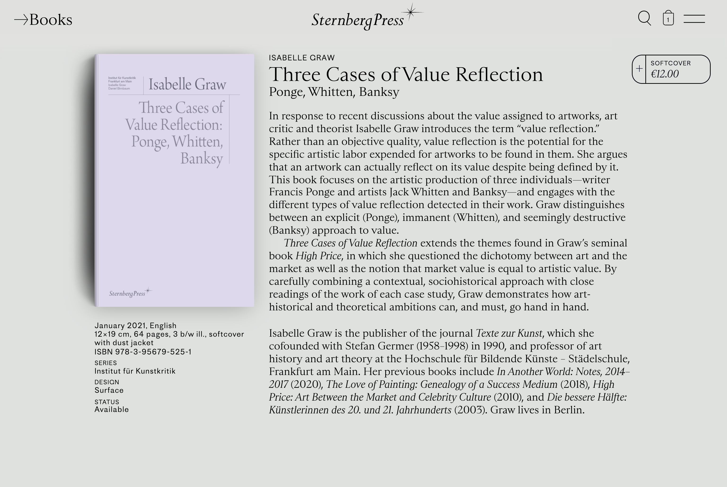
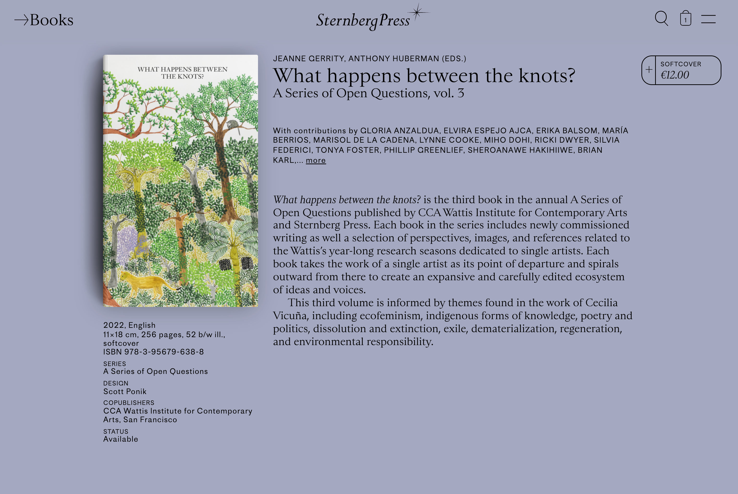
The result is appealing and fun to use: the landing page starts with 3D-animated books flying onto the screen, sparking curiosity. The books presented can be clicked on in order to go deeper and learn more about their contents. The more steady subpages that present the titles as if they were photographed lying flat on a table likewise use animation – but in a modest way that doesn’t get in the way. The overview pages dedicated to themes and publishing lines as much as the single entry pages for each book use an abundant range of carefully chosen backdrop colors that make the presentation lively and appetizing. Every single entry page allows to flip through the given book in order to get an idea of its content and graphic design. On the secondary, service-oriented subpages color is used in gradients on the typefaces rendering the text.
Speaking of type, apart from the Sternberg Press logotype (which is set in Perpetua Italic), the website mixes two faces: the sans-serif Proto Grotesk and the seriffed Sainte Colombe, both published by Production Type from Paris, France. Sainte Colombe by Yoann Minet is used for most of the reading texts. It is a Roman meandering between Renaissance and Classicism, rigorous in rhythm but generous with regards to idiosyncratic liberties in letterforms. Proto Grotesk is Jean-Baptiste Levée’s take on a quirky German sans of the 1880s. On the website it is used as a companion typeface to the first, rendering categories and info texts, marking a clear break on an informational level.
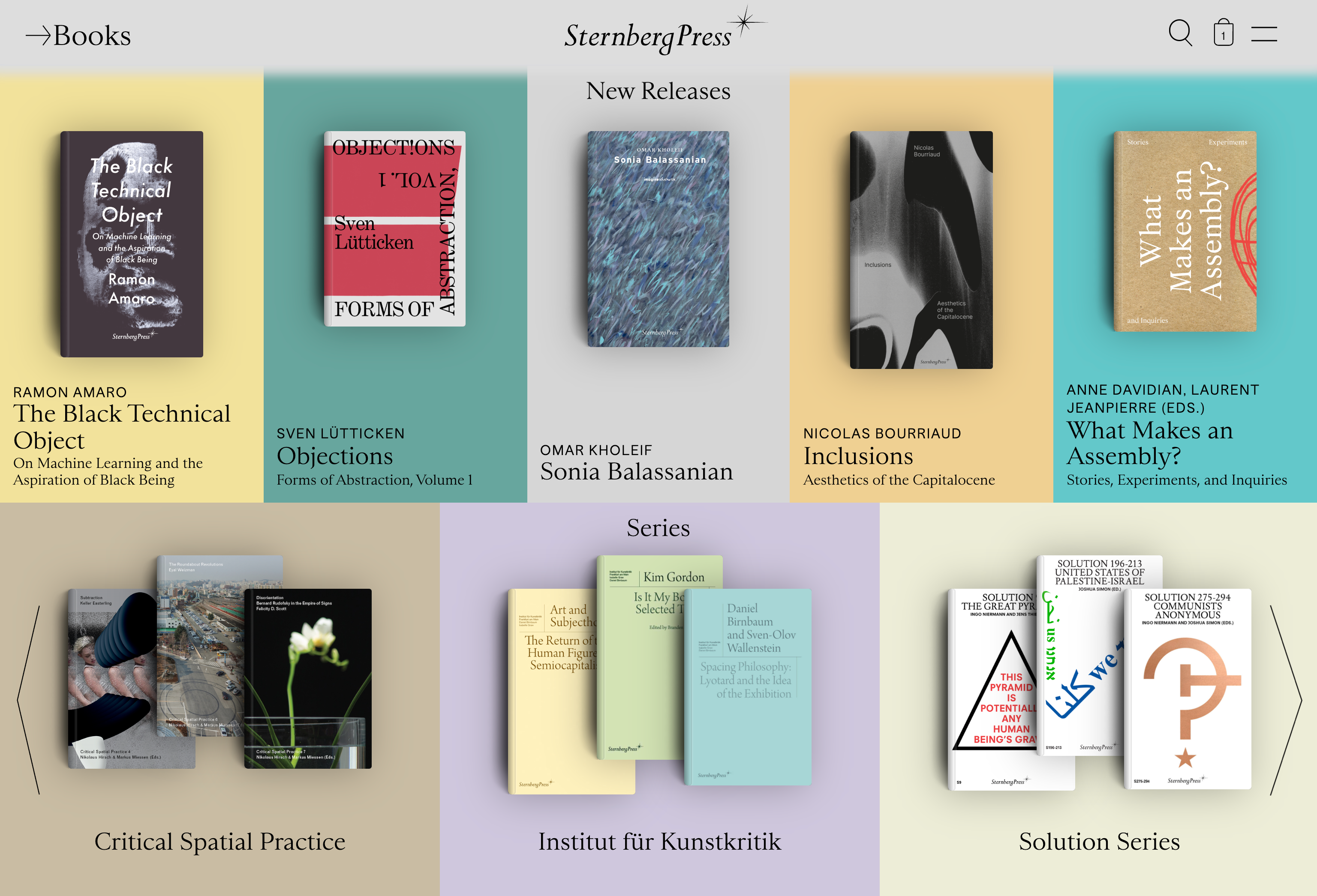
Homepage: new releases and series

Homepage: news and best sellers. As an exception to the general rule this type of subpage uses Proto Grotesk also for the reading text.
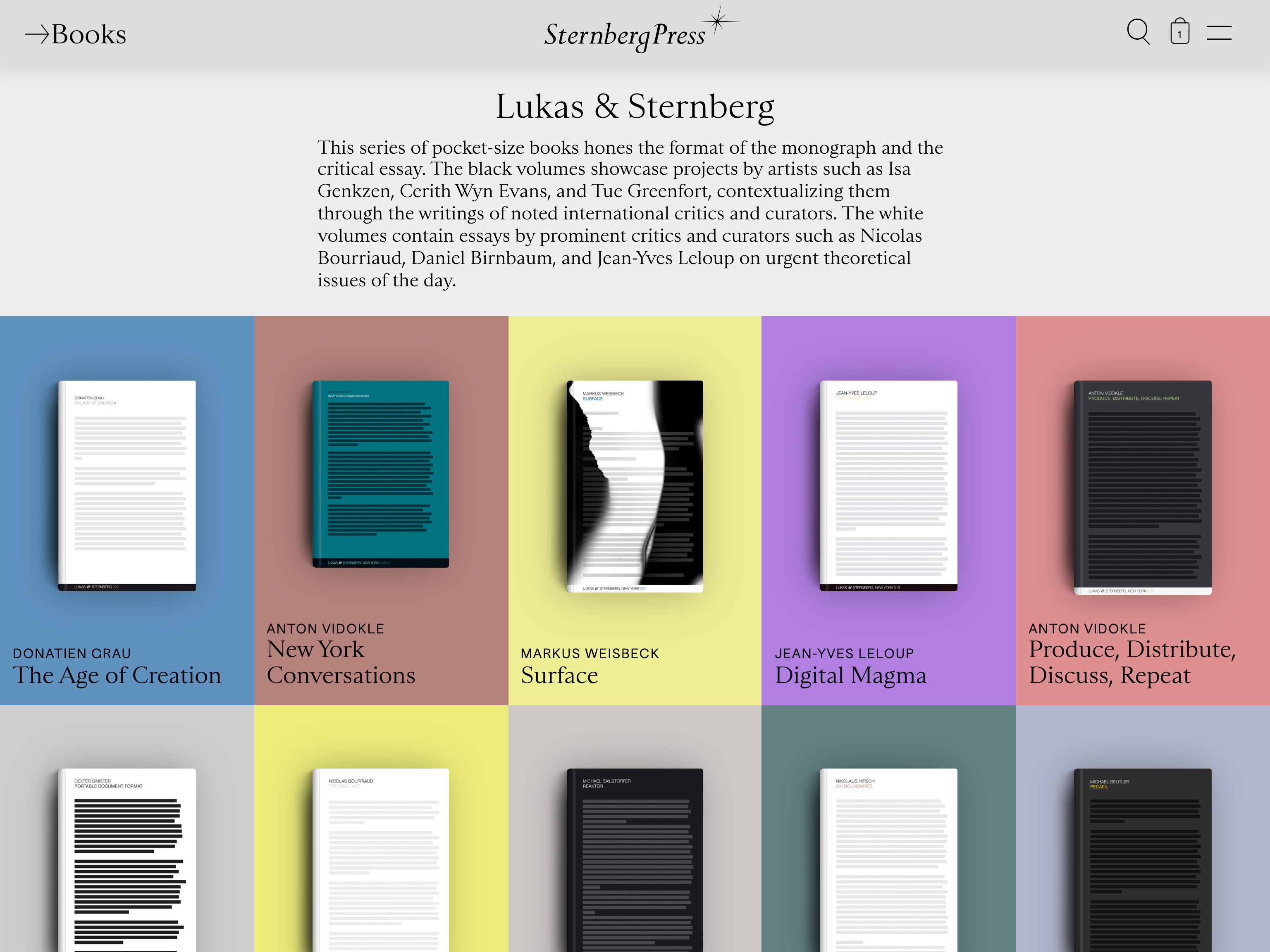
Series page: Lukas & Sternberg
Single book page
Single book page
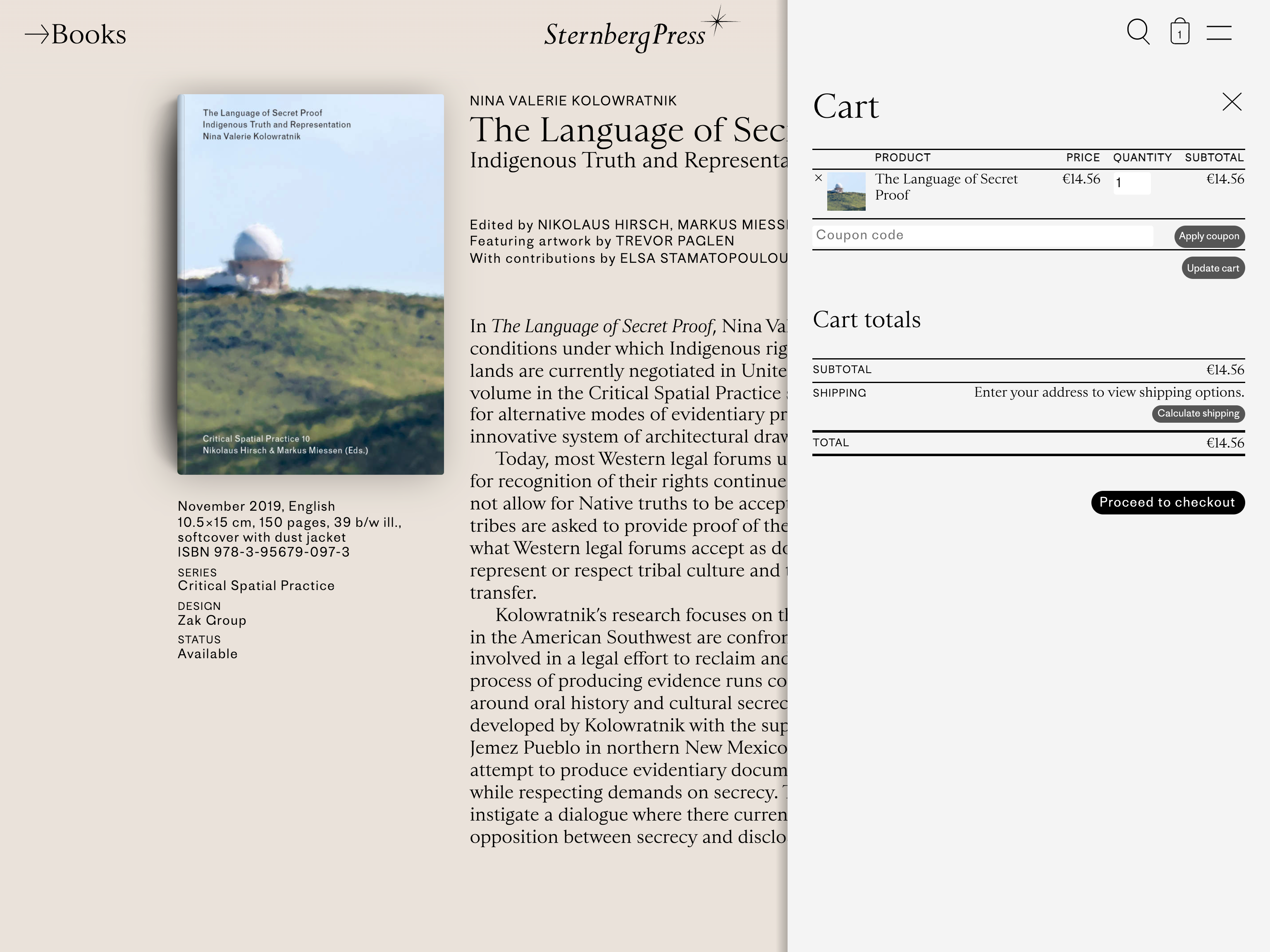
Single book page with cart
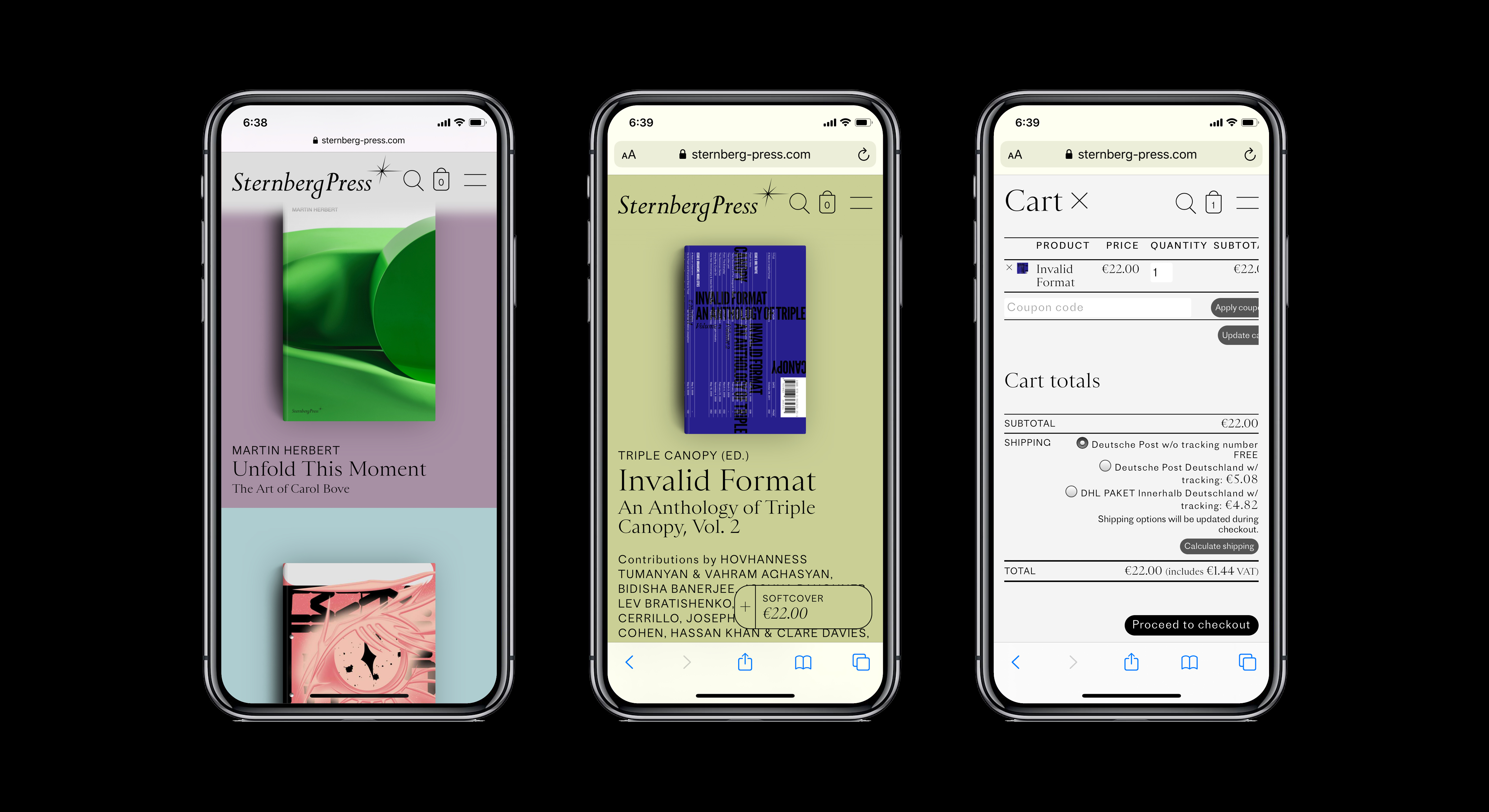
Mobile views
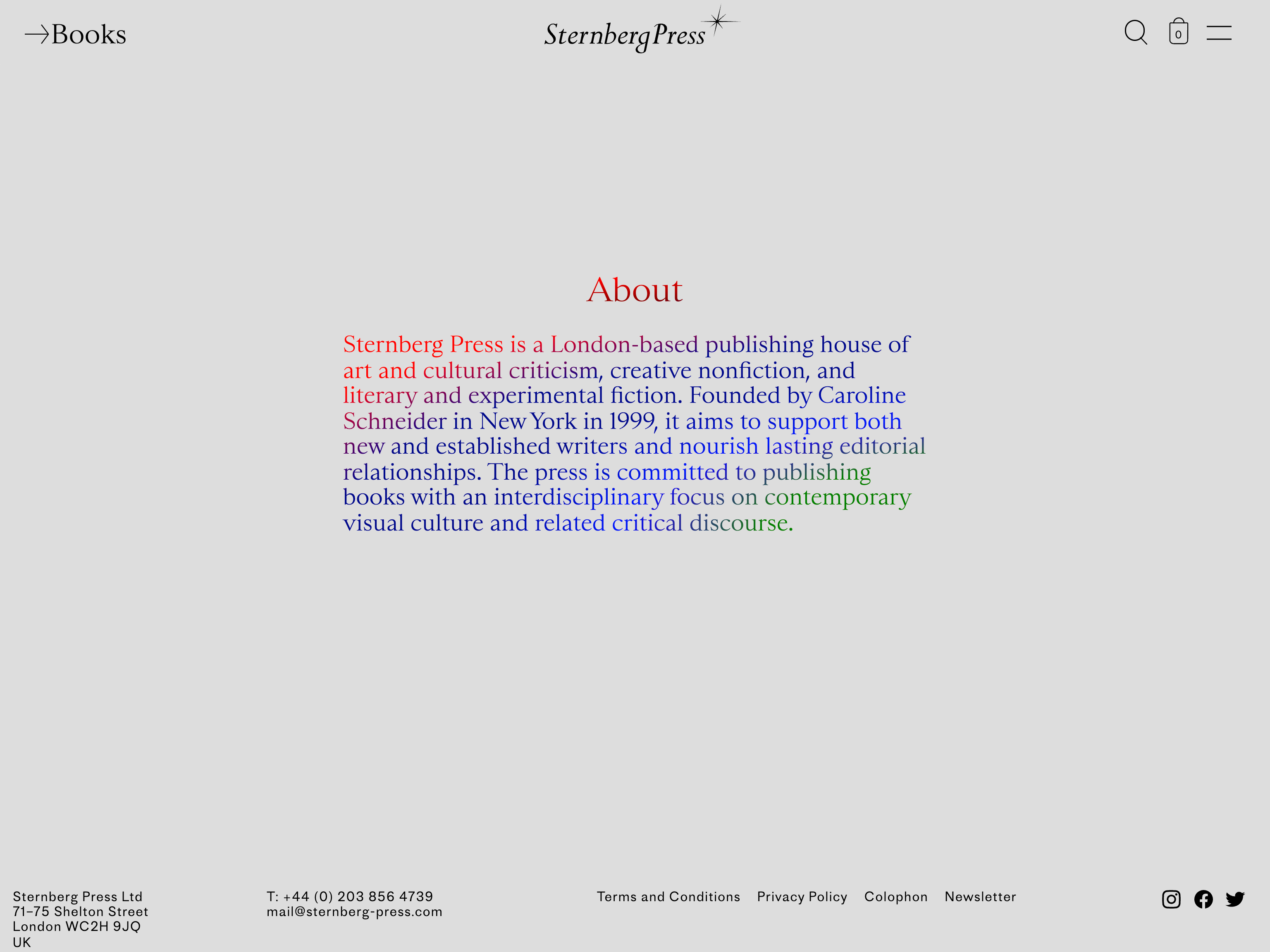
About page
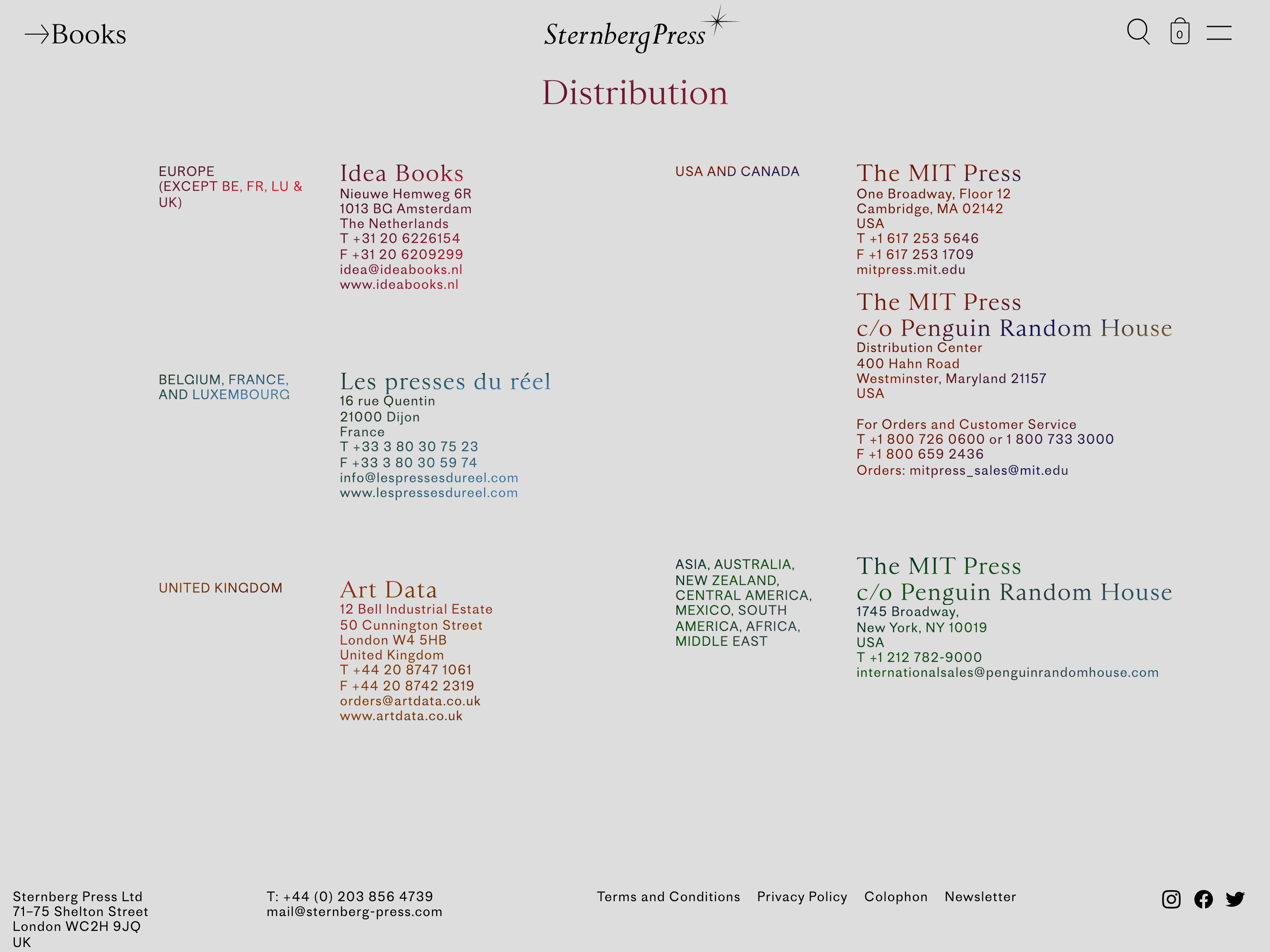
List of distributors


")


")


")