
Dia Elis
Apoc Revelations is the brand typeface of Dia Elis. The visual identity for the Greek olive oil producer was developed by G Design Studio, who comment on their work:
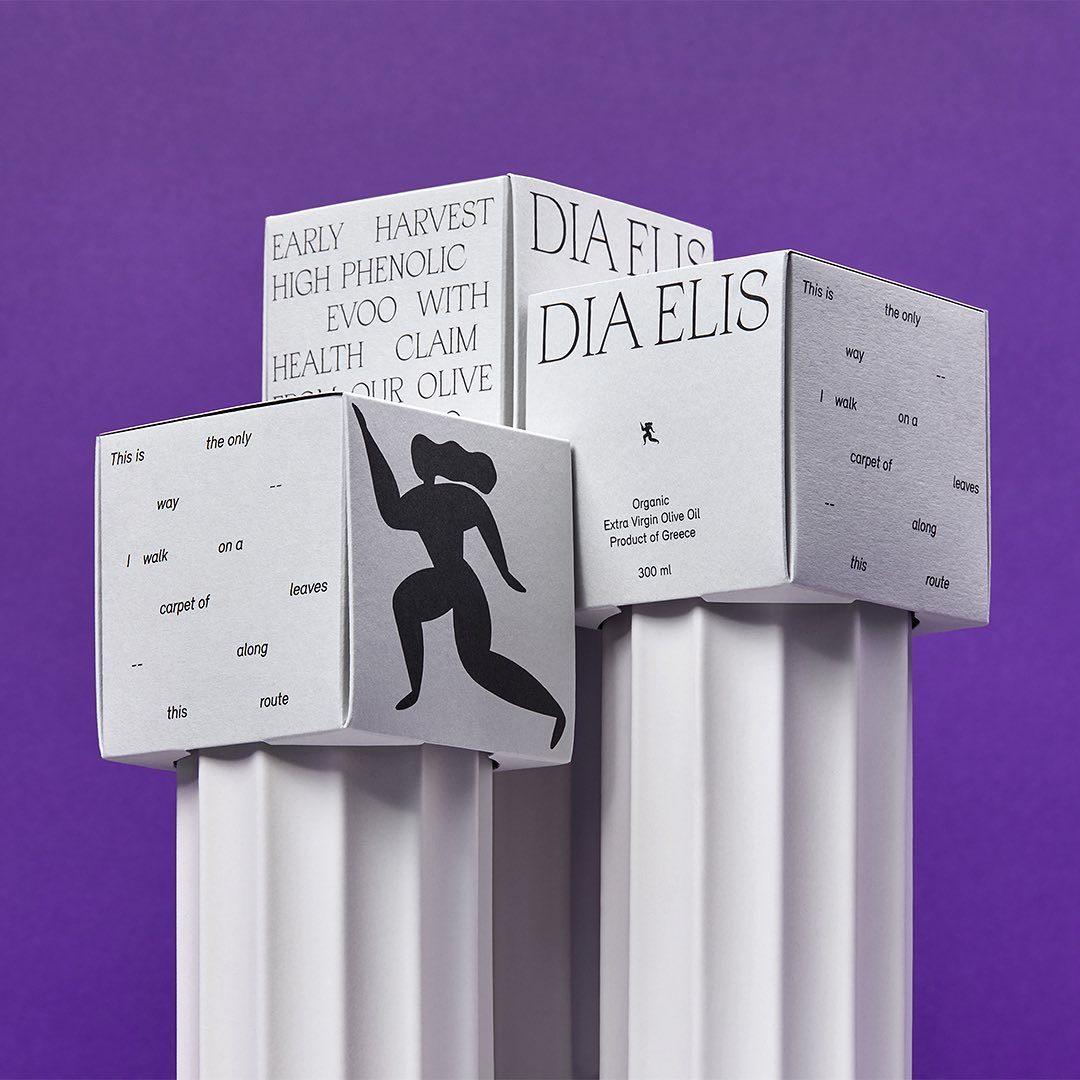
Inspired by the platonic ideals of rhythm and harmony, and the Olympic ideals of respect, fair play and physical prowess, we created a holistic identity that speaks to the past while looking to the future.
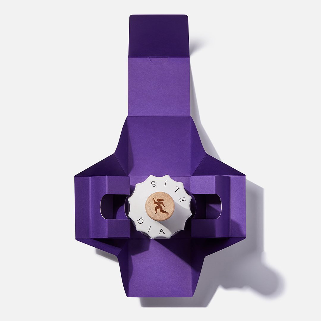
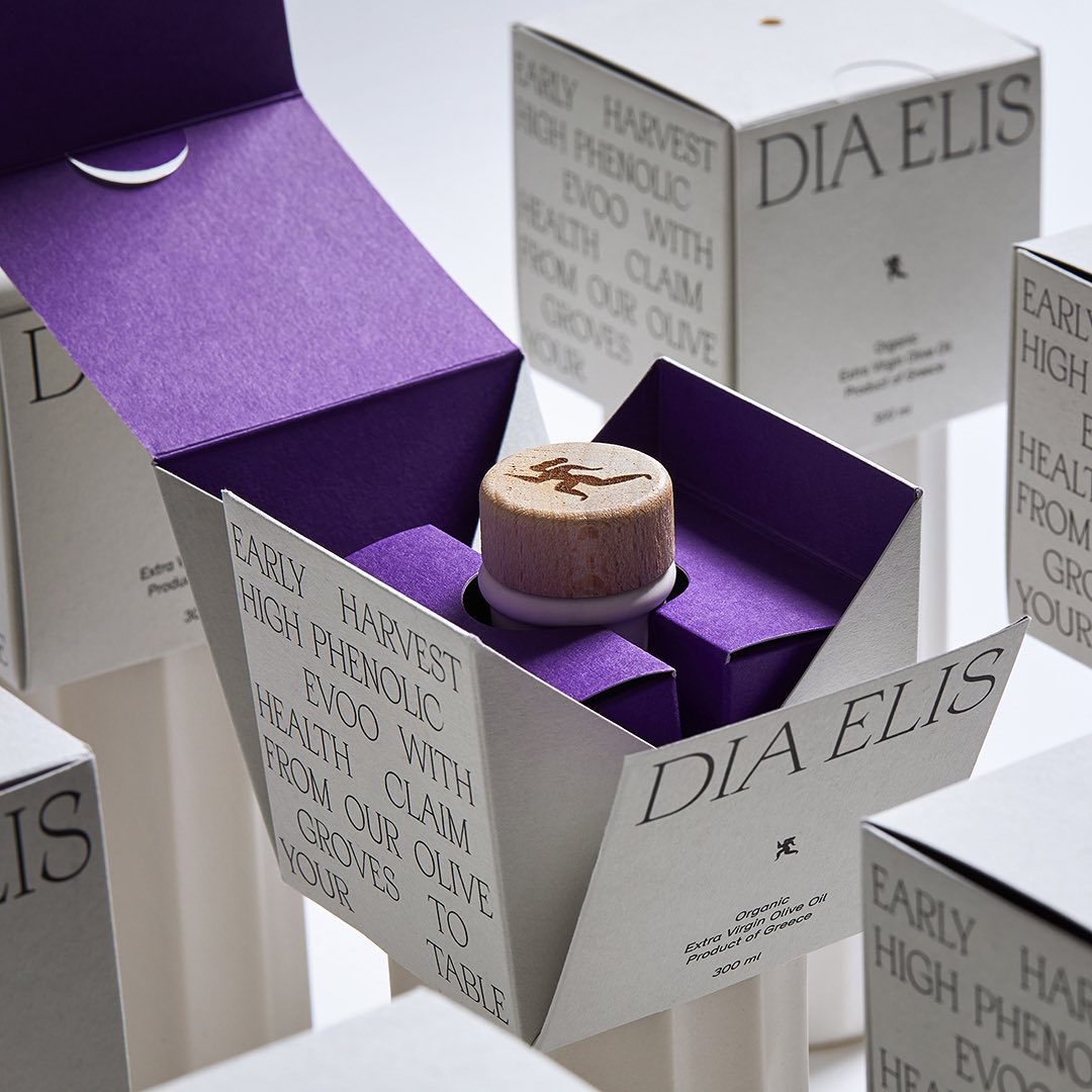
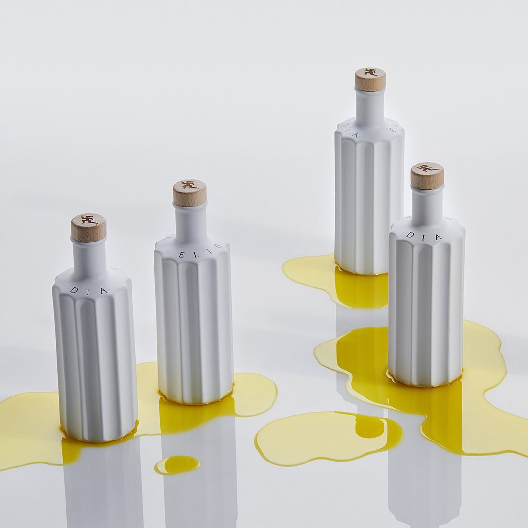
The logo is a female runner, sprinting ahead with the vigour and vitality bestowed by the product. Her dynamic silhouette recalls the red-figure vessels of ancient Greece. The steady pace of her heartbeat and breath is rendered in the sparse layout of the elegant typography, which creates a sense of rhythmical movement.
G Design Studio performed a comprehensive branding strategy, crafted the storytelling and conceived the structural packaging, a lightweight but load-bearing lid that is easy to pick up. The purple color pop when opening the packaging creates an element of surprise.
On the packaging, Apoc is paired with Relevant. The website pairs the logo in all-caps Apoc with text rendered in Forum.


")


")


")


")

")


